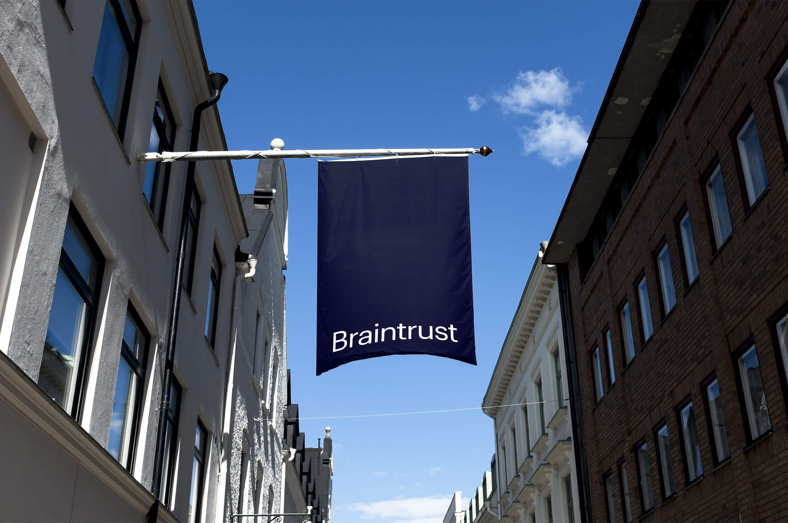
Braintrust
The first user-controlled talent network that connects organizations with highly skilled tech talent.
The first user-controlled talent network that connects organizations with highly skilled tech talent.
The freelance market is challenging to navigate and even more challenging to find work. Not to mention getting paid on time. With so much great talent available, the need for a market was overdue. Braintrust developed this new market. Their mission is to help freelancers find quality work they are excited about, all while getting paid fairly and quickly. It is the first user-controlled talent network. They connect organizations with highly skilled tech talent, allowing teams to be assembled to help tackle larger and more complex projects—without charging exorbitant fees.
Their innovative business model is changing the way work gets done. Talent keeps 100% of their market rate, organizations cut out expensive middlemen, and everyone’s incentives are aligned.
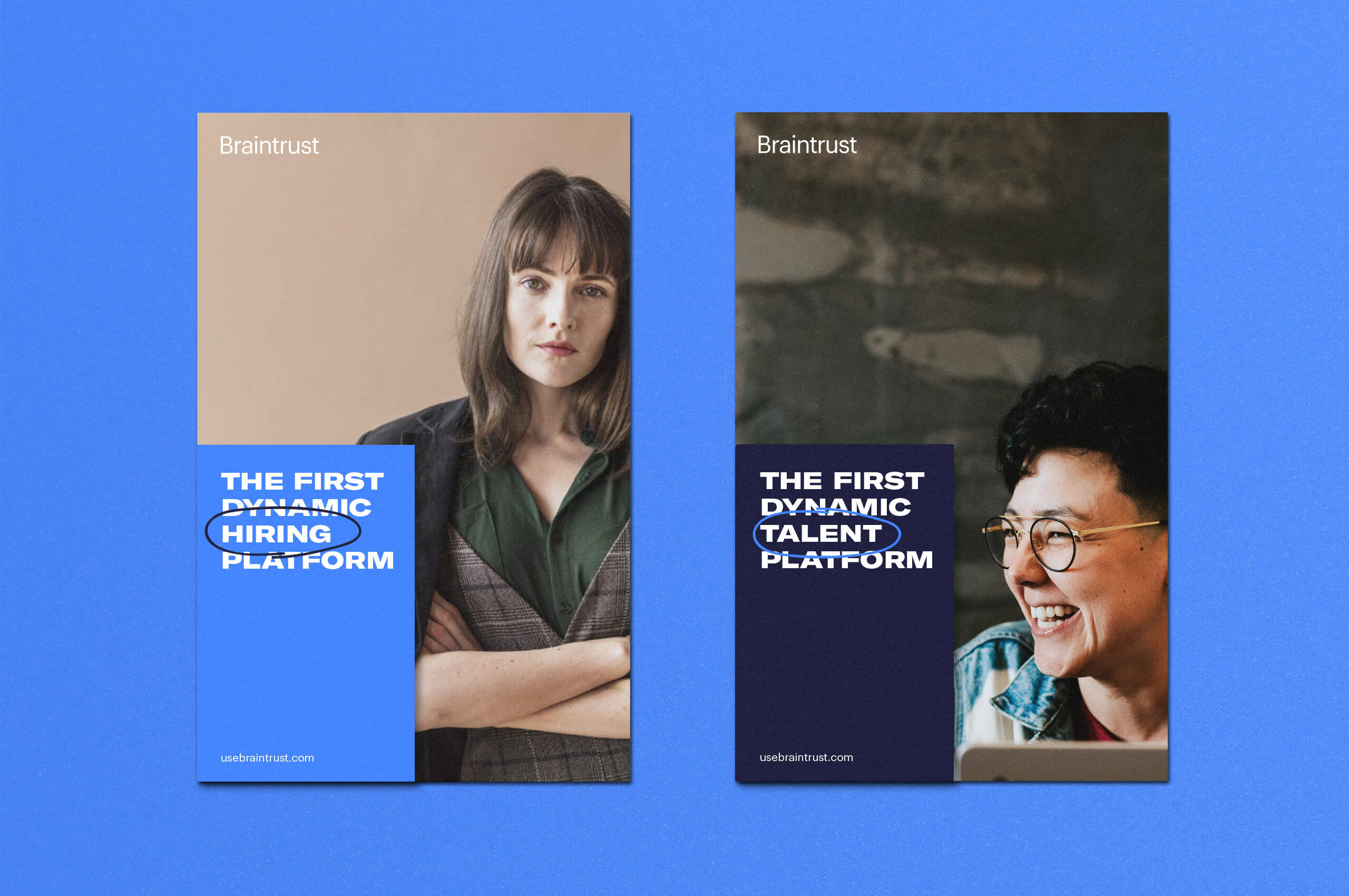
The founders of Braintrust approached Mast to help shape the direction of the identity. Creating a flexible identity that would allow for seamless integration of the brand personality across all mediums. From the outward-facing website, to the freelancer/client backend, and to the physical manifestation of the brand through ad campaigns.
We worked with them to create an identity that felt as forward-thinking as their mission while ensuring it felt like an established and trusted brand. Resulting in a brand that appeals to both talent and employers. We worked closely with Robot Koala to shape the look, feel, and interaction of the identity across the website and platform backend.
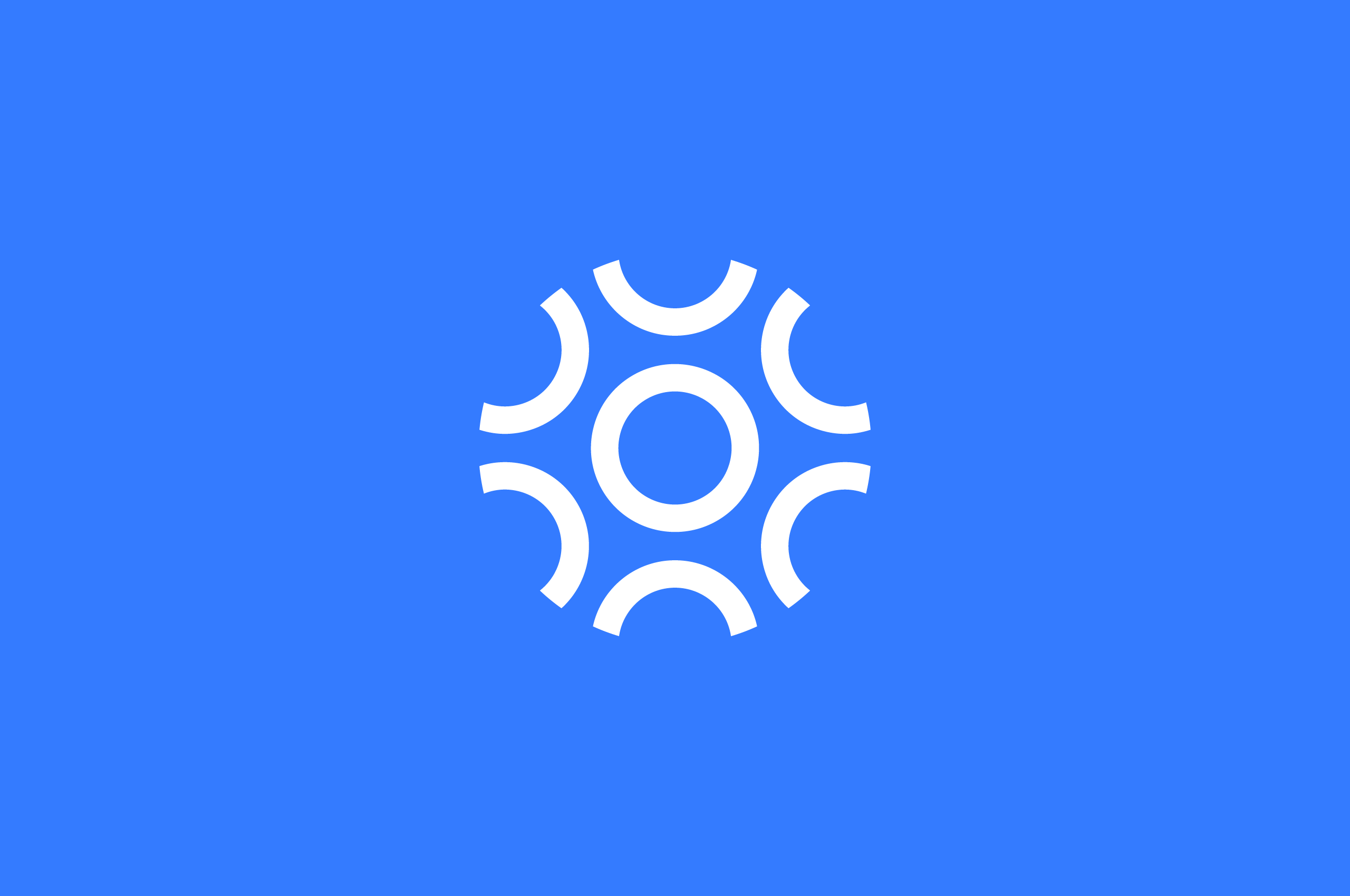

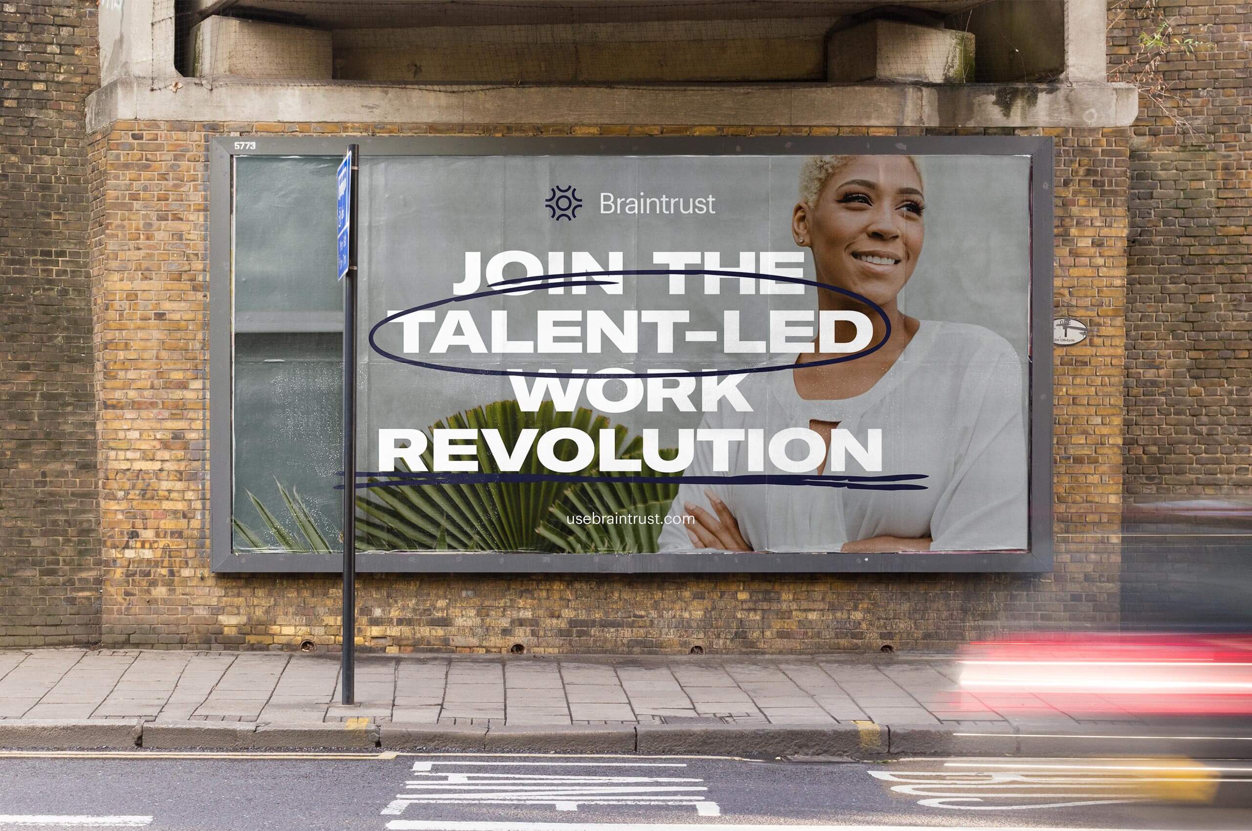
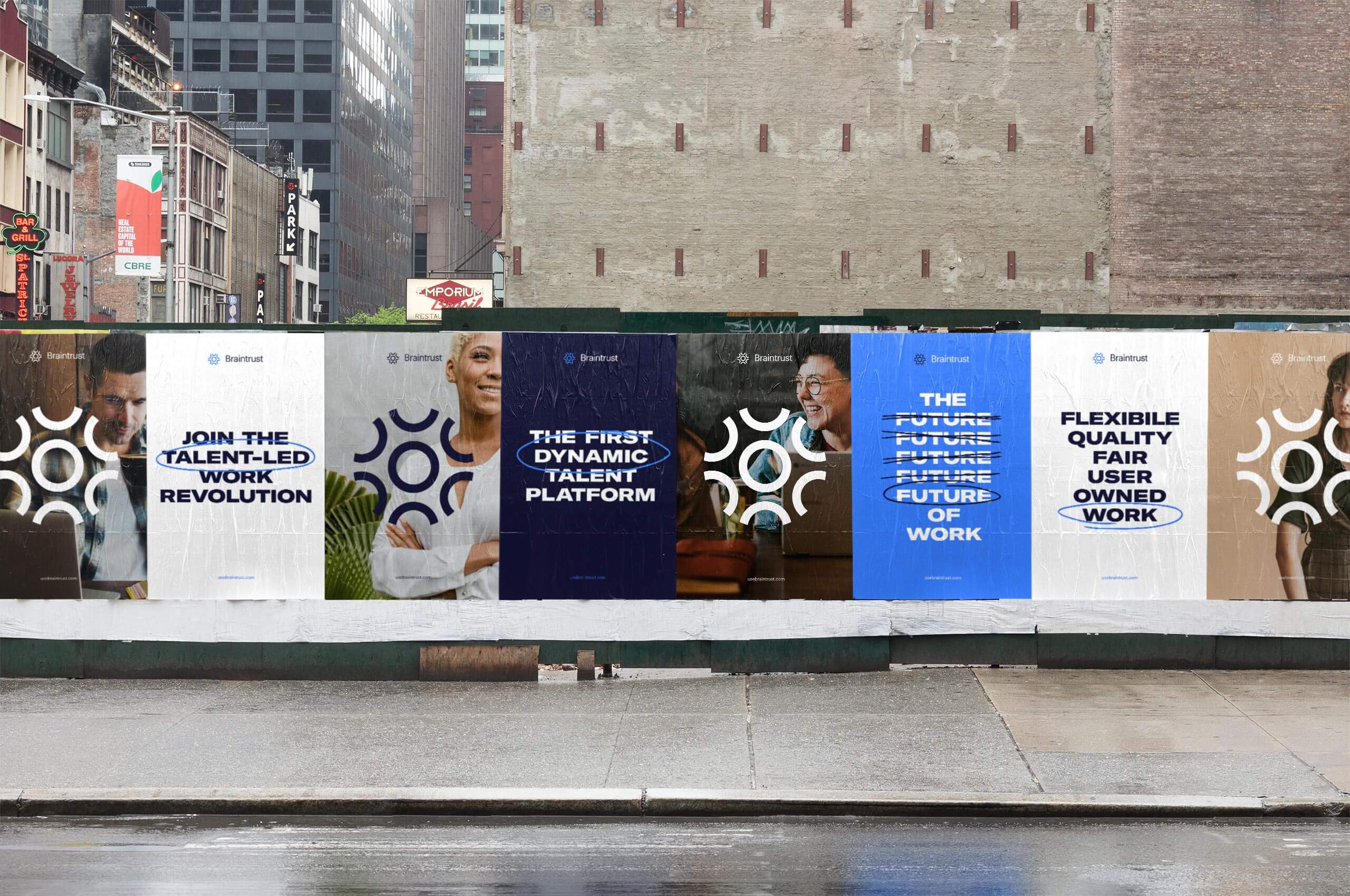
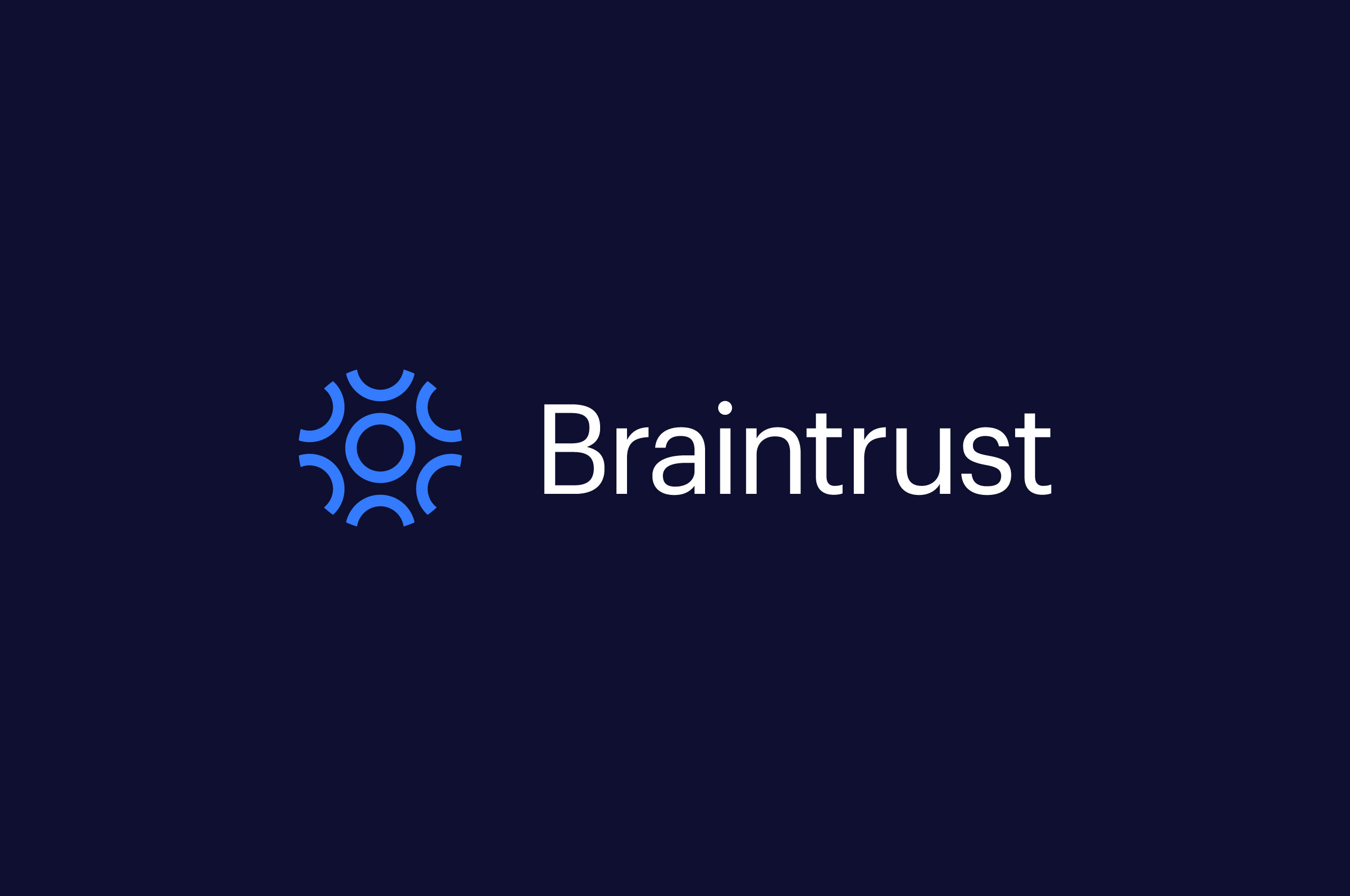
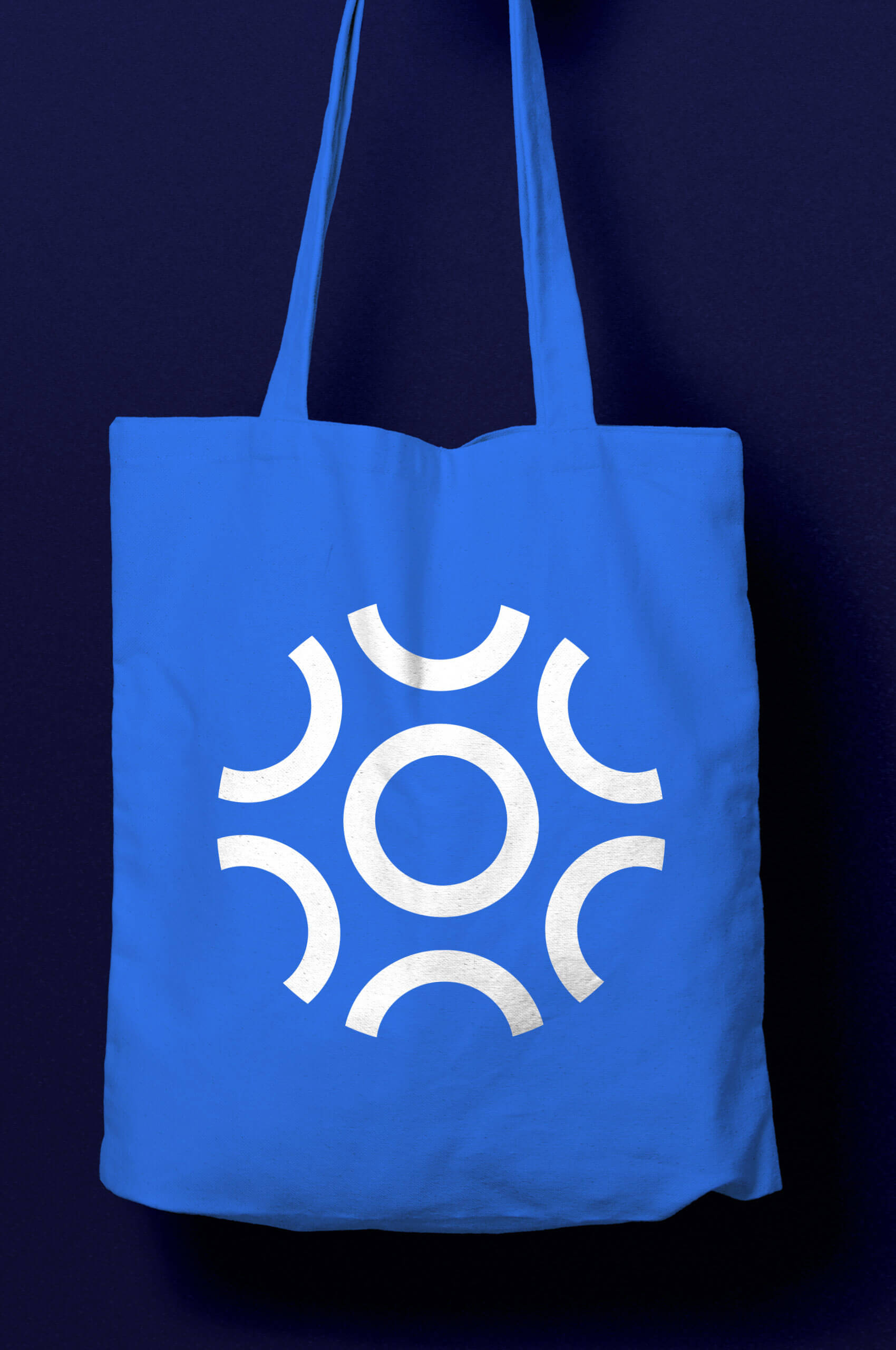
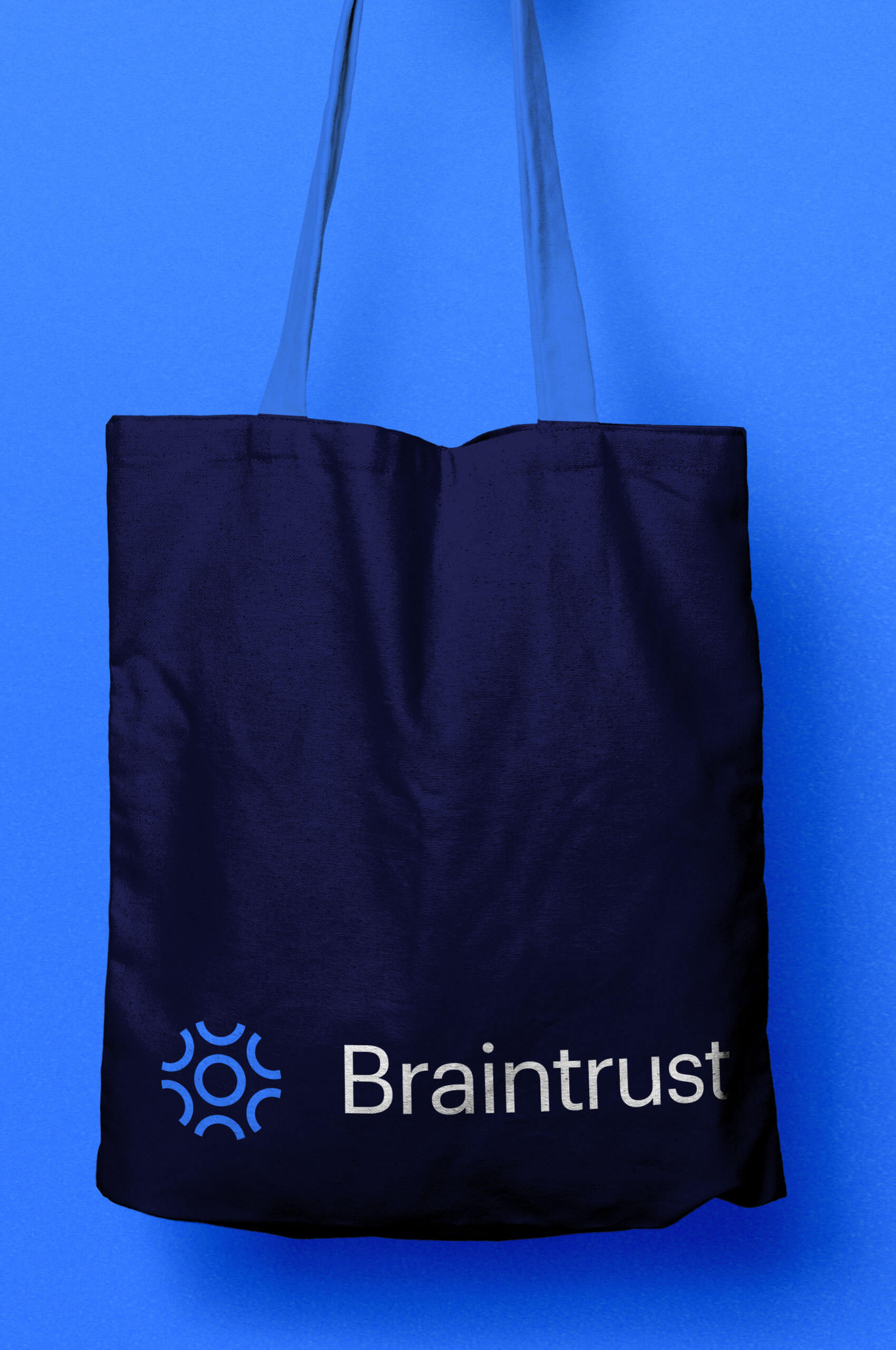
When it came to developing a symbol for Braintrust, we knew it had to be centered around the personal nature of the platform. We created a symbol that embodies the notion of human-centered connection. This was achieved through the visual representation of many people uniting to create a team, with a shared mind, or a Braintrust.
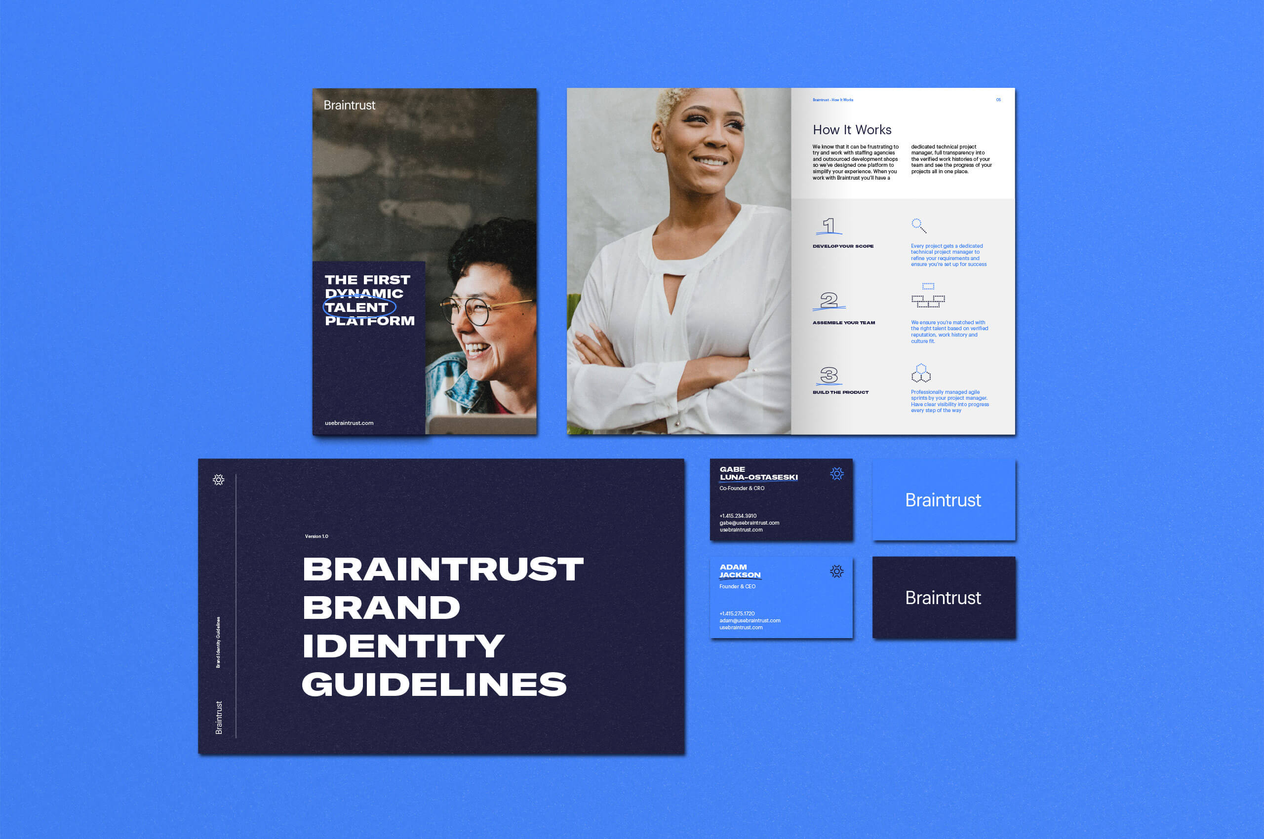
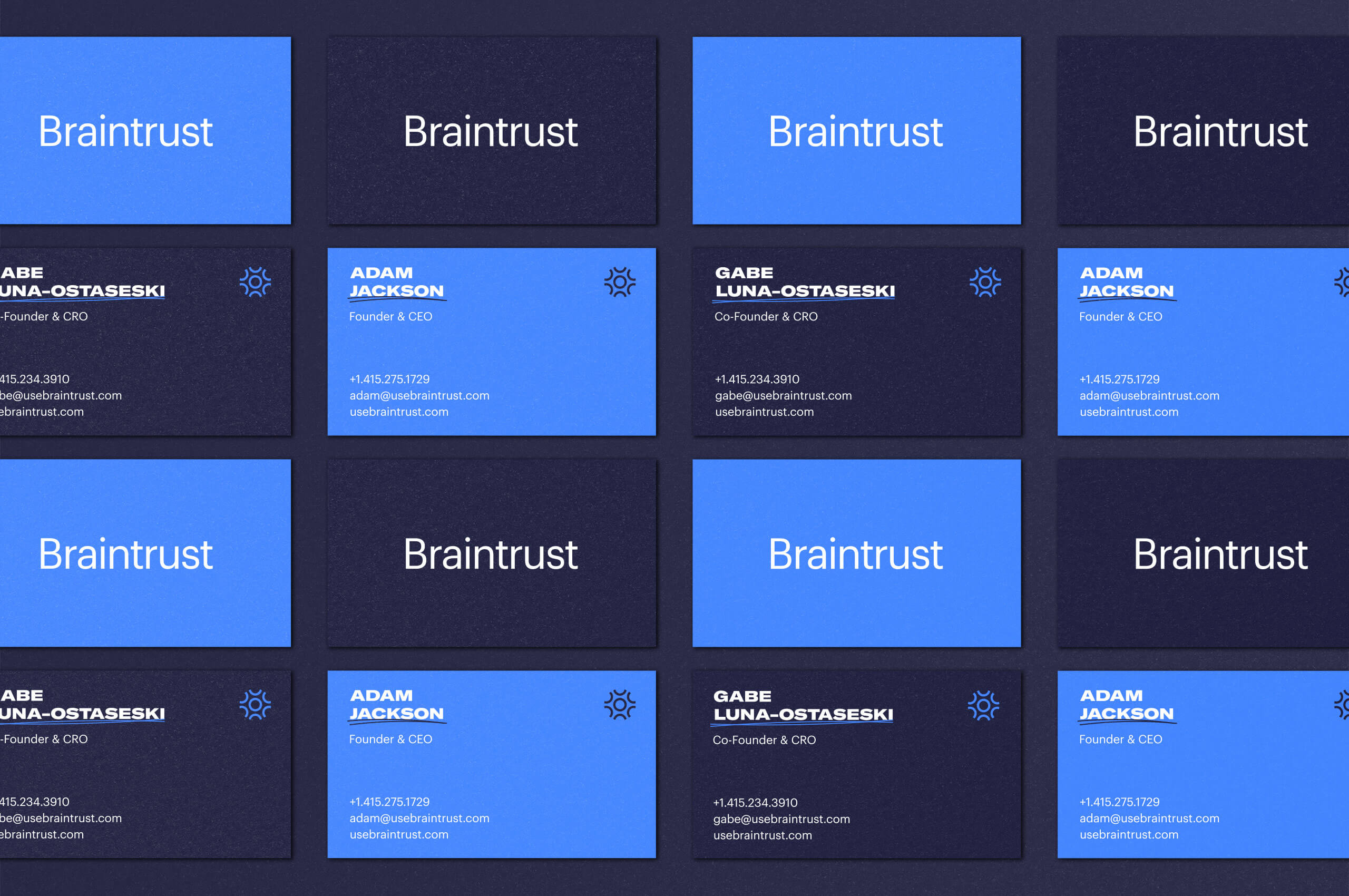
We developed a unique iconography set to be used across the physical and digital touchpoints of the brand. These icons were created with the same rationale of the symbol: many different pieces joining to create a clear and concise message. Creating a flexible system that can easily be added to as new icon needs arise.
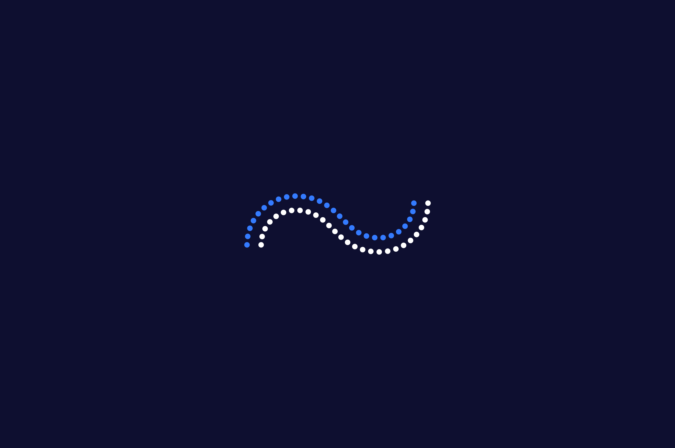
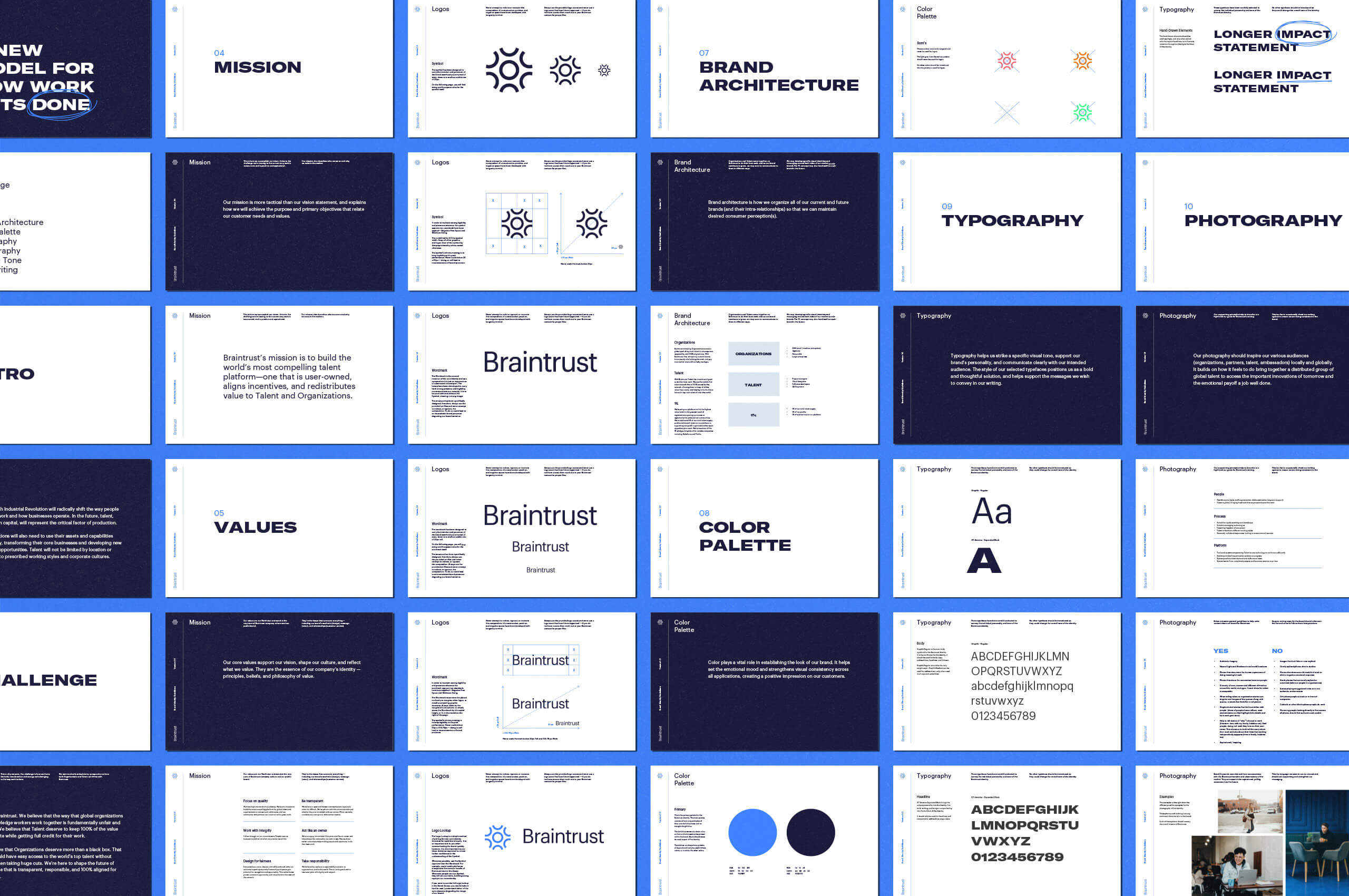
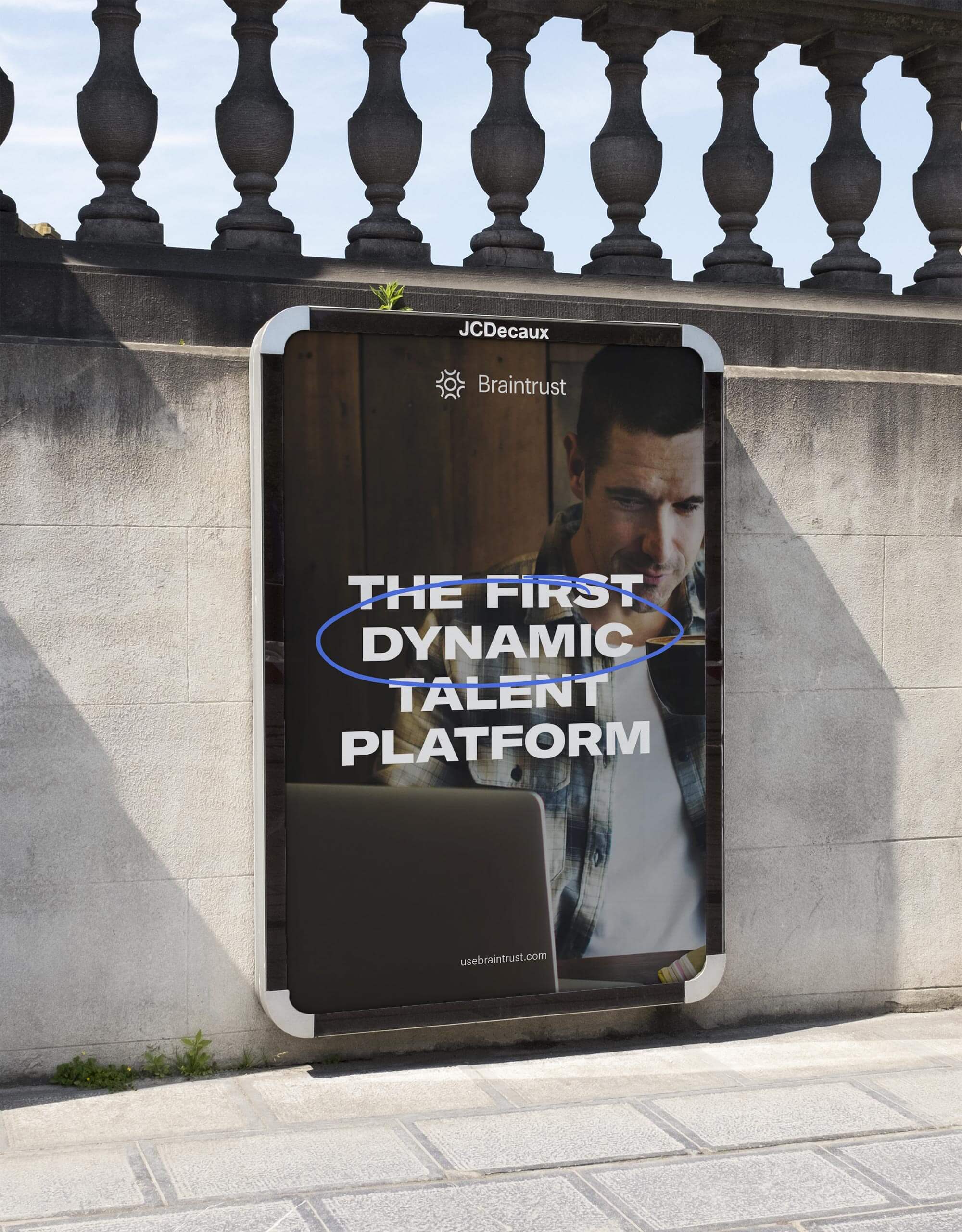
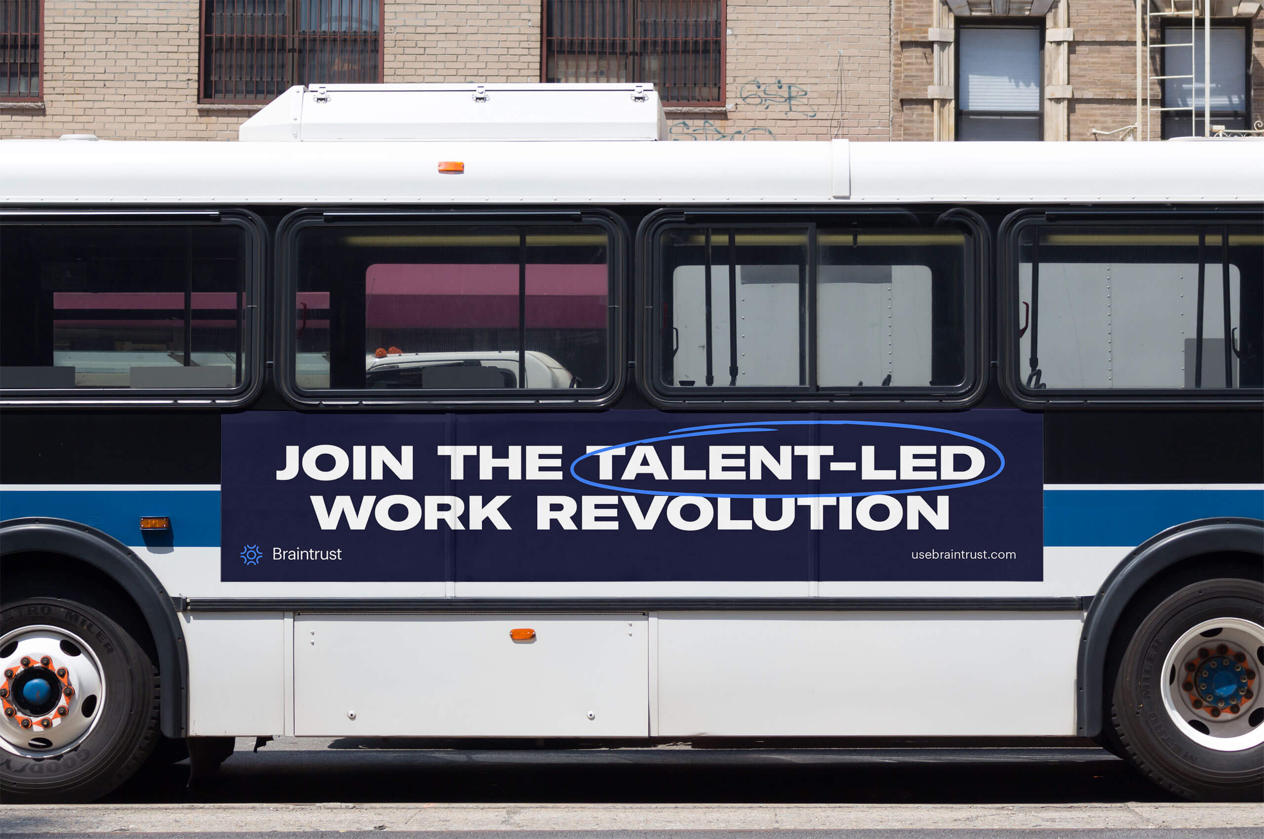
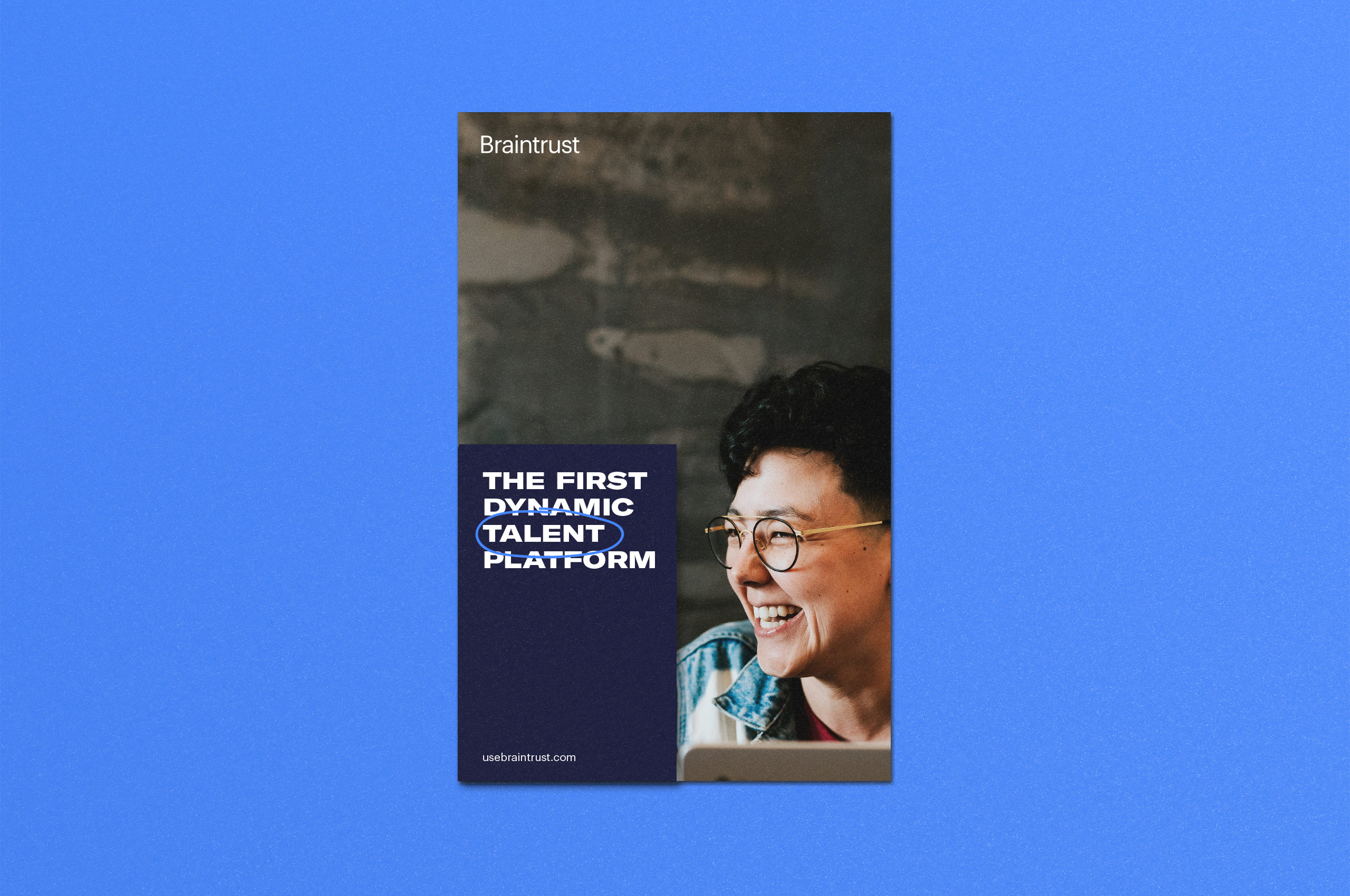
To convey the collaborative nature of the platform, we wanted to interject a human touch into the otherwise polished brand. Taking inspiration from whiteboard collaboration we were able to develop a unique vernacular for the brand. Scanning rough hand-drawn elements to interact with the polished brand elements to create a greater sense of emotion throughout the buildout. Allowing the partnership and teamwork of the platform to shine in all instances of the identity system.