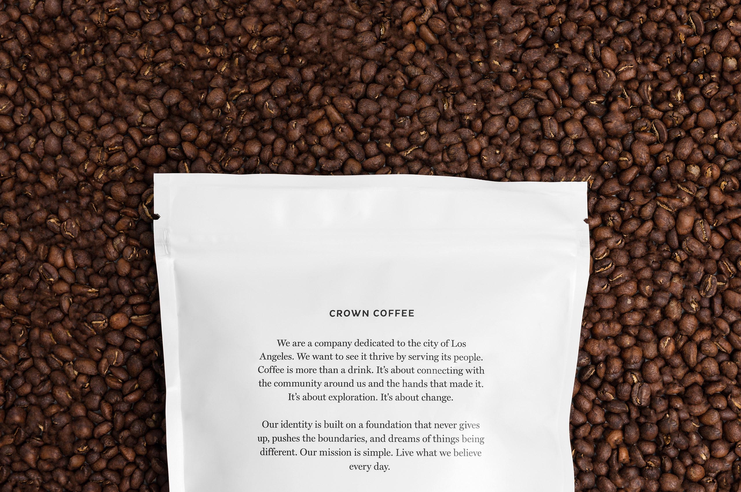
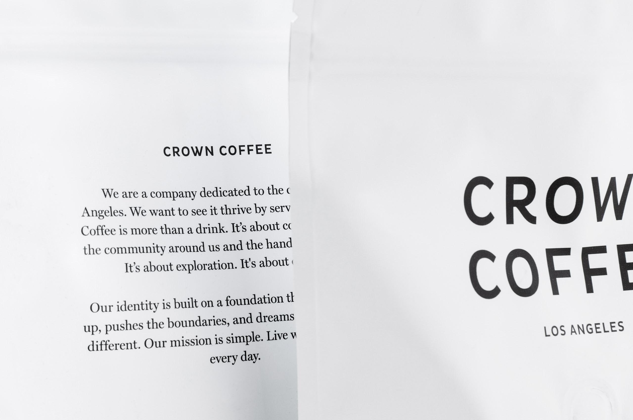
Crown Coffee
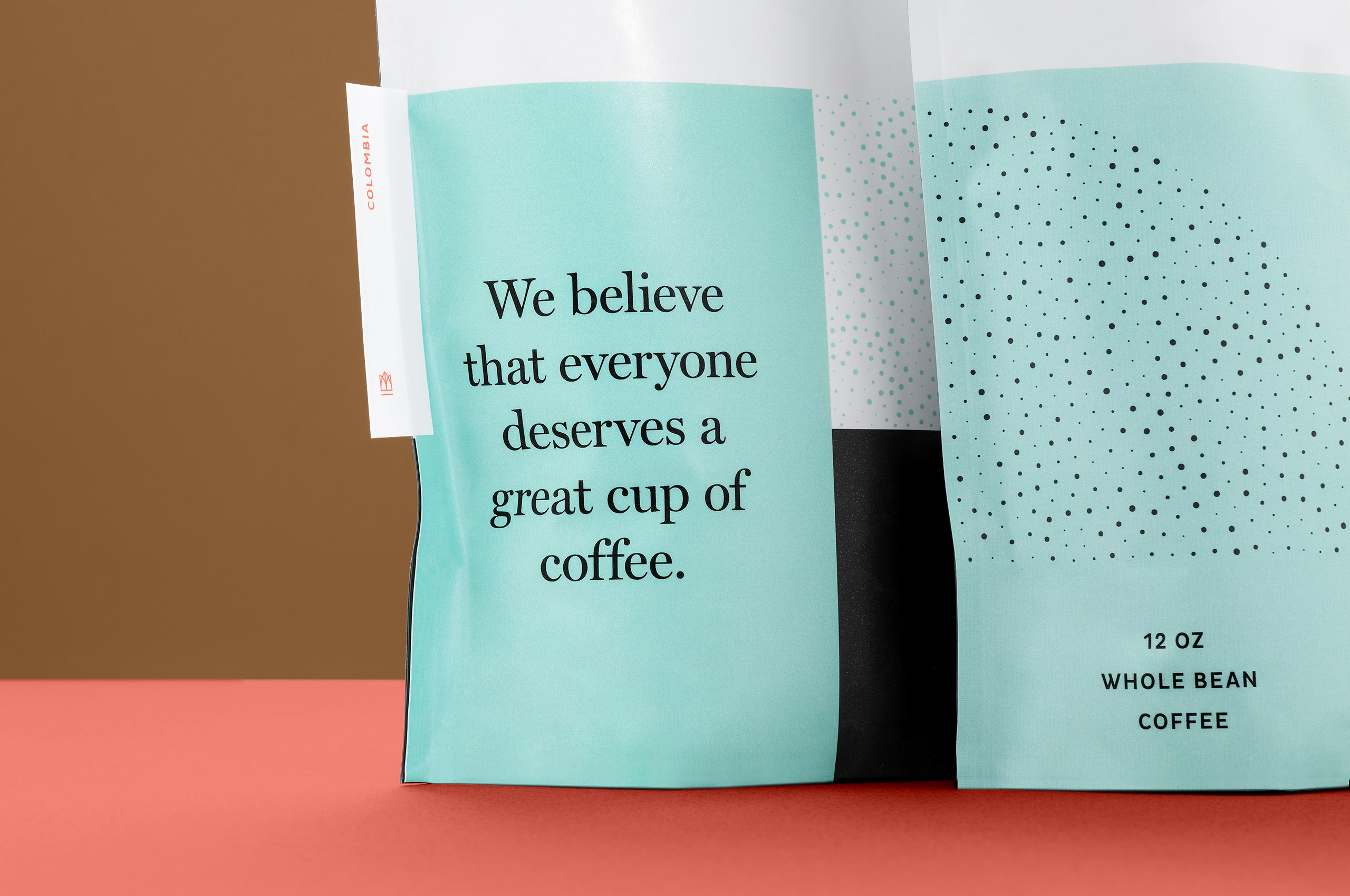
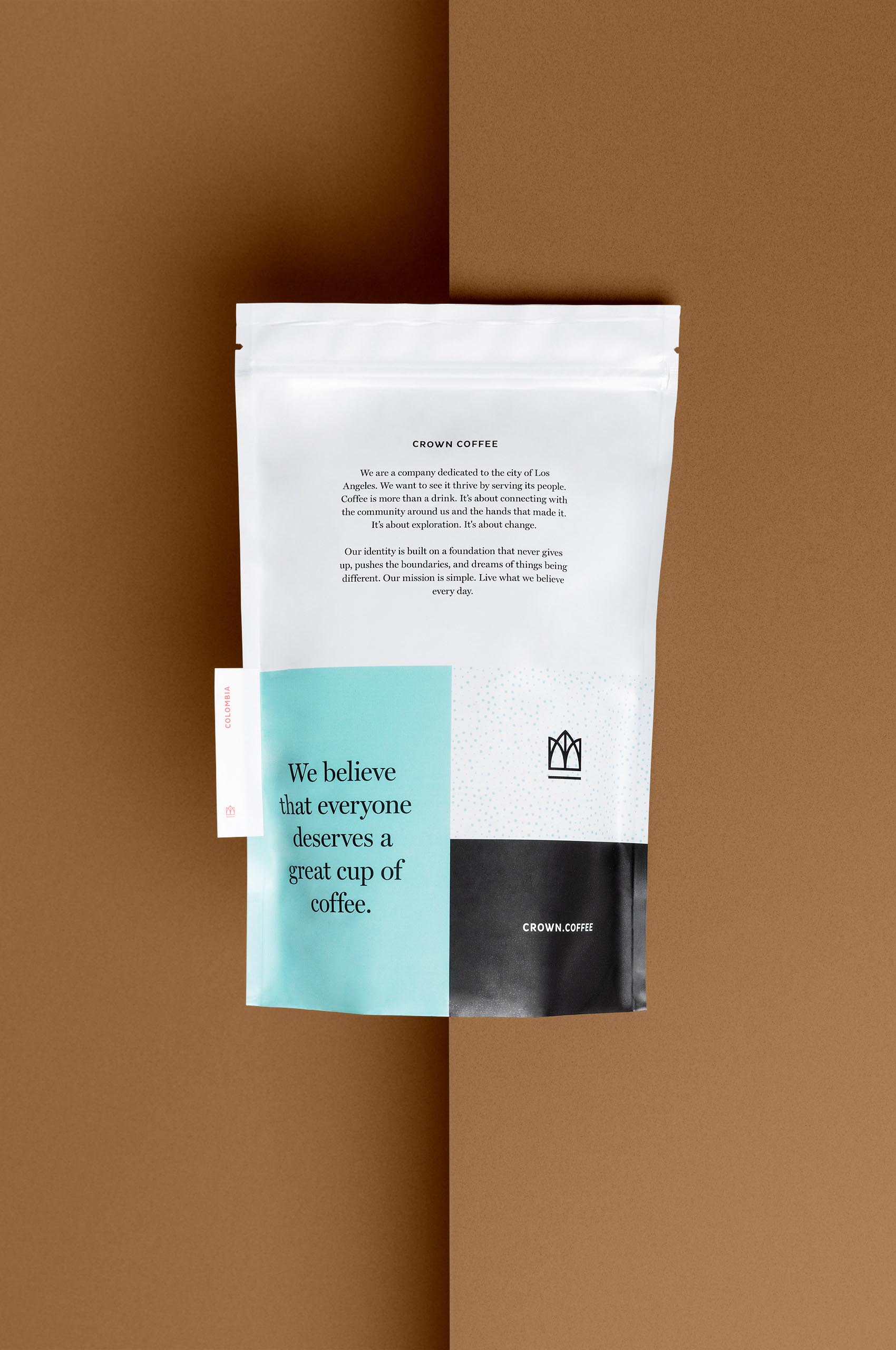
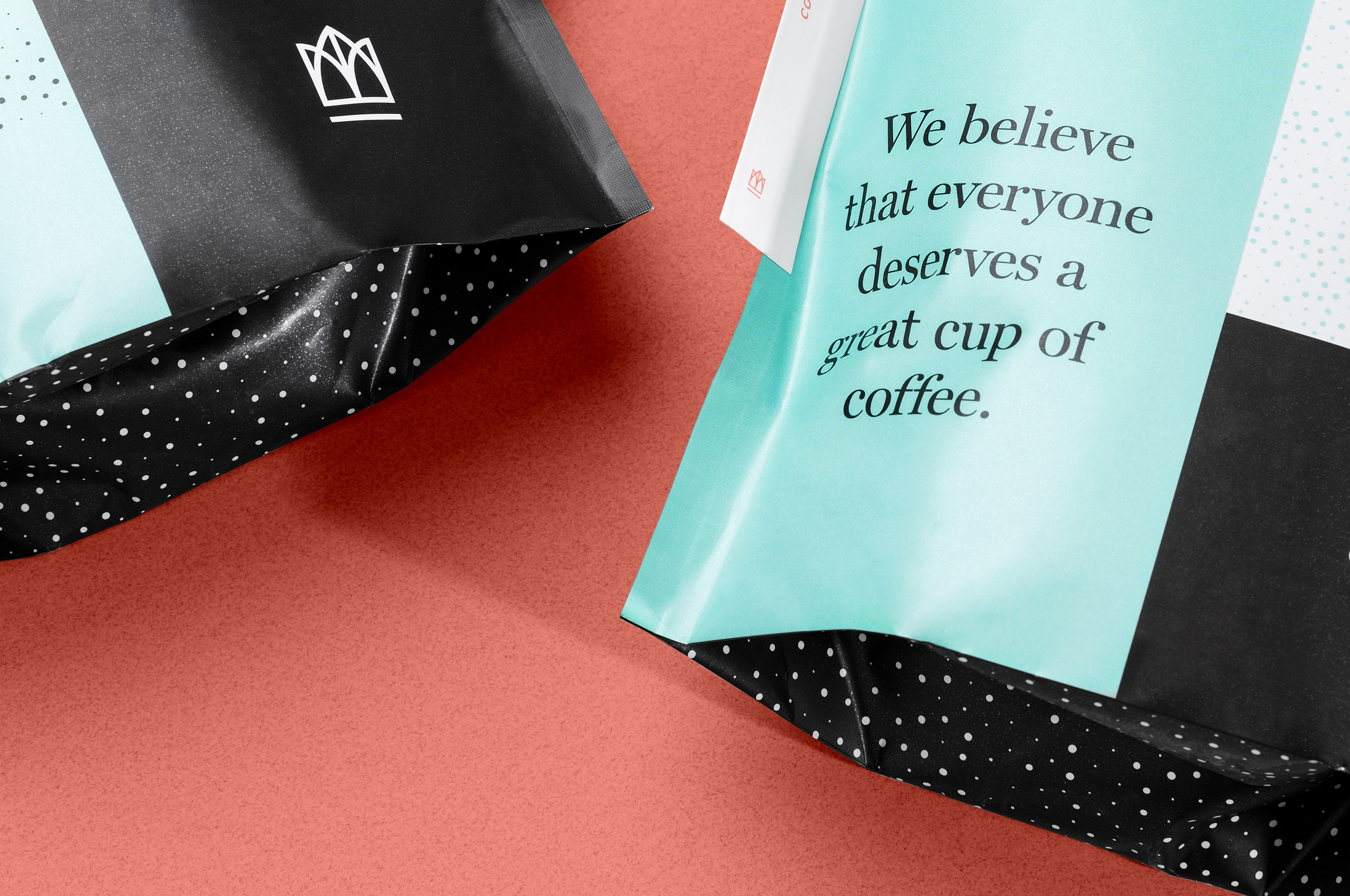
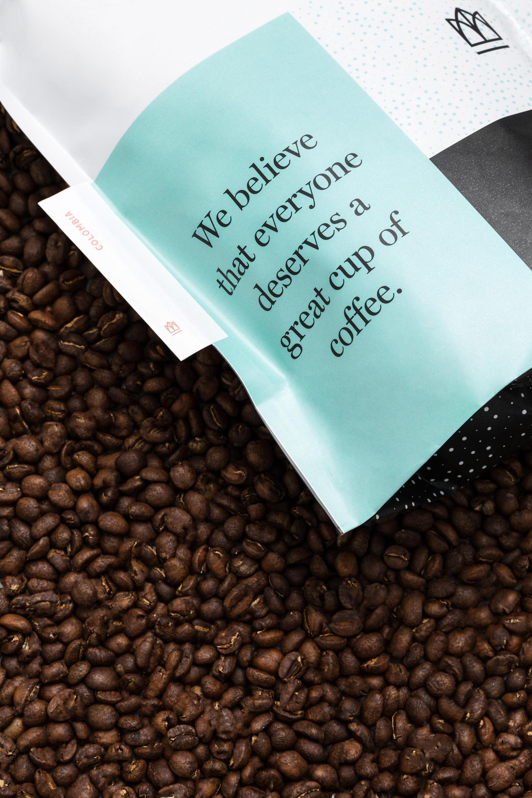
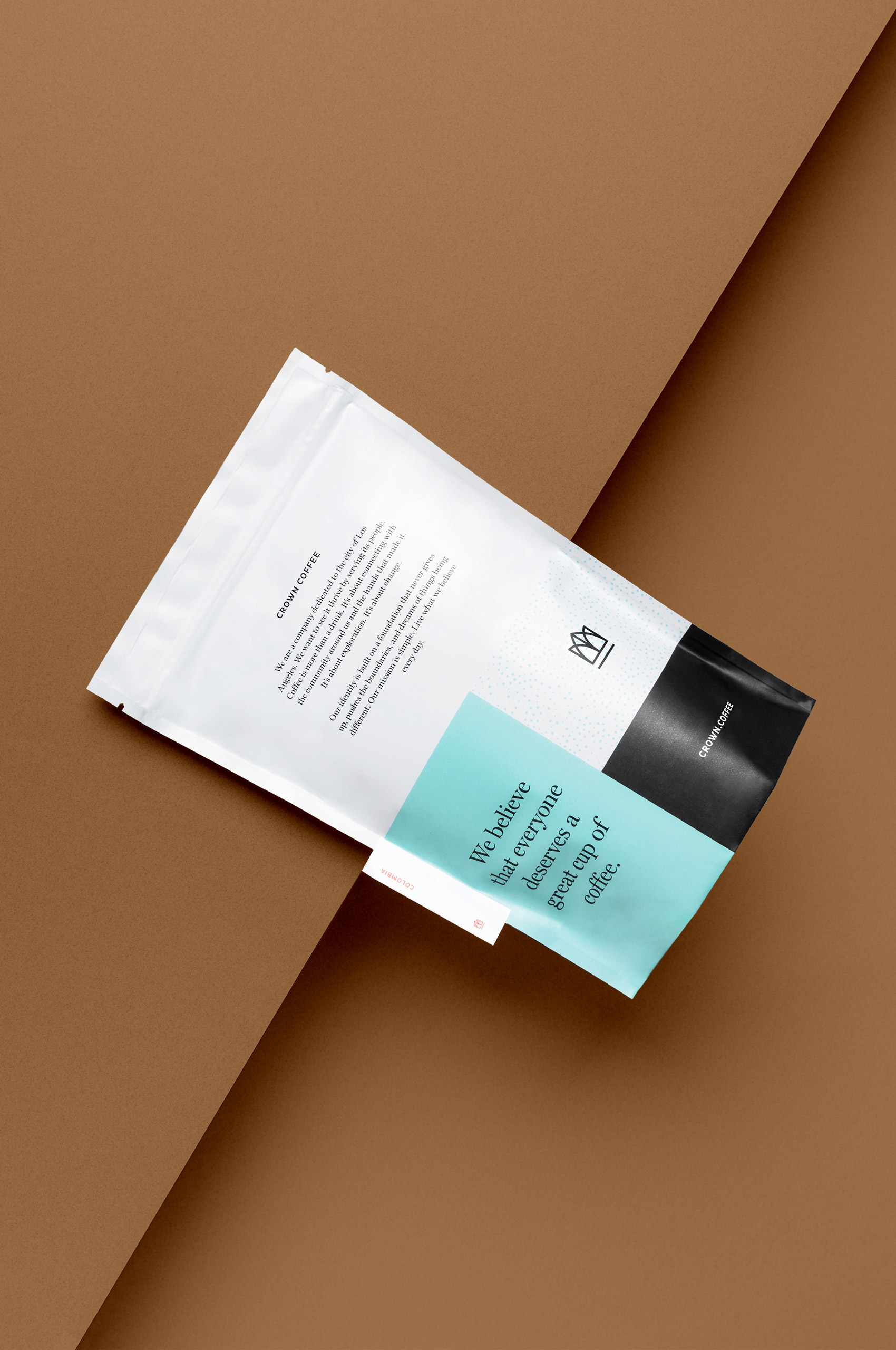
Crown started with a simple belief: that everyone deserves a great cup of coffee.
Crown started with a simple belief: that everyone deserves a great cup of coffee.
Crown started when two friends noticed a trend in third-wave coffee shops in their city of Los Angeles. They noticed that overall, it wasn’t that inclusive, it is easy to feel intimidated, feel out of the know, and feel overwhelmed. This spurred the idea to create a coffee company centered around inclusion and knowledge. Allowing customers to feel empowered and excited about the coffee they were drinking, even if they weren’t familiar with craft coffee. At the end of the day, they truly believe that everyone deserves a great cup of coffee.
While upon first hearing the name, one might think that the company is exclusive or high-brow. That couldn’t be further from the truth, the name comes from the original name of their city, “The Town of Our Lady, the Queen of Angels.” They wanted to start a company that highlighted their community and made everyone feel like they were kings and queens. Allowing them to wear the crown.
They came to Mast with this story and wanted to design a brand around it. We worked with them to develop a bright, energetic, and expressive brand that could appeal to all.
Product photos by Scott Snyder.
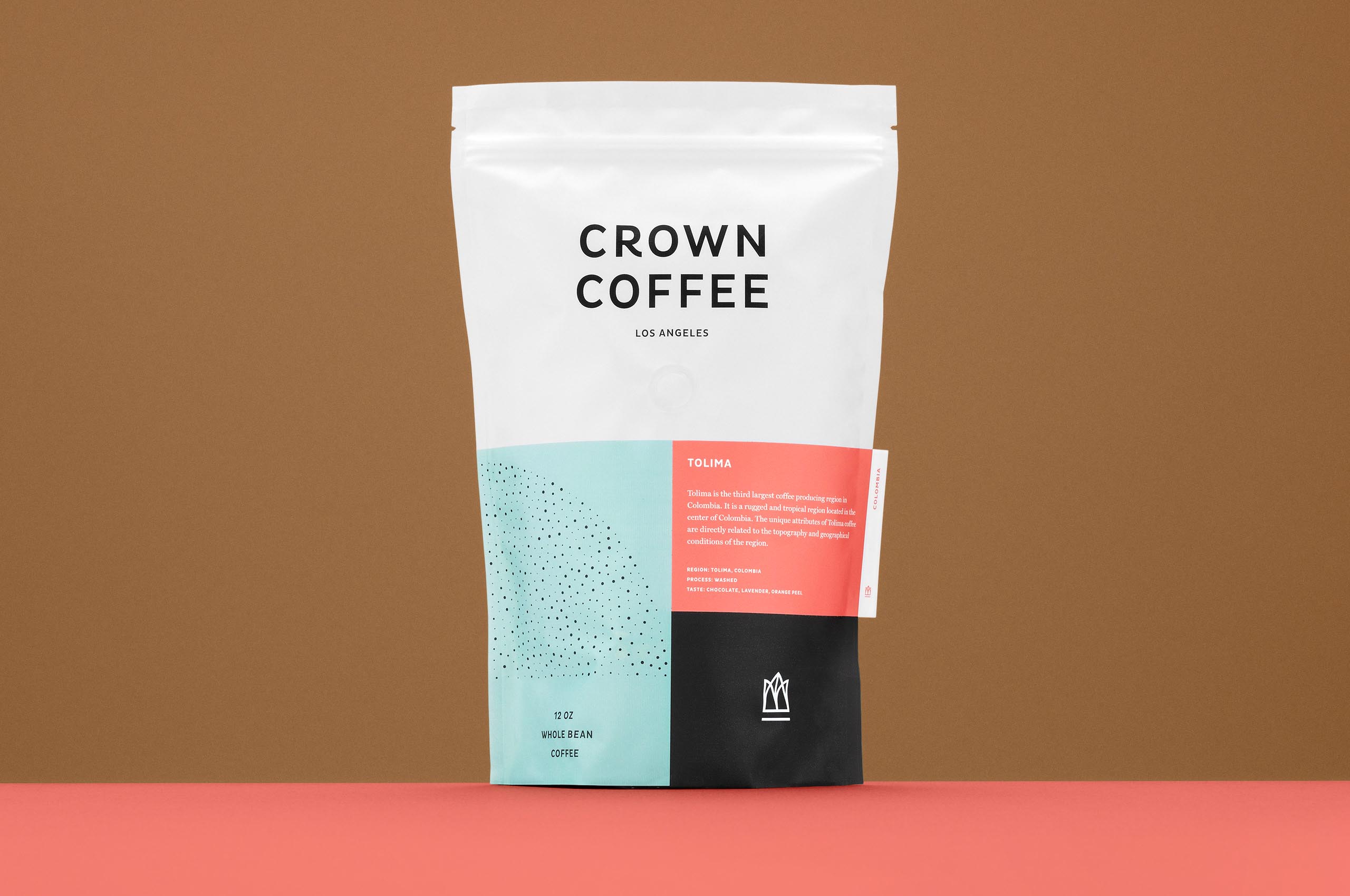
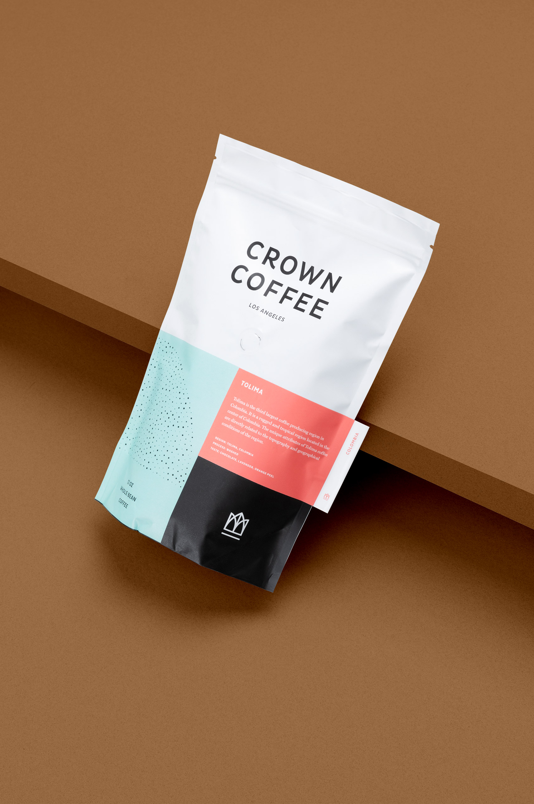
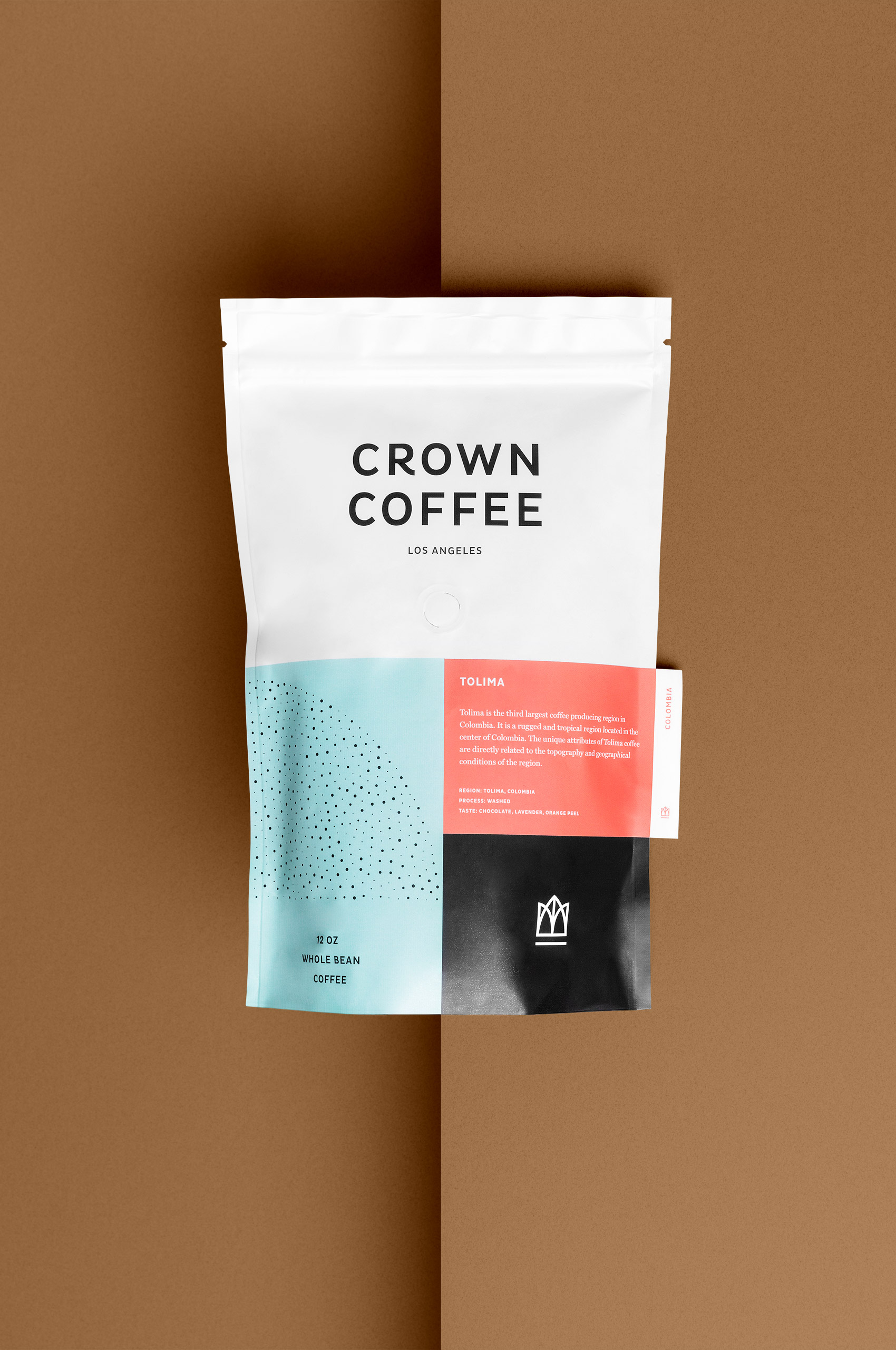
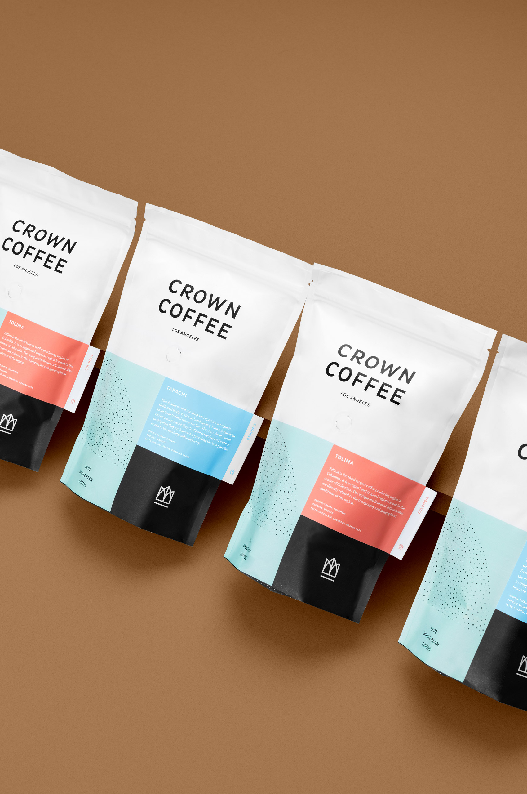
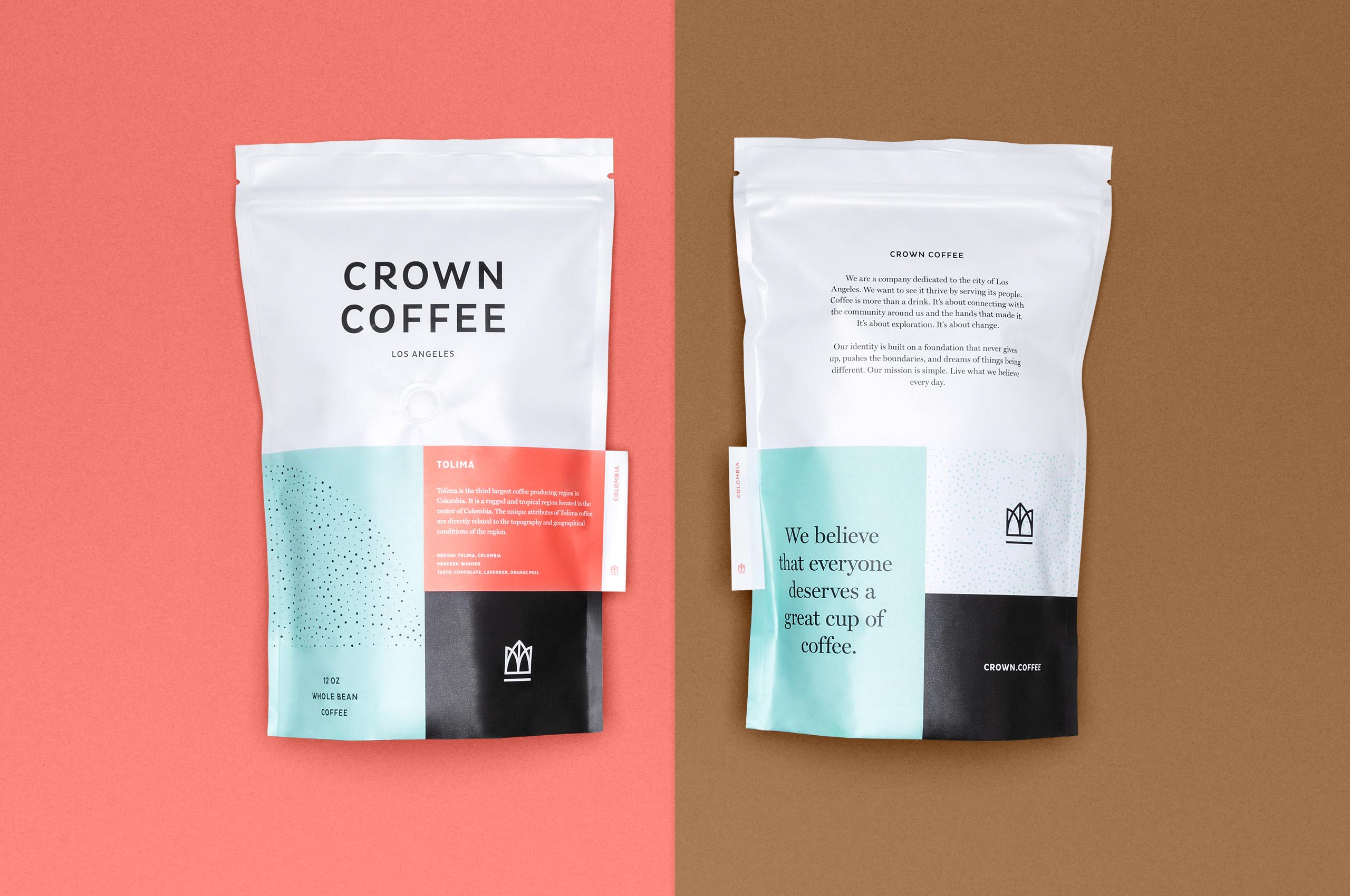
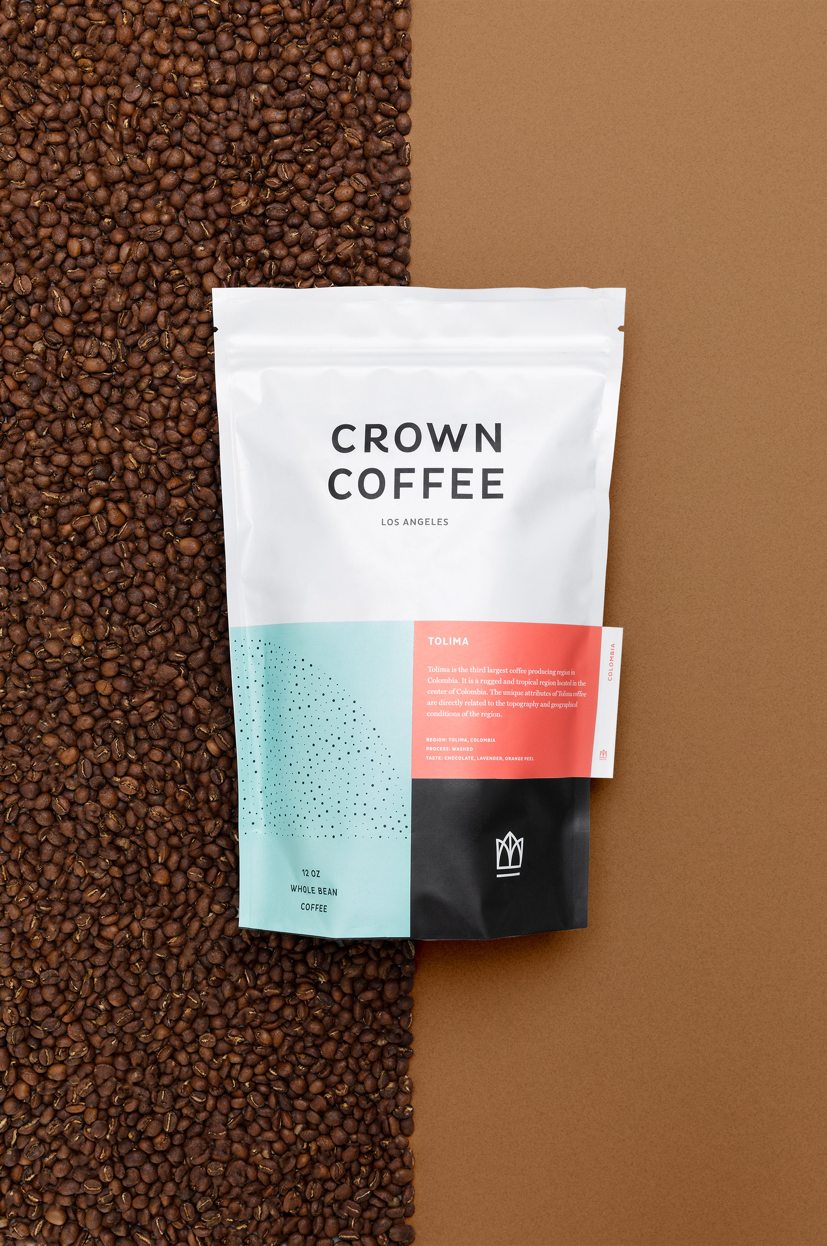
We developed a brightly colored bag with a labeling system that would fit seamlessly into the modular design. Creating a bag that would be striking on the shelf and provide multiple levels of information to the potential customer. We used a color-coded regional system for the backgrounds, tabs with the country name or blend allowing for quick recognition, and plenty of information for the coffee savvy.
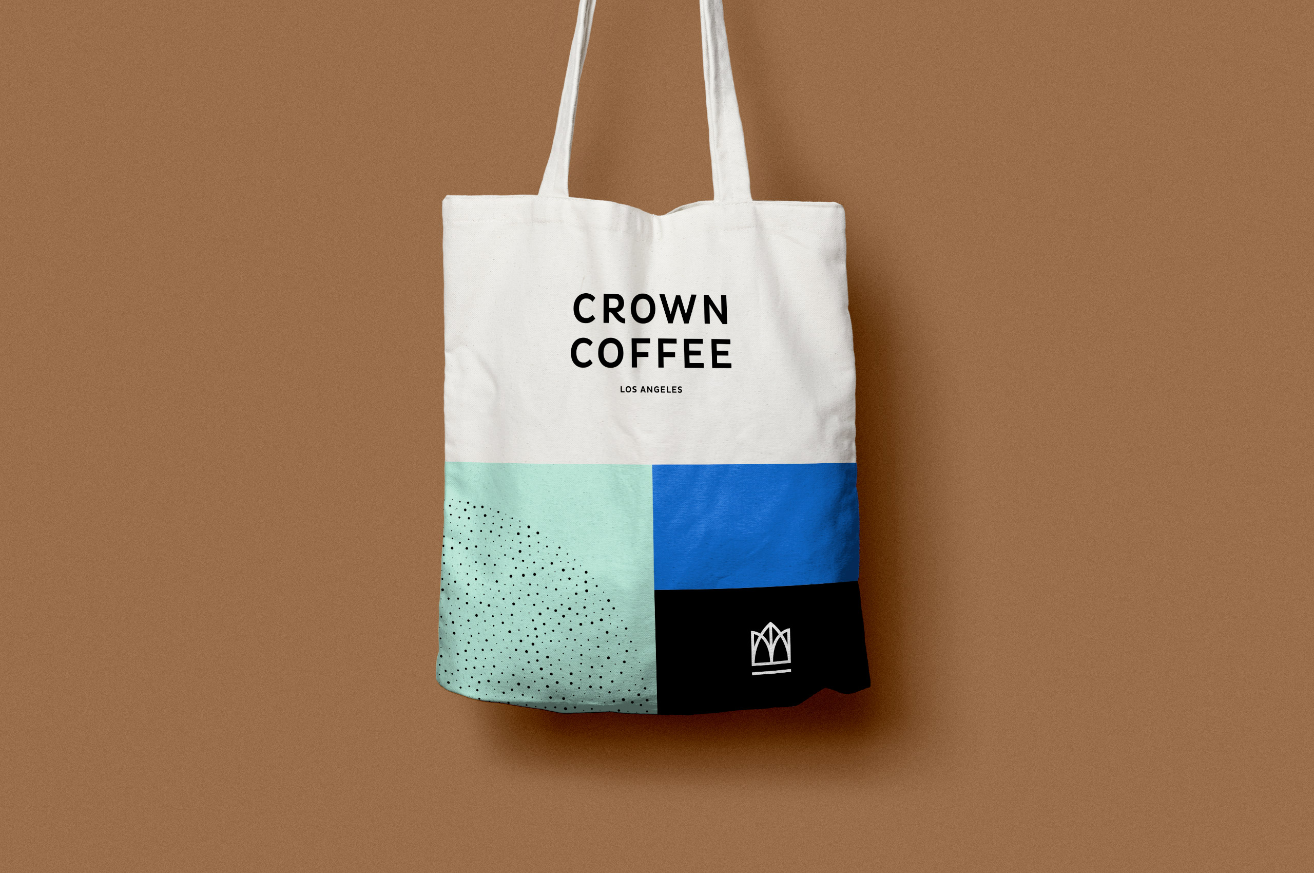
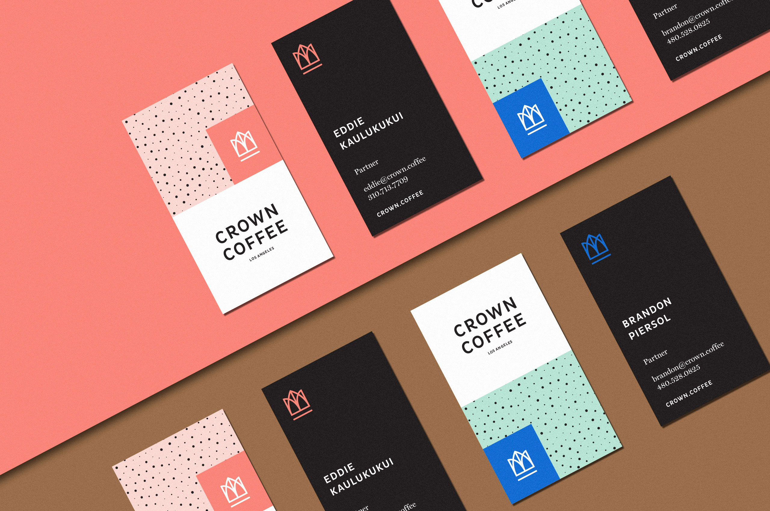
When it came to developing the symbol, it became quickly evident that we needed to create a crown. But this couldn’t be just any crown, it couldn’t feel overdone or too embellished. It had to be something that would appeal to all. It was developed to represent the crown through the lens of history. The history of the item itself, but also the history of Los Angeles, the forms within the icon are reminiscent of historic Los Angeles buildings along with the shape of a coffee bean.

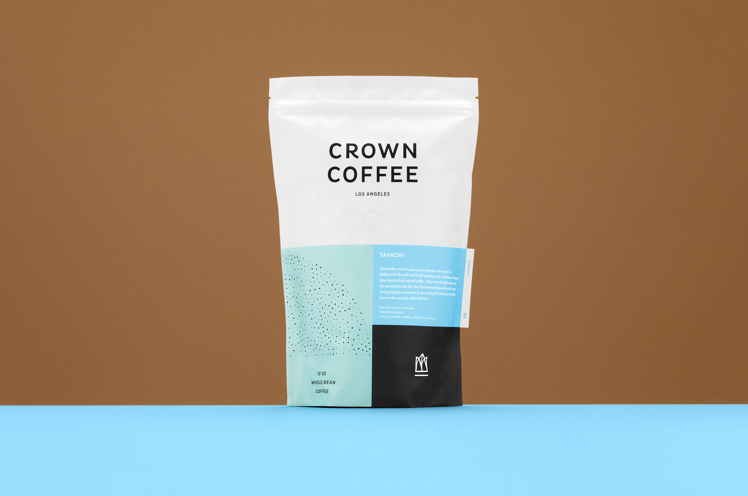
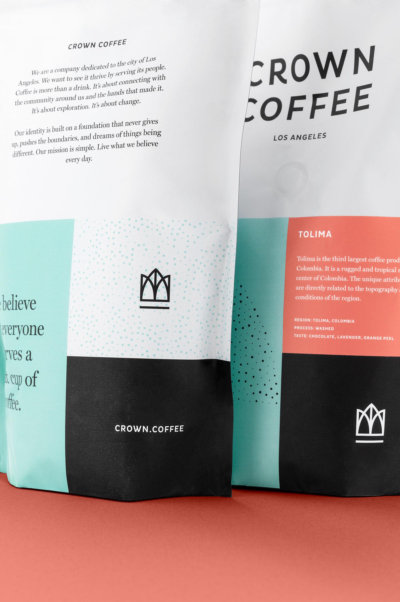
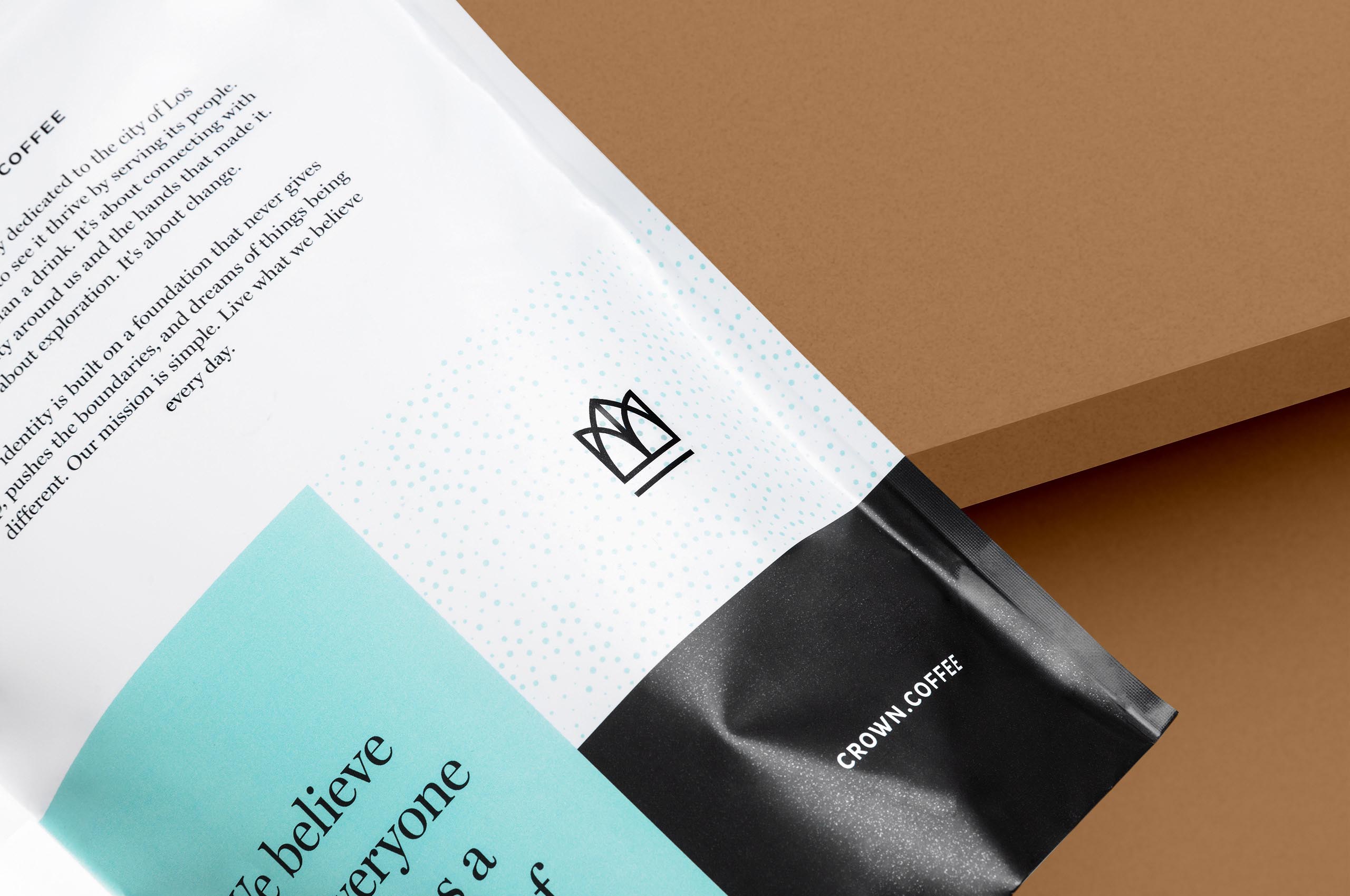
To enhance the modular system, we developed a pattern unique to Crown. The pattern was developed to mimic the imperfect nature of coffee beans. ; no two beans are alike just as no two customers are alike. The pattern is used throughout the brand, in packaging, collateral, and promotional items.