Hazel
A startup working to redefine the meaning of aging through ground-breaking products.
A startup working to redefine the meaning of aging through ground-breaking products.
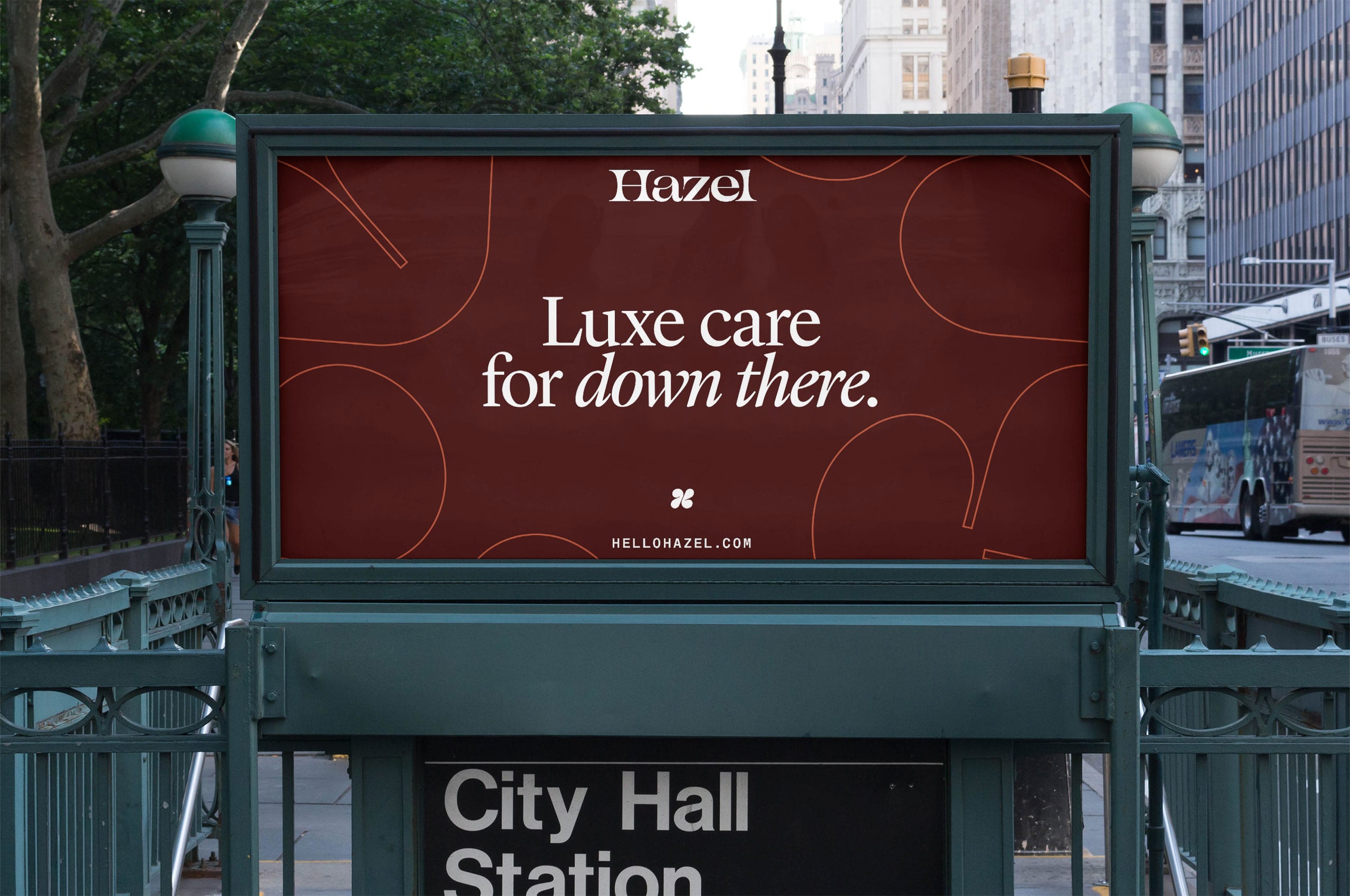
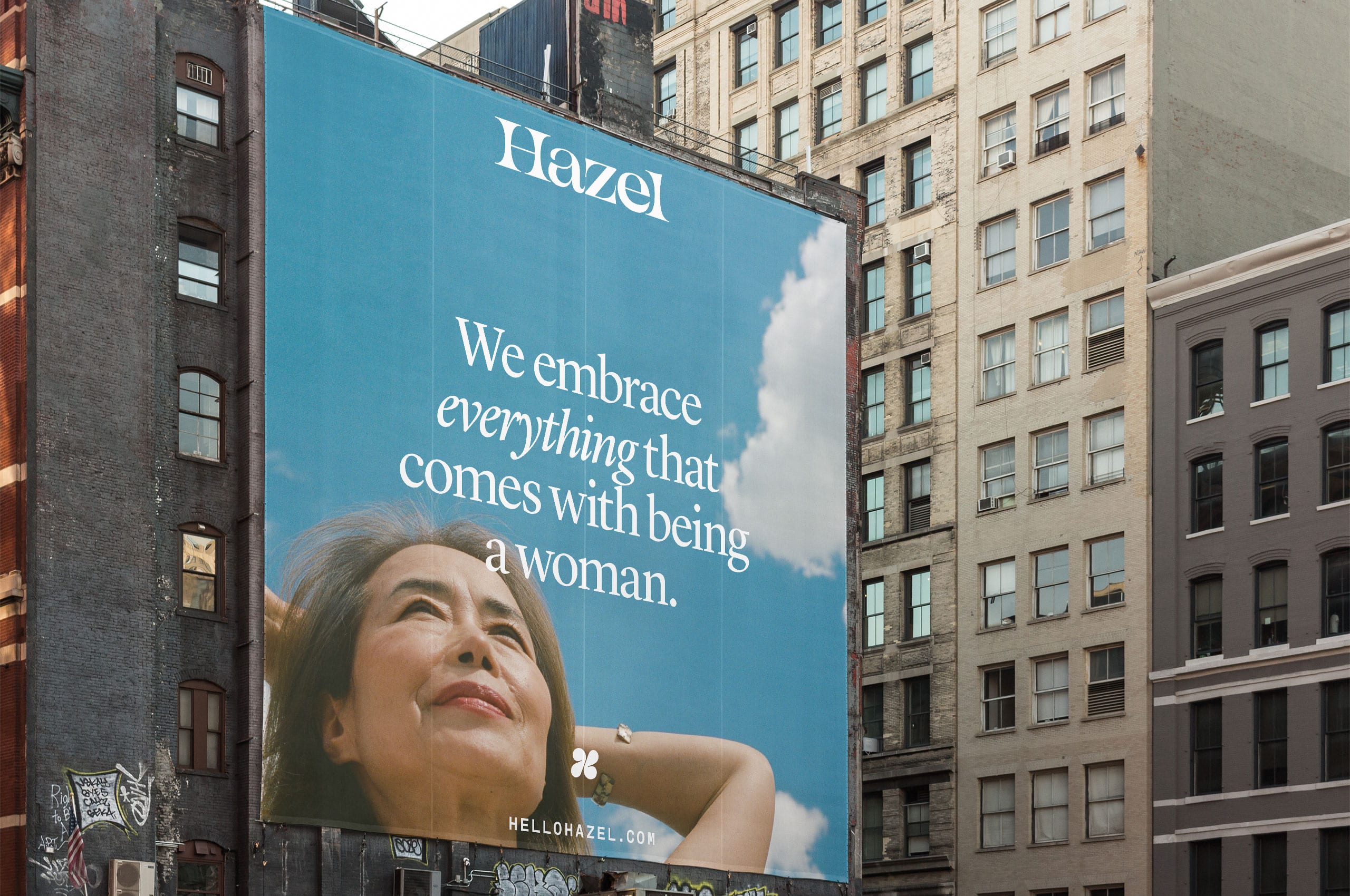
For far too long, the incontinence category has made women feel ashamed and alienated; Aubrey Hubbell and Steven Cruz saught to fight this head-on by starting Hazel; a personal care company working to redefine the meaning of aging. Believing that no two women are the same, they have developed a suite of thoughtful, ground-breaking products that make women feel less ashamed and alienated and more empowered as they age. Their products exist to boost confidence and make their customers feel excellent at every age.
We worked with them ahead of their launch to help build a brand that possessed as much personality as their customers—resulting in an expressive, elegant, and flexible brand.
Collaborators:
Website: Abby Muir
Illustration: Lisa Tegtmeier
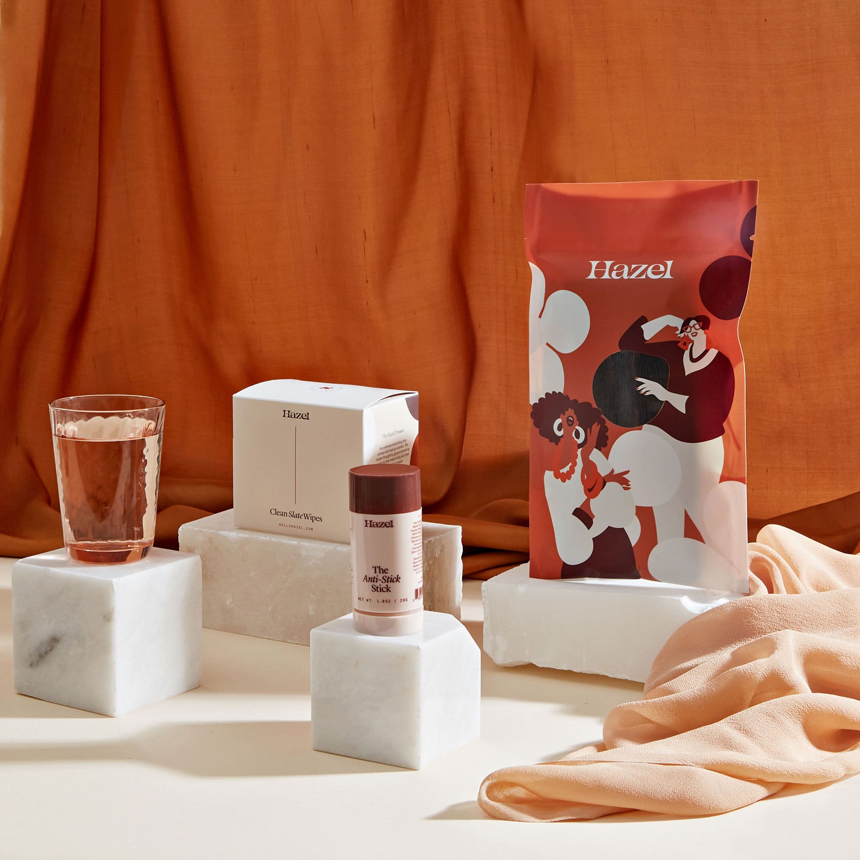
Product Photography: Tracie Davis
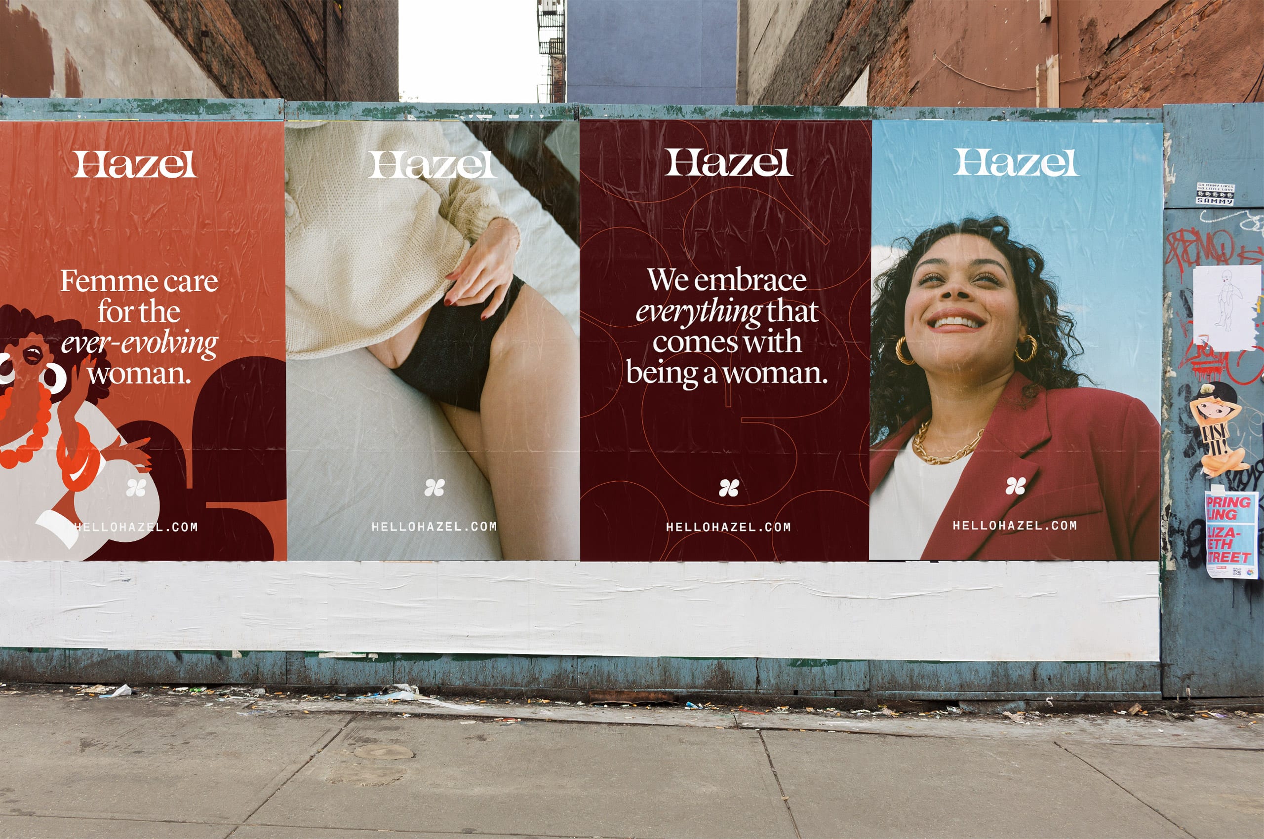
Editorial Photography: Chloe Horseman


No two bodies are the same, no two women are the same, and people should be comfortable in their skin. The Hazel symbol spreads the love of individual power, beauty, and strength. Its structure is an expressive and abstracted ‘H’ mark that will stand with the mission of Hazel for decades to come.
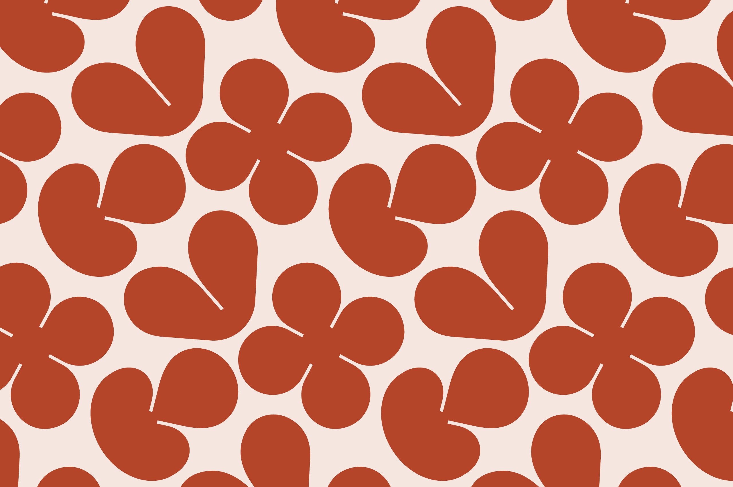
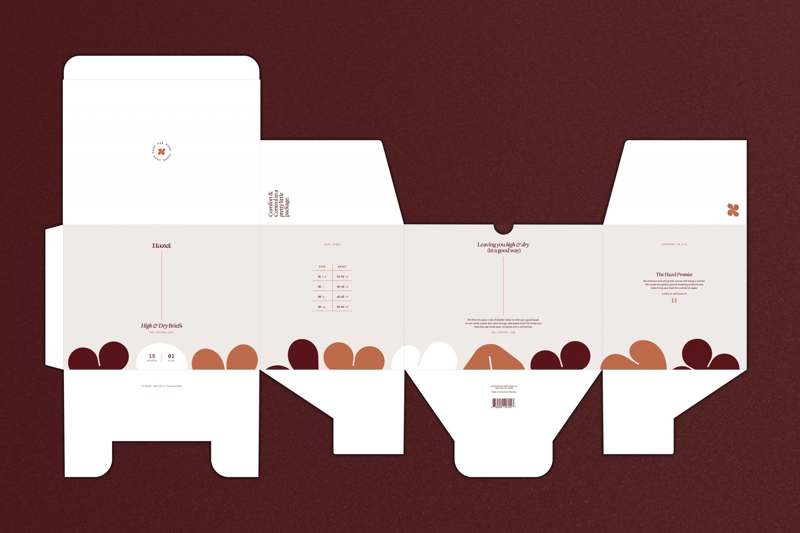
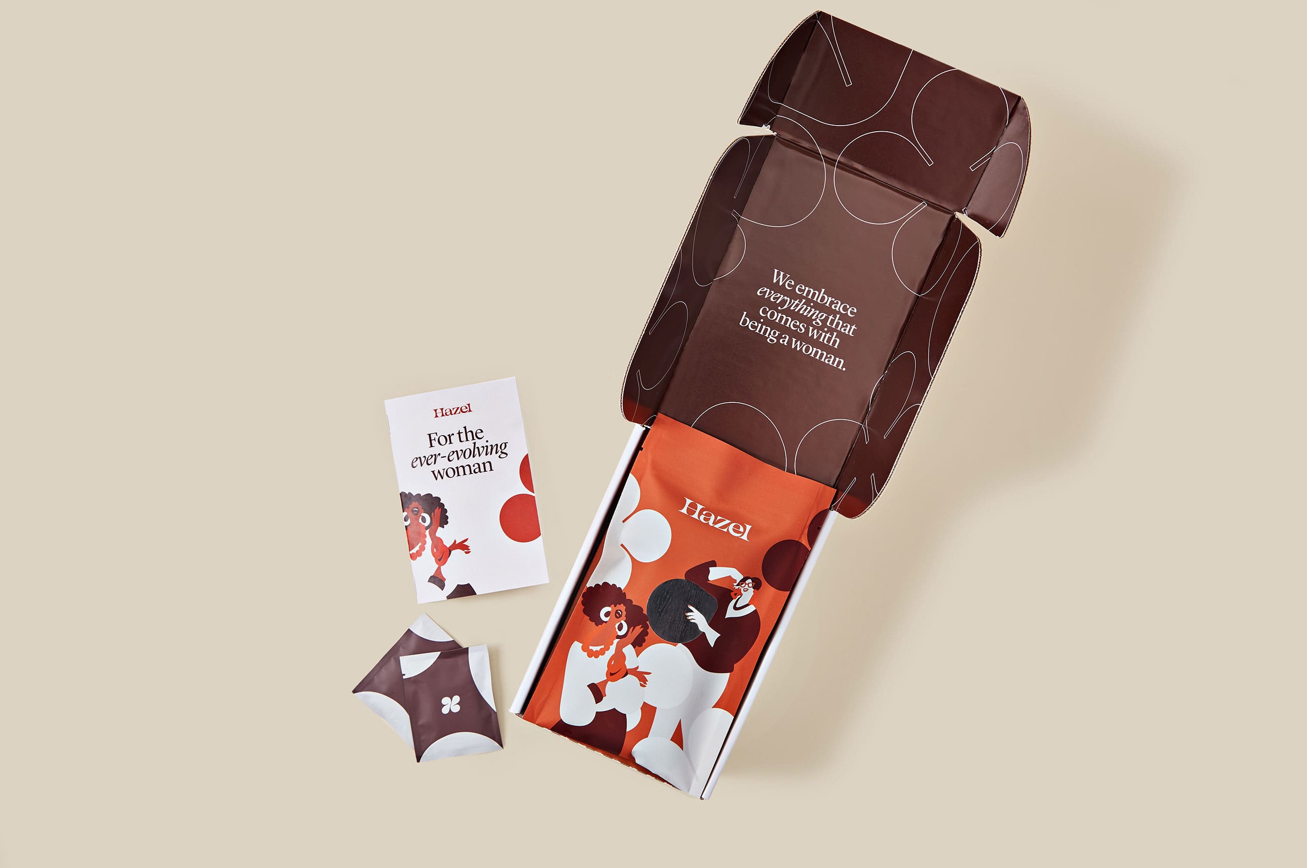
Taking inspiration from the symbol, we developed a flexible pattern to be used throughout the buildout of the brand. The pattern system consists of three individual shapes that can be used independently, in groups, in a repeating pattern, or abstracted—creating an extremely flexible pattern system to be used in many ways while preserving the essence of the brand.

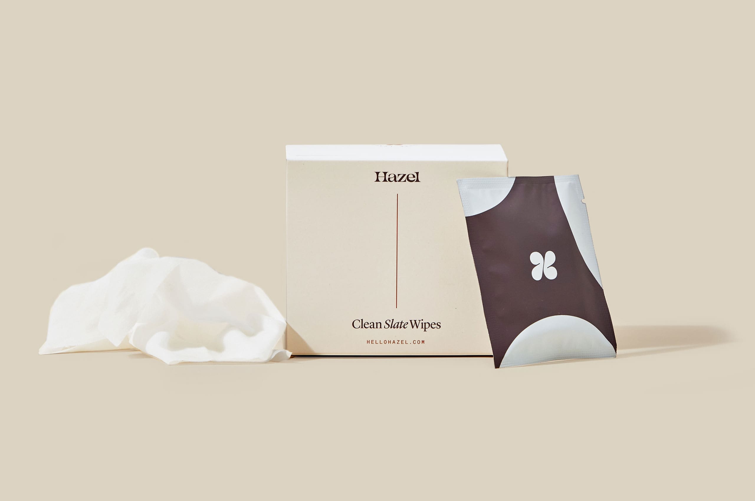
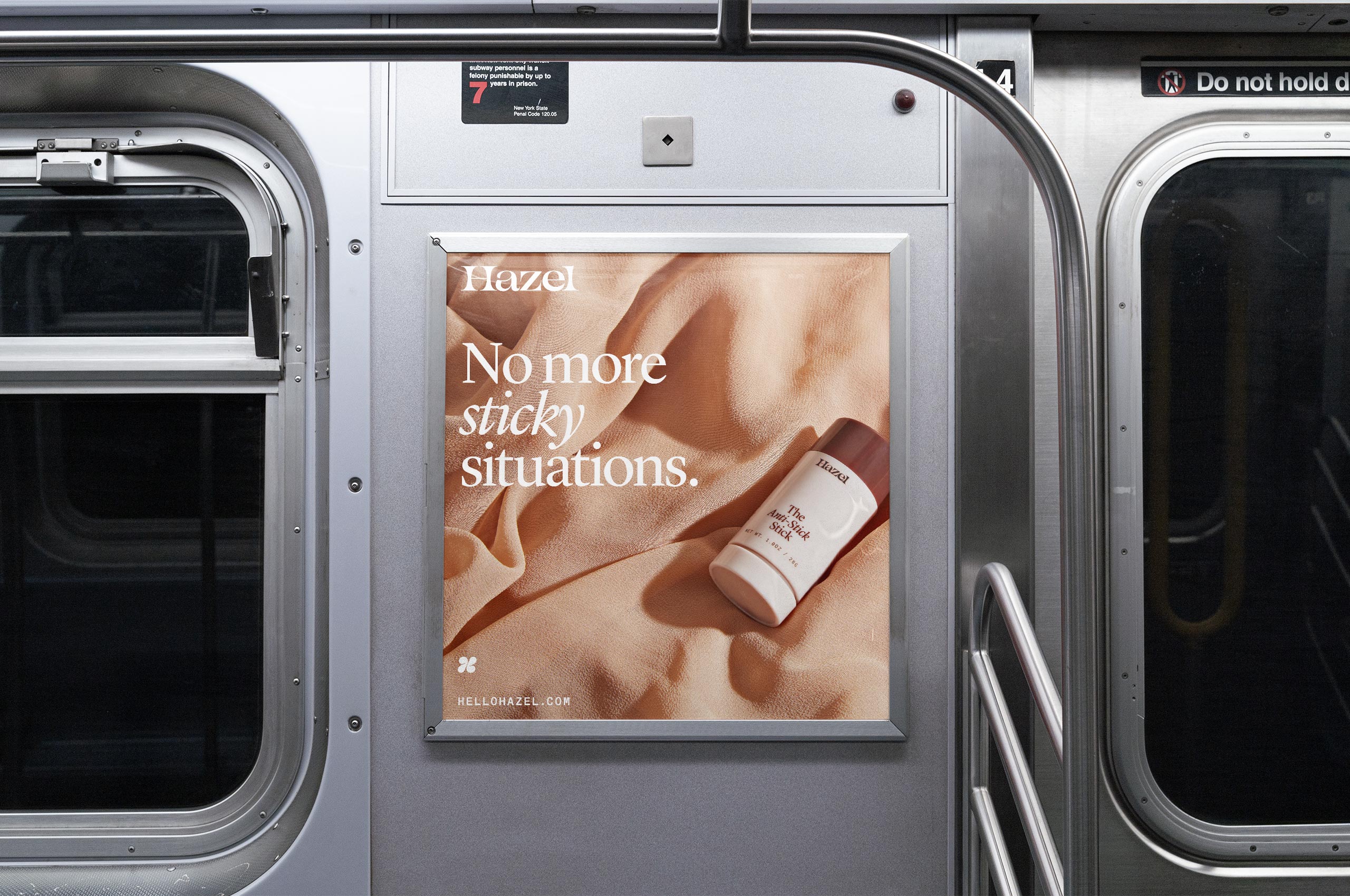
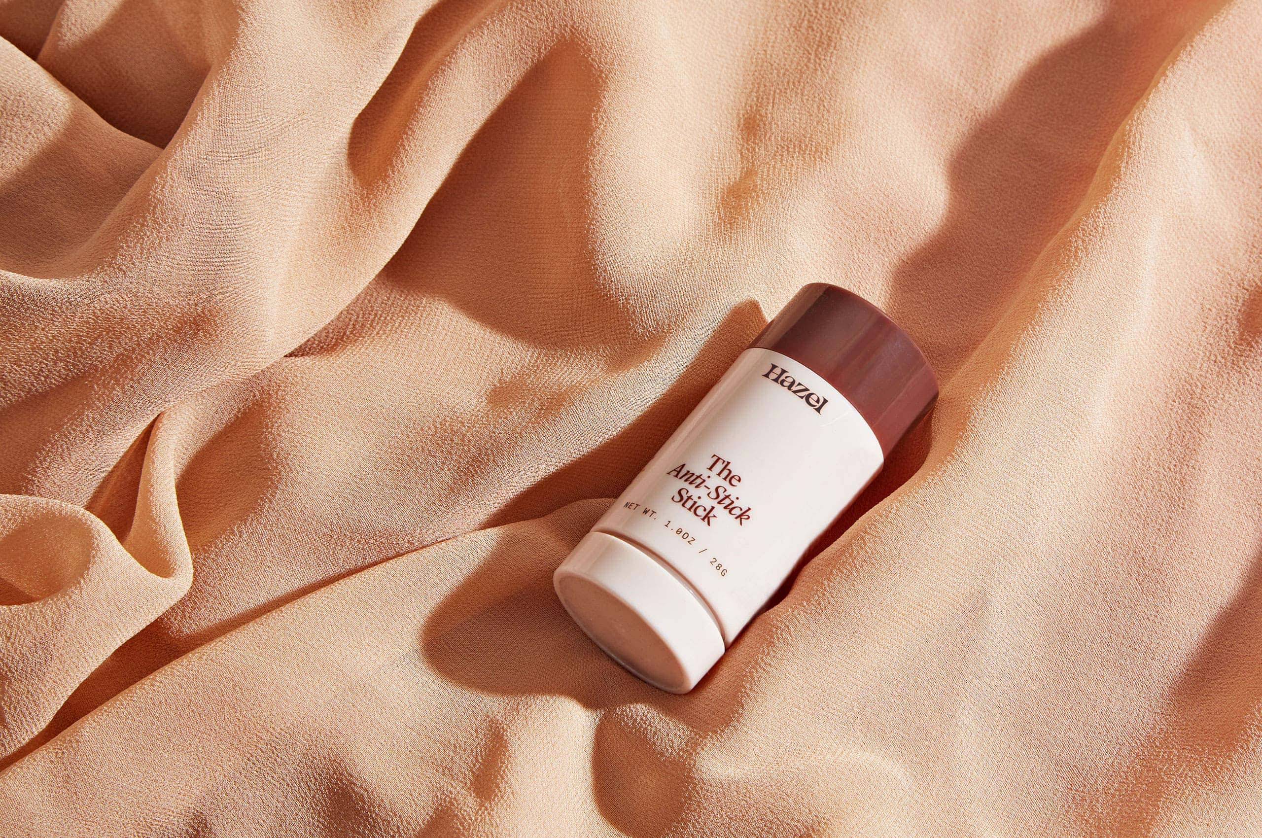
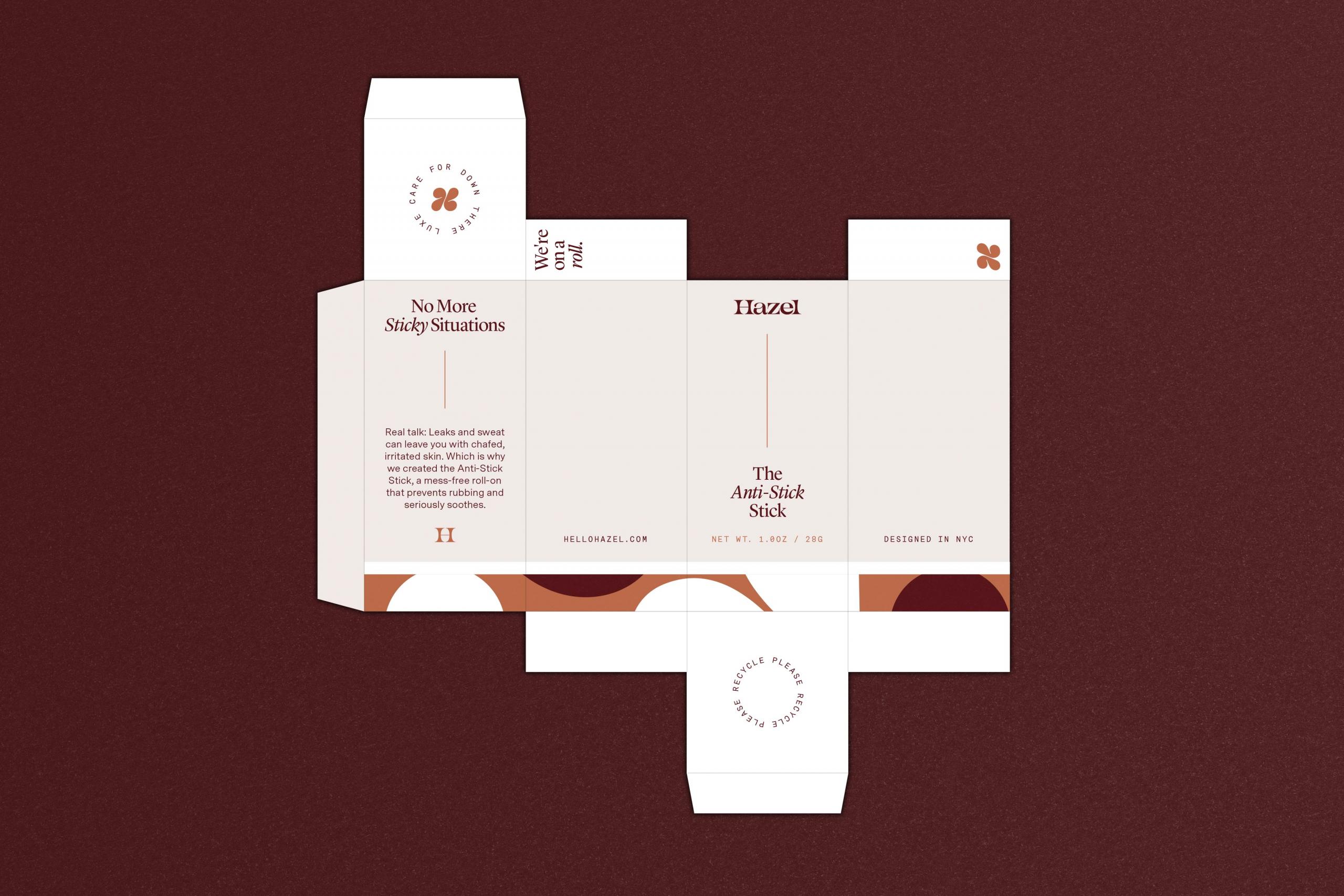
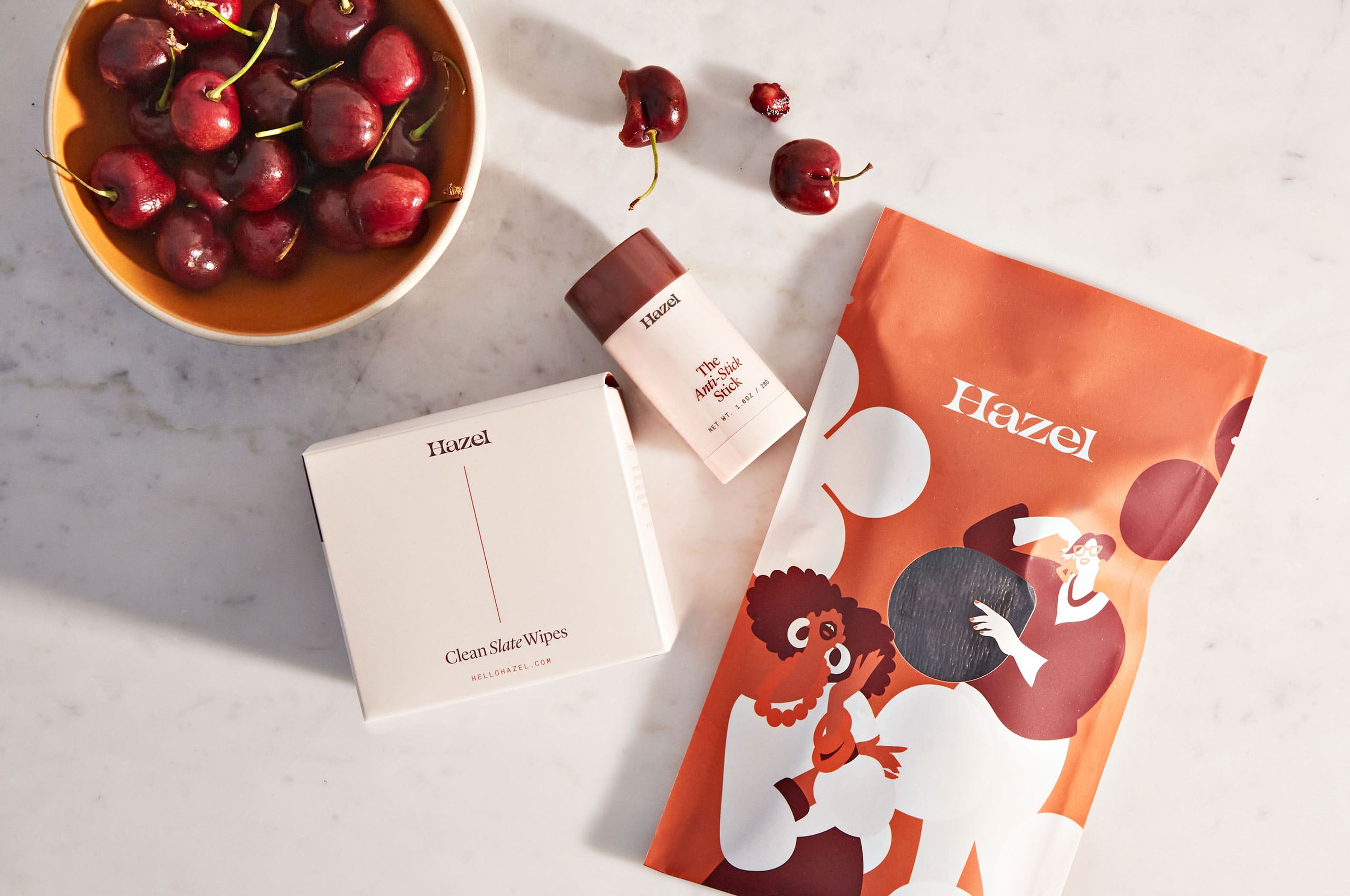
The packaging system we created for Hazel, balances the high-end feeling of an elegant fashion brand, with an expressive personality that is unique to Hazel.
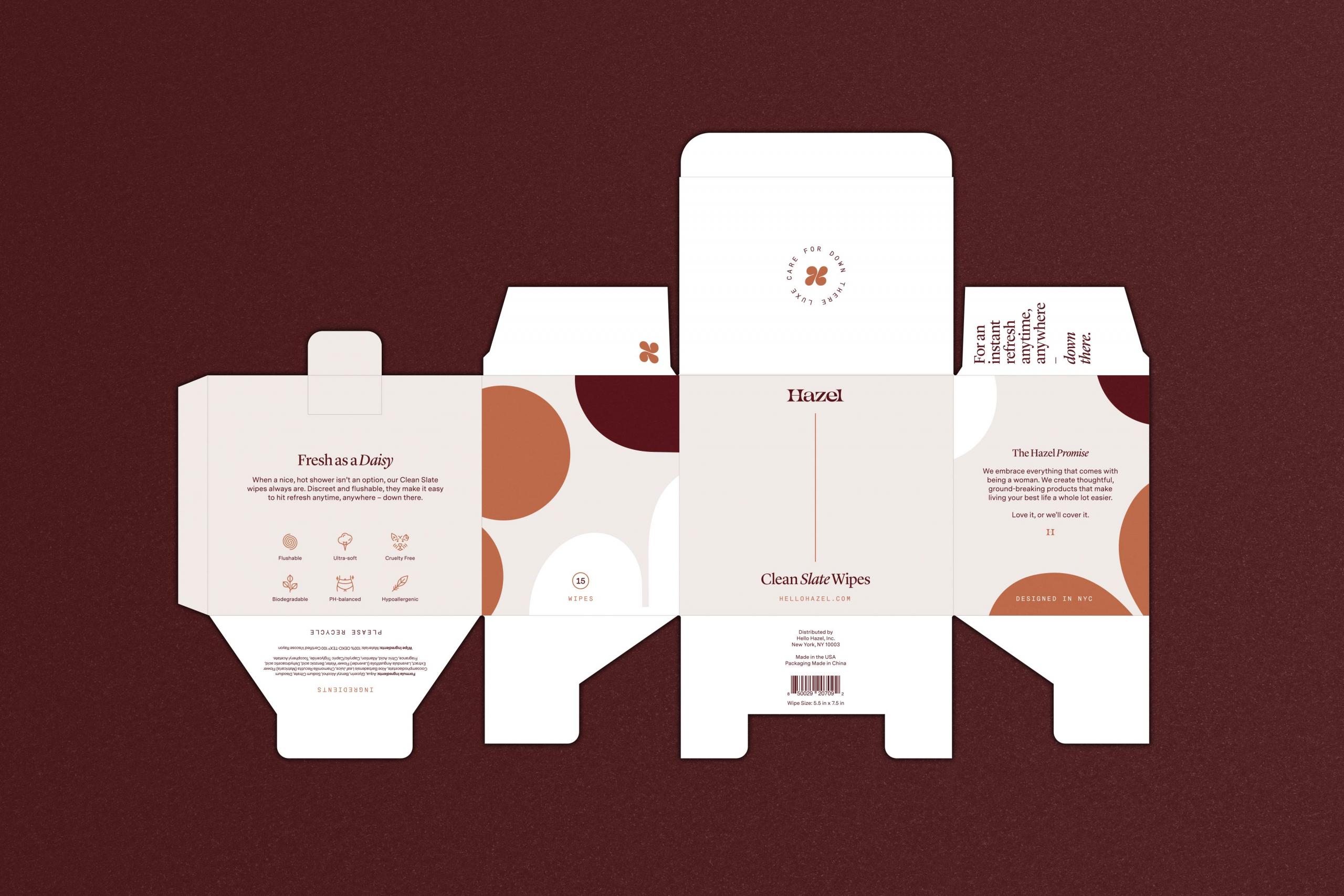

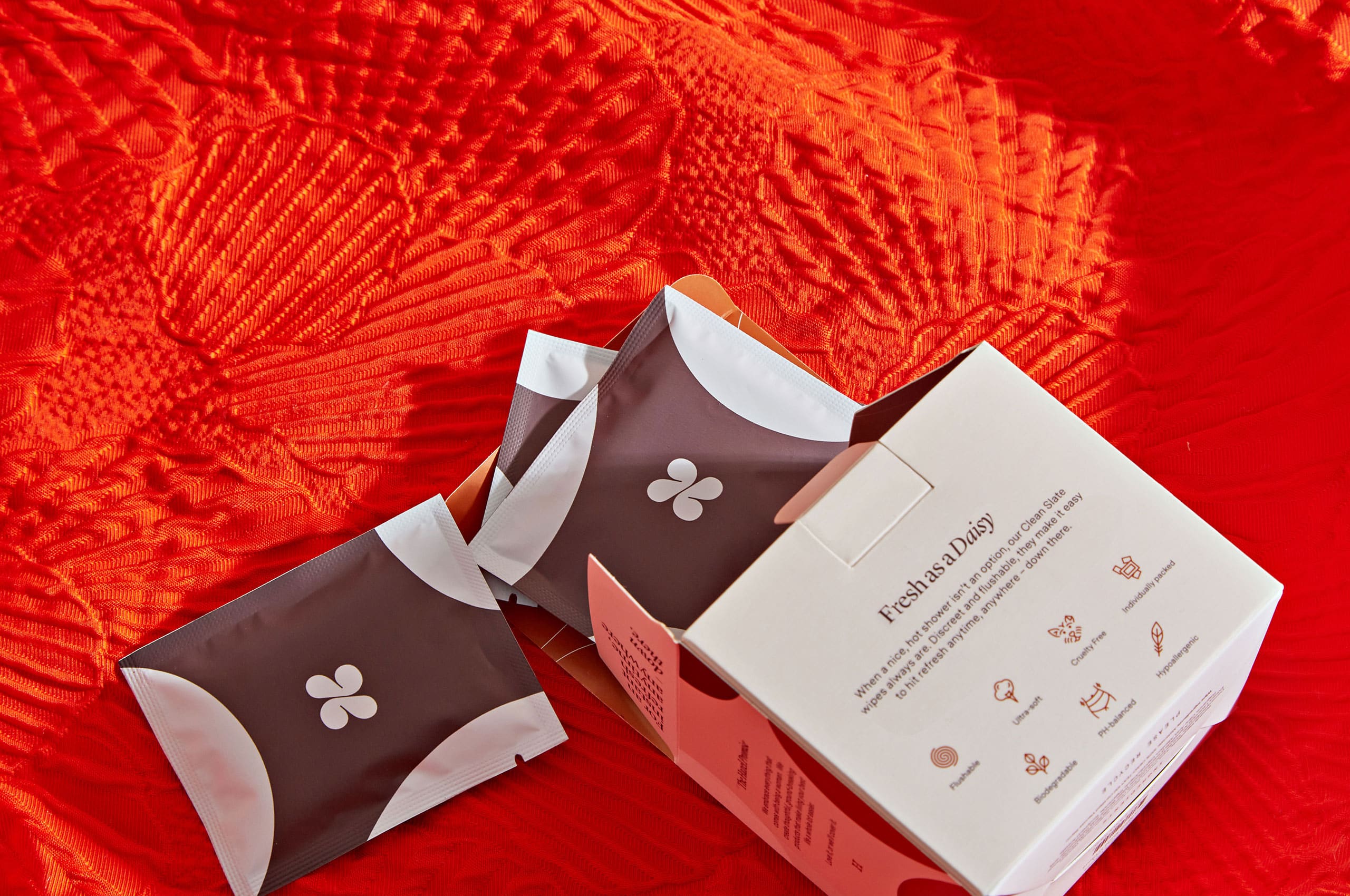
To create a unified brand presence across the packaging system and website, we created 60+ icons to help tell the story of Hazel while bringing a unique personality to even the smallest brand touchpoints.

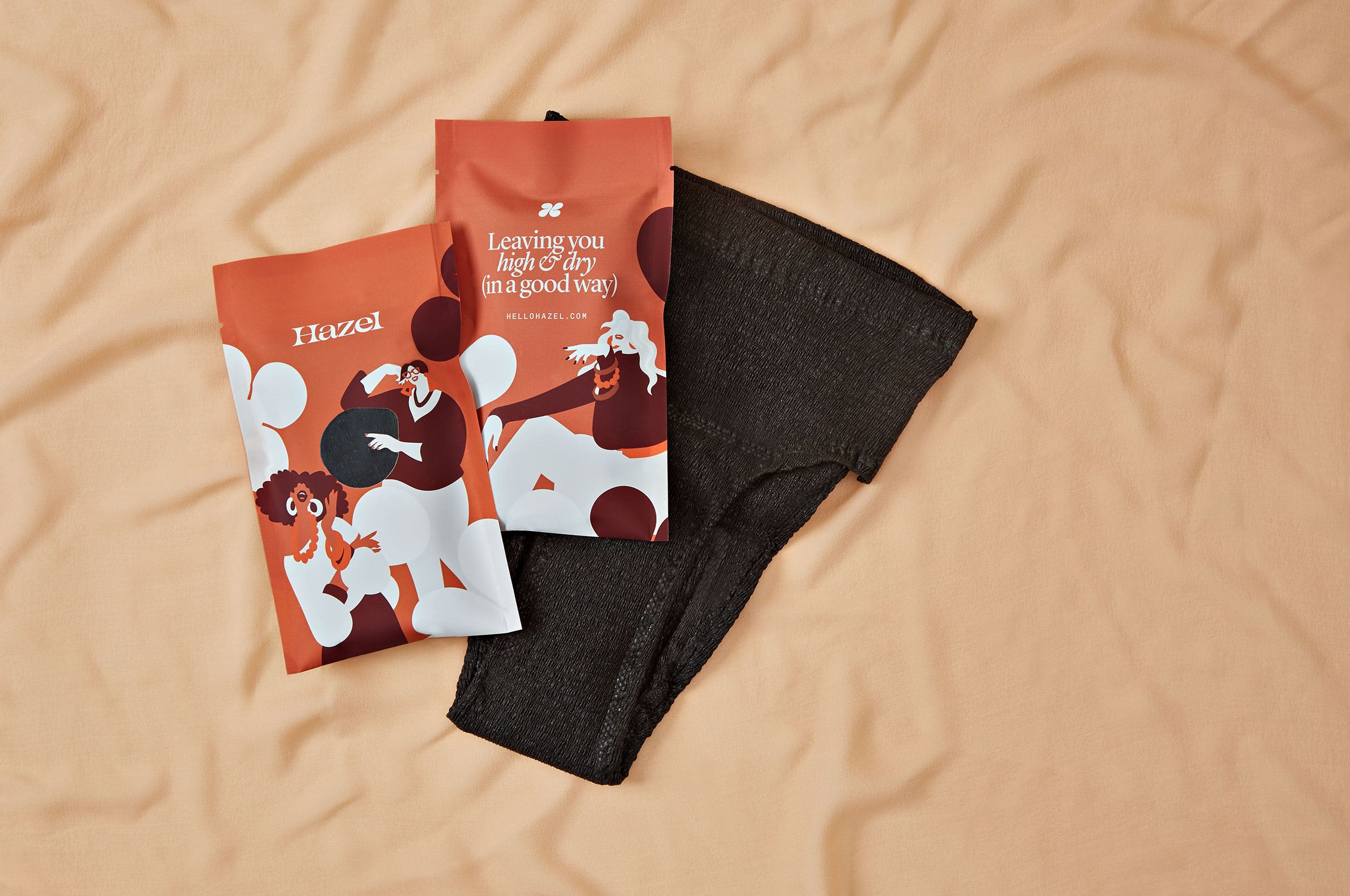
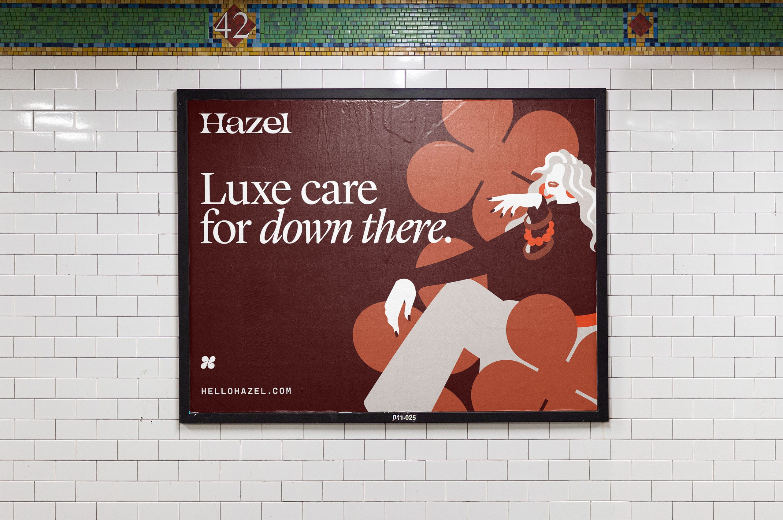
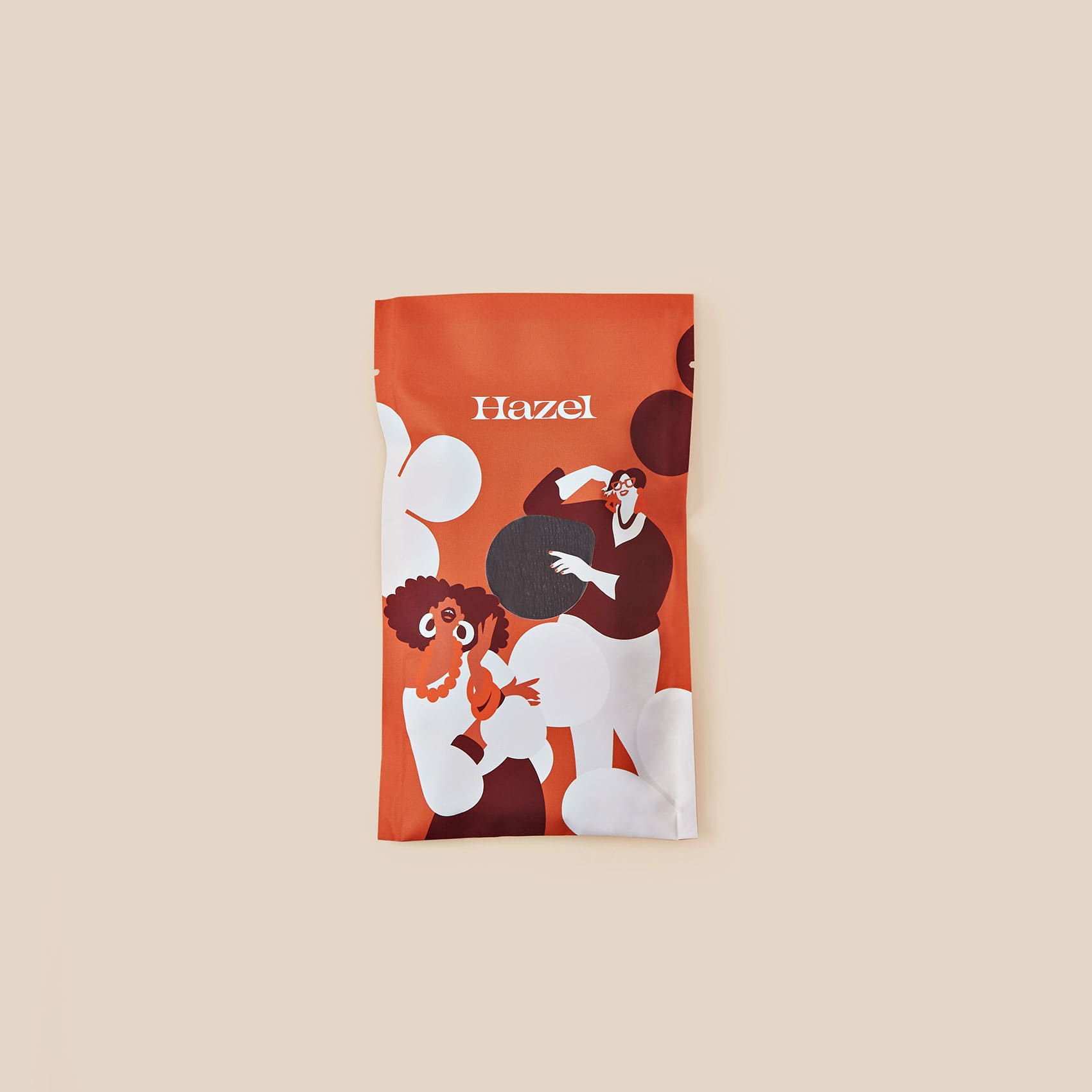
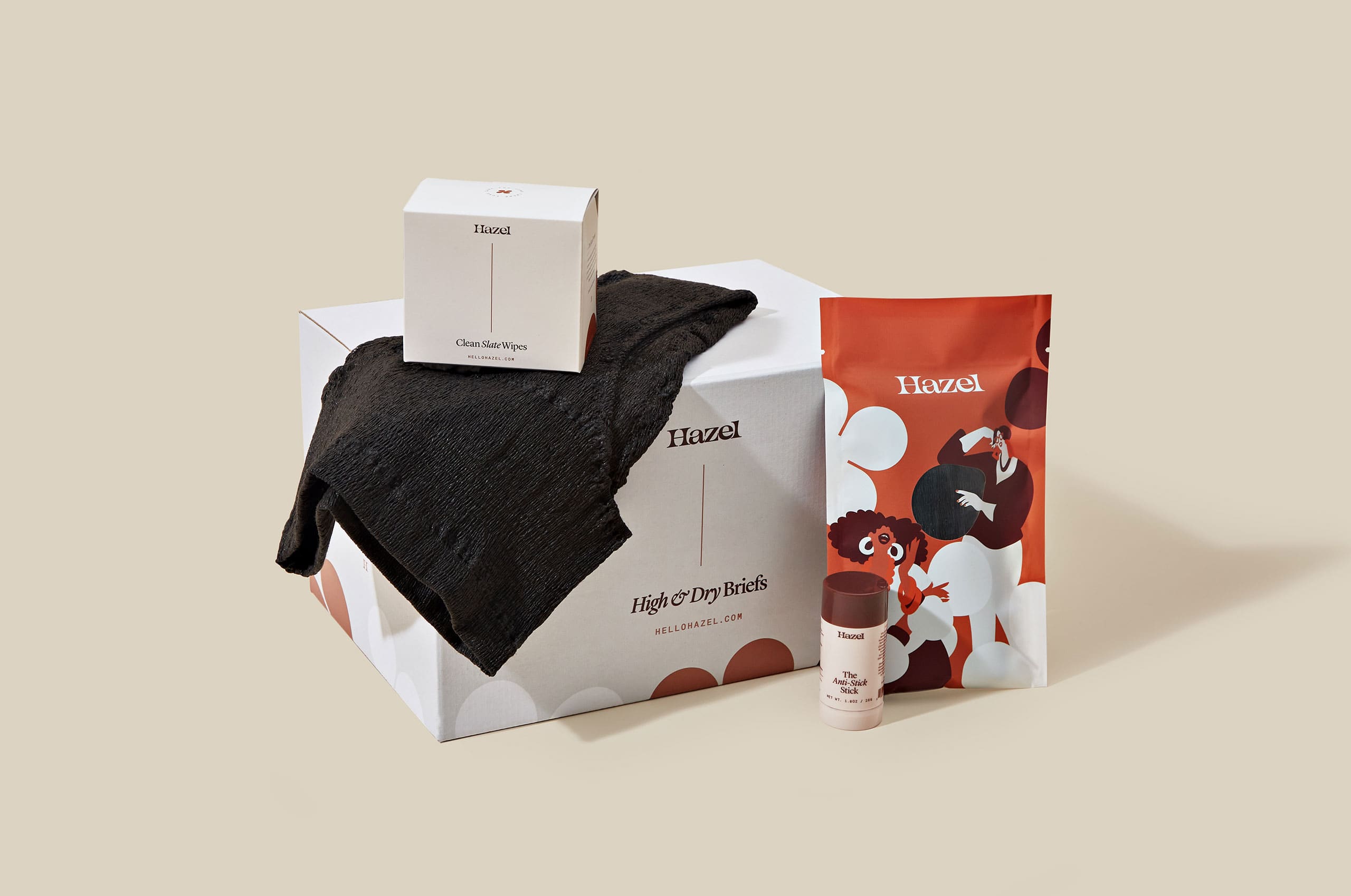
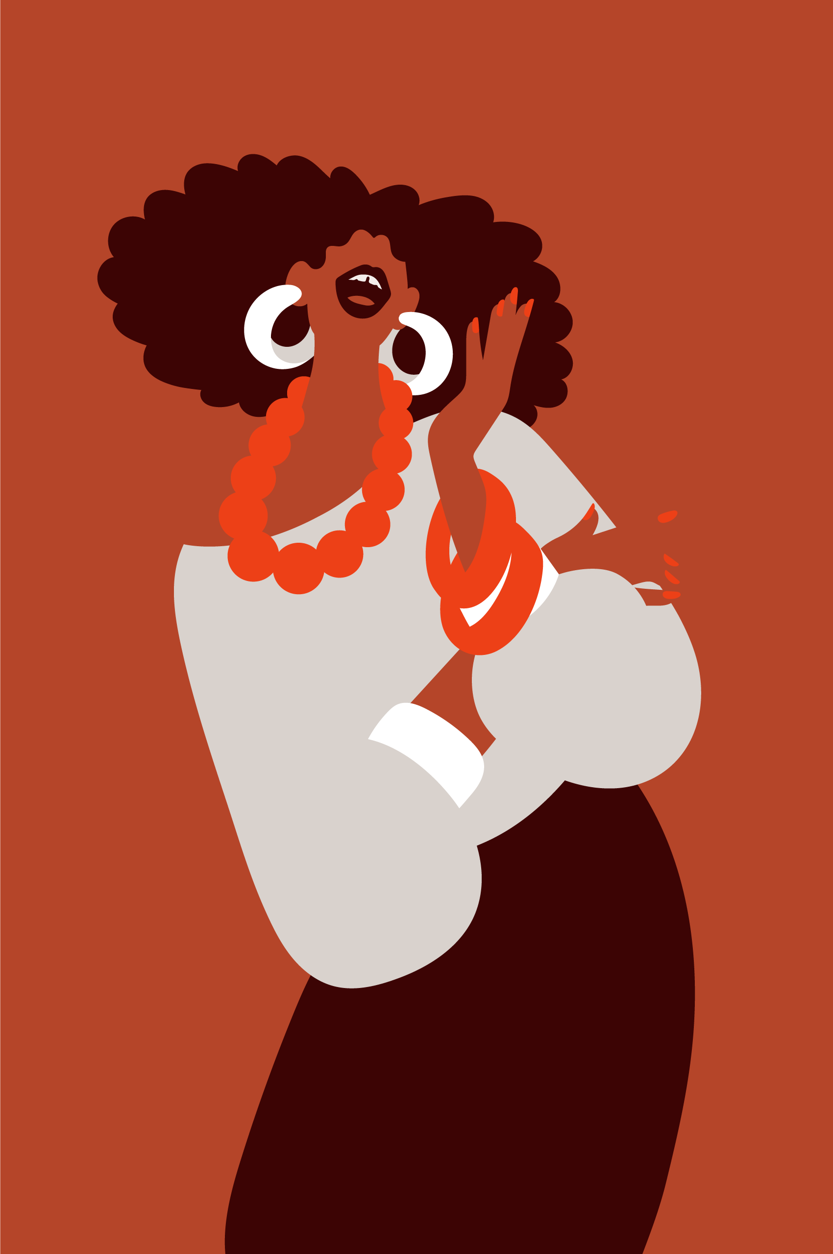
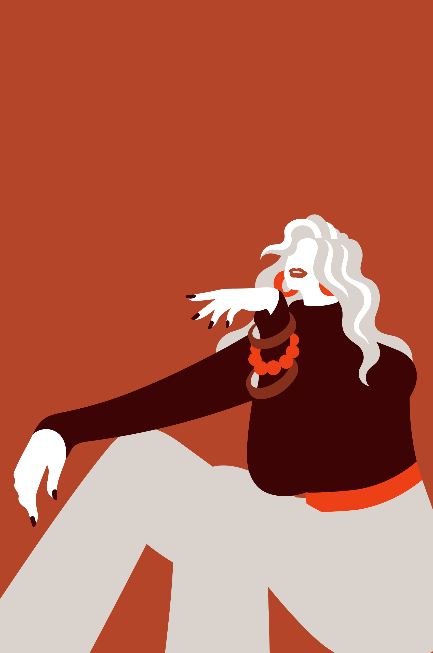
We enlisted Lisa Tegtmeier to create a suite of illustrations to work in harmony with the pattern elements. These expressive figures bring joy, excitement, and humanity into the brand. These illustrations live on Hazel’s flagship product, briefs, as well as the physical buildout of the brand and website.
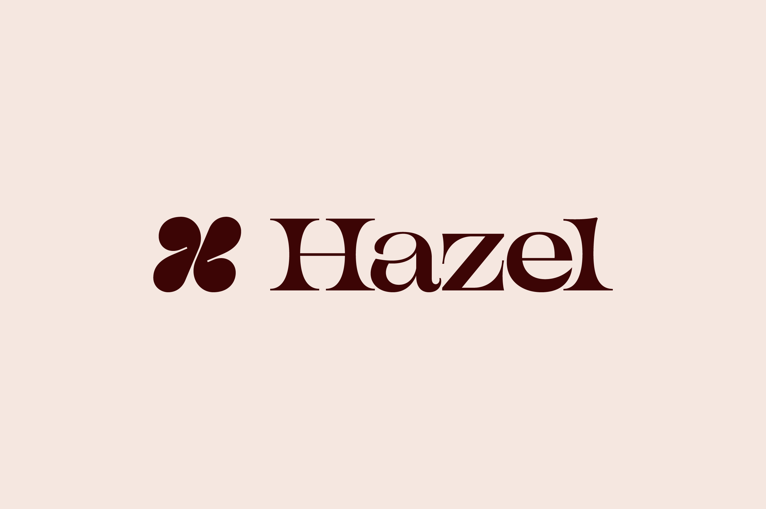
Like its abstracted counterpart, the wordmark was constructed to express that every woman is unique. Through its expressive curves, our wordmark spreads the message of uniquity and community.

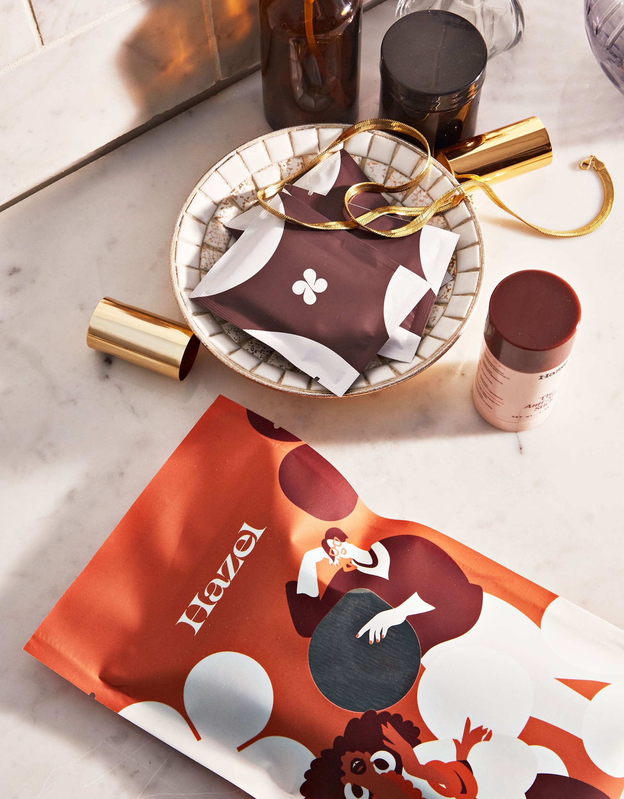
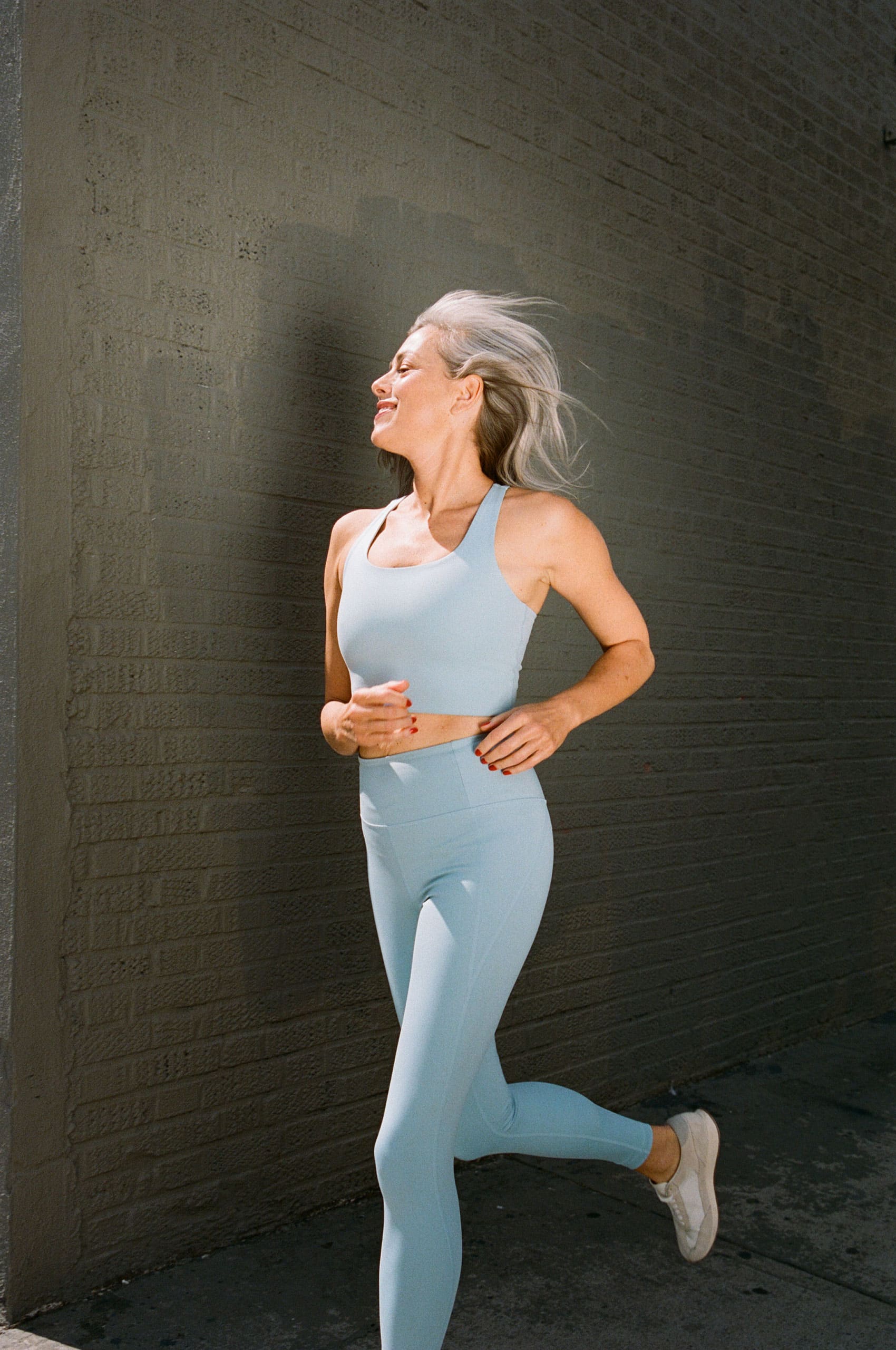
The brand comes alive through product and editorial photography, showing Hazel’s products in real-life applications.
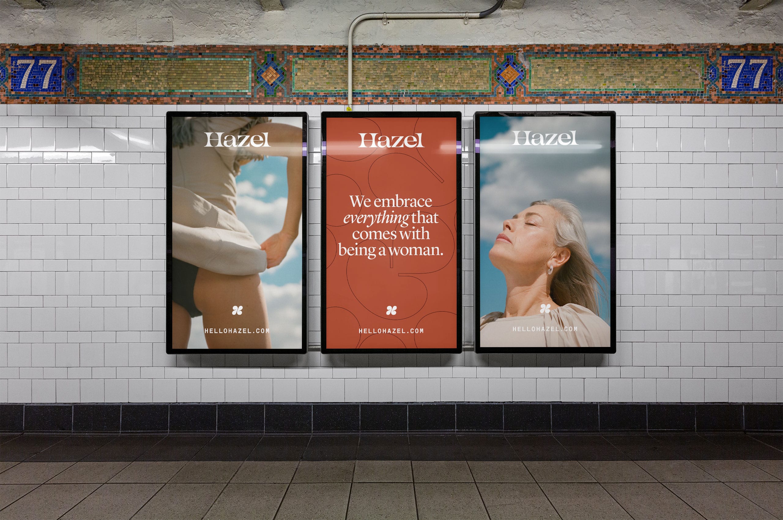

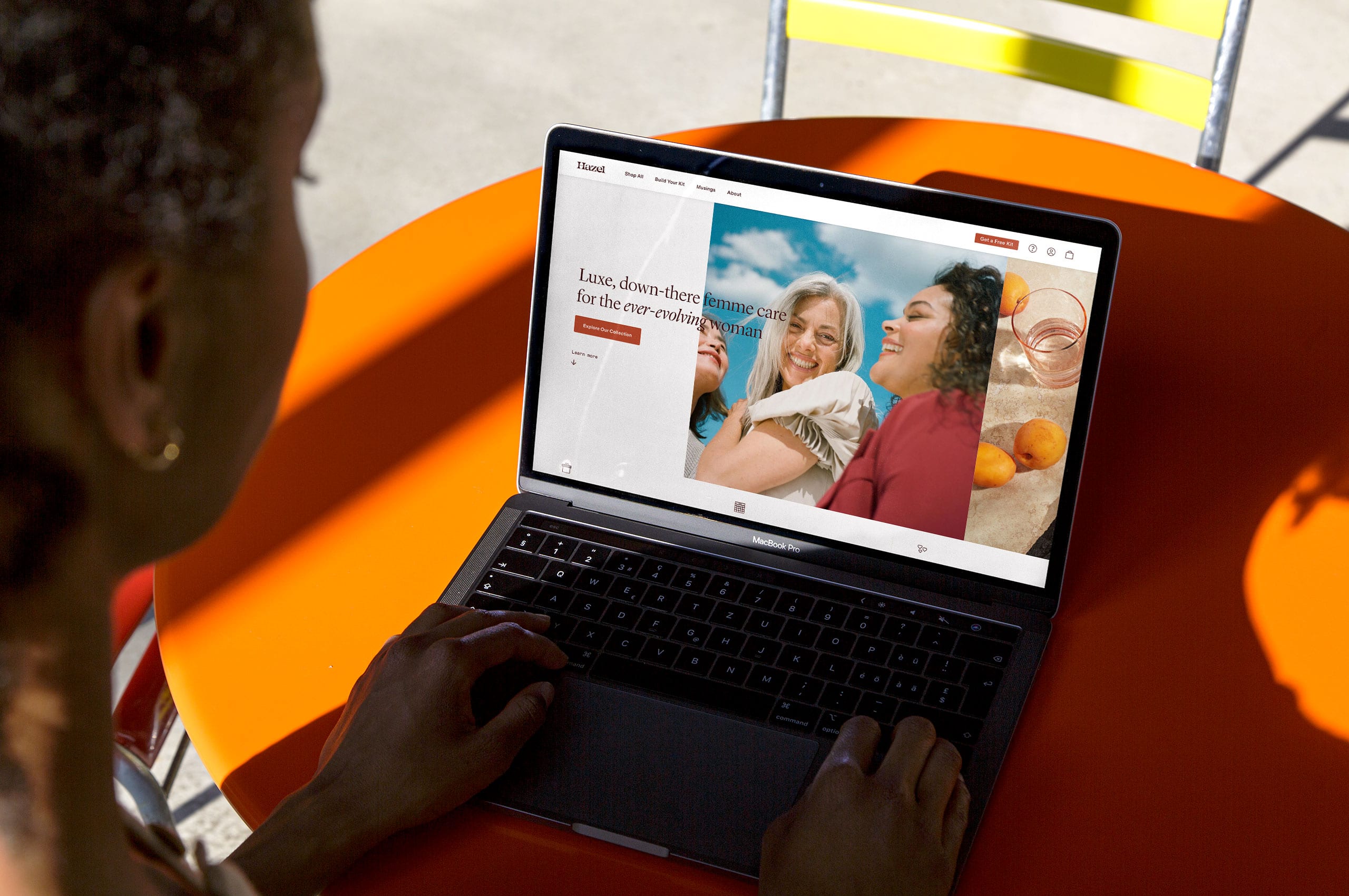
The digital home of Hazel brings the brand to life on screen, a beautiful and functional website that allows customers to learn about Hazel, their products, and their manifesto. The website was thoughtfully designed by Abby Muir.