OpenPhone
Rethinking the phone experience and offering a platform that doesn't sacrifice quality for features.
Rethinking the phone experience and offering a platform that doesn't sacrifice quality for features.
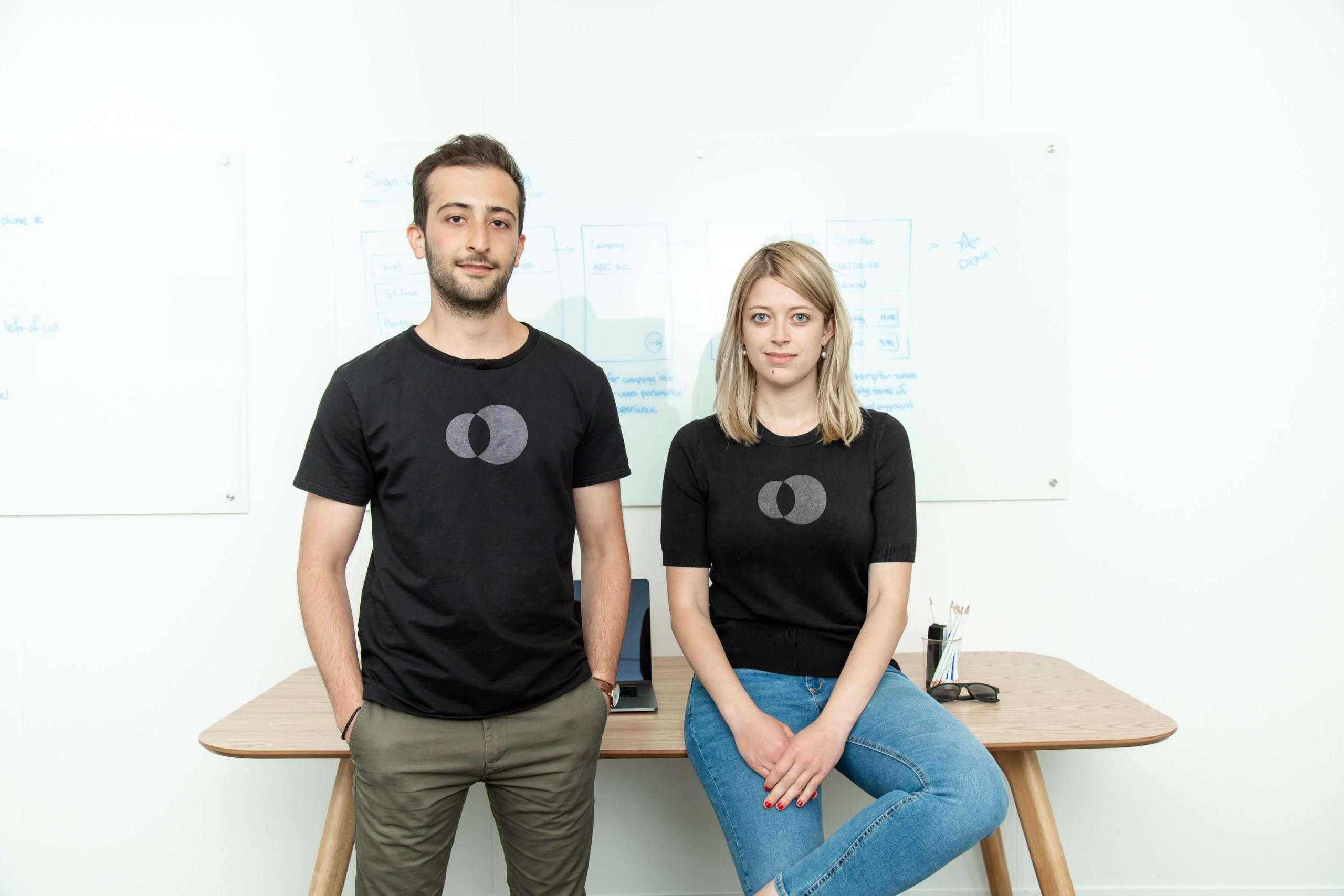
Smartphones that many people carry around are extremely advanced until you open the phone application. The phone functionality operates quite similarly to a landline. Mahyar Raissi & Daryna Kulya founded OpenPhone to tackle this problem head-on. “The smart device offers too much untapped potential to be stuck in the same communication methods as the landline. I think of existing phone solutions as a black box – closed and limiting. We’re the opposite of that.” – Mahyar Raissi
They set out to develop a simple and delightful business phone for startups, small businesses, and individuals. A solution that would provide a highly advanced business phone nested within an existing smartphone or computer. Resulting in a unique and truly delightful cross-platform phone experience.
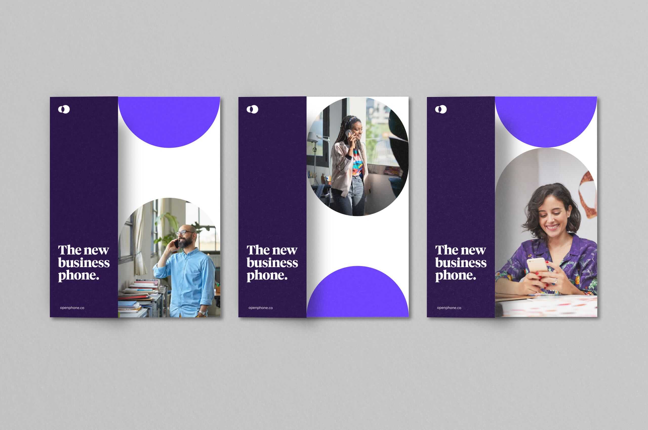
OpenPhone approached Mast to help develop a refresh to their identity that would coincide with a huge update to their product. We worked with them to develop an identity that was as fluid and expansive as their product. A holistic identity system that did not feel limited in any way, yielding the availability to produce endless opportunities and outcomes for the future of the brand. Supporting their efforts for years to come. All while creating something that would be highly functional in a myriad of different sizes. Ultimately resulting in a brand that seamlessly flows from the digital space to the physical and back.

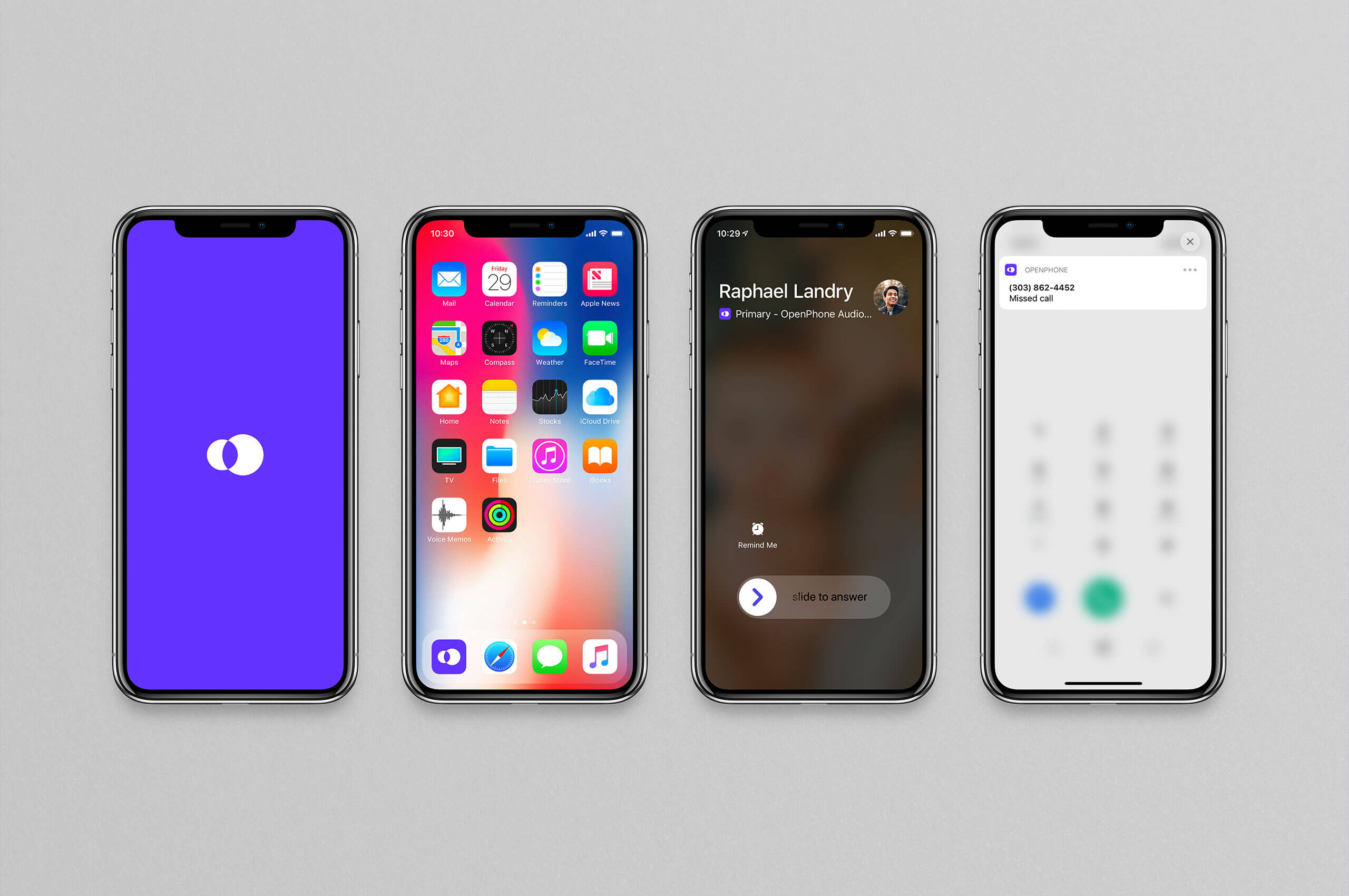
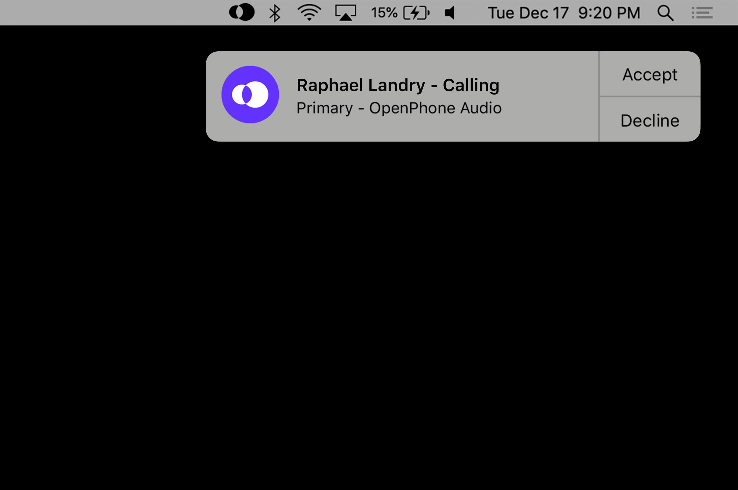
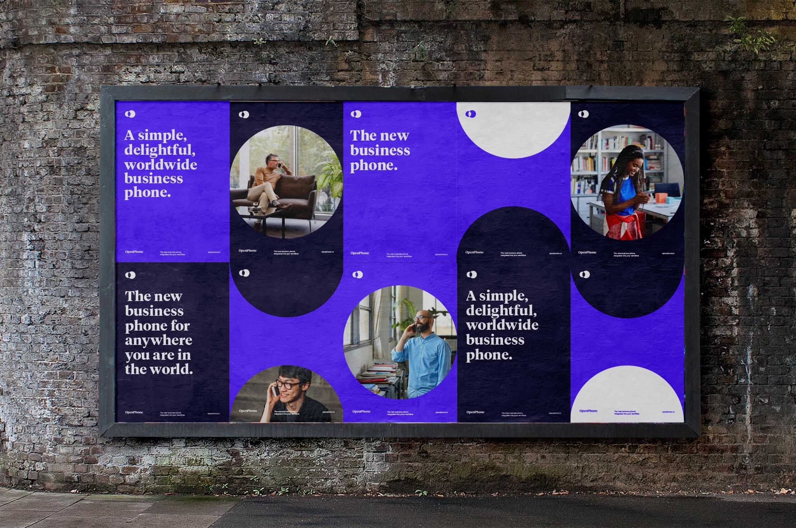
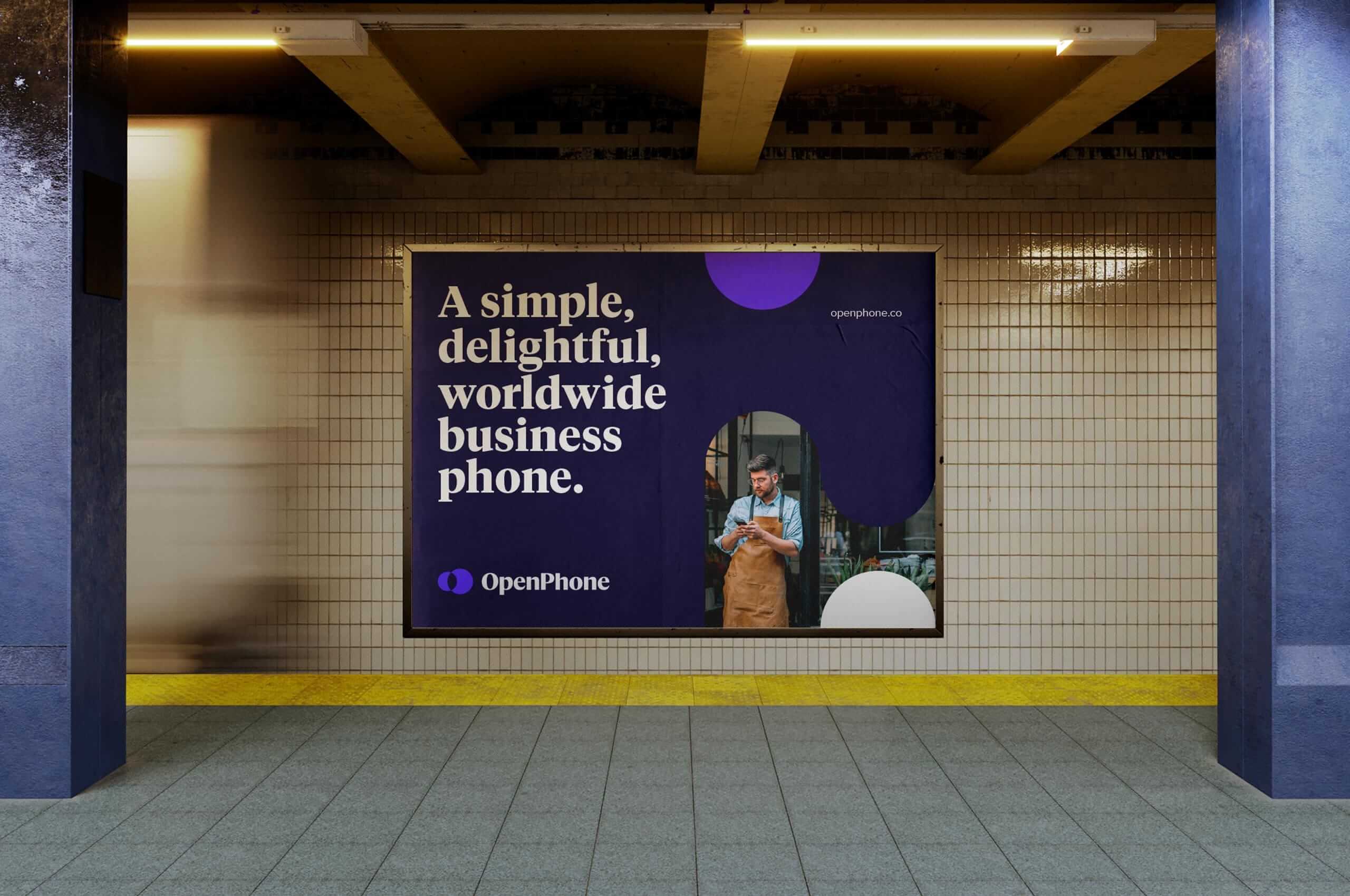
With a multitude of possible uses, the symbol had to be bold enough to be scaled down to a few pixels or used feet tall. We worked closely with the OpenPhone team to create an ownable symbol that would be as recognizable on a billboard, in a dock, or even in a menu bar.

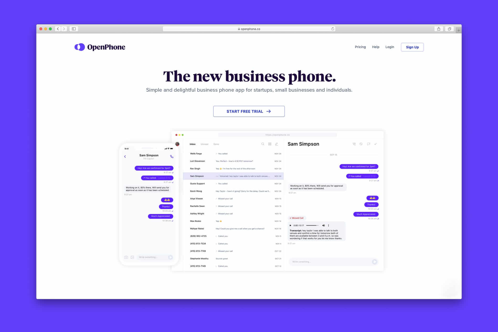

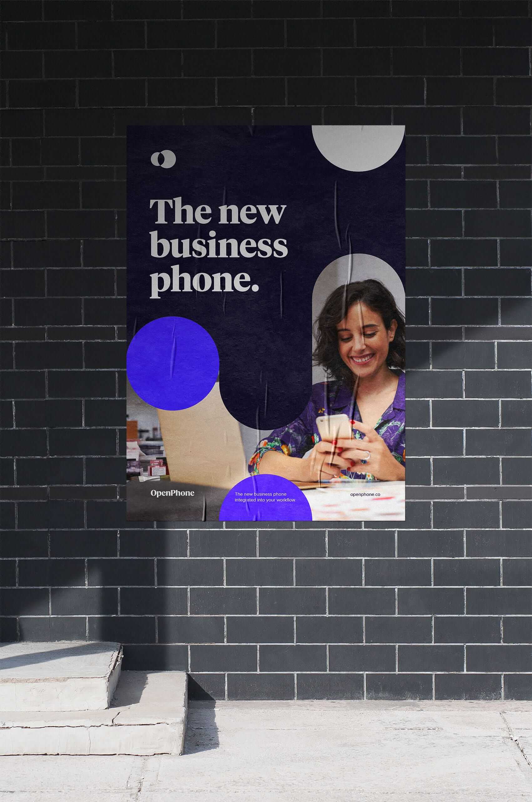
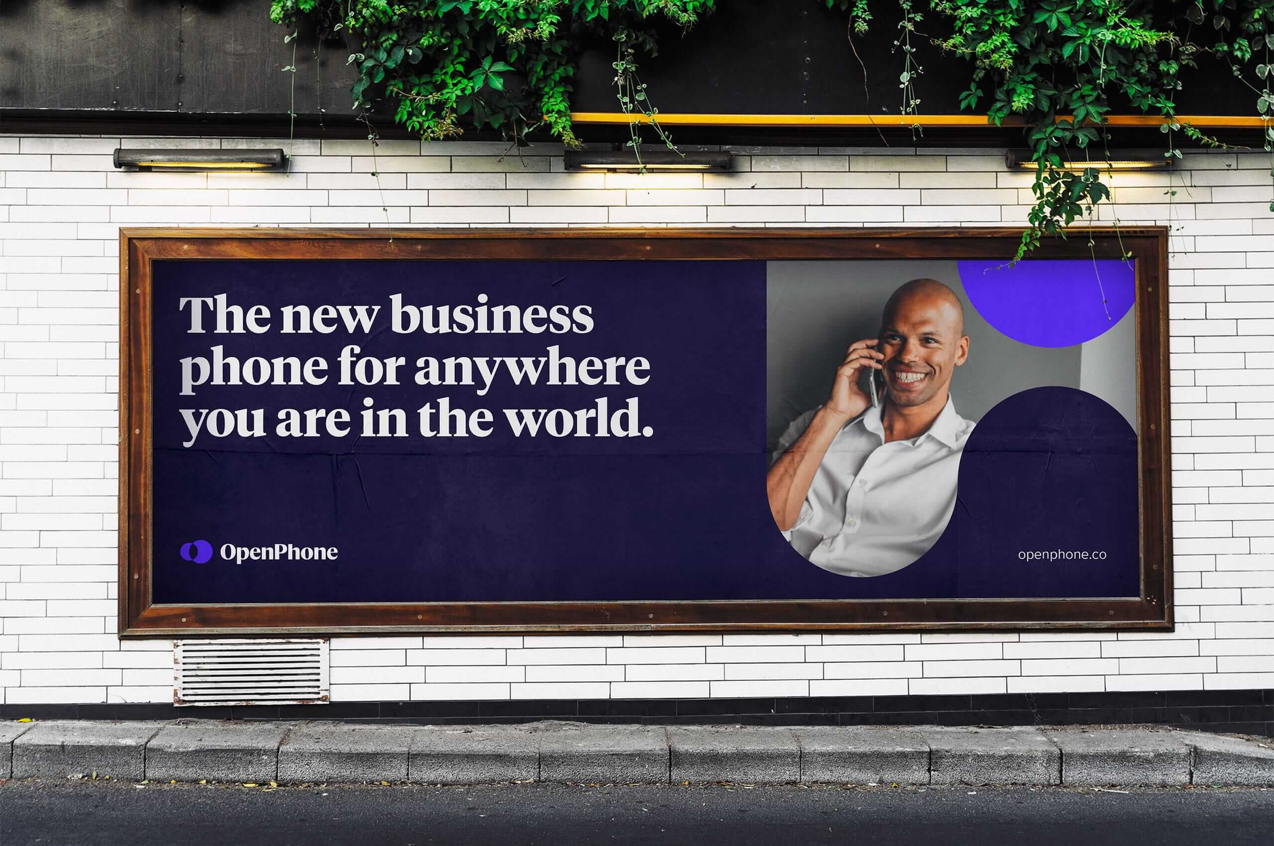
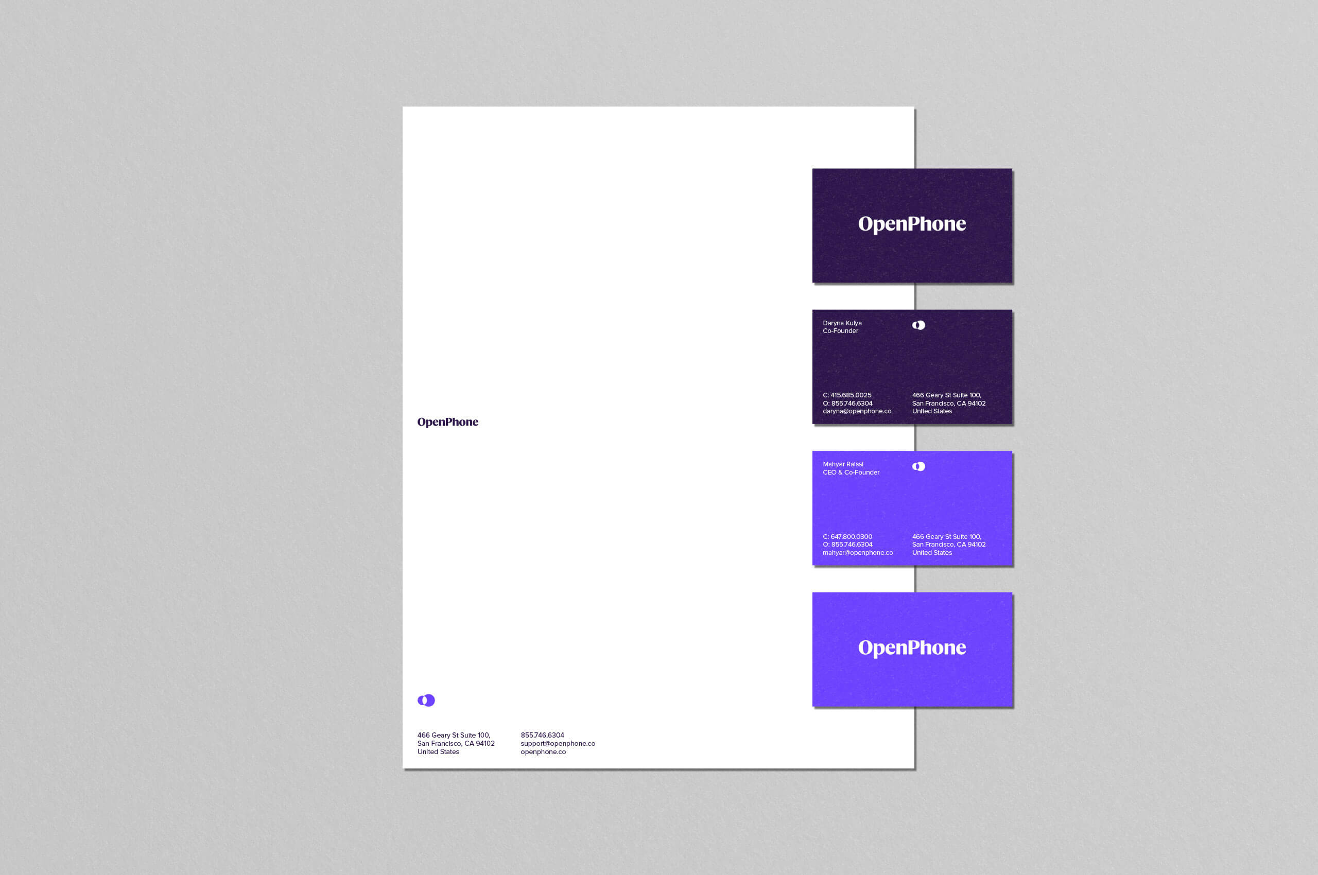
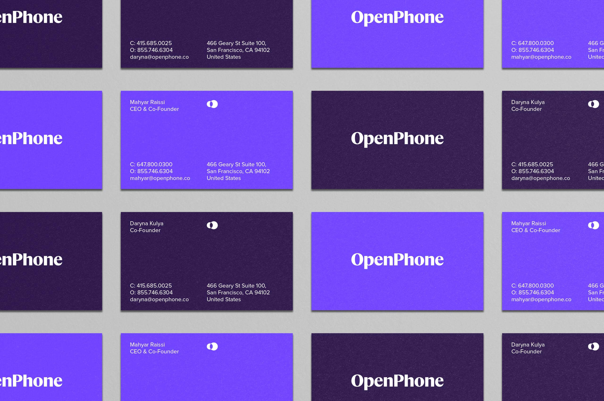
We developed a clean and concise core collateral set that mirrored the functionality of the application itself. Creating an uninterrupted bond between the physical and digital worlds of the brand.

The symbol finds inspiration in the intersection of community and communication. The way in which people communicate across the world is constantly changing and evolving. There is an ever-growing need to reach clients and employees outside the bounds of your current country. OpenPhone exists in the overlap, connecting communities through a seamless product.
This symbol echoes the boundless nature of the product while creating a connection to the letters “O” and “P” that can be found hidden within the form.
By decoupling the shapes that create the symbol, we were able to create a new and unique vernacular for the pattern buildout of the brand. Utilizing this pattern in conjunction with the clean typography of the application, we created an exciting and fluid system with a clear message.