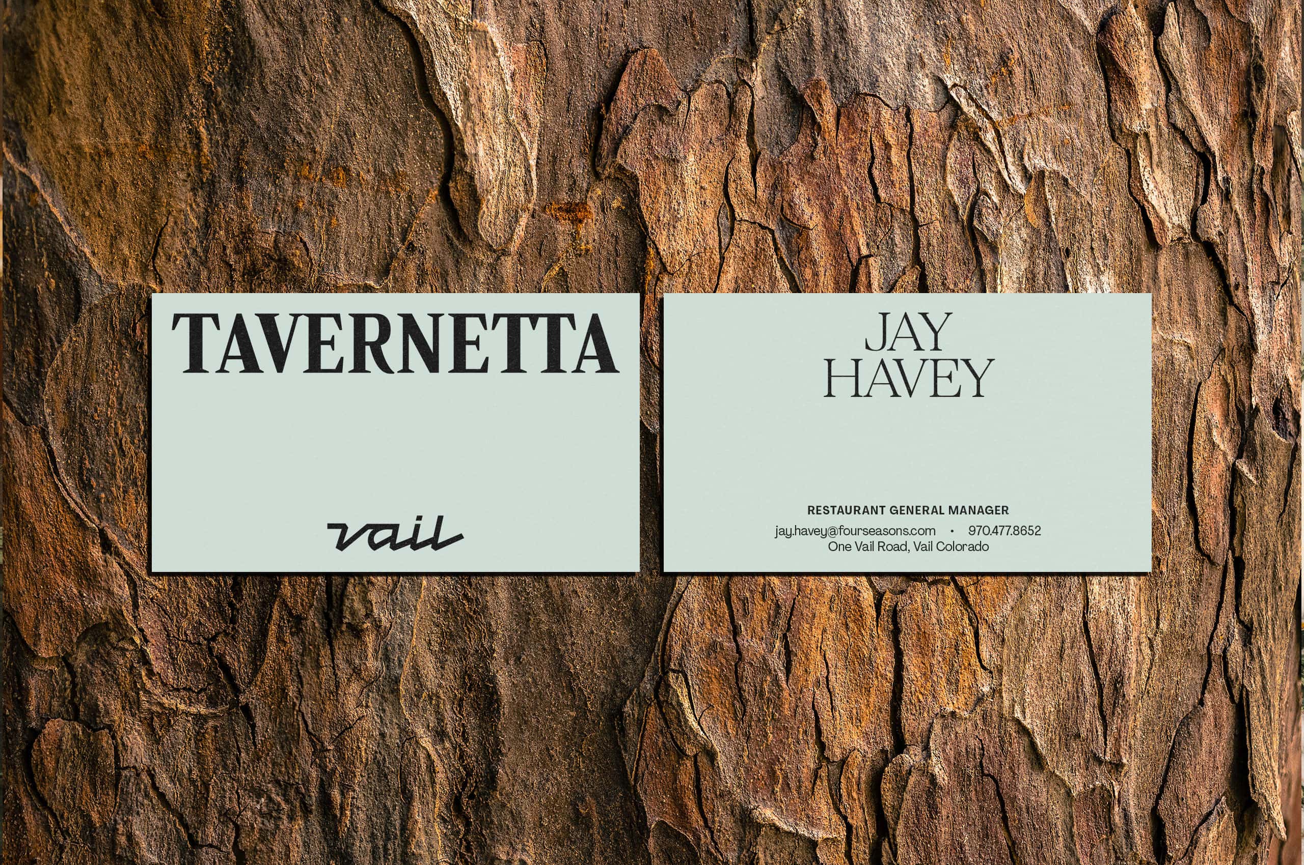
Tavernetta Vail
Where northern Italian alpine tradition meets modern mountain elegance.
Where northern Italian alpine tradition meets modern mountain elegance.
Frasca Hospitality Group’s Tavernetta has earned a devoted following in Denver. Guests at the Union Station location kept asking the same question: When is Boulder getting a Tavernetta? Then the opportunity shifted, Vail came calling.
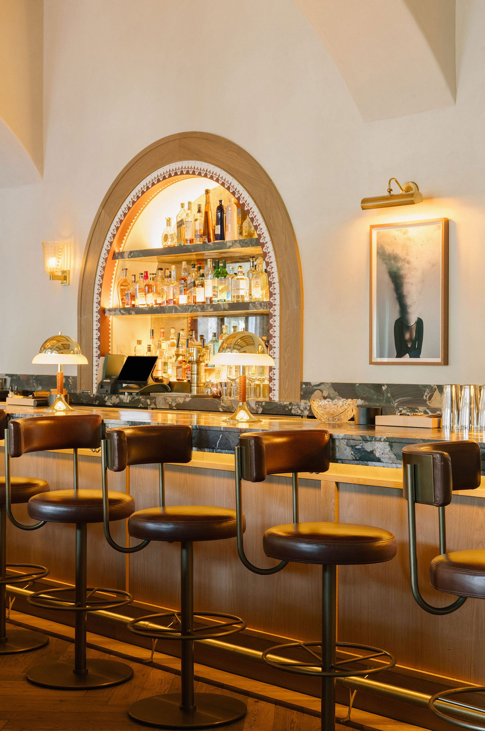
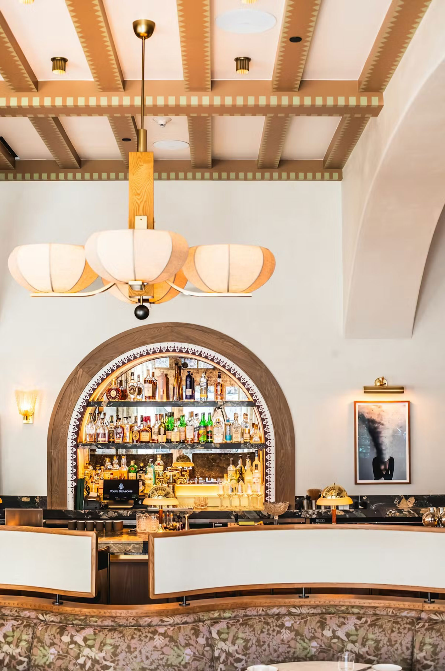
The challenge wasn’t reinvention. It was evolution. How do you honor an established brand while creating something that feels native to an entirely different landscape? The Denver identity carried urban warmth and warehouse sophistication. Vail demanded mountain air, alpine heritage, and the spirit of northern Italy’s high country.
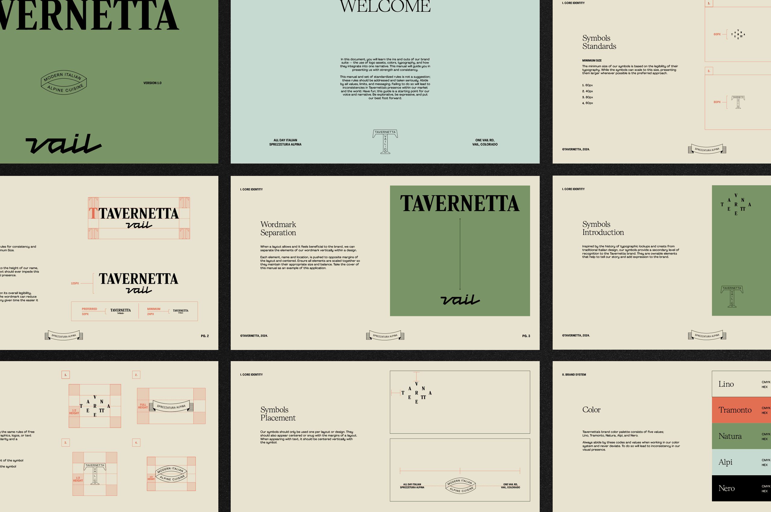
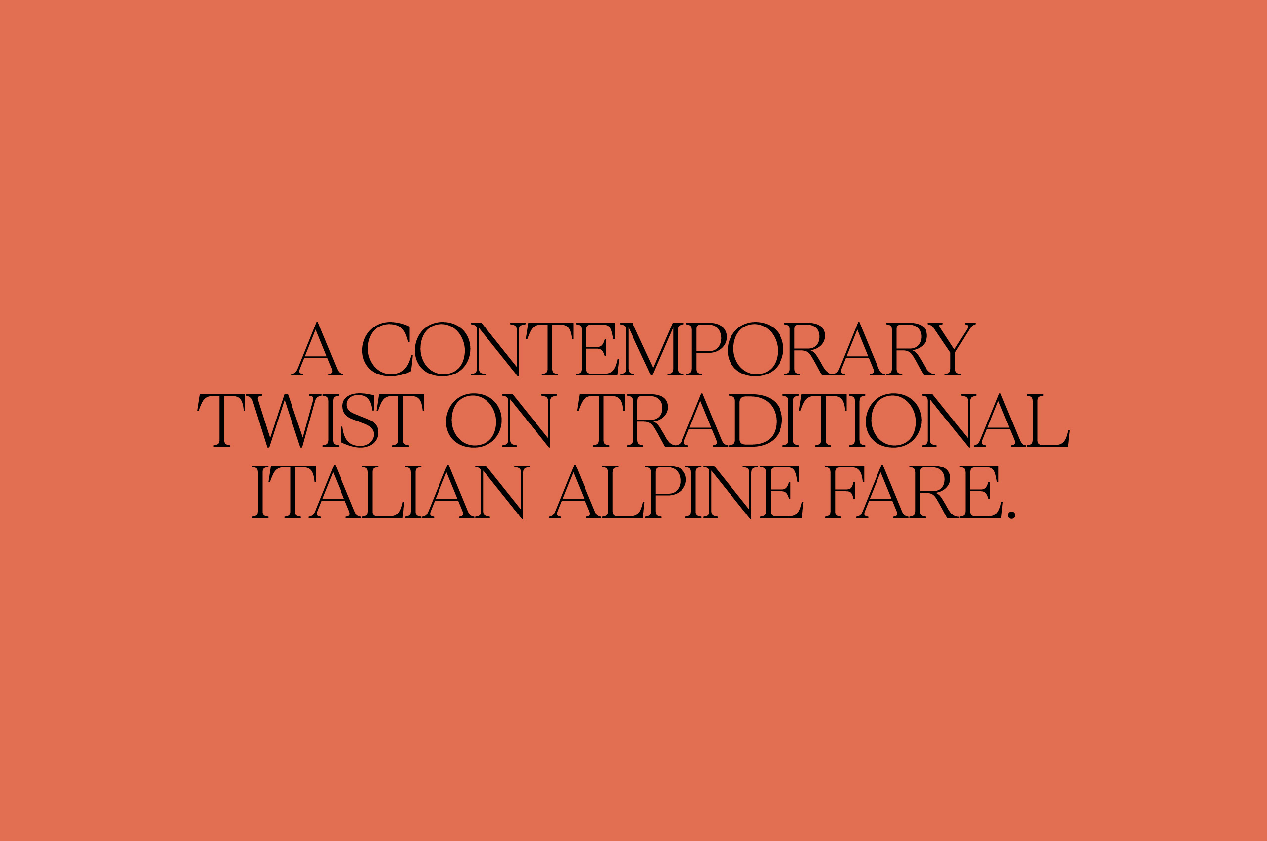
We developed an identity that maintains the Tavernetta name while introducing location-specific design language. Drawing from three distinct influences—antique Italian design, serene modernism, and subtle fashion—the system creates what the team calls Tavernetta’s mountain house. Familiar but transformed. Rooted but elevated.
Collaborators:
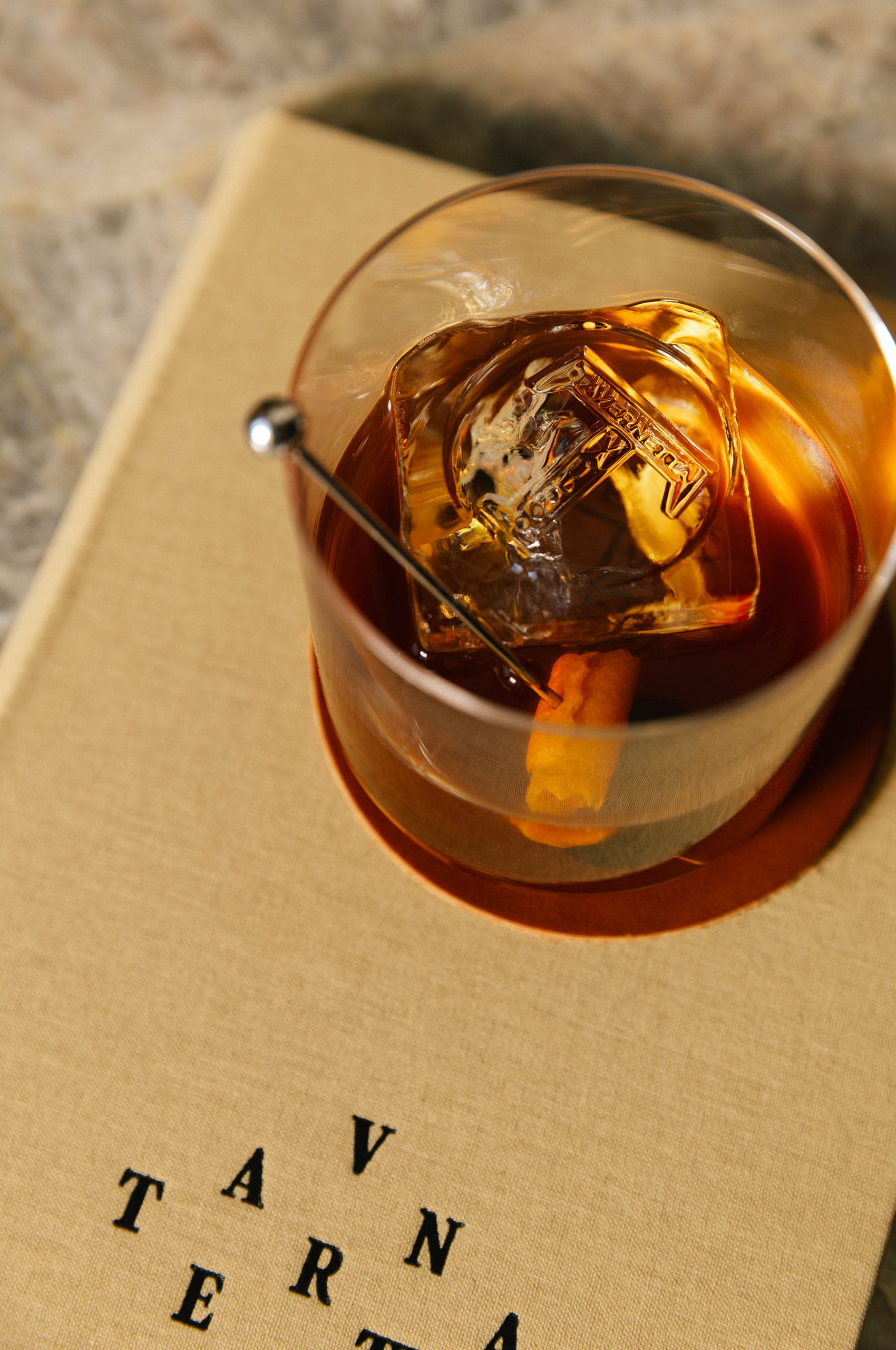
Photography: Amanda Proudfit. Casey Wilson.
Typography: Badson.

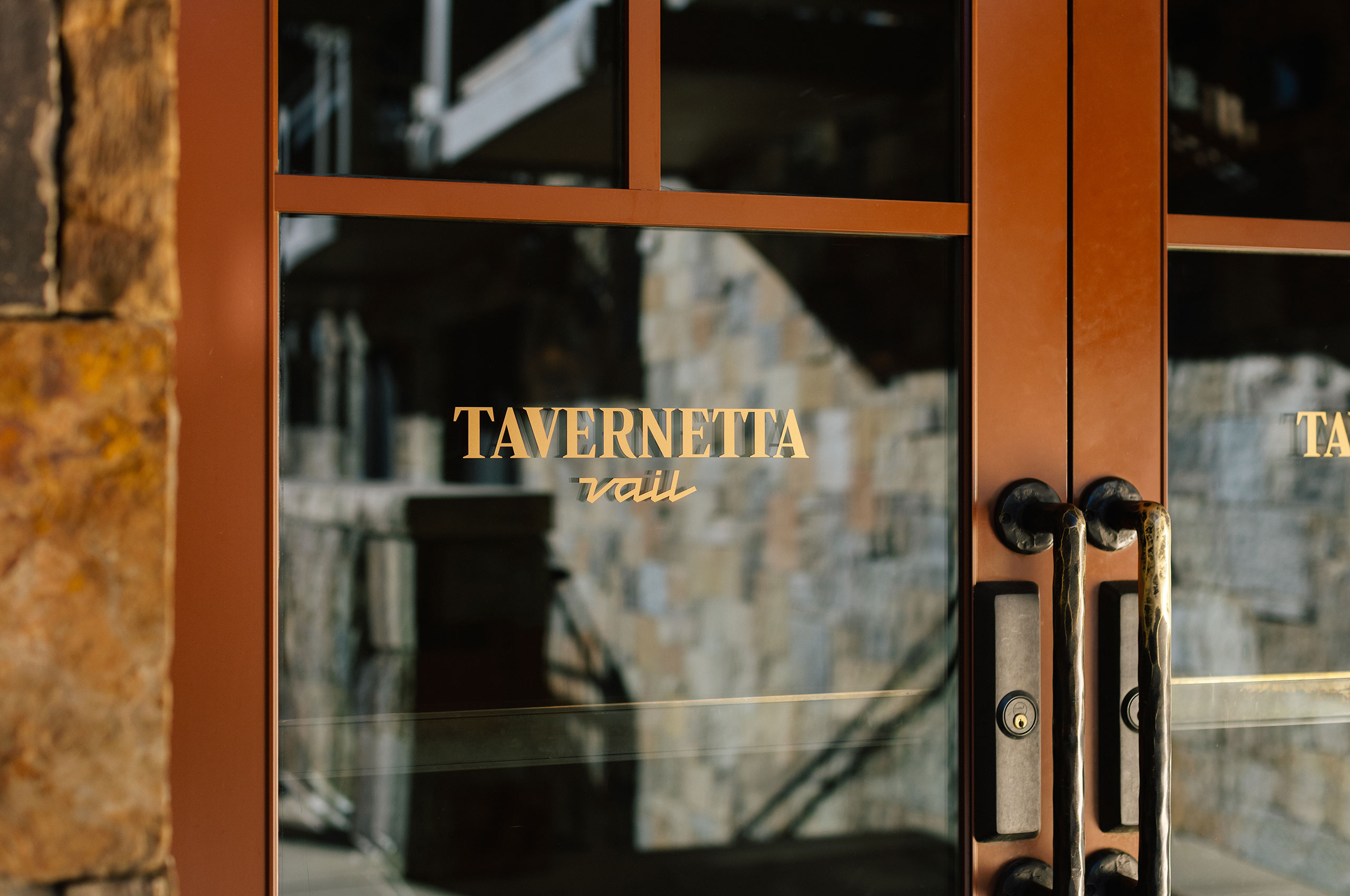

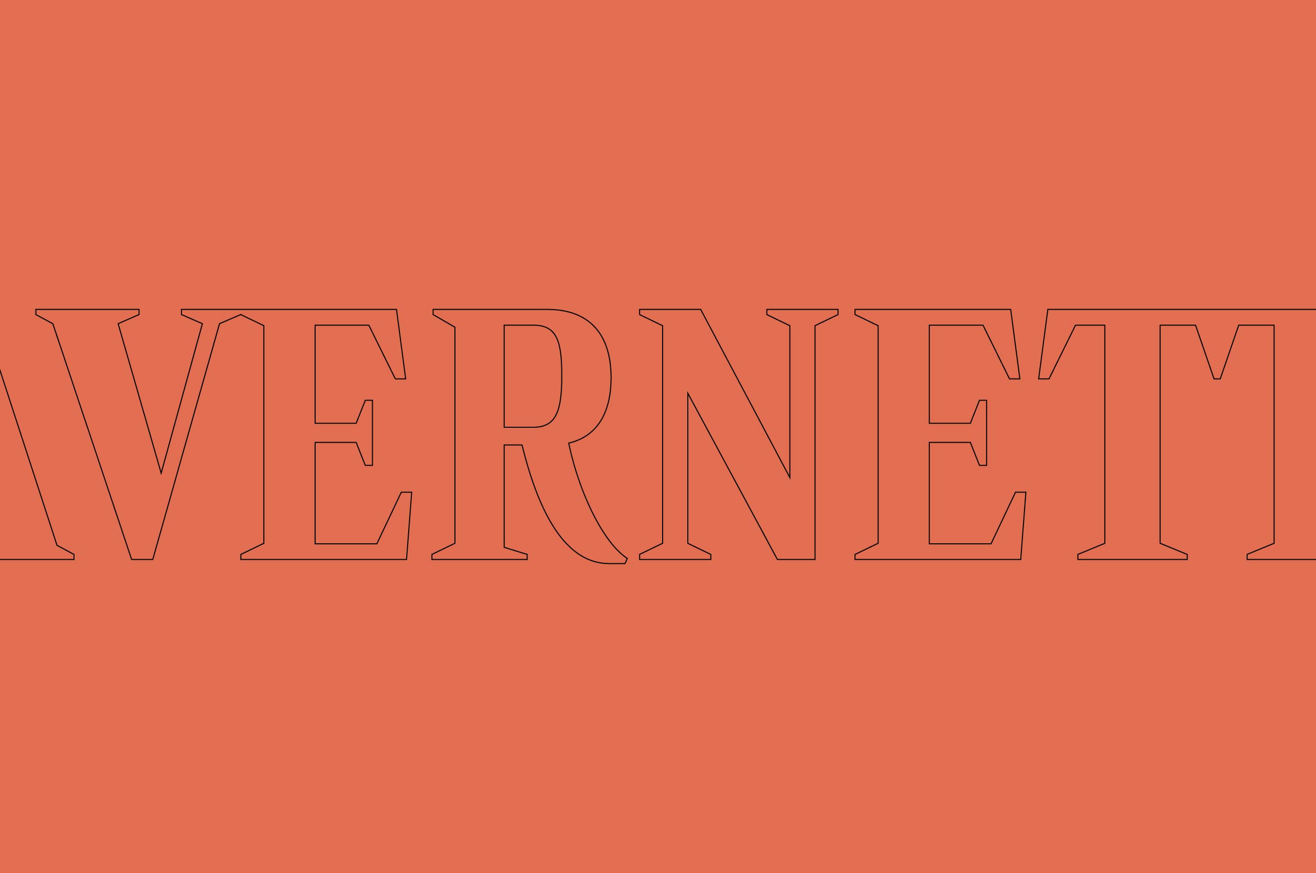


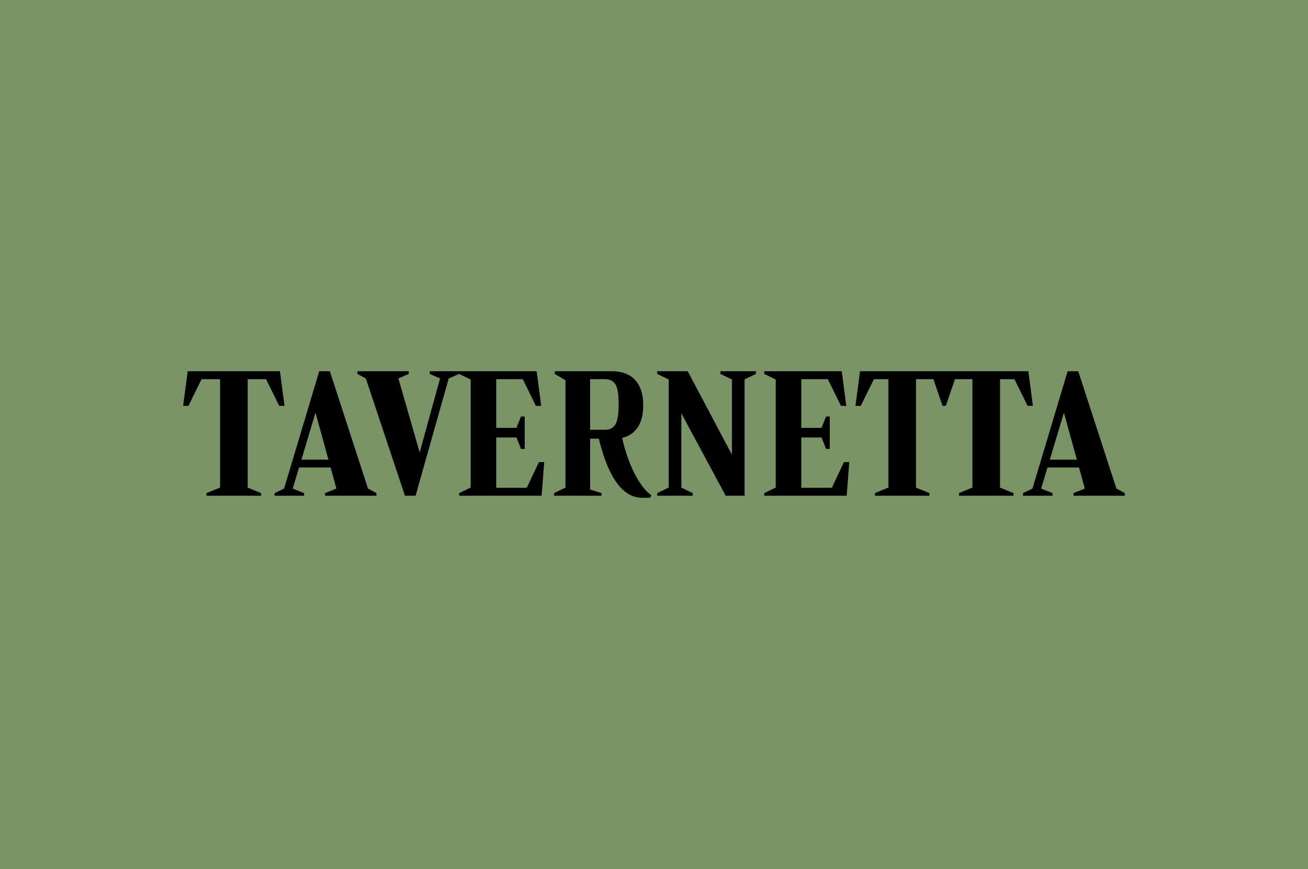
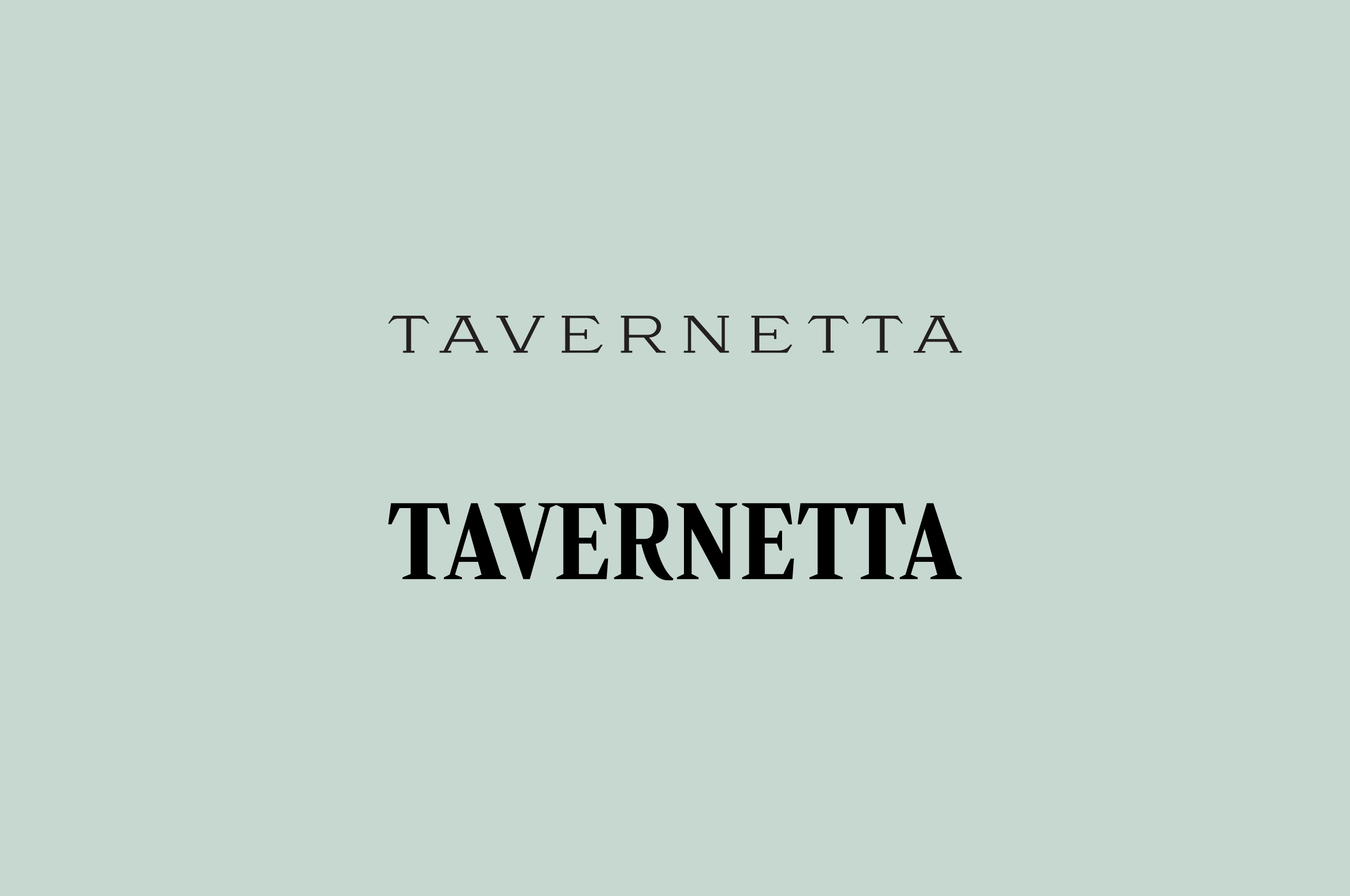
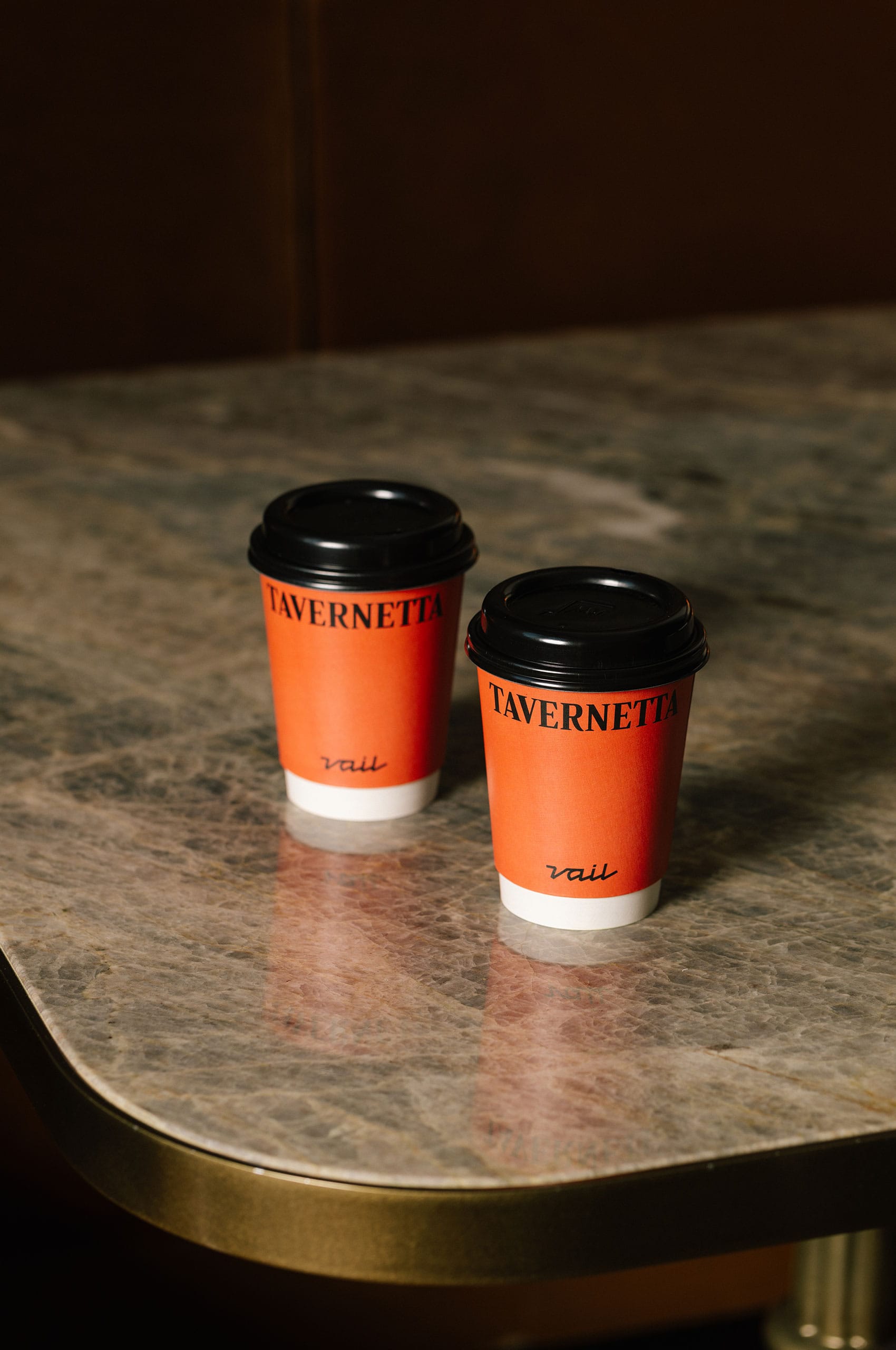
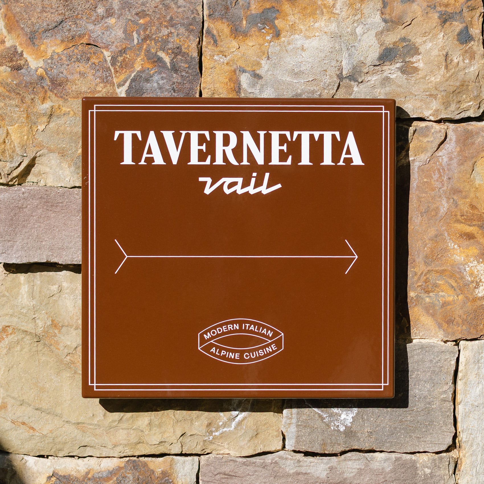
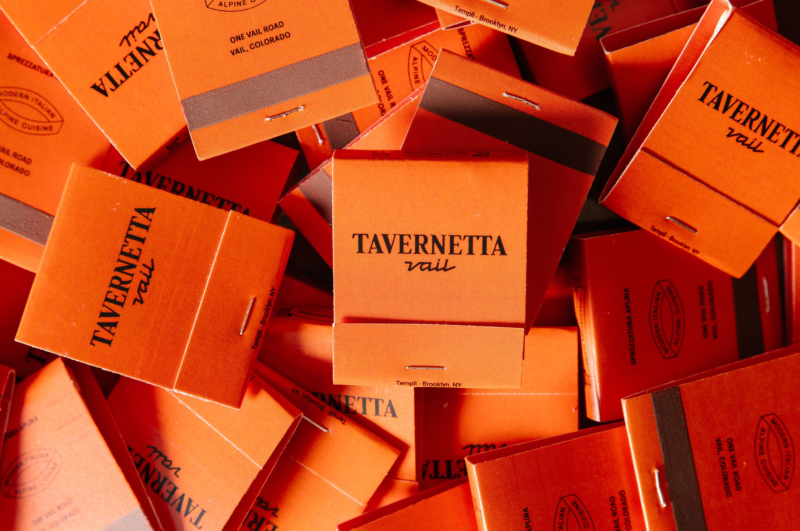
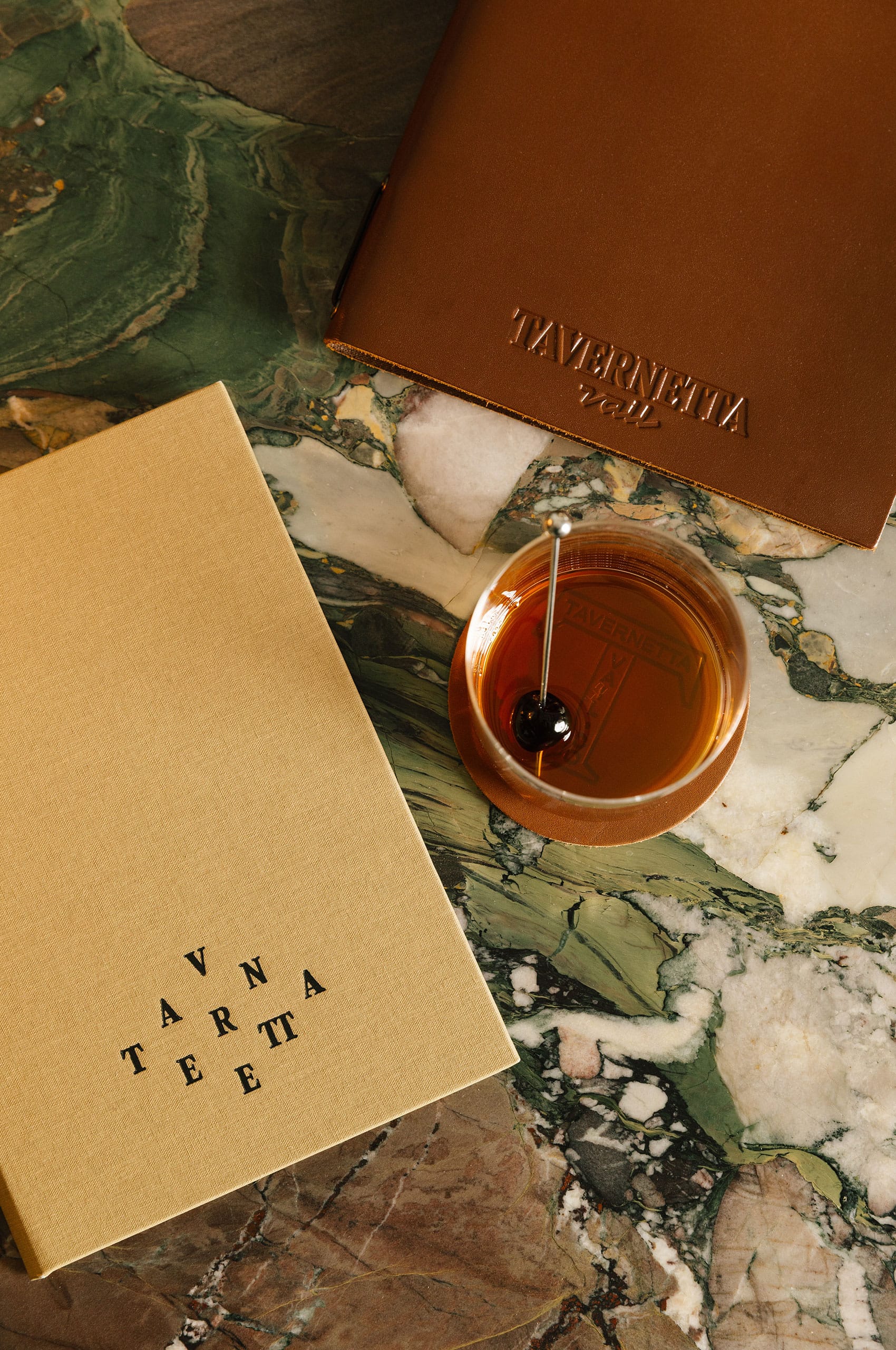
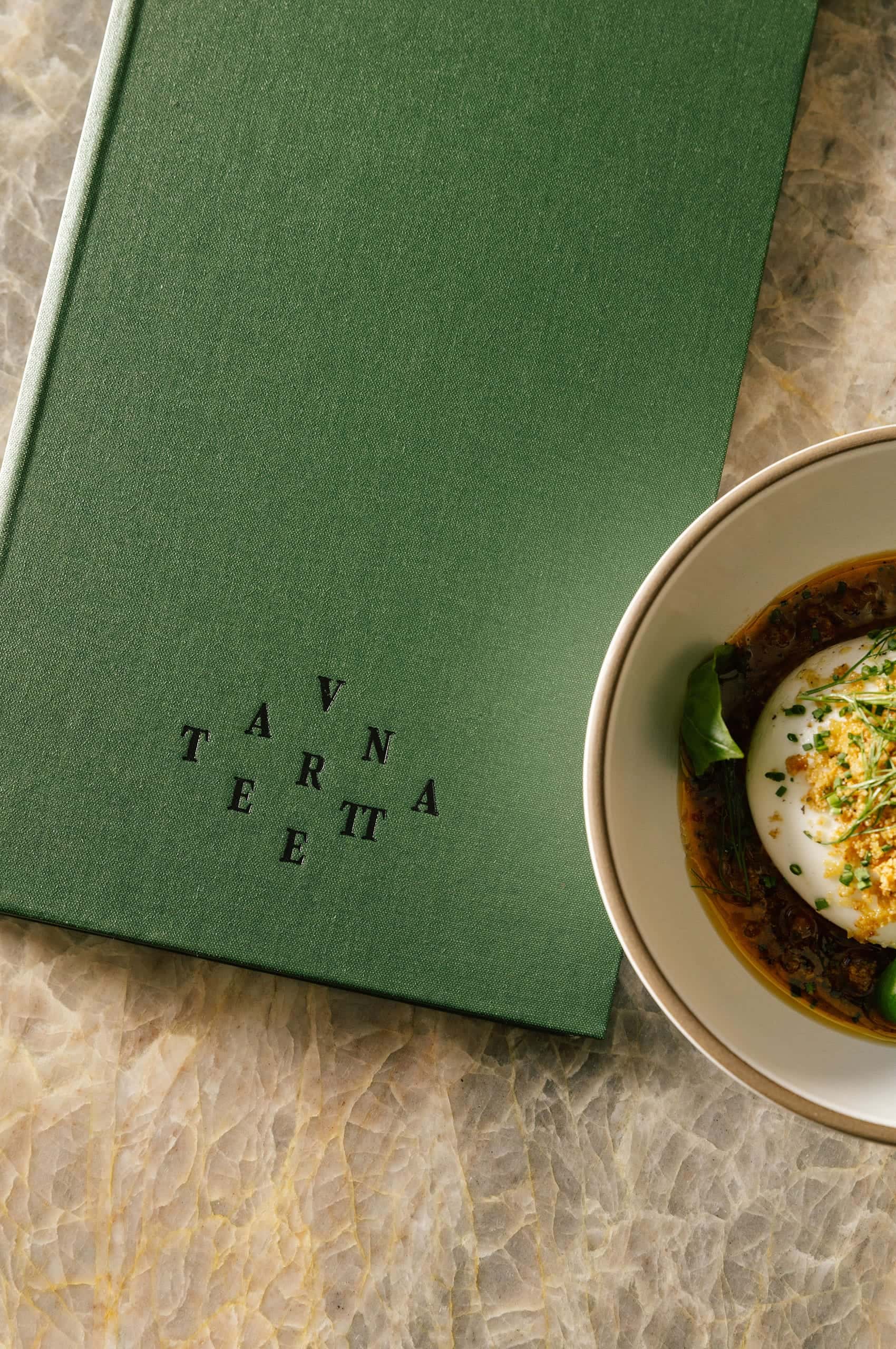
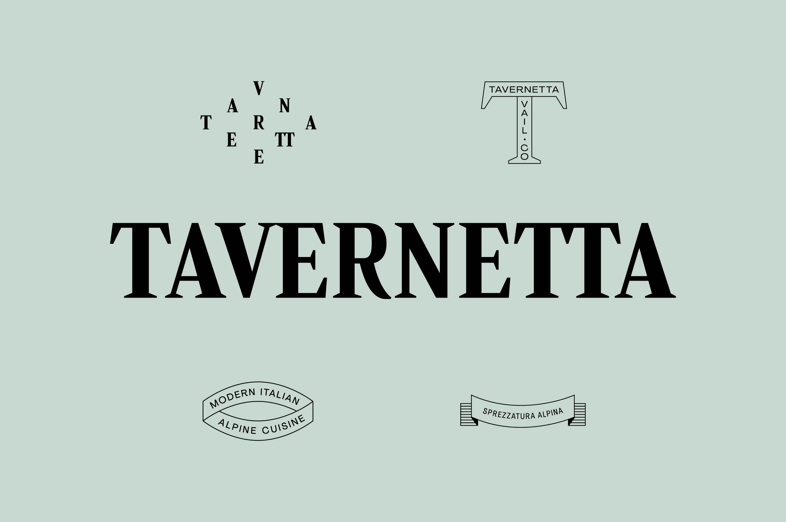
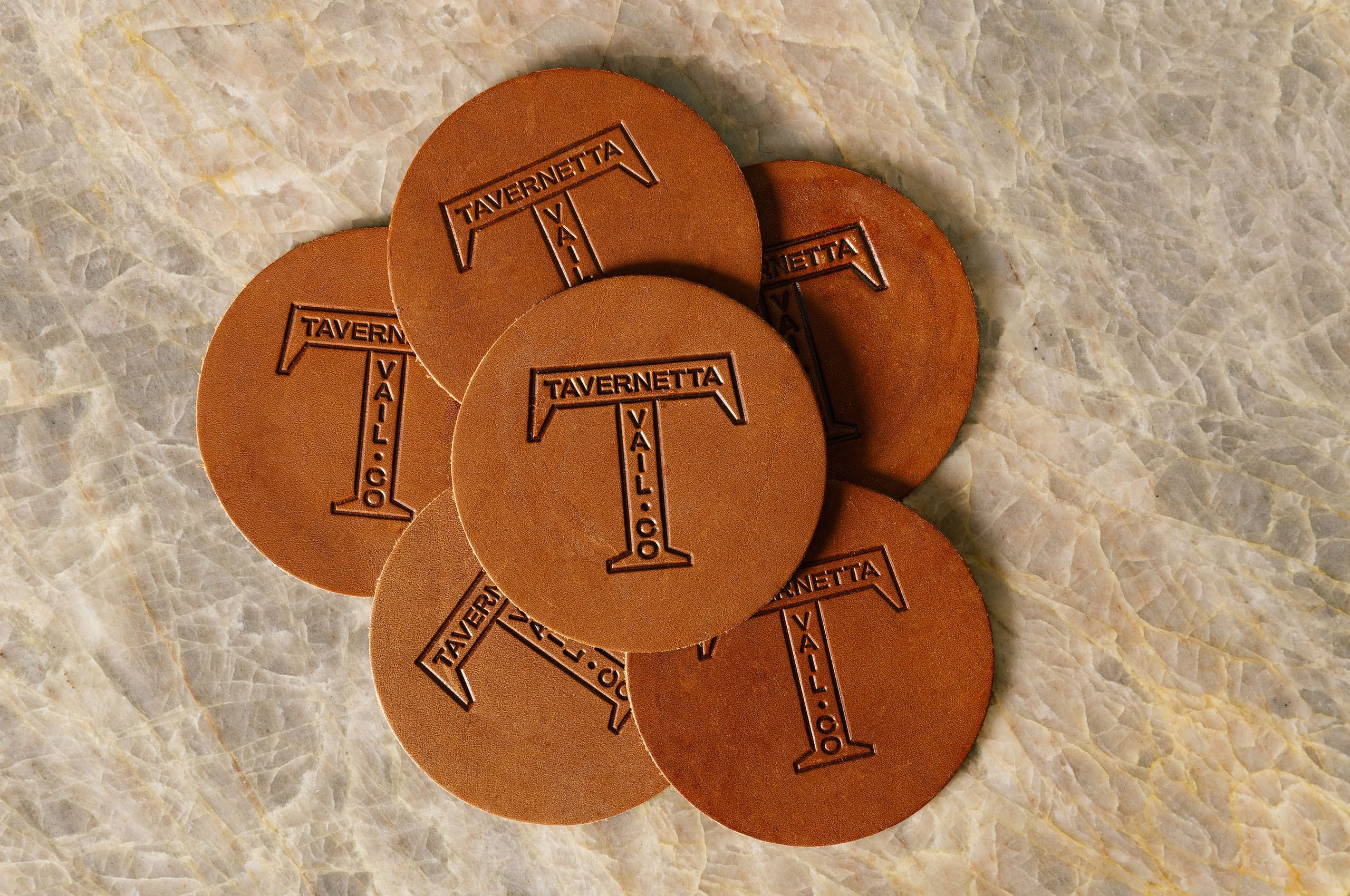
The original Tavernetta wordmark had gravitas, but it needed refinement to be more broadly usable. We worked with our friends at Badson to create an update that focused on improving versatility—creating a mark that could work across signage, menus, and collateral without losing impact.
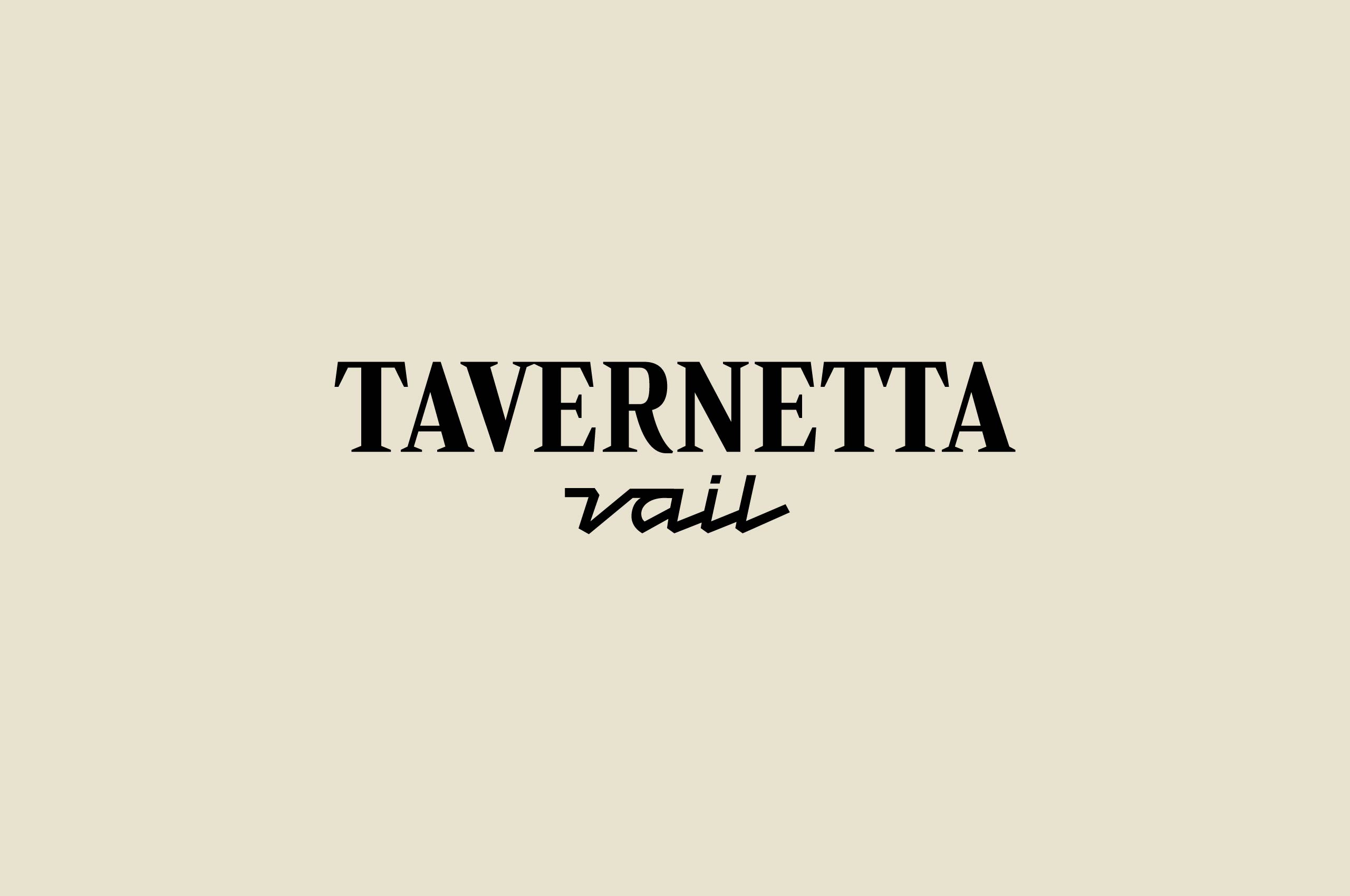
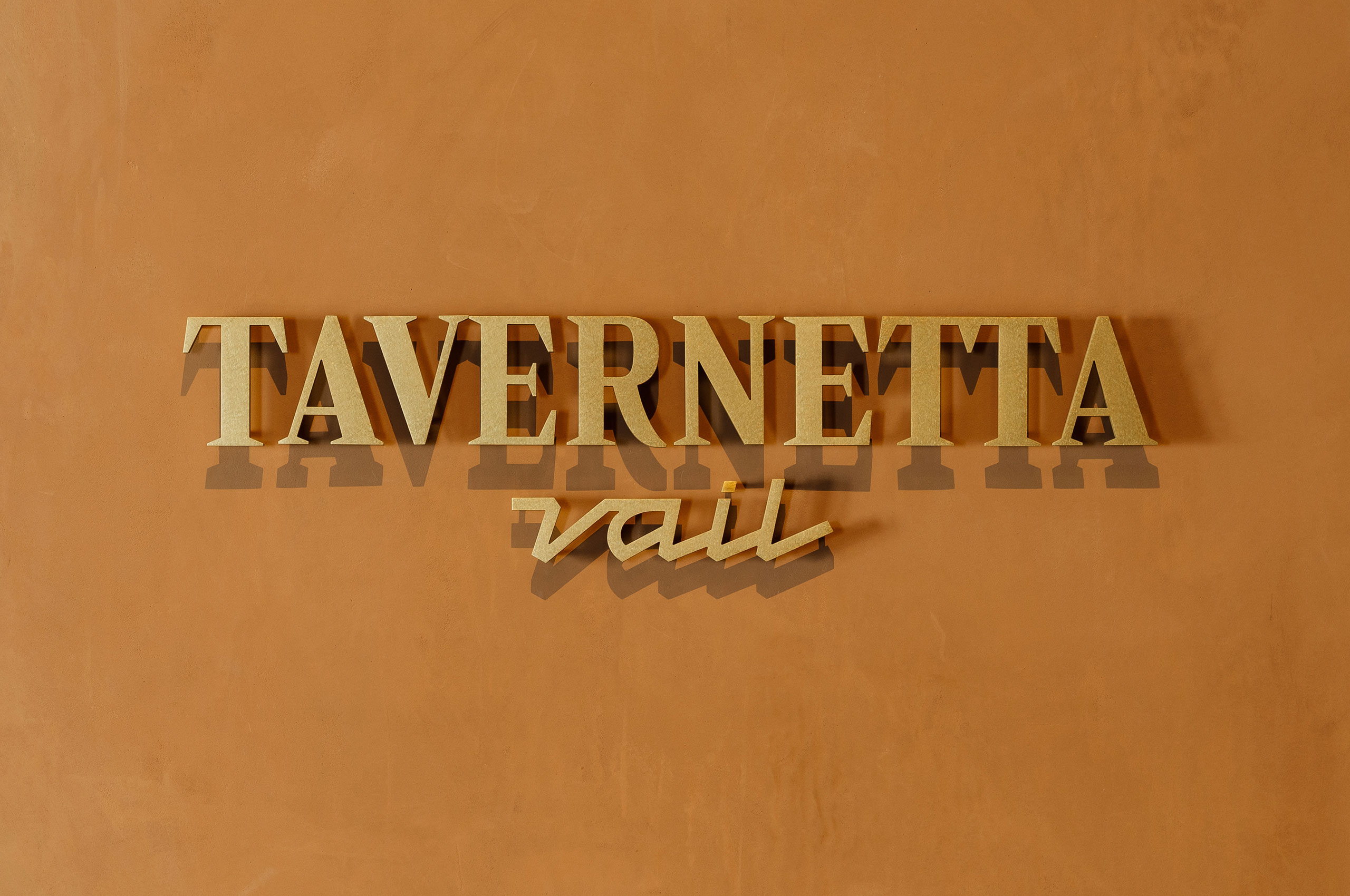
The wordmark now performs across contexts. Bold serif capitals anchor the mark with classical weight and proportion, drawing from historical Italian typography. Formal but not rigid. Established but adaptable.
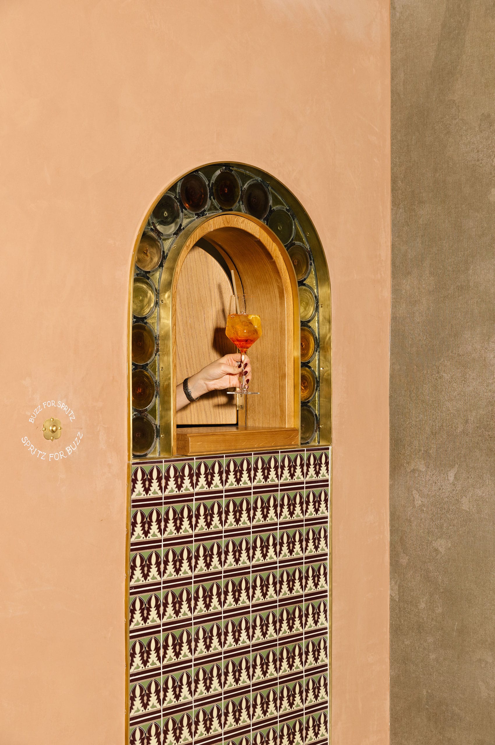
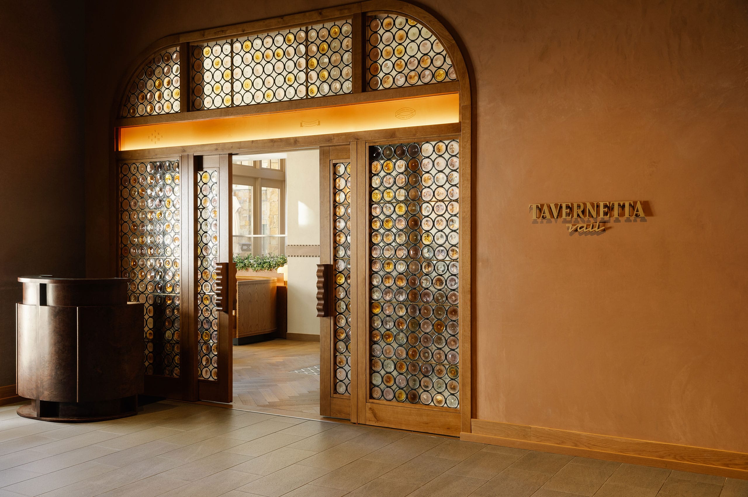
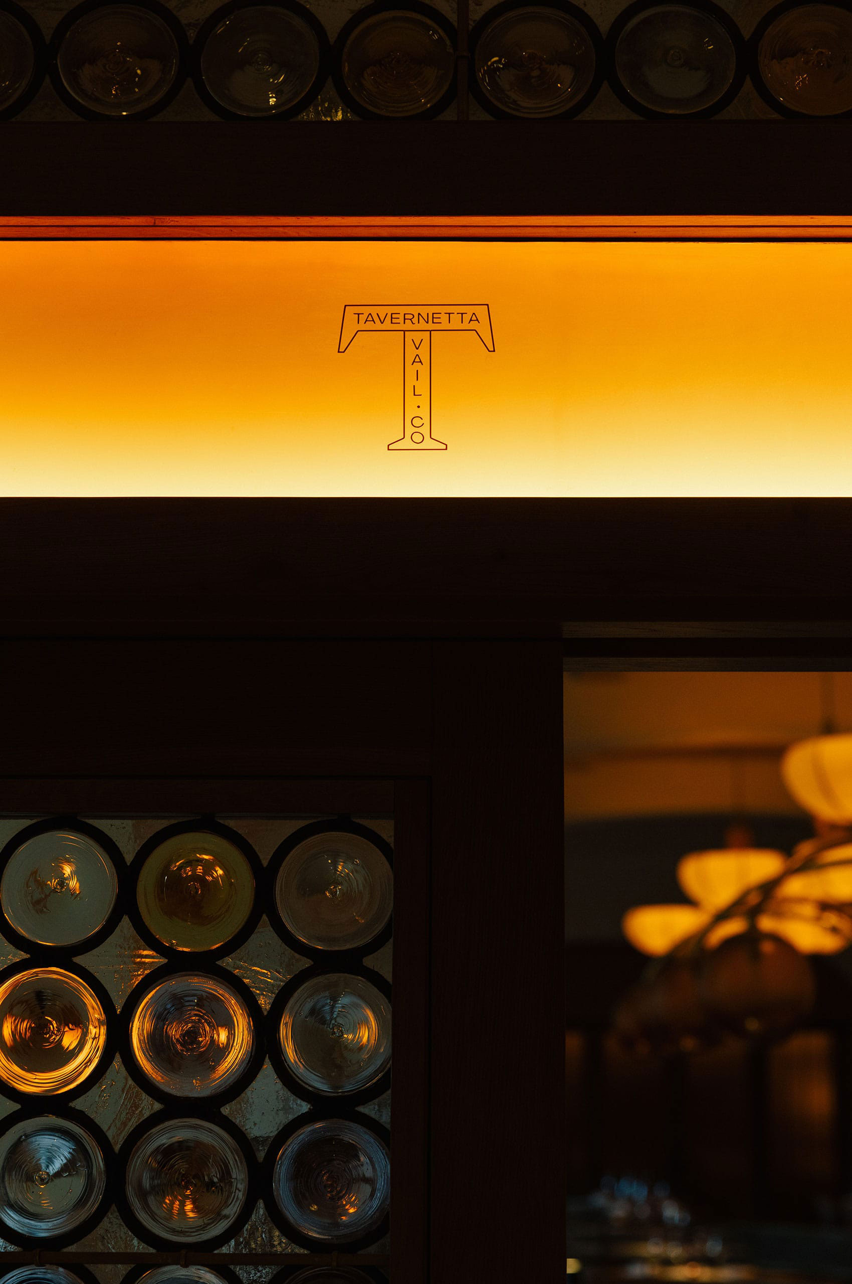
The Tavernetta Spritz window—a modern interpretation of the small street-facing openings where wine was sold directly from palazzos, particularly during plague times when distance was necessary.
These small windows have become iconic symbols of Italian resourcefulness and hospitality. Tavernetta’s version creates a moment of discovery, a tangible connection to centuries of tradition executed with contemporary craft. Historical but immediate. Playful but reverent.

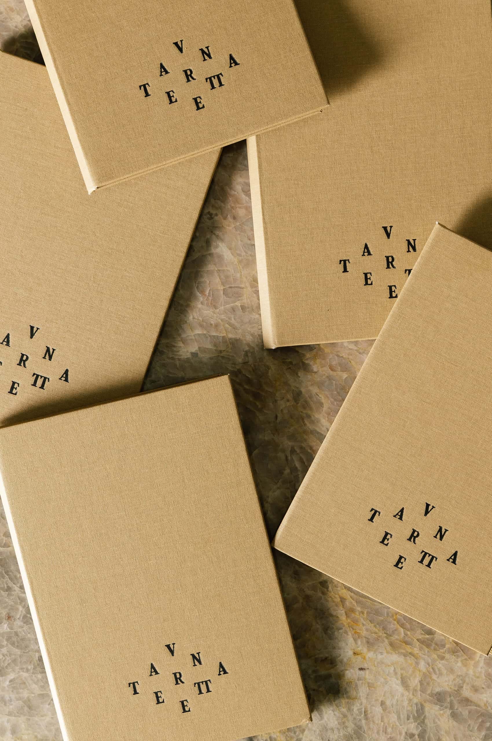
The typographic system establishes personality through emotion rather than decoration. Emotive typefaces bring warmth and character to every touchpoint—vintage charm balanced against modern clarity, nostalgic references without precious affectation.
The goal was to create something that feels both timeless and entirely current. Typography that carries history without being trapped by it.


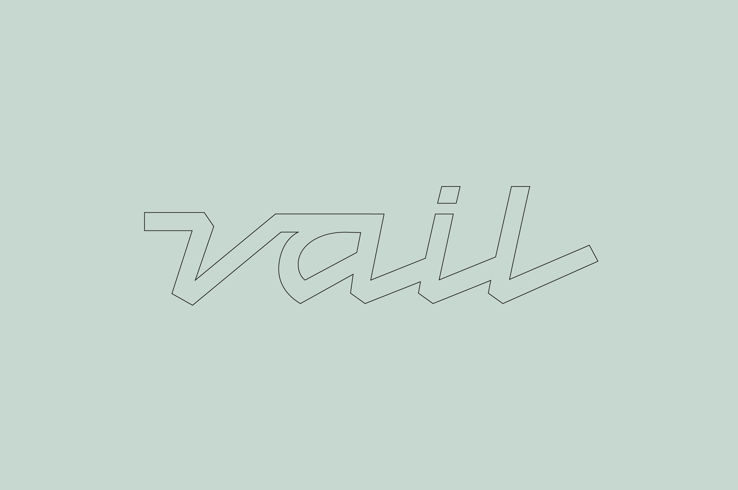
The location identifier takes an entirely different approach from the main wordmark. The flowing script references hand-painted lettering found on vintage Italian signage.
Loose, confident strokes. The kind of mark that looks effortless but requires precision. Paired with the structured serif above, it creates the tension that makes the full lockup work: formality meeting casualness, tradition meeting spontaneity. Sprezzatura in typographic form.

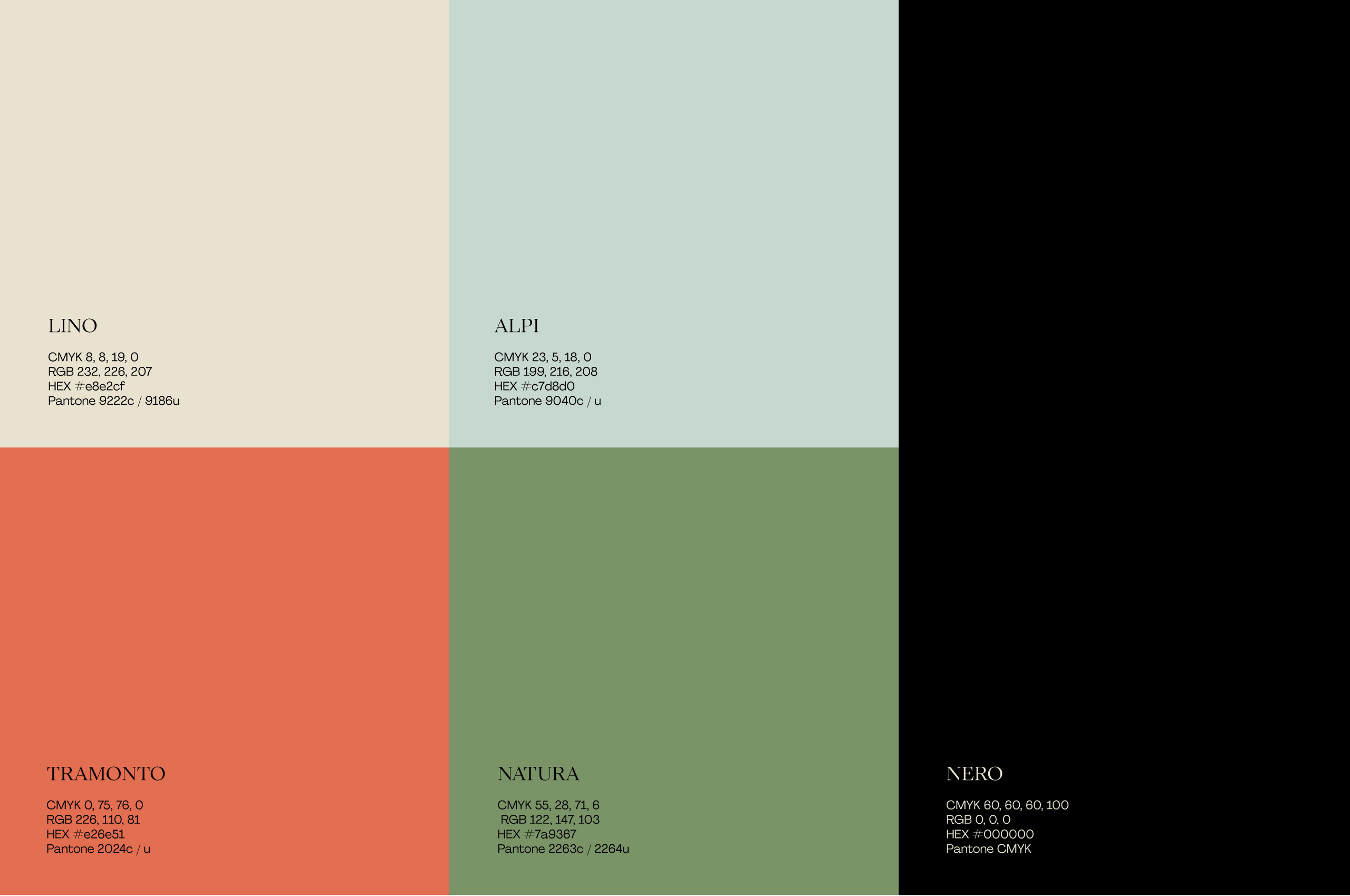
Light meets warmth. Air meets earth. The palette balances openness with grounding, creating atmosphere before content arrives.
Five shades work independently or together. Adaptable but coherent. A system that carries the identity wherever it needs to go.

The identity introduces a guiding concept: Sprezzatura Alpina. Borrowed from Baldassare Castiglione’s Renaissance ideal of making the difficult look effortless, sprezzatura has long defined Italian style and sophistication.
Sprezzatura Alpina is distinctly Tavernetta Vail. It’s the philosophy behind every decision—the refined rusticity of materials, the careful casualness of execution, the balance between mountain and luxury. Sprezzatura Alpina isn’t just a banner mark in the visual system. It’s the entire approach distilled into two words.
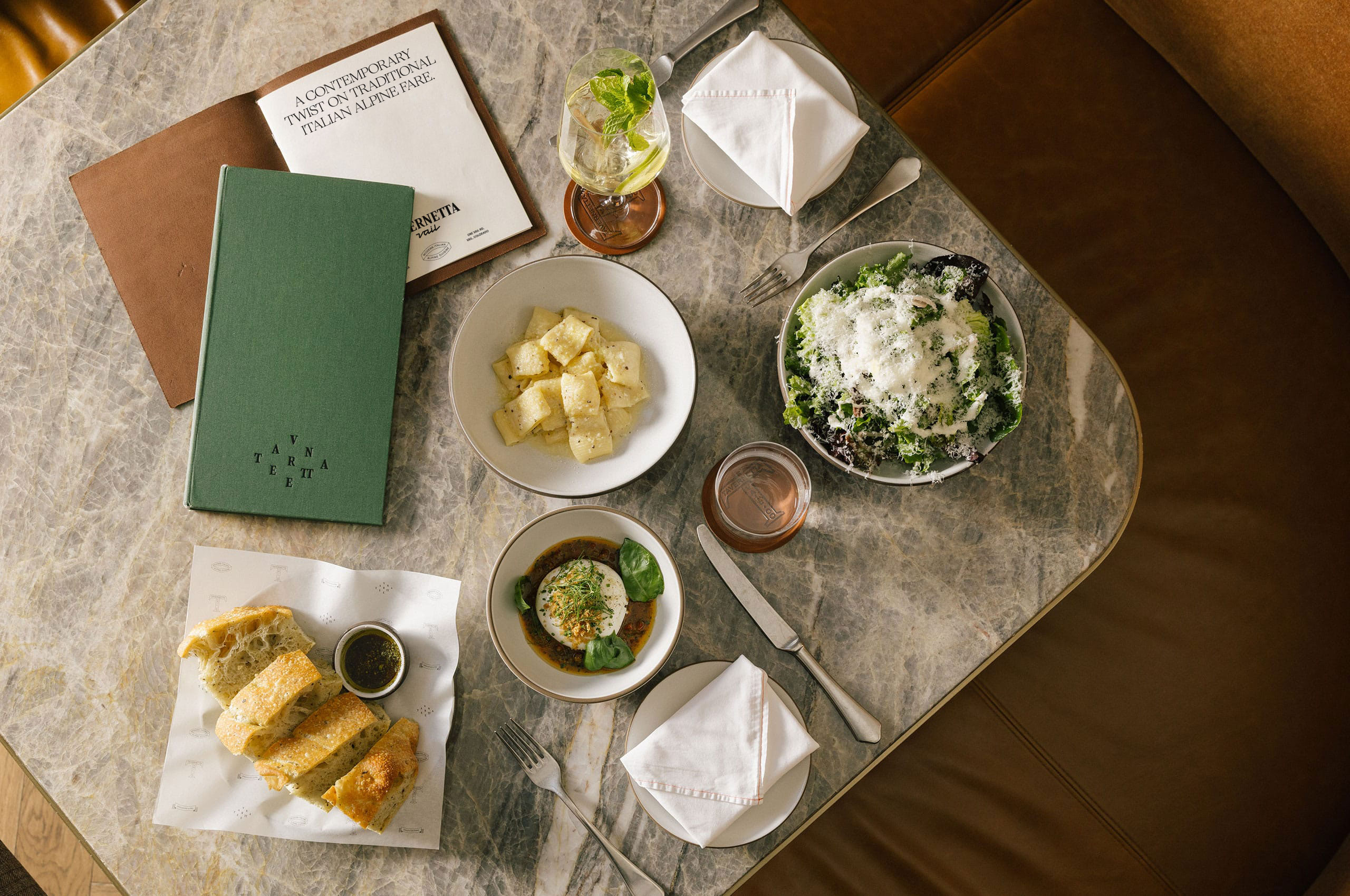

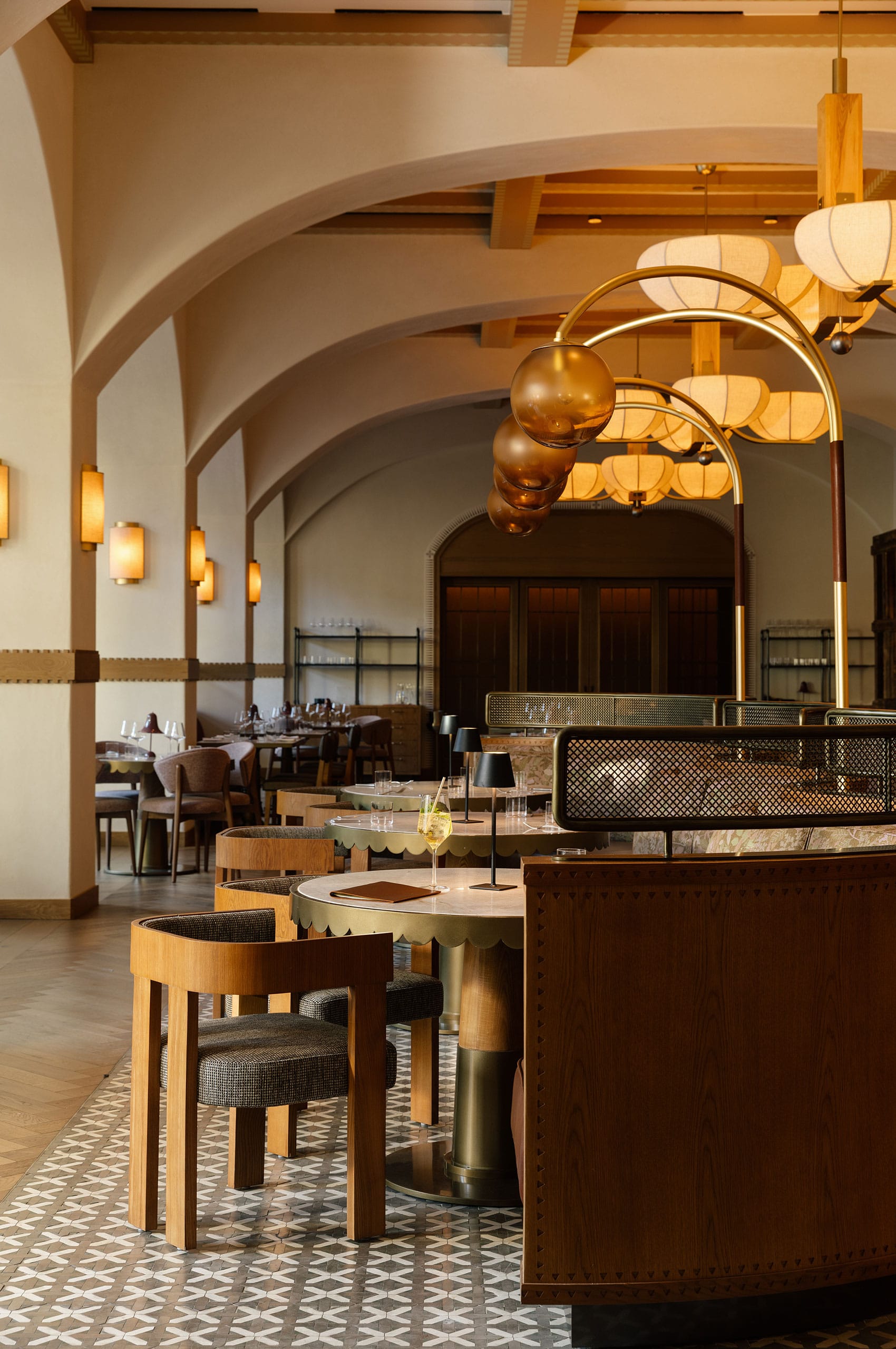
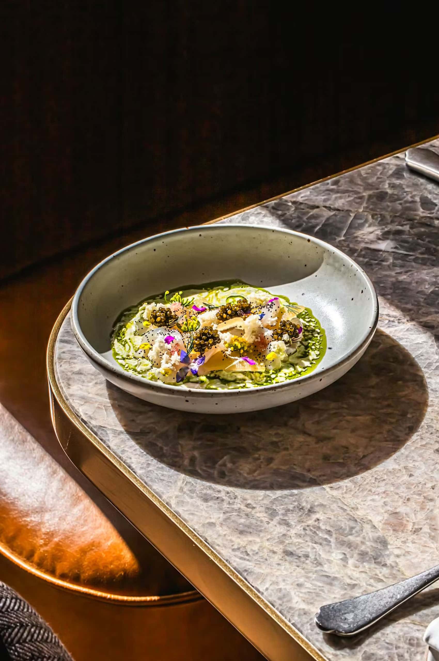
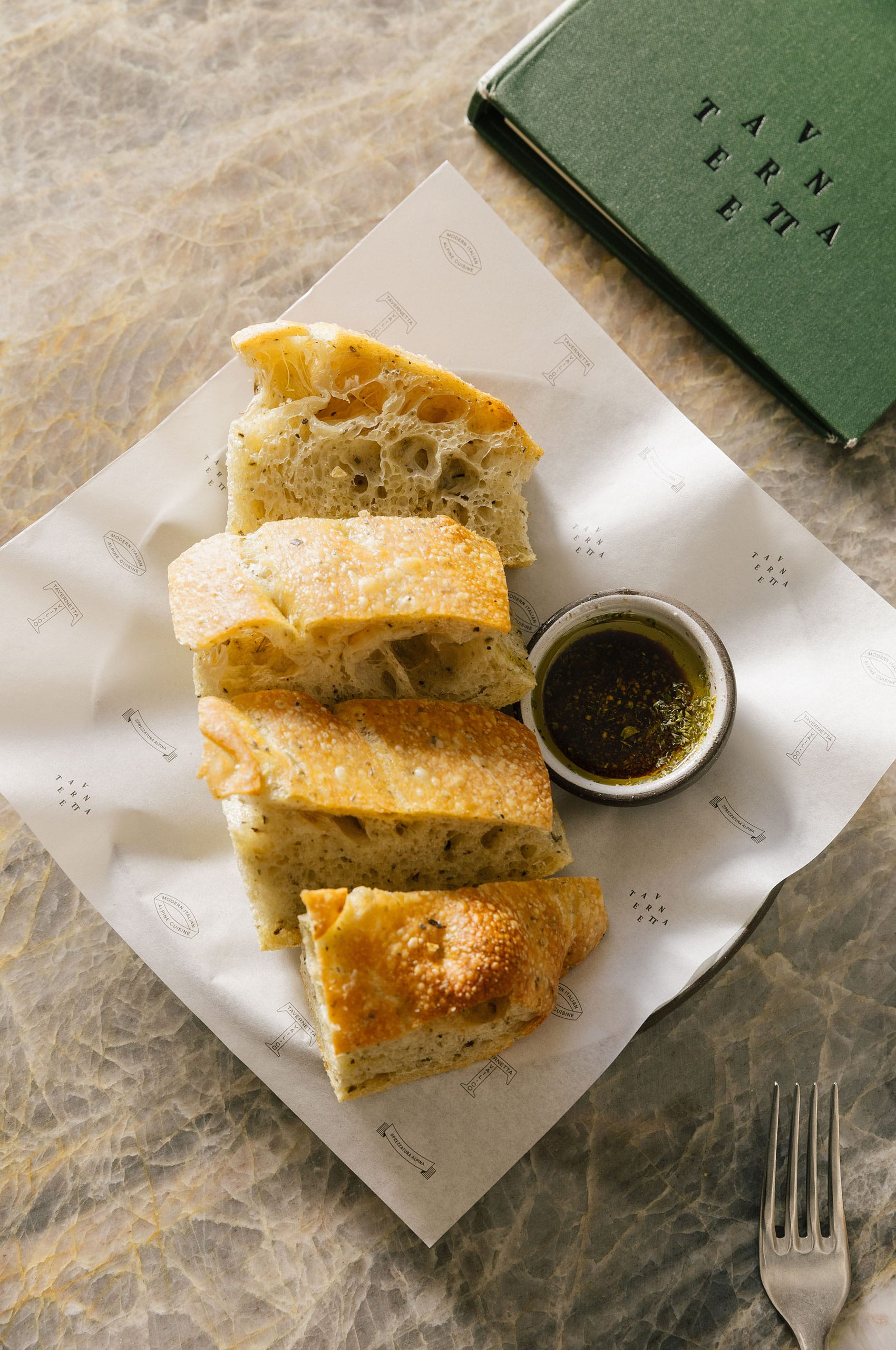
The menu system demonstrates how the full identity comes together. Typography, color, and symbols work in concert. The layouts balance what Italian dining demands with what mountain hospitality offers. Structured enough to signal refinement, relaxed enough to feel welcoming.

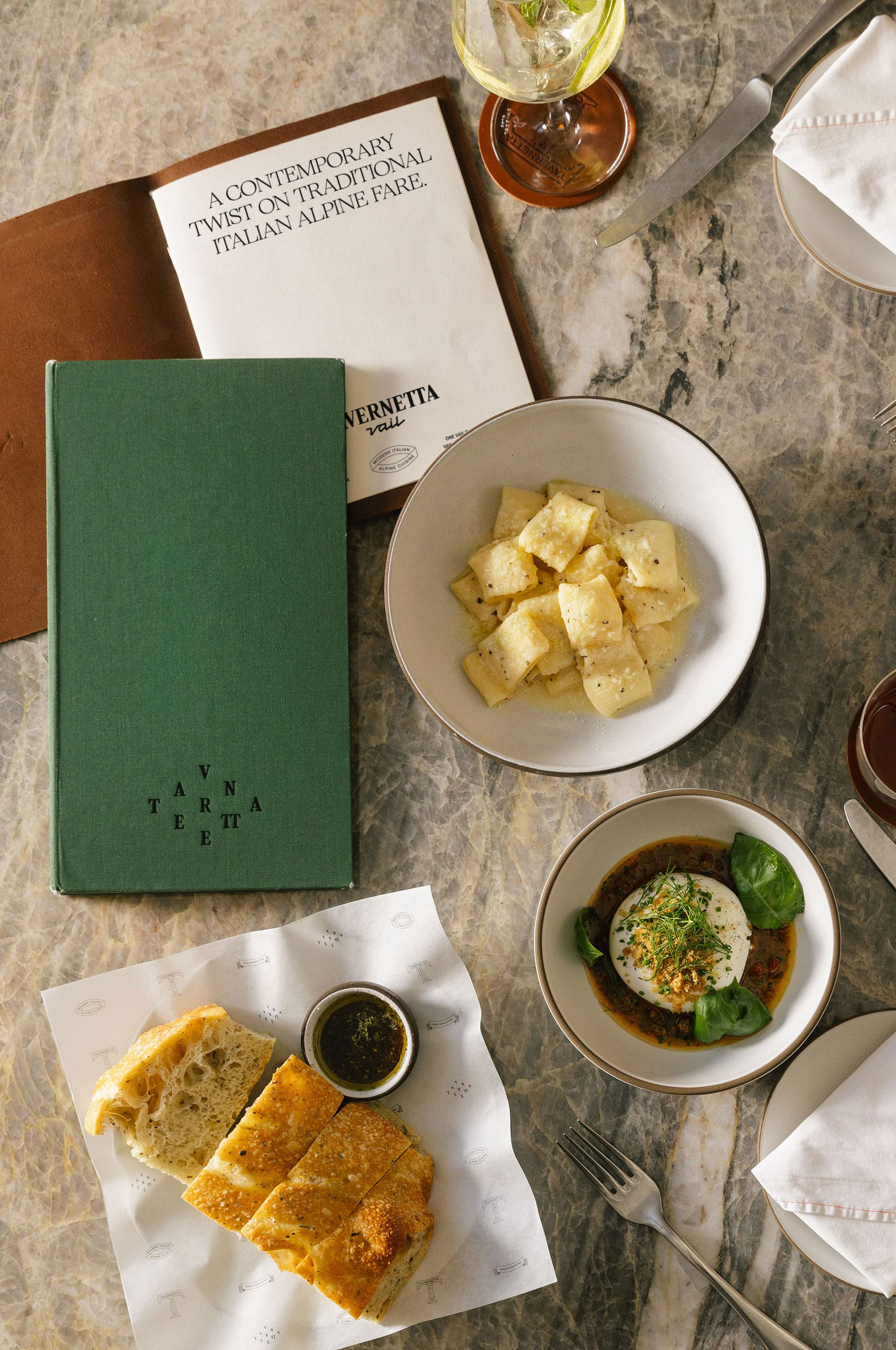
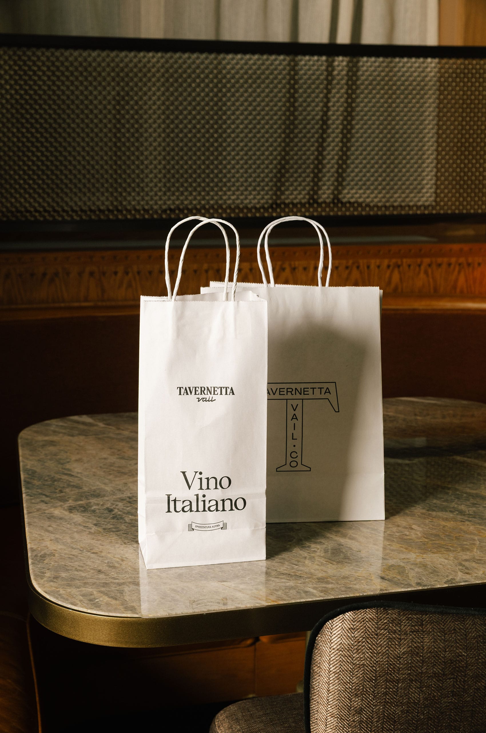
The supporting marks create flexibility across the system. Together, they form a visual language as varied as the experience itself. Coherent but adaptable. A system built to work.