Apto
An essential suite of commercial real estate products all under one roof.
An essential suite of commercial real estate products all under one roof.
Built by former brokers who were tired of the available products, Apto set out to change the way commercial real estate brokers work. They achieved this by creating a suite of products under the same roof. Previously, brokers had to bounce around from product to product to get the information they need. By housing everything in the same place, Apto allows brokers to do their jobs more efficiently and with greater ease. Empowering them to effectively find, engage, and win potential business.
Ahead of a large website relaunch and an overhaul of the application, Apto reached out to Mast to help refresh their identity, wanting to create an organic progression of the brand. We worked with them to develop a refresh rooted in the history of the brand while allowing the update to establish a personality of its own. Resulting in a simple, modern brand that mirrors the simplification, ease, and clarity of the product.

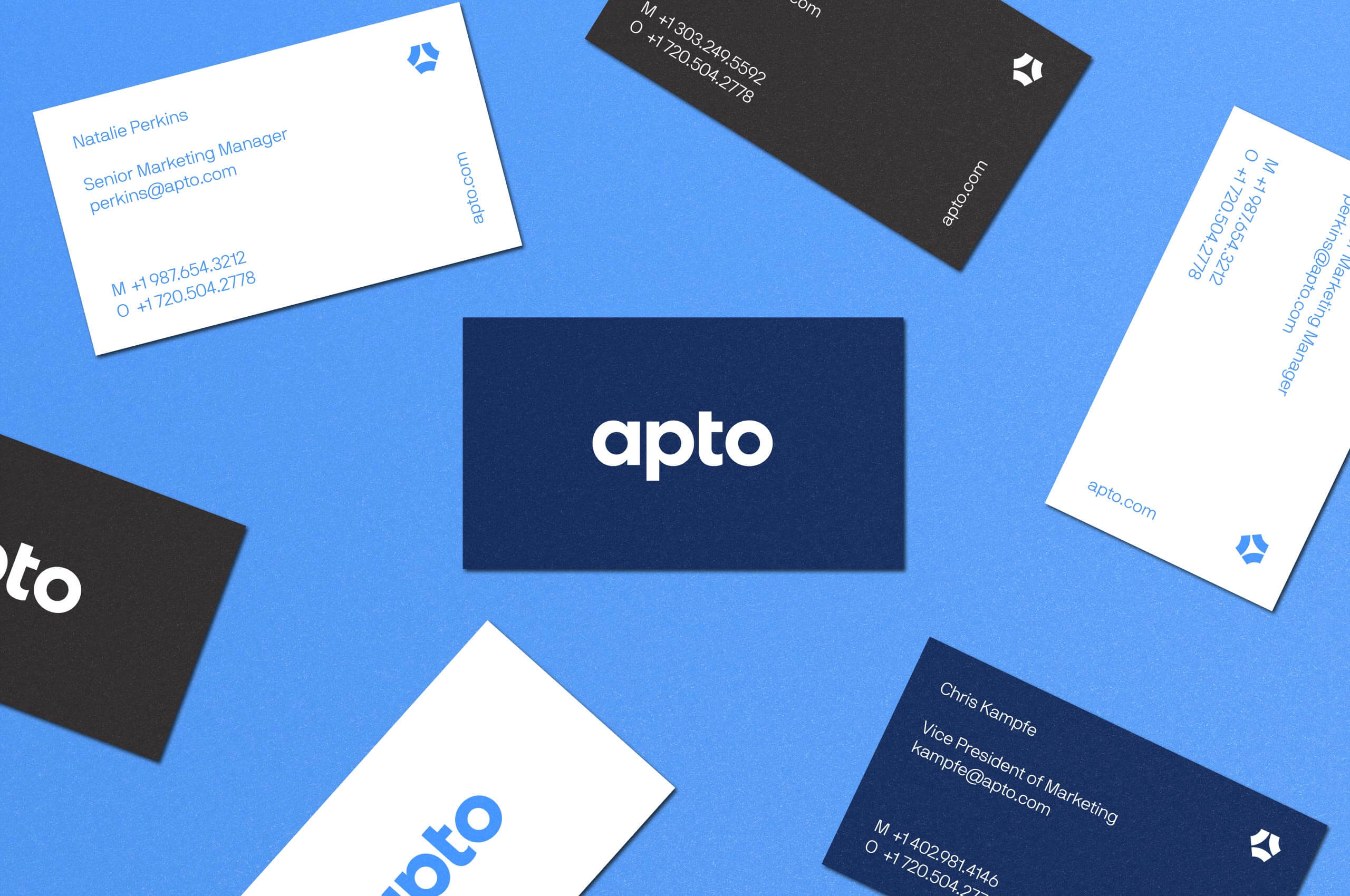
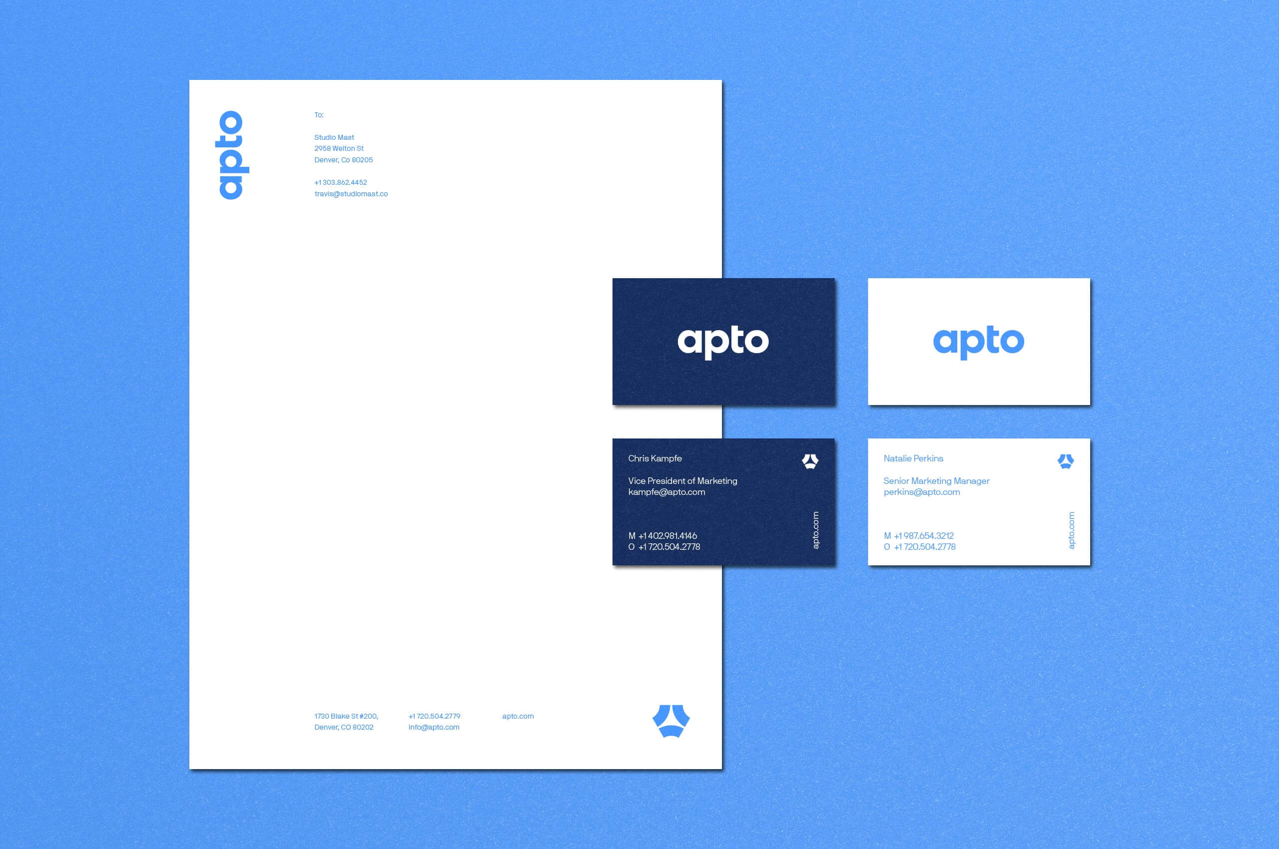

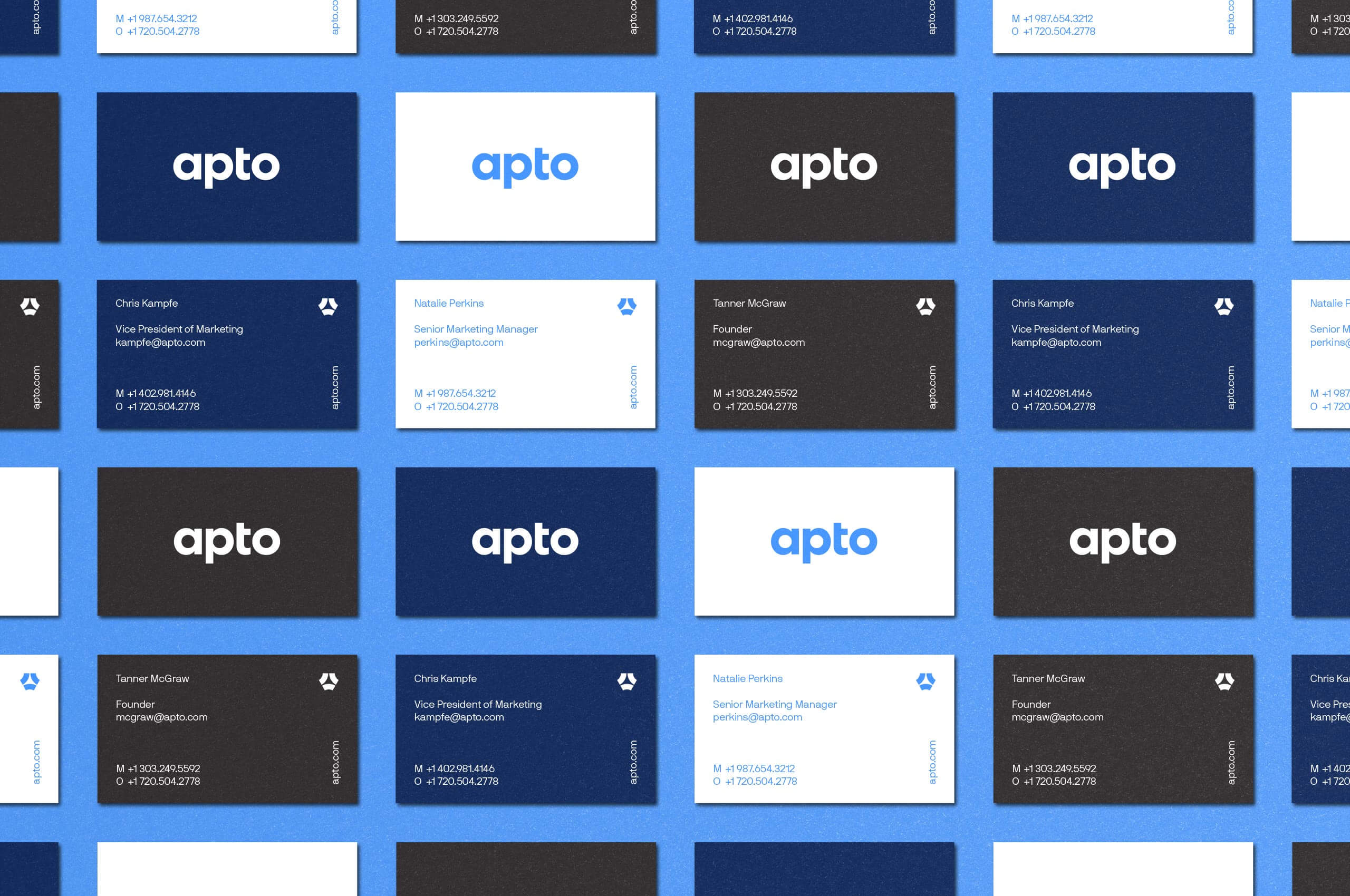

When developing the updated wordmark, it was important to create a natural evolution; building upon the established equity while increasing legibility and usability. The former wordmark, while modern, was too thin for the majority of the use-cases. We developed a thicker update to the mark that takes cues from the symbol, allowing for harmony when paired.
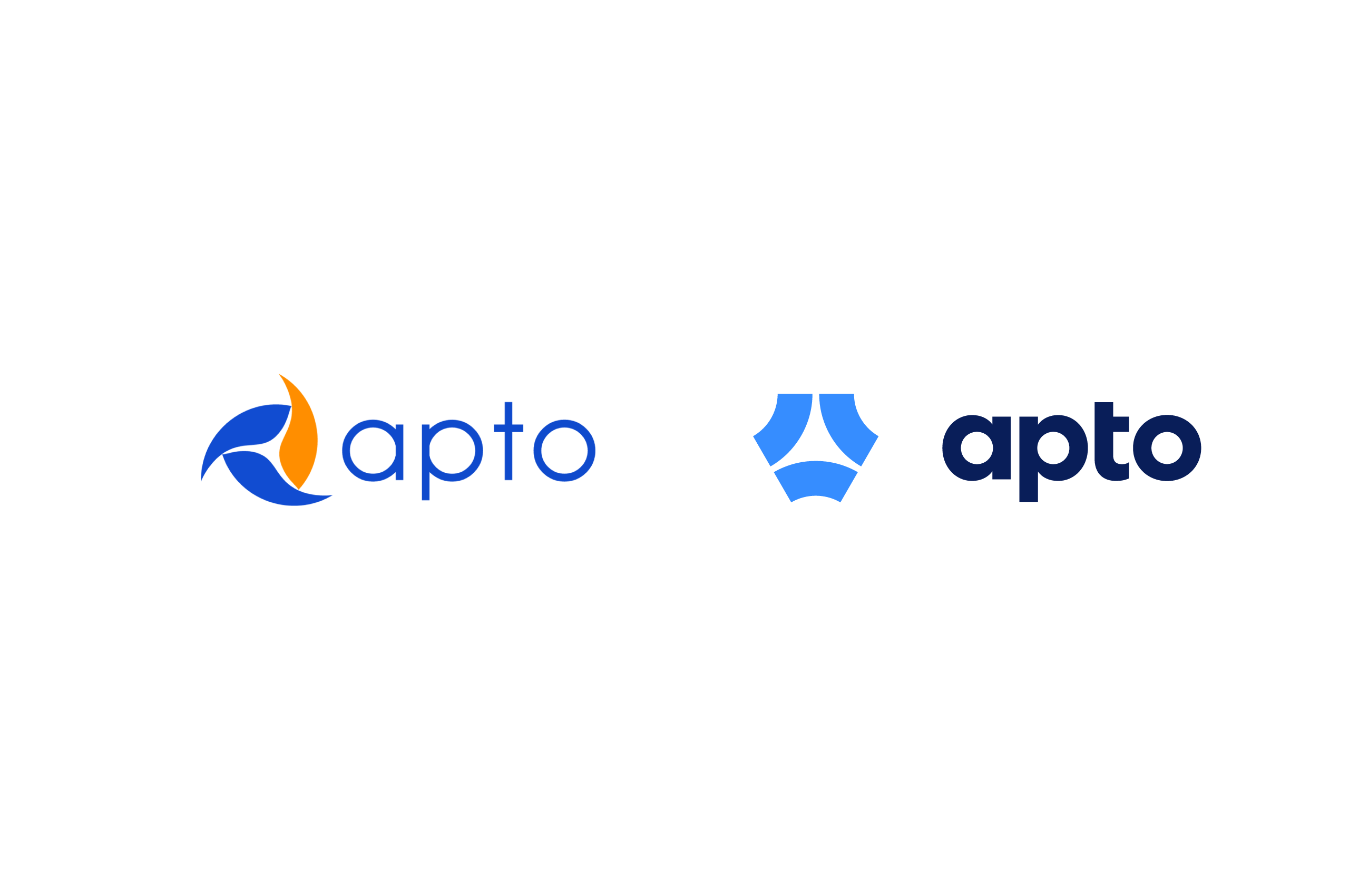
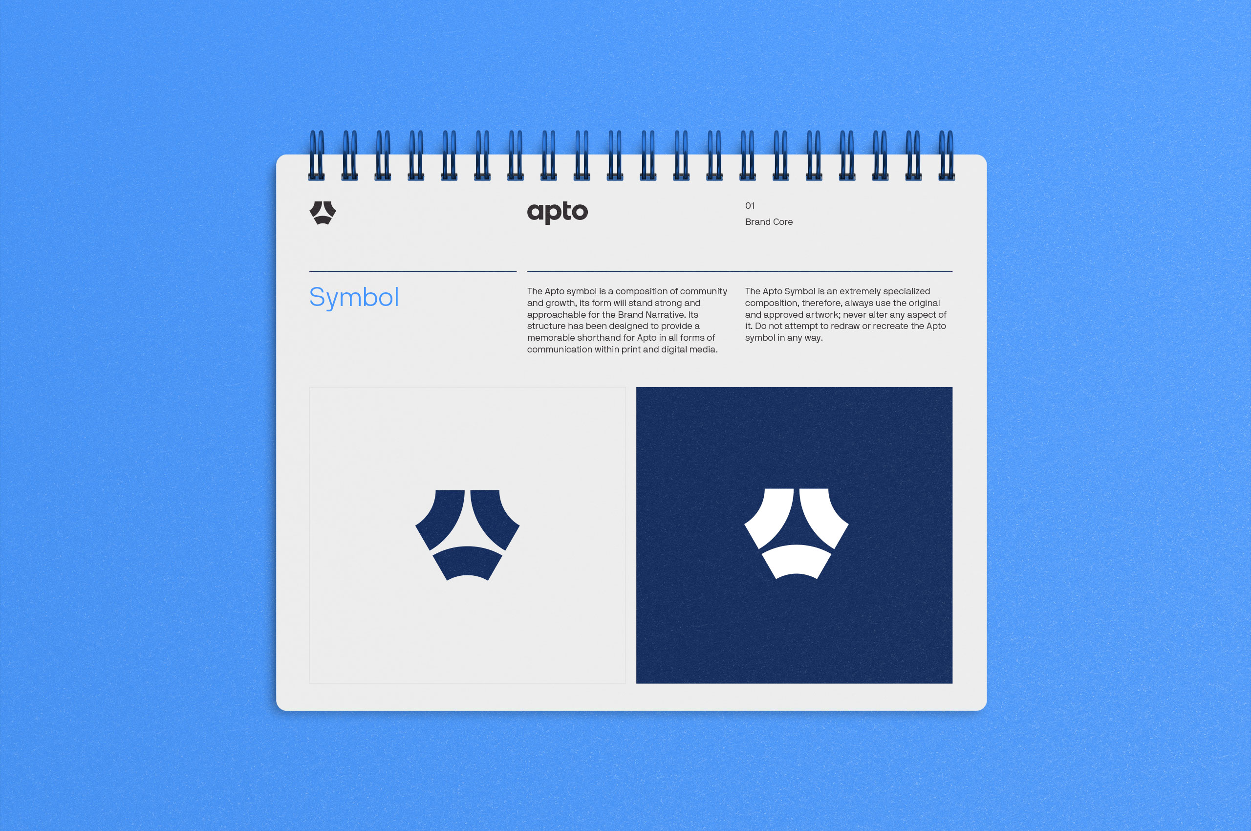
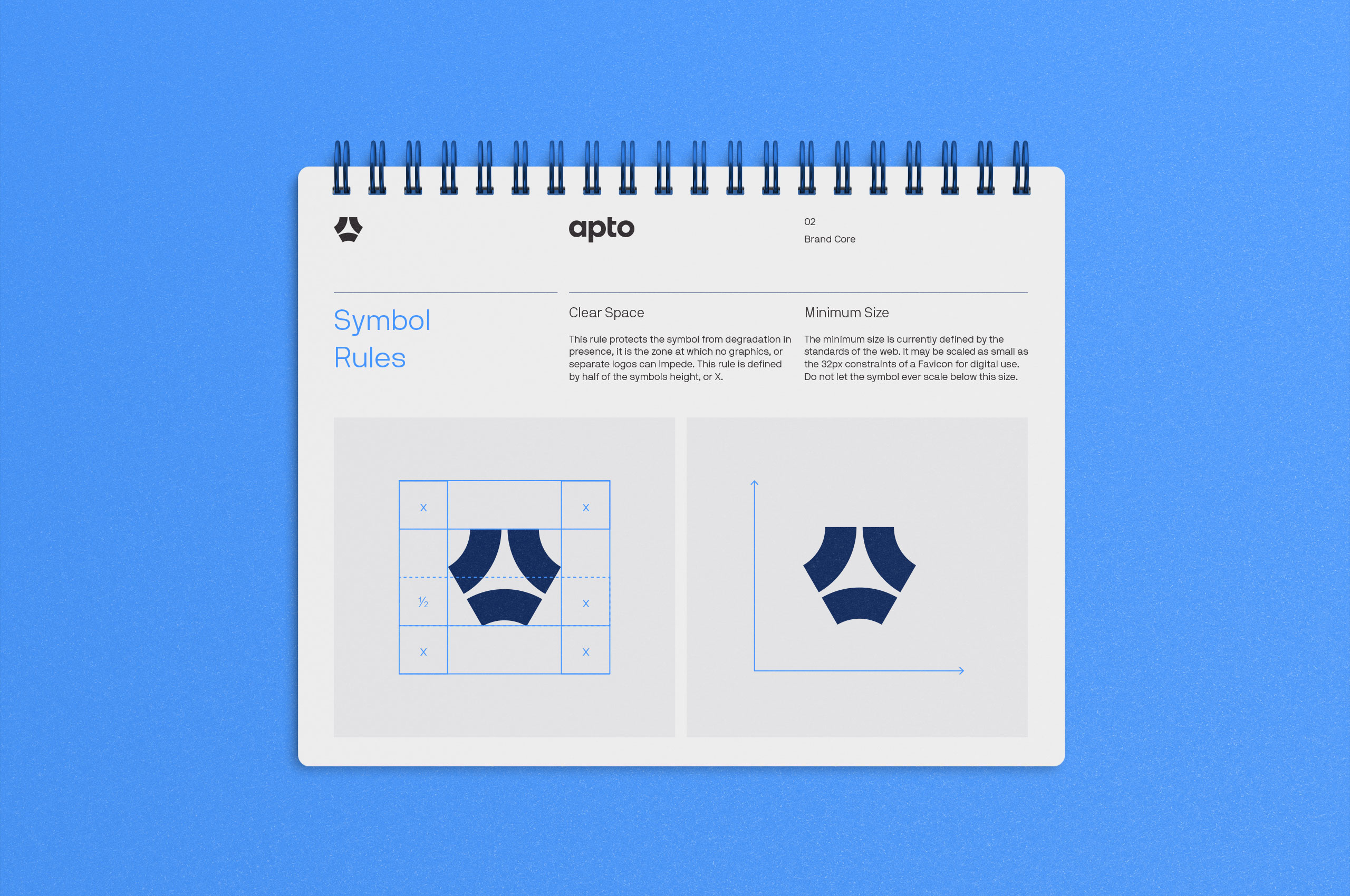
Recognizing that the symbol needed to be updated, we didn’t want to completely lose the equity established. Instead, we created a reinvention of the symbol. Building upon the concept of the connection of three pieces, we produced an updated symbol that showcases the constant input and output of information, creating a simplified workflow for brokers. Saving time and maximizing output, allowing for growth. We reoriented the shapes on a delta, creating a strong upward movement in the negative space, illustrating growth while also representing a simplified “A.”

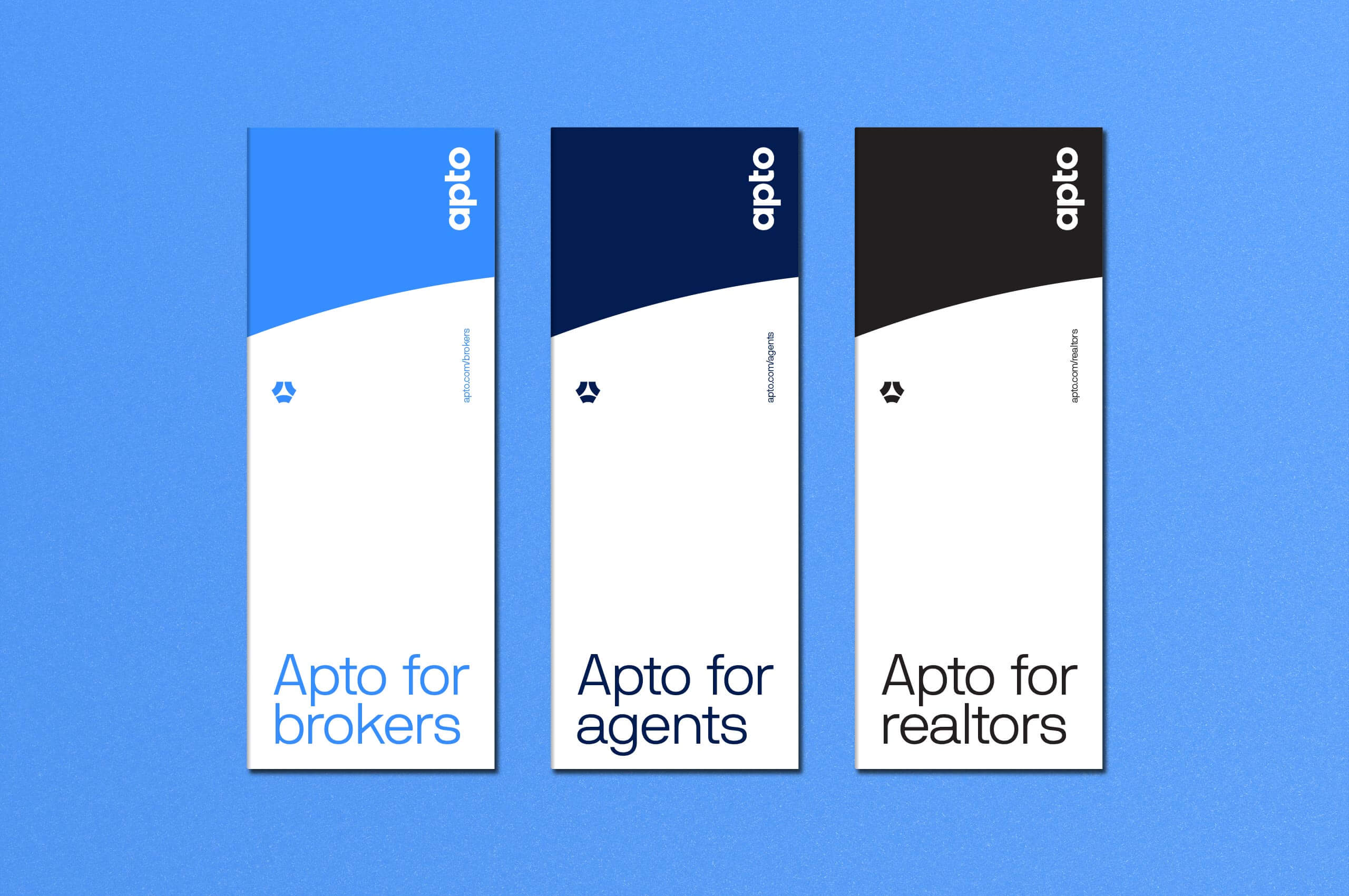
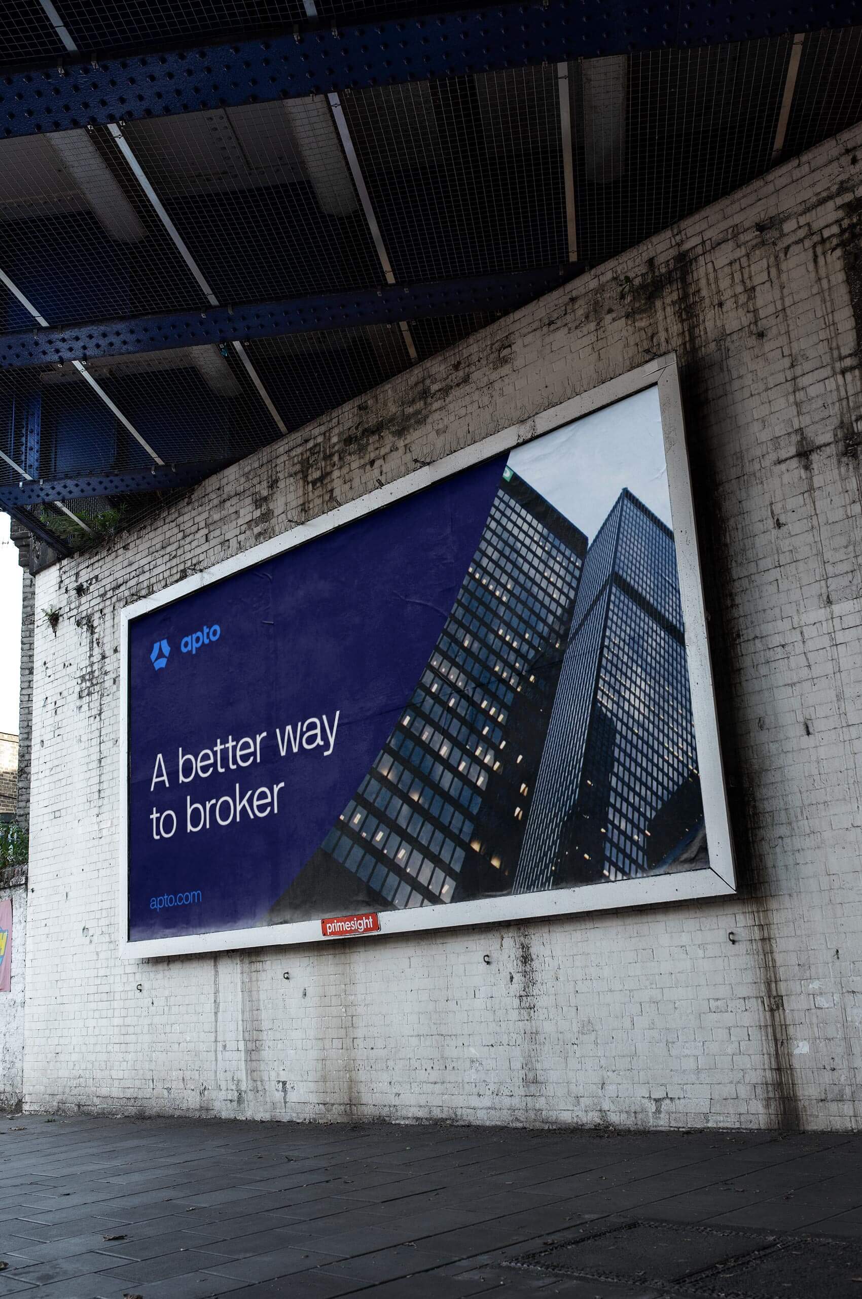
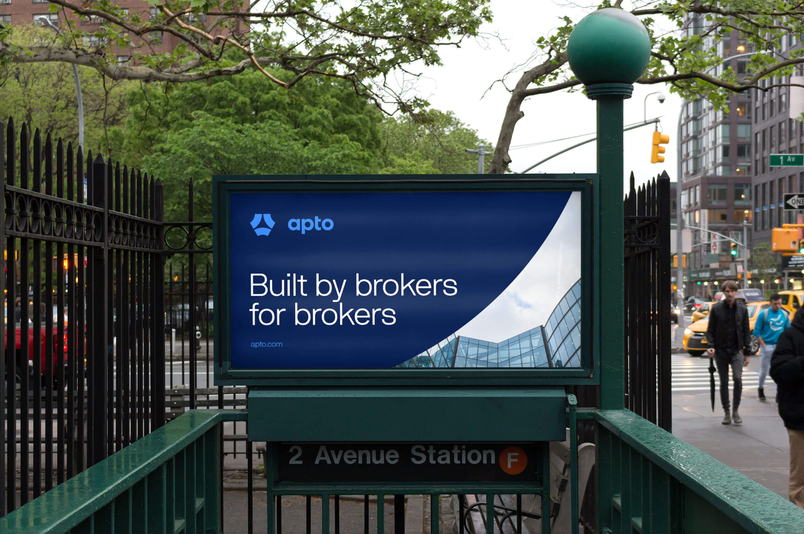
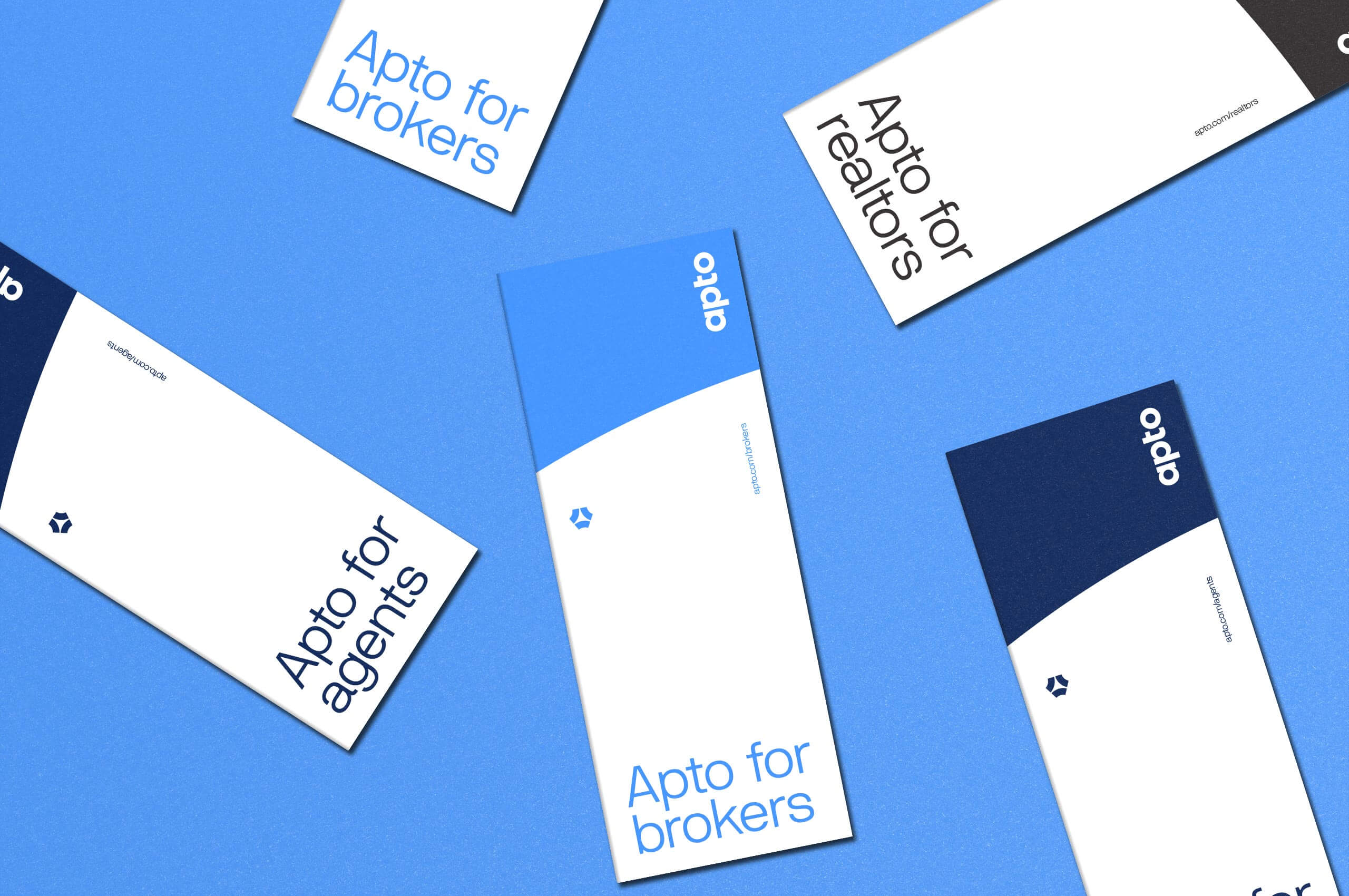
Building upon the motion found in the symbol and desire for simplicity, we created an expressive visual system. Rooted in the flexibility of the product, the system smoothly extends from physical to digital applications.
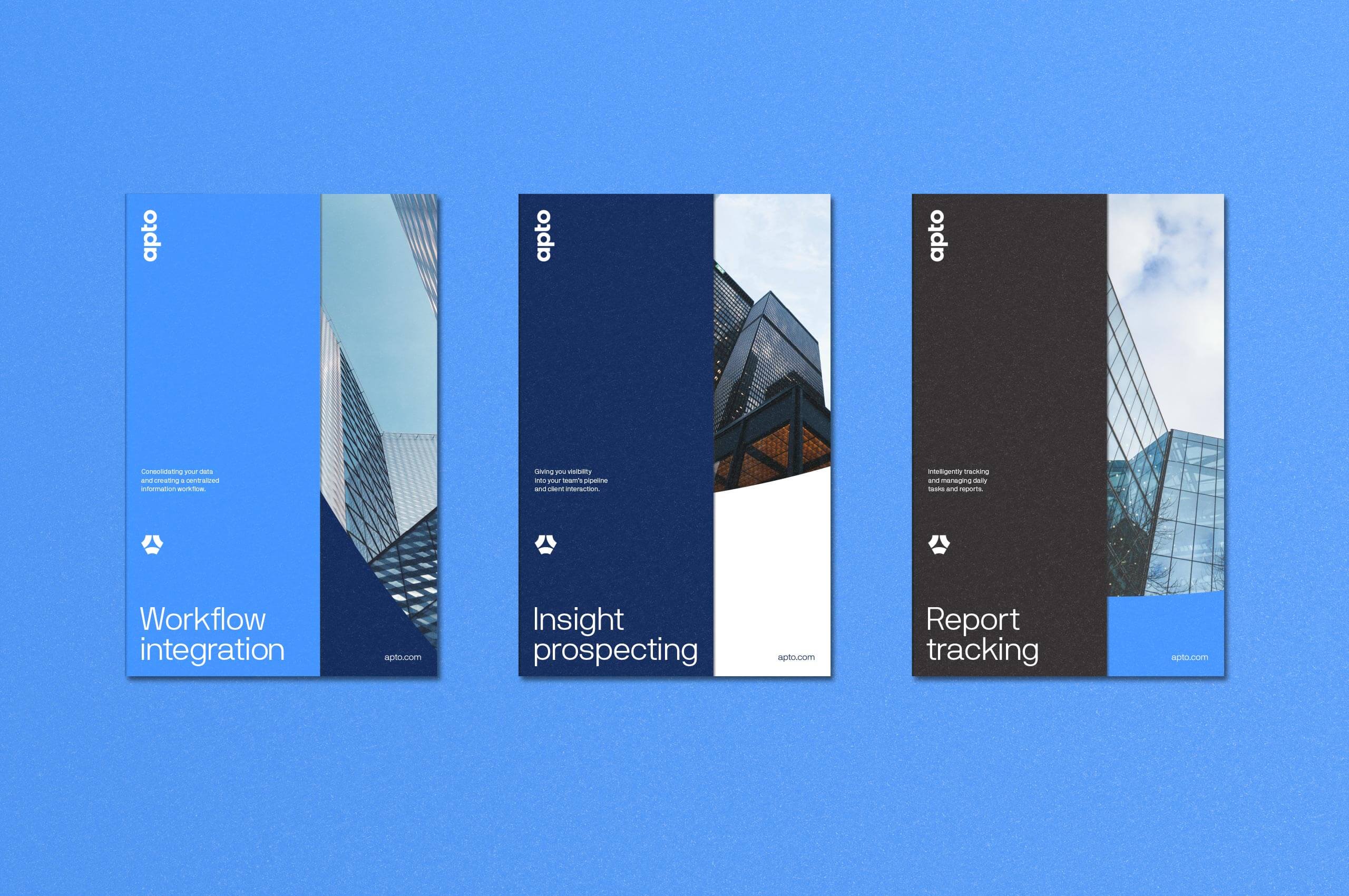
In the larger-scale applications of the brand, it was important to convey the simplicity of the product while incorporating emotive photos that would resonate with brokers passing by. Utilizing these photos along with broker-specific language ensures it will grab the attention of their customers. Ultimately, creating an expressive set of outdoor advertising applications that would resonate with potential customers.