Founders Pledge
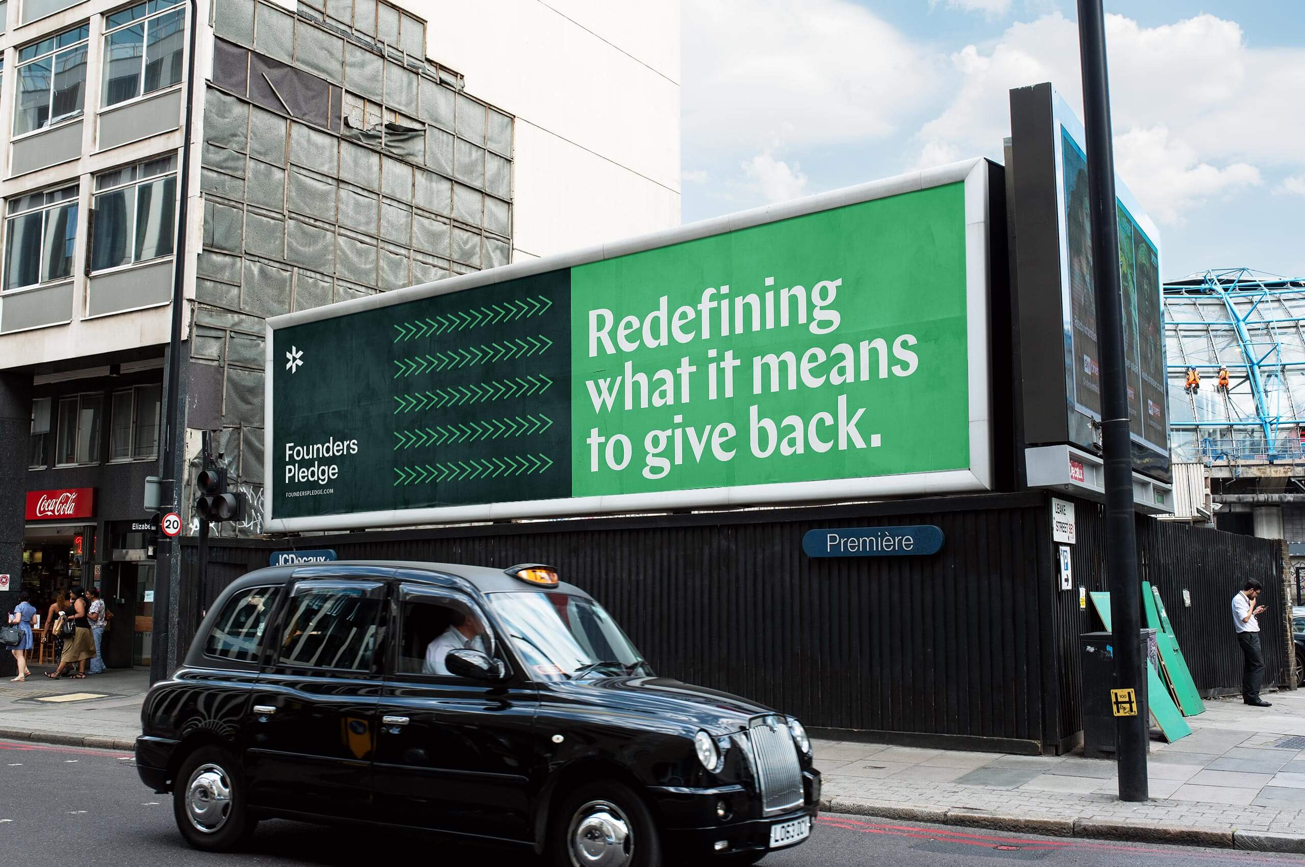
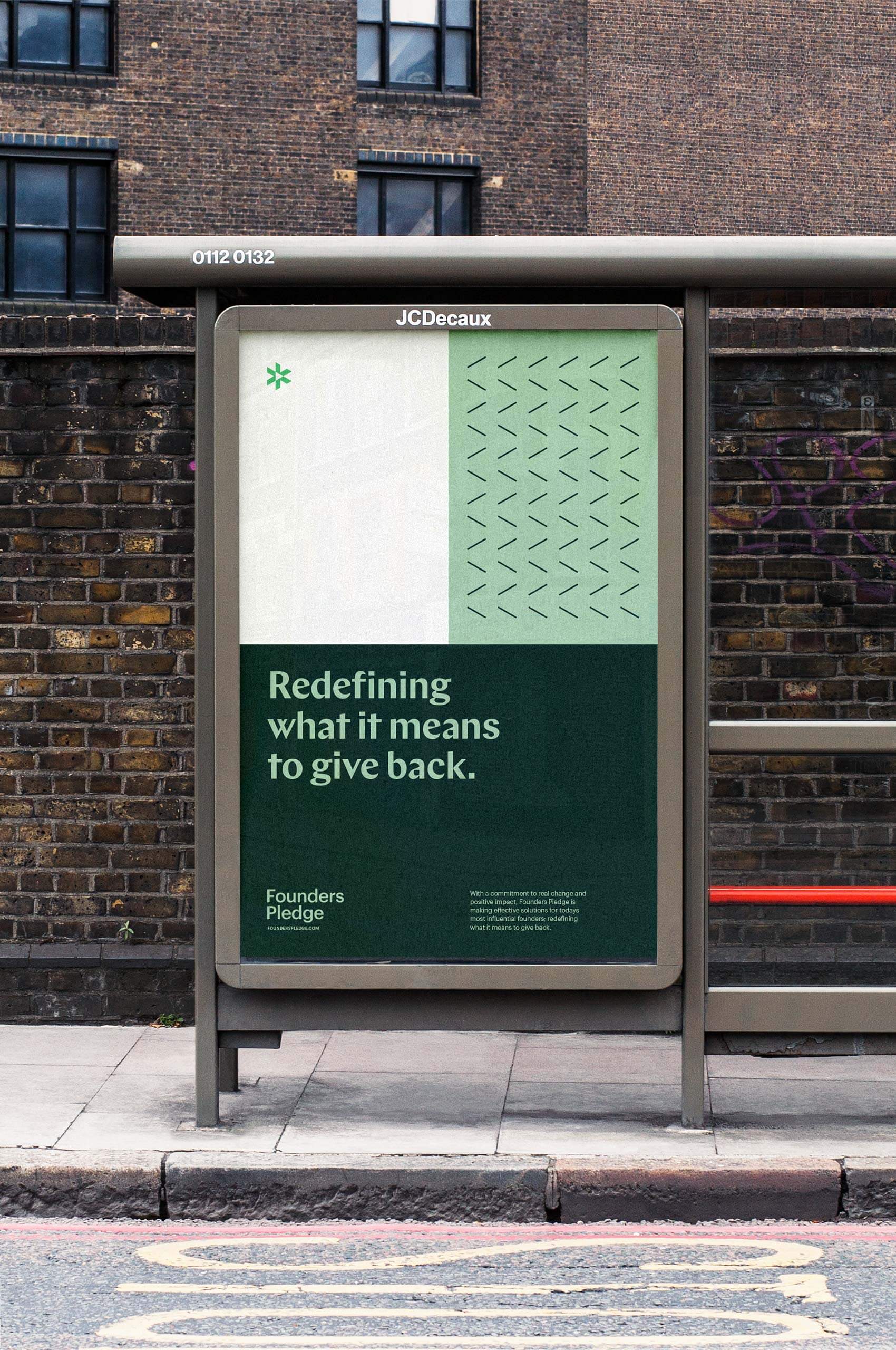
Through impactful philanthropy, Founders Pledge is redefining what it means to give back.
Through impactful philanthropy, Founders Pledge is redefining what it means to give back.
Founders Pledge is a global community of tech leaders with a shared commitment to social impact through philanthropy. Through each member’s binding pledge to donate a portion of their personal proceeds to charity, the London-based non profit is able to achieve this mission.
“Our mission is to empower entrepreneurs to do immense good. We approach this mission with a deep understanding of the sector – Founders Pledge was built for and by entrepreneurs, and launched out of Founders Forum, Europe’s foremost network of digital and technology entrepreneurs. Our board members, advisors, sponsors and funders include some of the most influential voices in the tech sector and social sector.”
They hold a truly unique model. Their operating costs are fully funded by a separate group of founders, philanthropists, and institutions. They don’t charge their members fees or dues. 100% of their donation ends up with the causes they choose to support.
Upon entering a new stage of maturity, they approached Mast to help overhaul their identity; enabling them to reach a wider audience of entrepreneurs. We worked with them to create an updated, elevated, and exciting identity that fell in-line with their growing vision for the company.


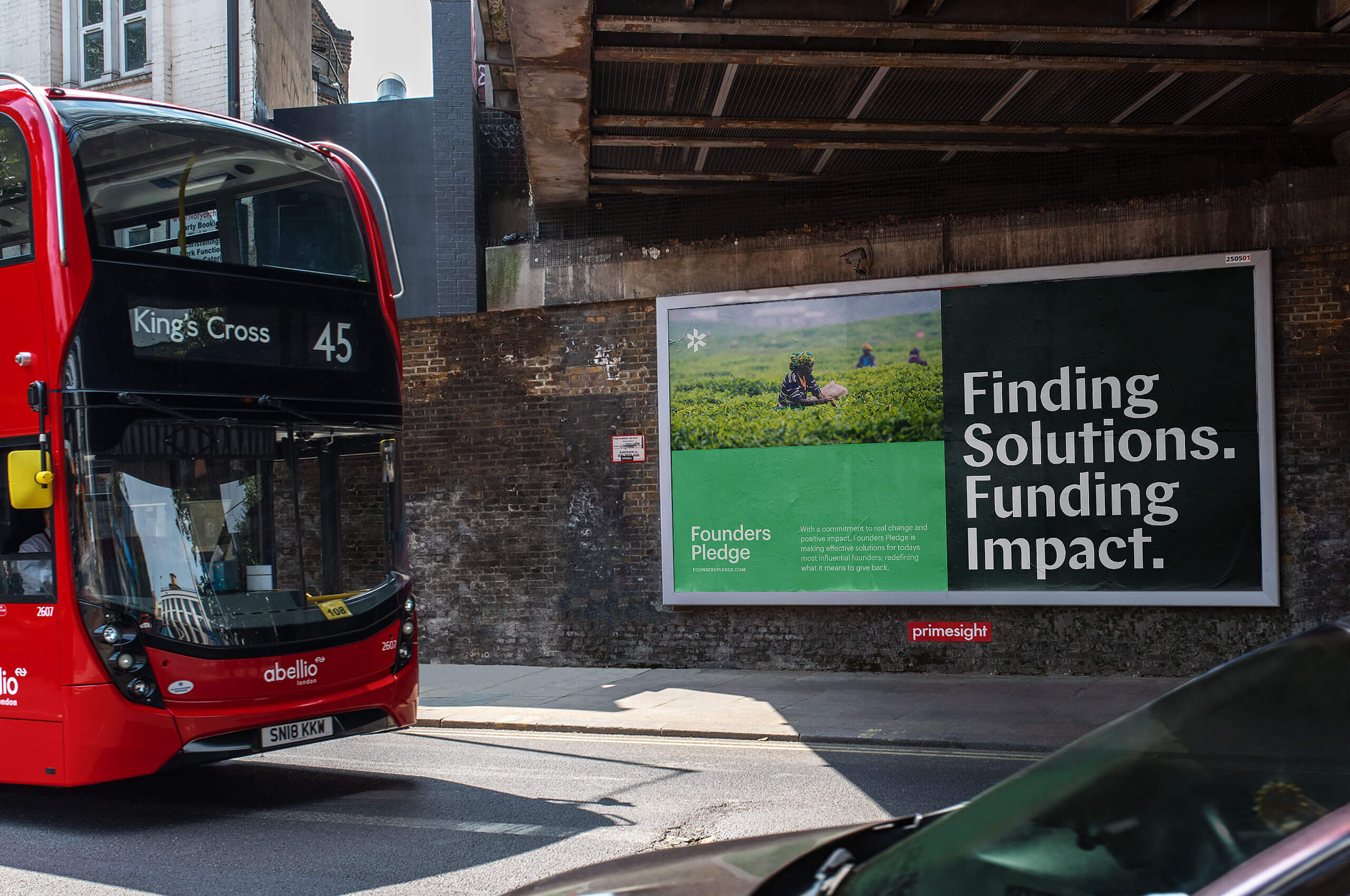
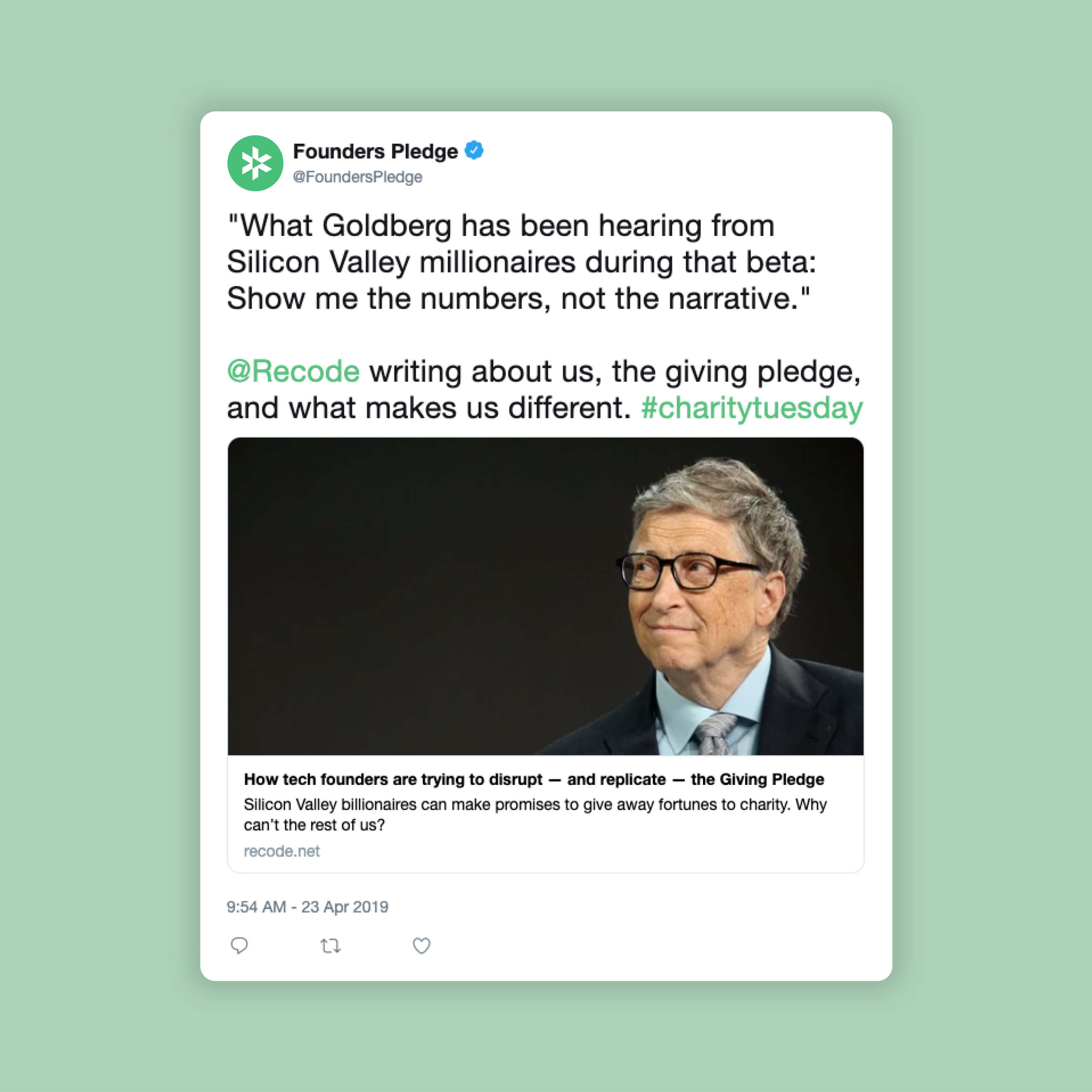
Founders Pledge works closely with founders and charities to maximize impact. They help equip their members with charity research, streamlined giving infrastructure, and a global network of experts to learn from. Empowering them to bring their resources to the global problem-solving table.
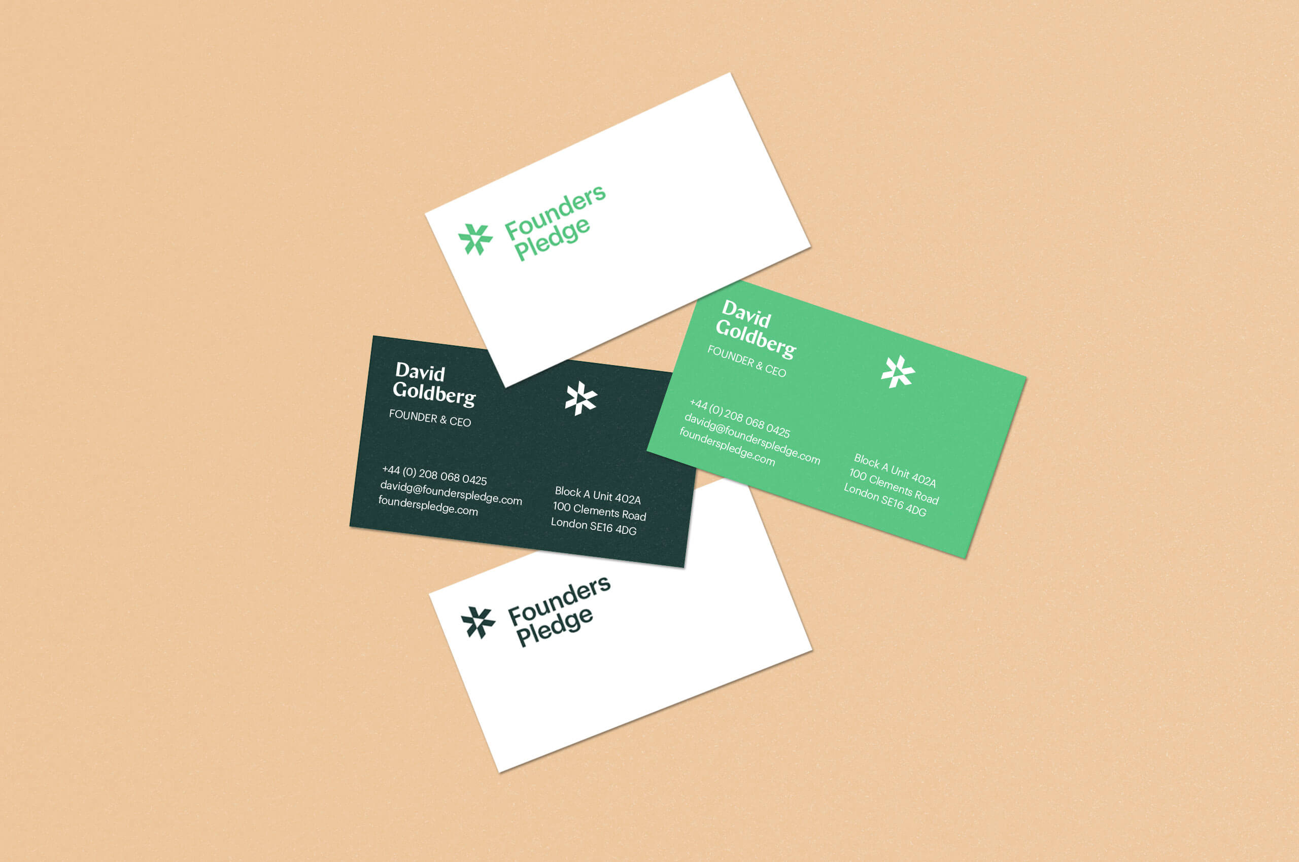
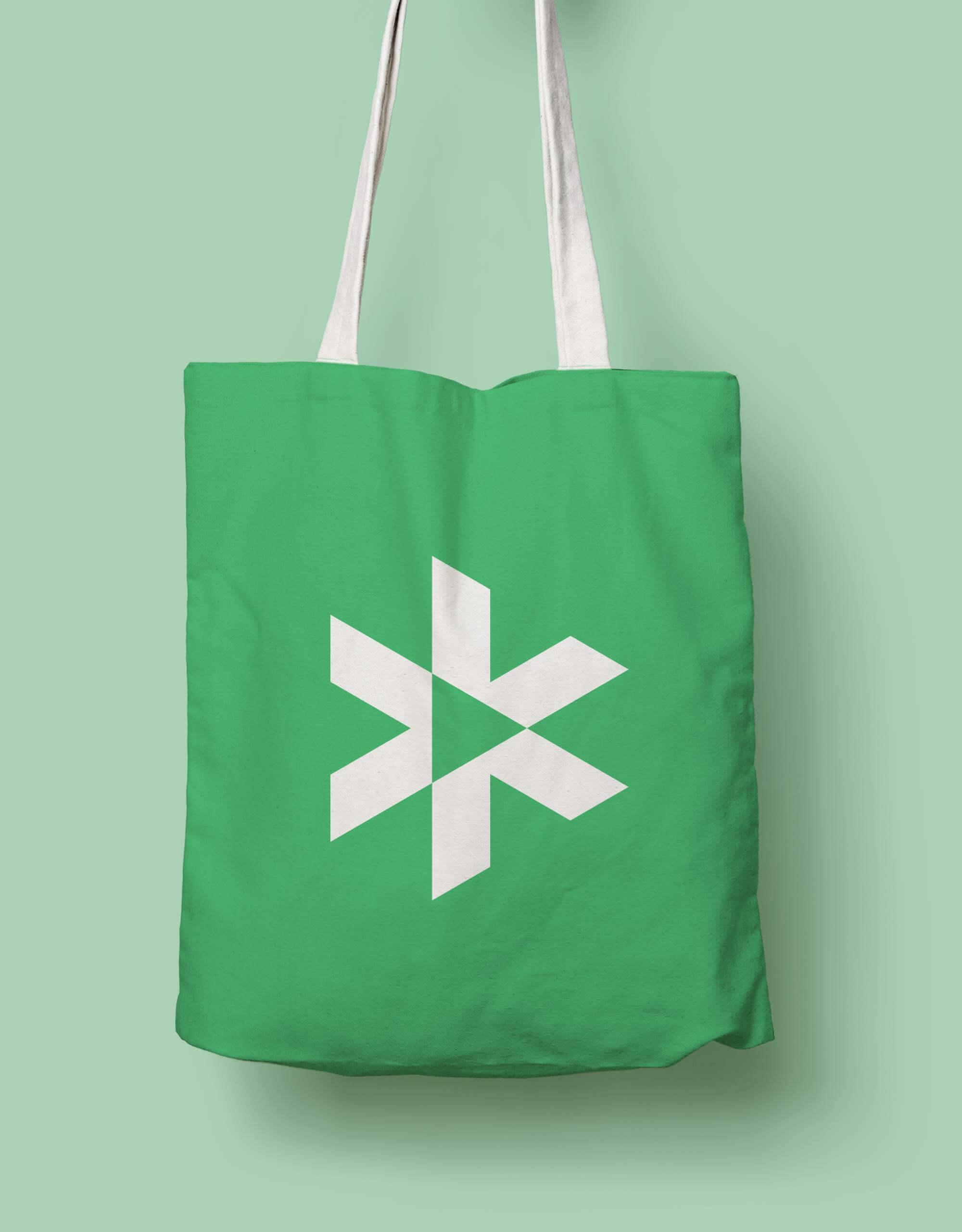
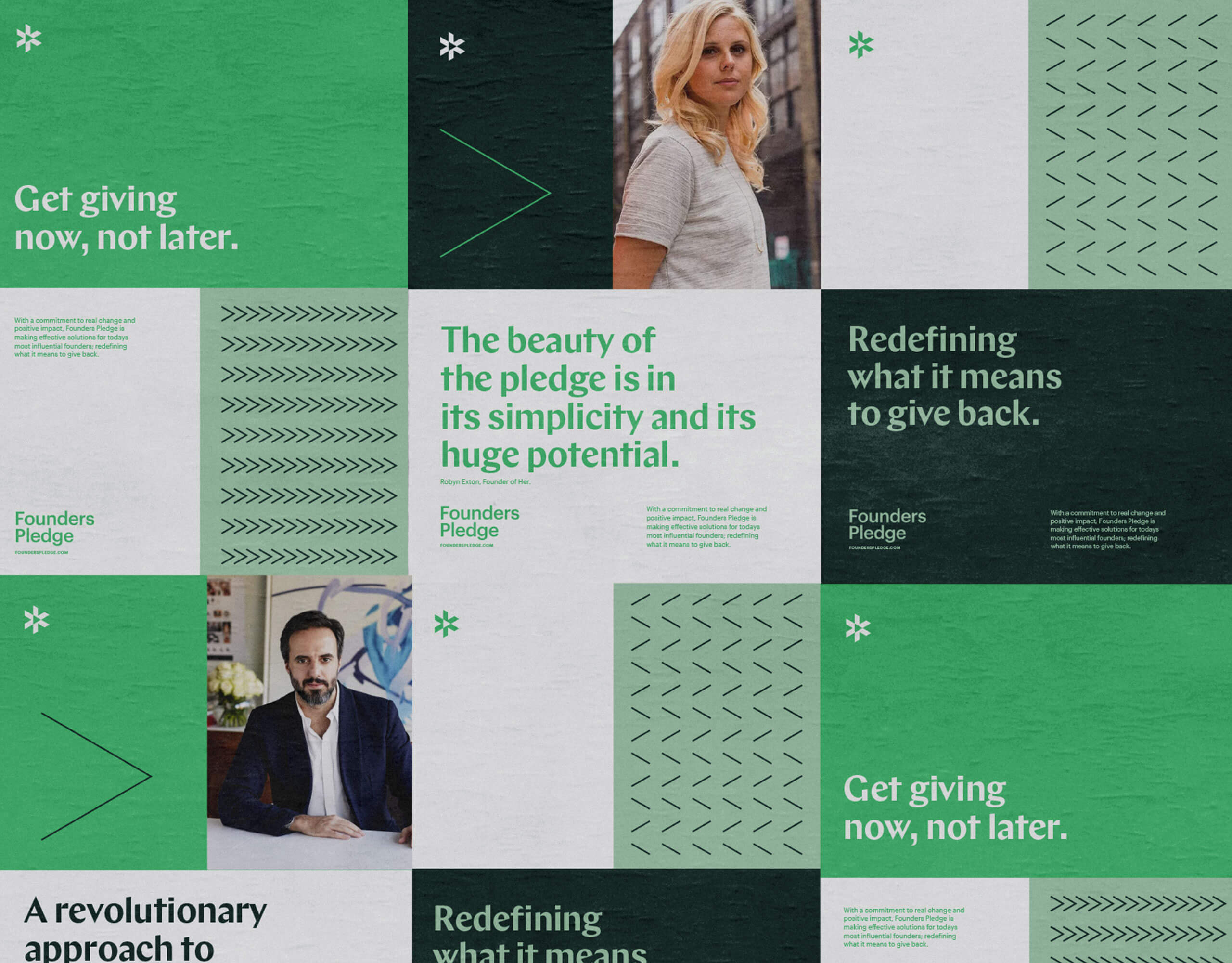
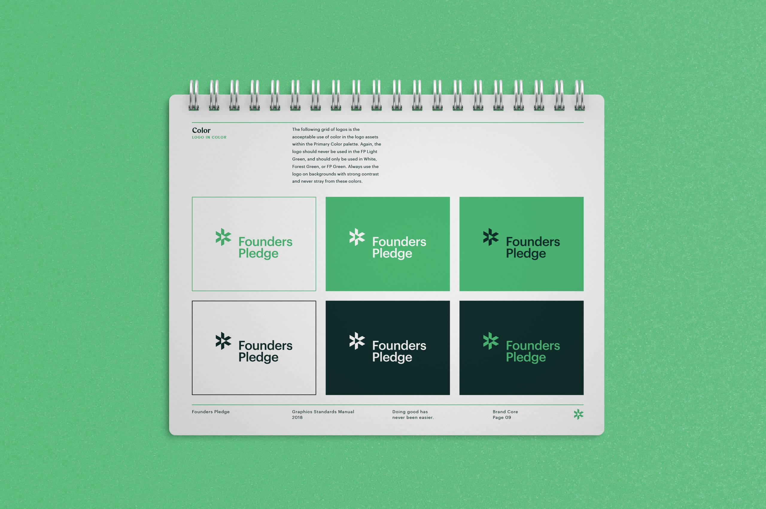
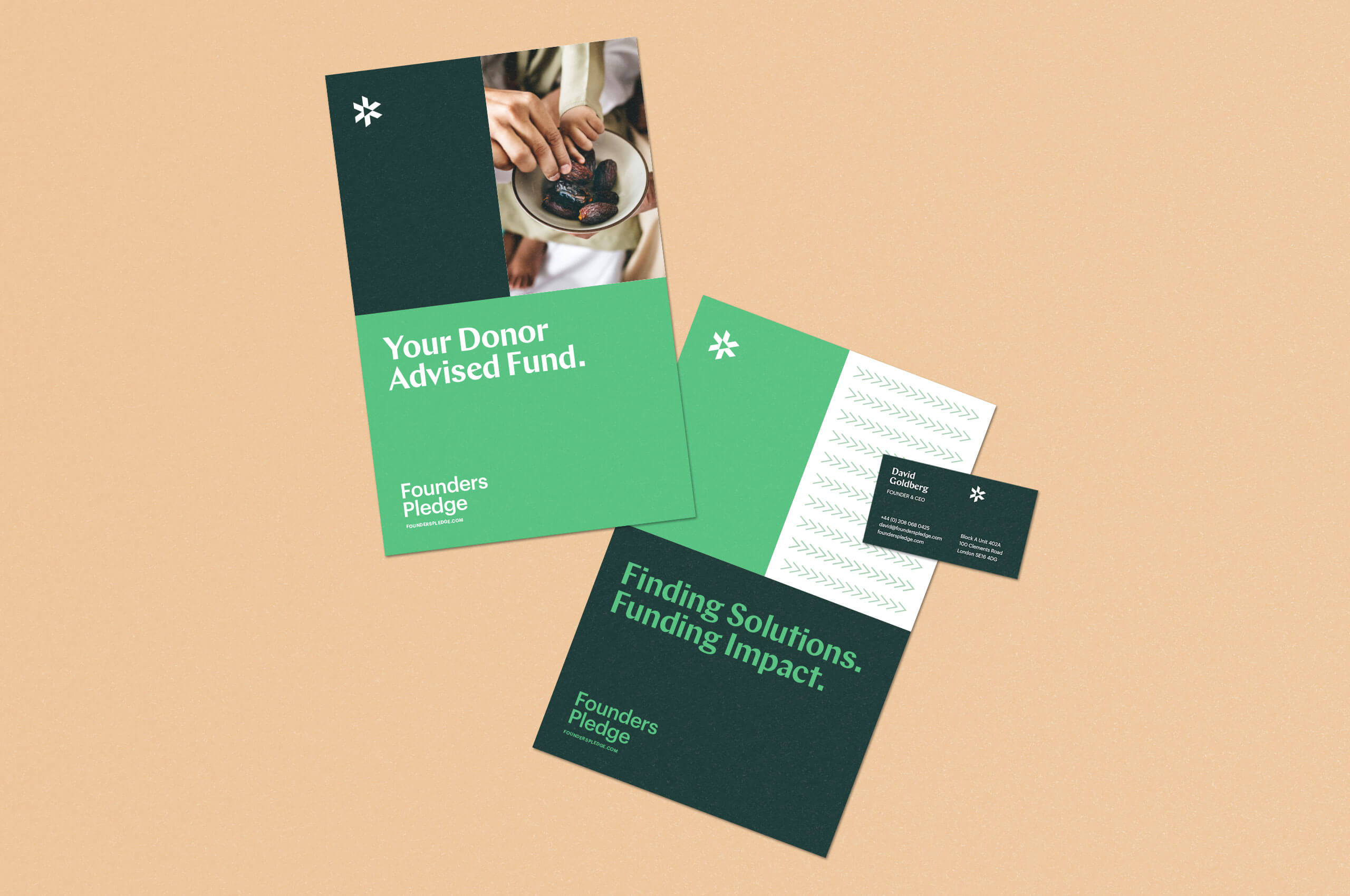
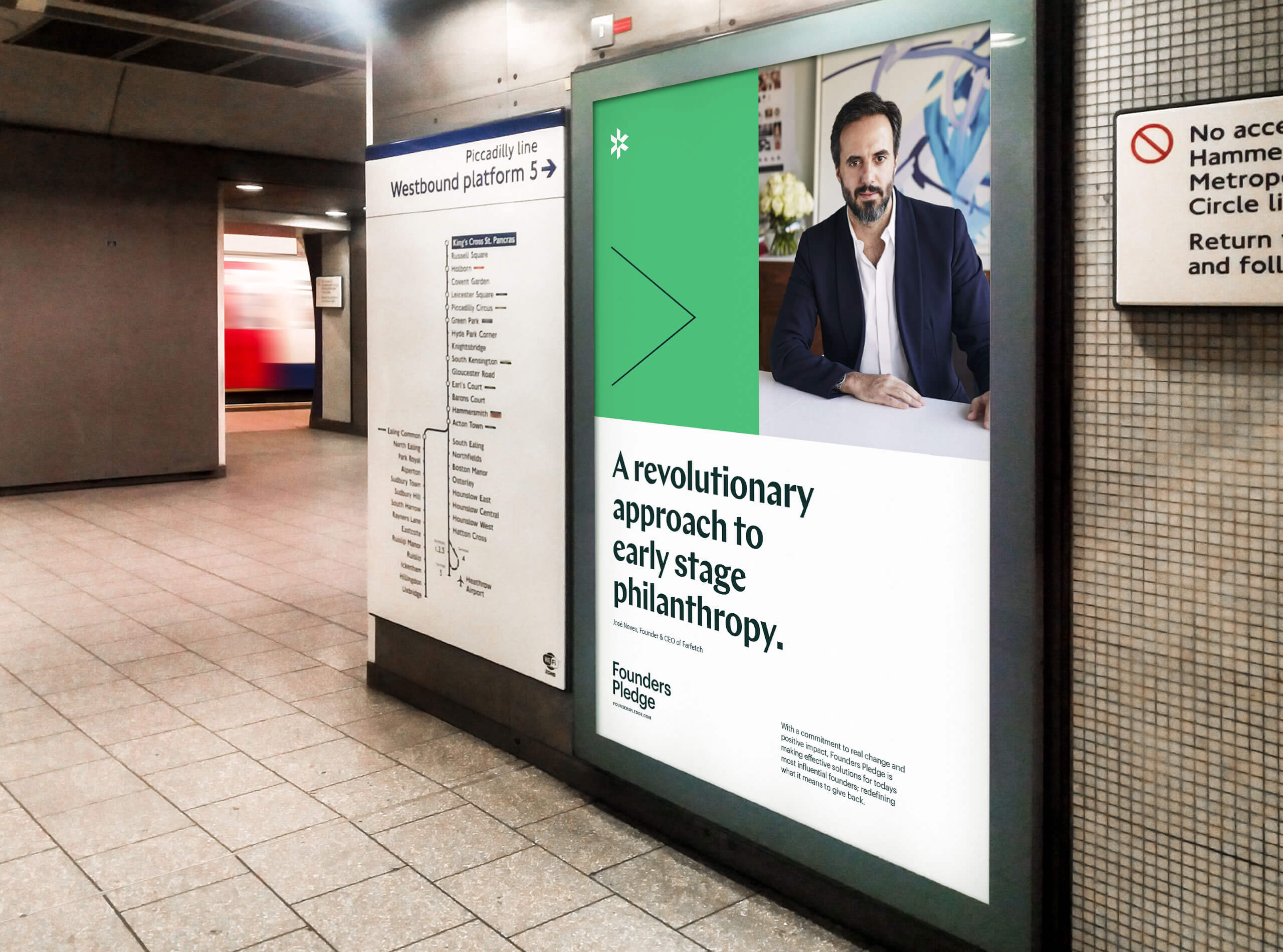
We created the symbol with three arrows converging on a single point, to signify the three components of their model. Founders, Founders Pledge, and the charities they support. These three arrows unite, creating a forward pointing arrow. Symbolizing their commitment to forward progress through impactful philanthropy.
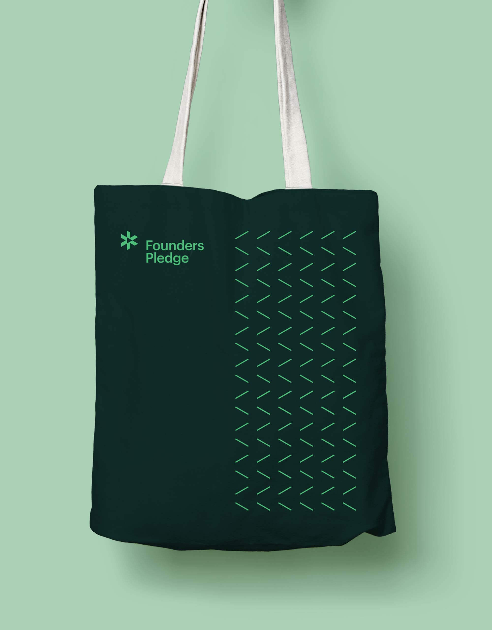
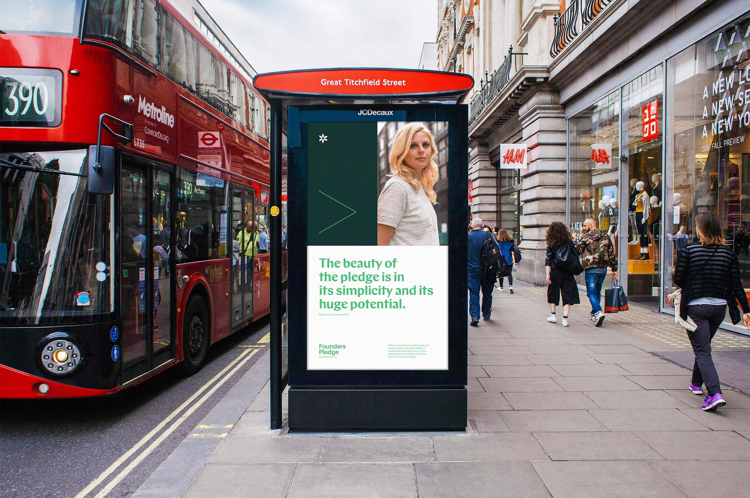
This message of forward progress creates a common thread, woven throughout the visual buildout of the brand through the use of various arrows in multiple applications, the most obvious being patterning.
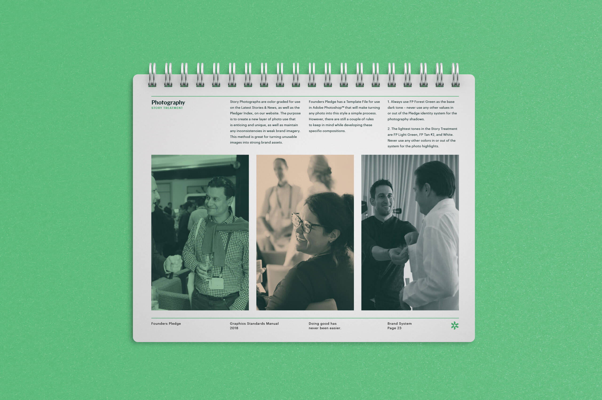
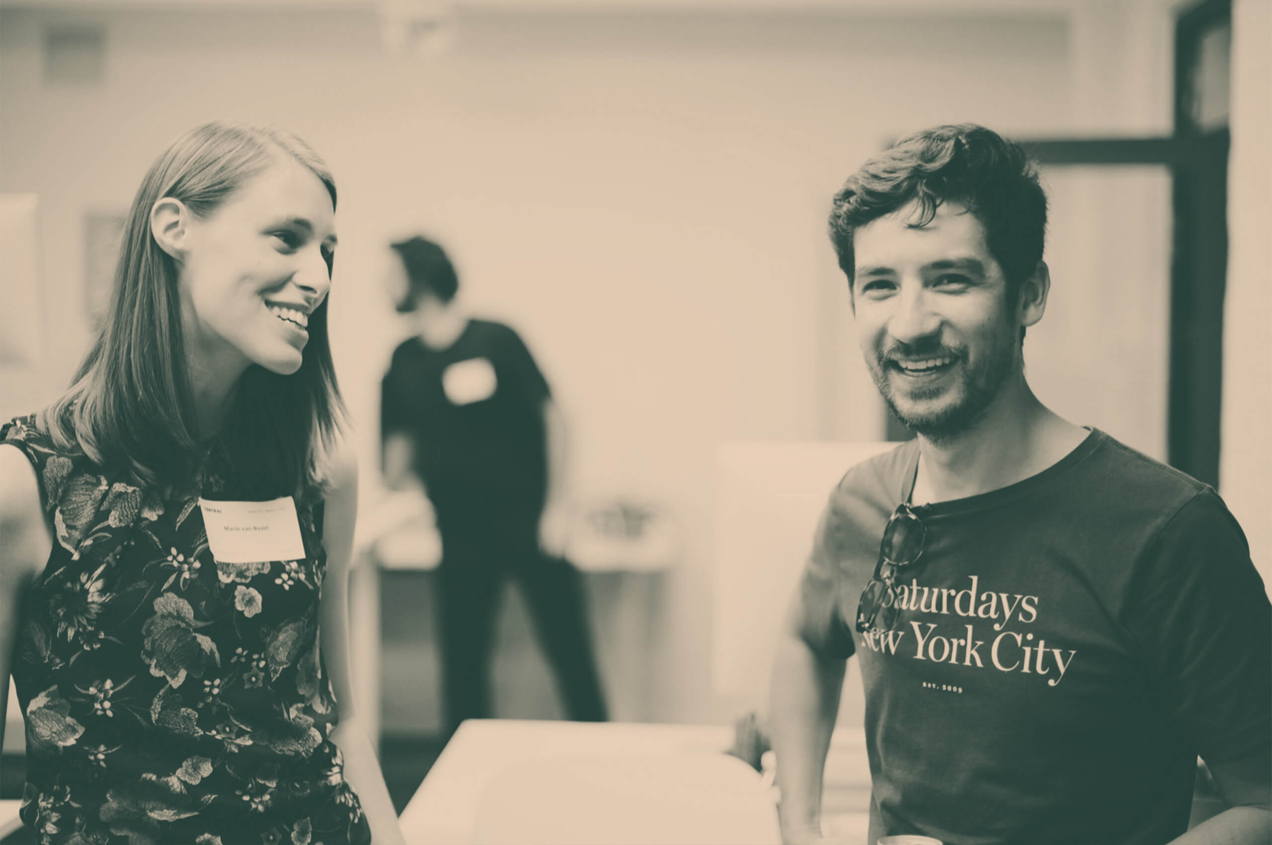
On the previous site, photos accompanying stories and articles were often provided by many different entrepreneurs. This frequently created a visual discord due to the photos being edited differently.
When we began creating assets for the new website, we knew we had to tackle this issue. To combat this, we developed a unique color-grading style to be utilized throughout this section of the site. Creating a unified look, no matter the photos provided.
By working closely with the talented team at Telegraph Creative, we were able to faithfully execute and expand the brand online.
We developed a unique, grid-based modular system to be utilized throughout the physical buildout of the brand, as well as digitaly.This system allows for illustrations, patterns, and photos to seamlessly shift in and out while still feeling like part of a larger, holistic brand system.

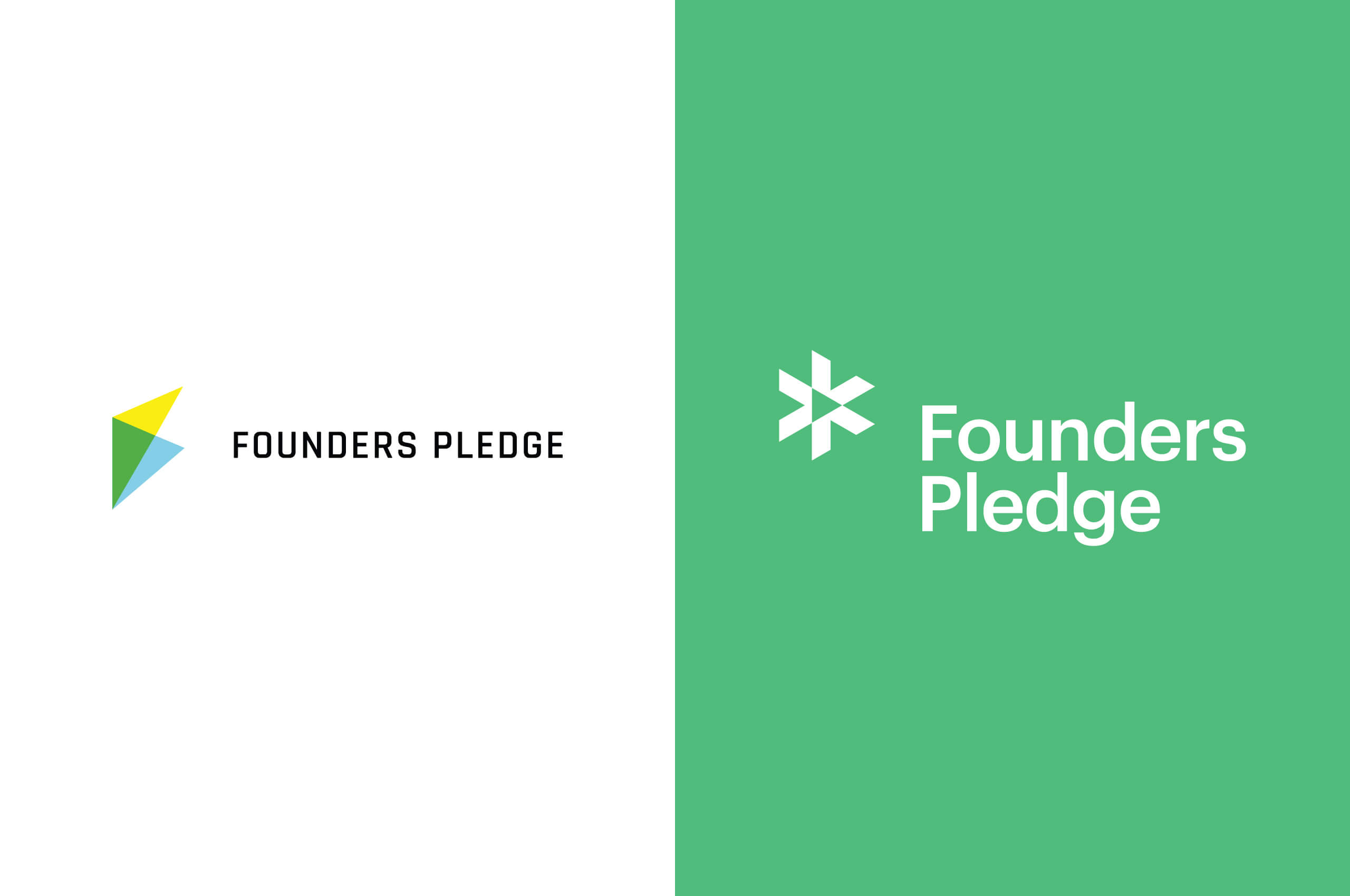
Before and after. Previously, the identity utilized a letter-based mark. Limiting the reach and impact of the brand as they move into new markets. Creating an abstract, representational mark was an important factor in their decision to rebrand.