Gobble
In 15 minutes or less, you can have fun making a delicious dinner and get back to spending time with family.
In 15 minutes or less, you can have fun making a delicious dinner and get back to spending time with family.
One of the original meal kit companies, Gobble decided to take the time to perfect its offering before planning a large expansion. When the time came for that large expansion, they realized their brand needed an update.
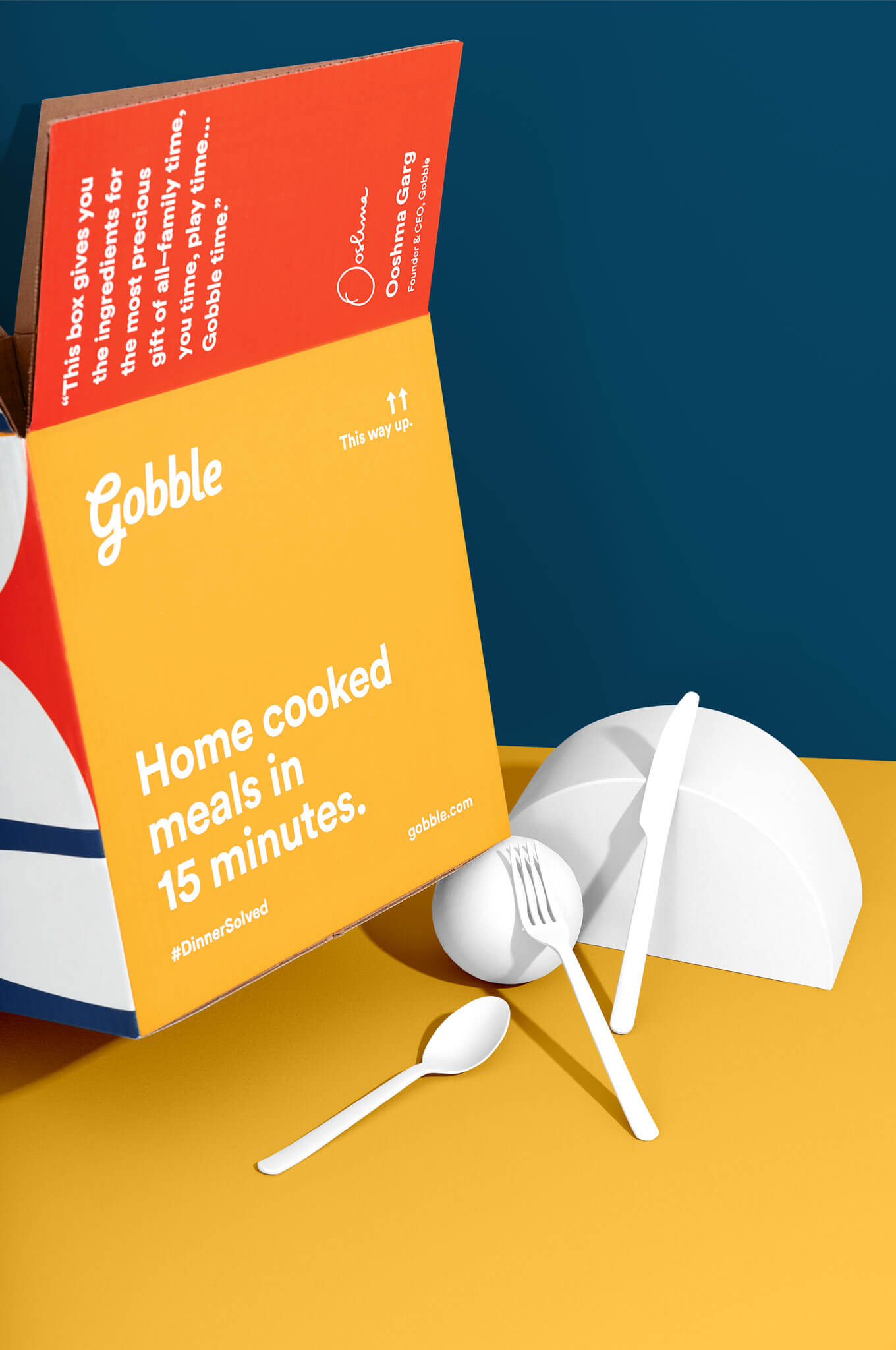
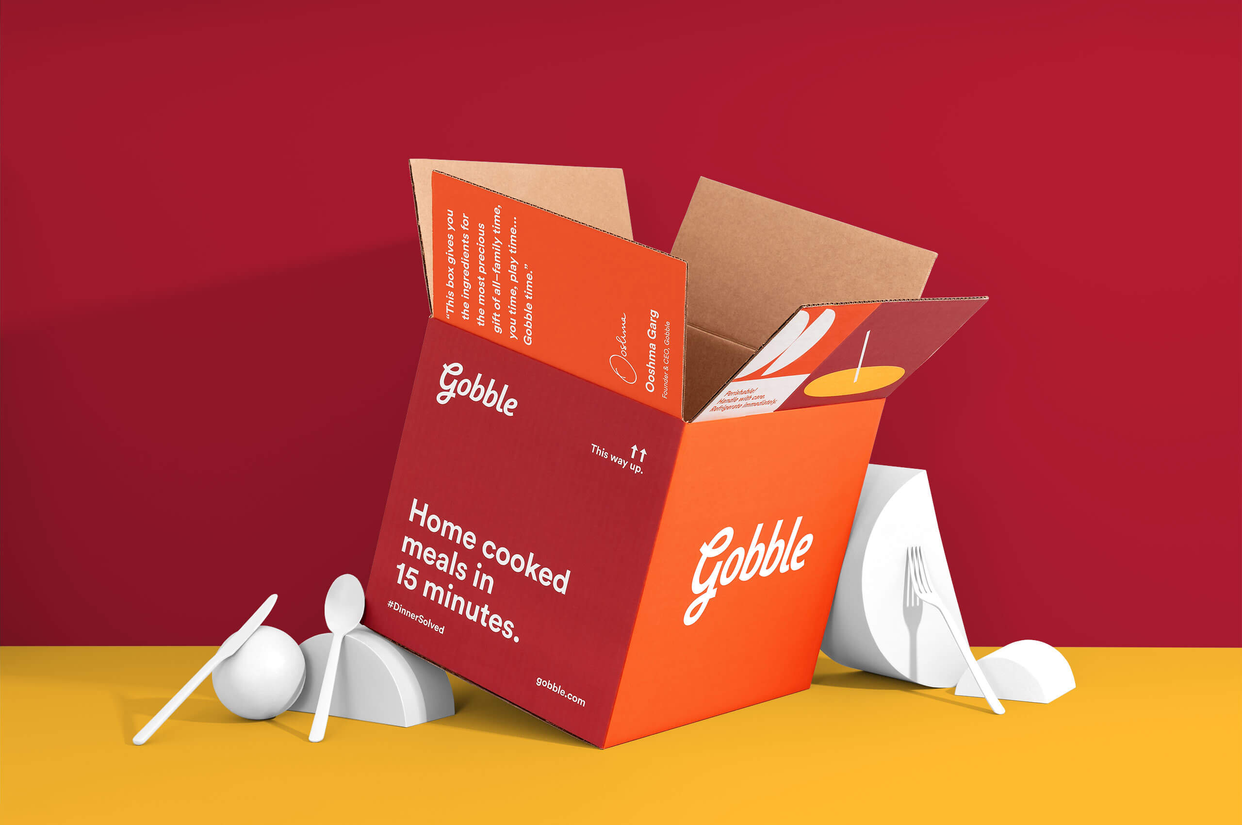
The ethos behind the company is to create 15-minute gourmet dinners that you can cook with a single pan. All ingredients prepped and ready to go into that pan. By simplifying the process, Gobble created a uniquely fun cooking atmosphere especially for working families, without hours of prep and cleanup time. Allowing families to get back to spending time with their loved ones.
Mast partnered with our friend Mackey Saturday to create a brand that felt as fresh and fun as the meals and experiences offered by Gobble.
Photos by Scott Snyder


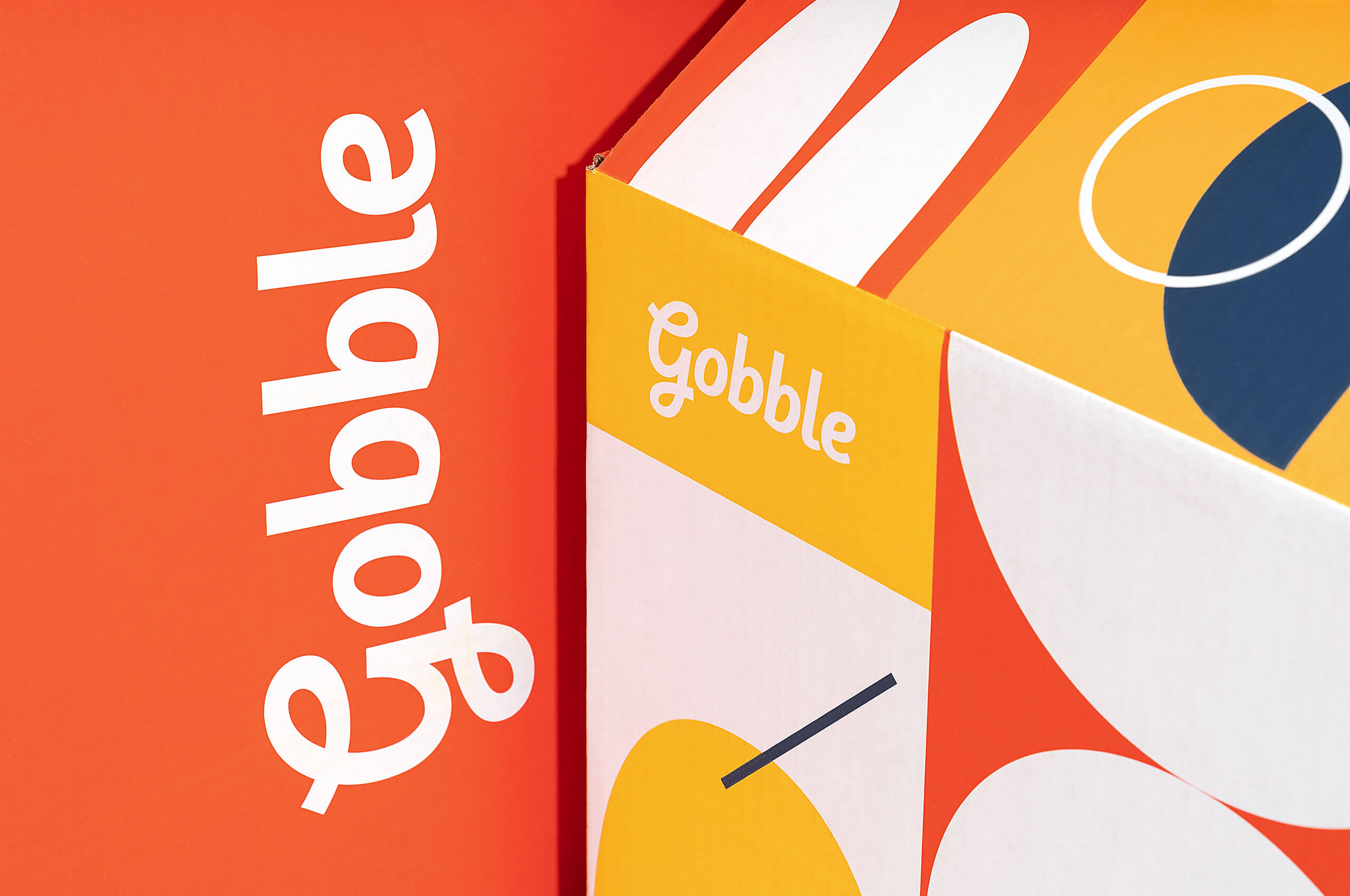
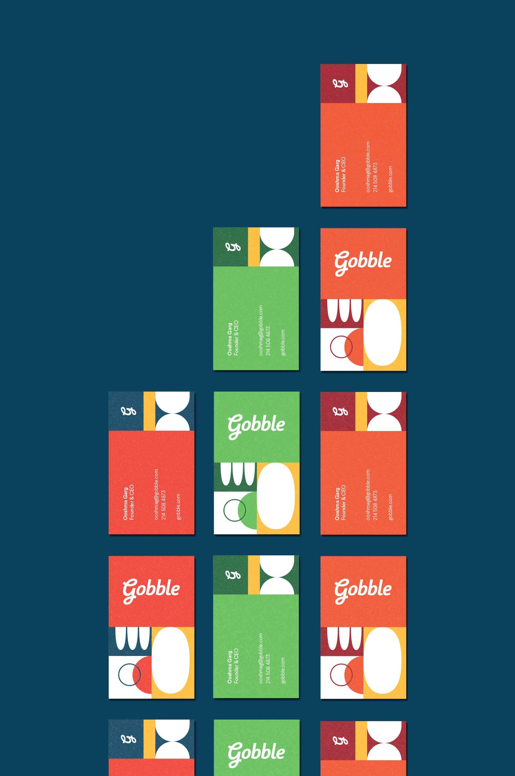
It all started with the wordmark, with the system to follow. It was important to create a fully custom wordmark for Gobble that built upon their existing logo to preserve brand equity. While updating to embody their ease of use and customization of menus.
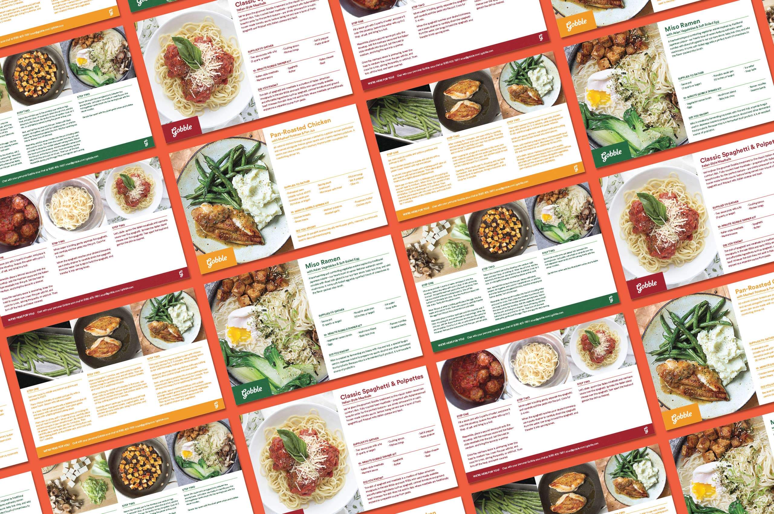
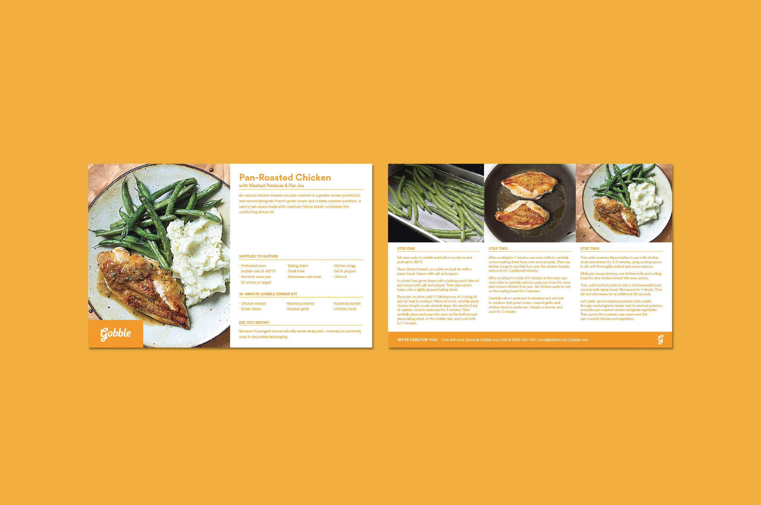
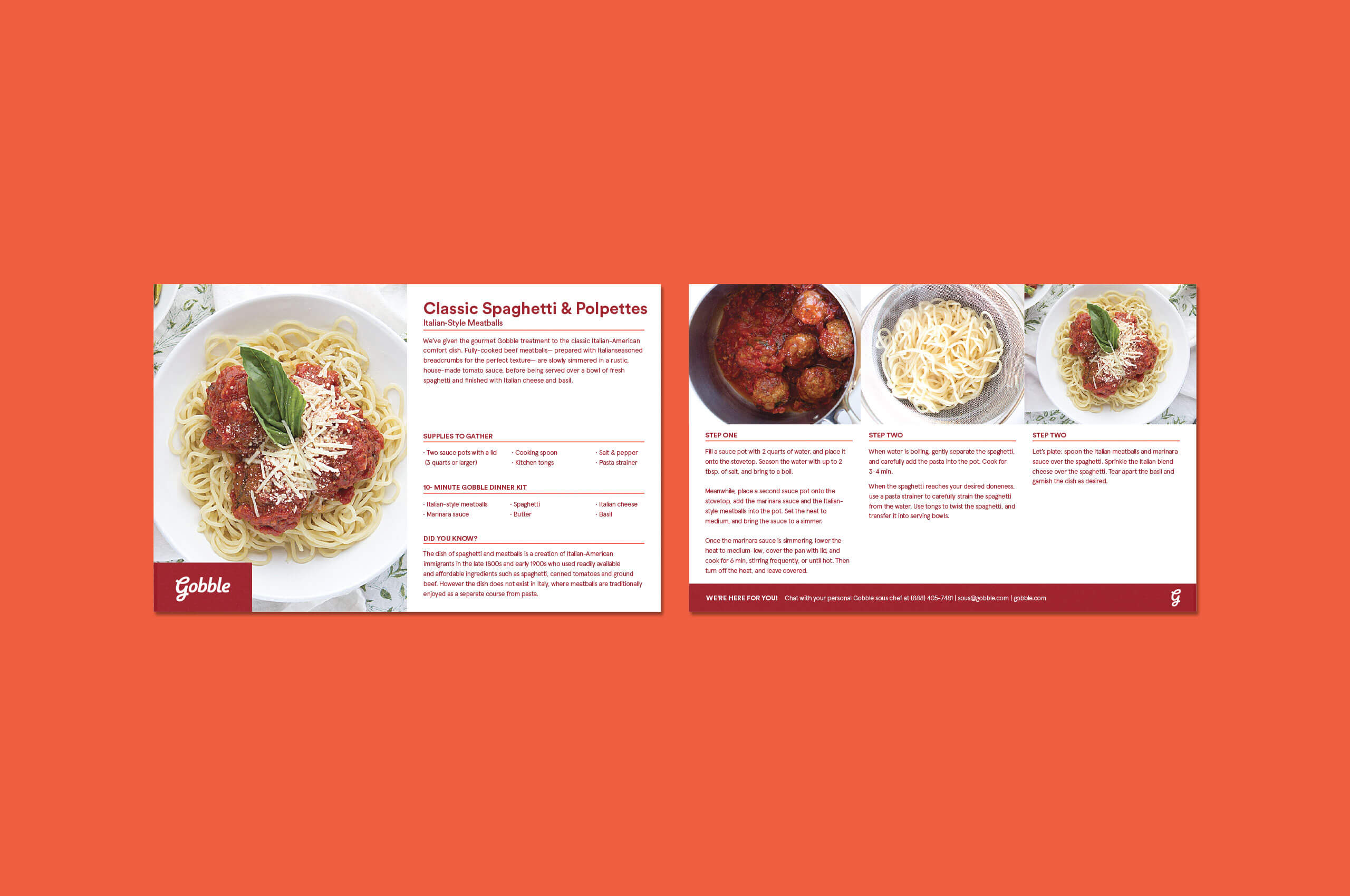
With a brand that was so fun and lively, we still needed to be able to present information clearly and concisely for the user. Allowing them to quickly understand the steps needed to make their meal. We designed a restrained set of recipe cards that would live inside the boxes, removing the patterns to allow the food to be the star of the show. All corresponding to the specific meal/protein type for faster recognition by the user, right out of the box.
We were so excited to work with Dann Petty who brought the brand to life on the website.

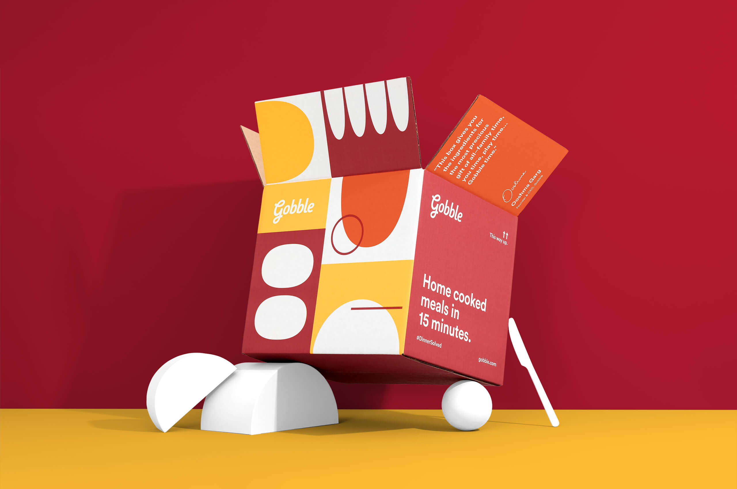
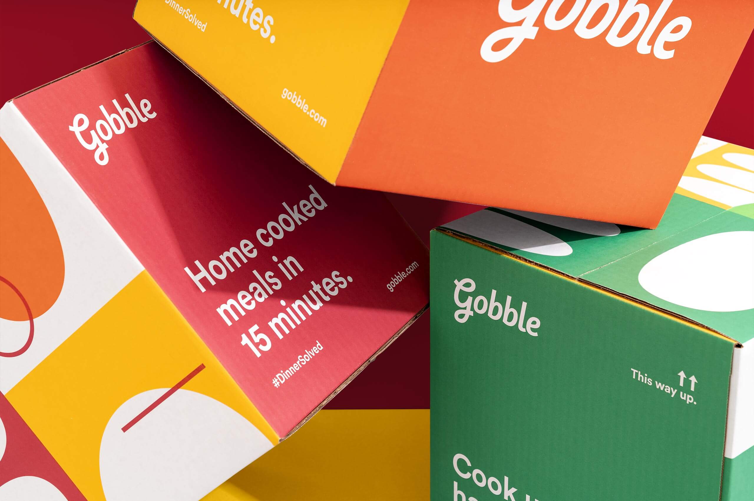
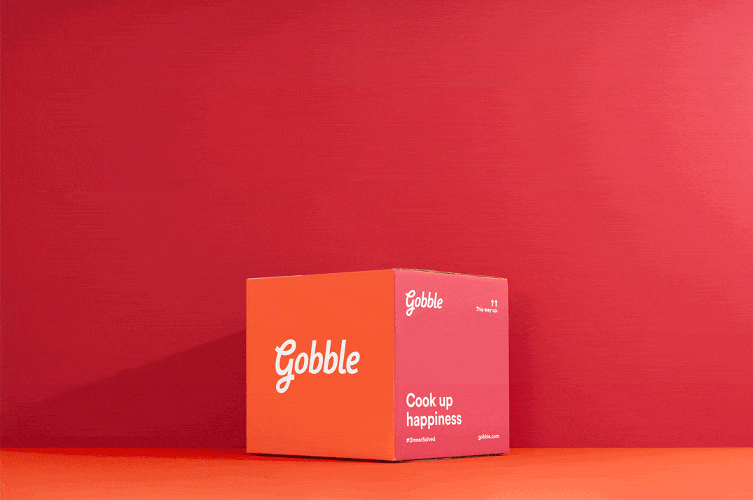
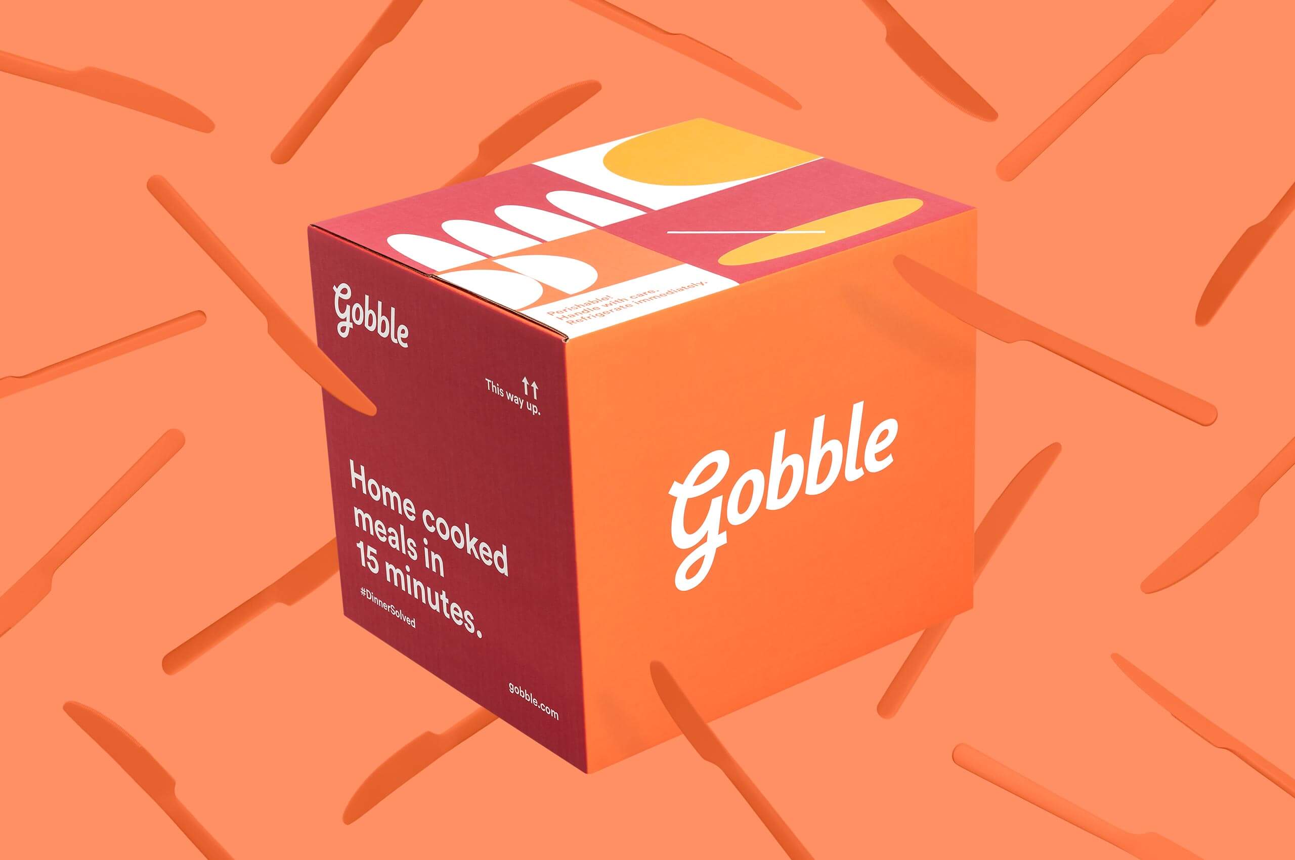
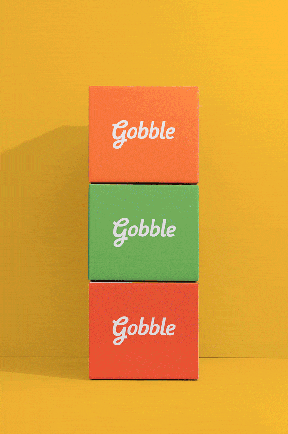
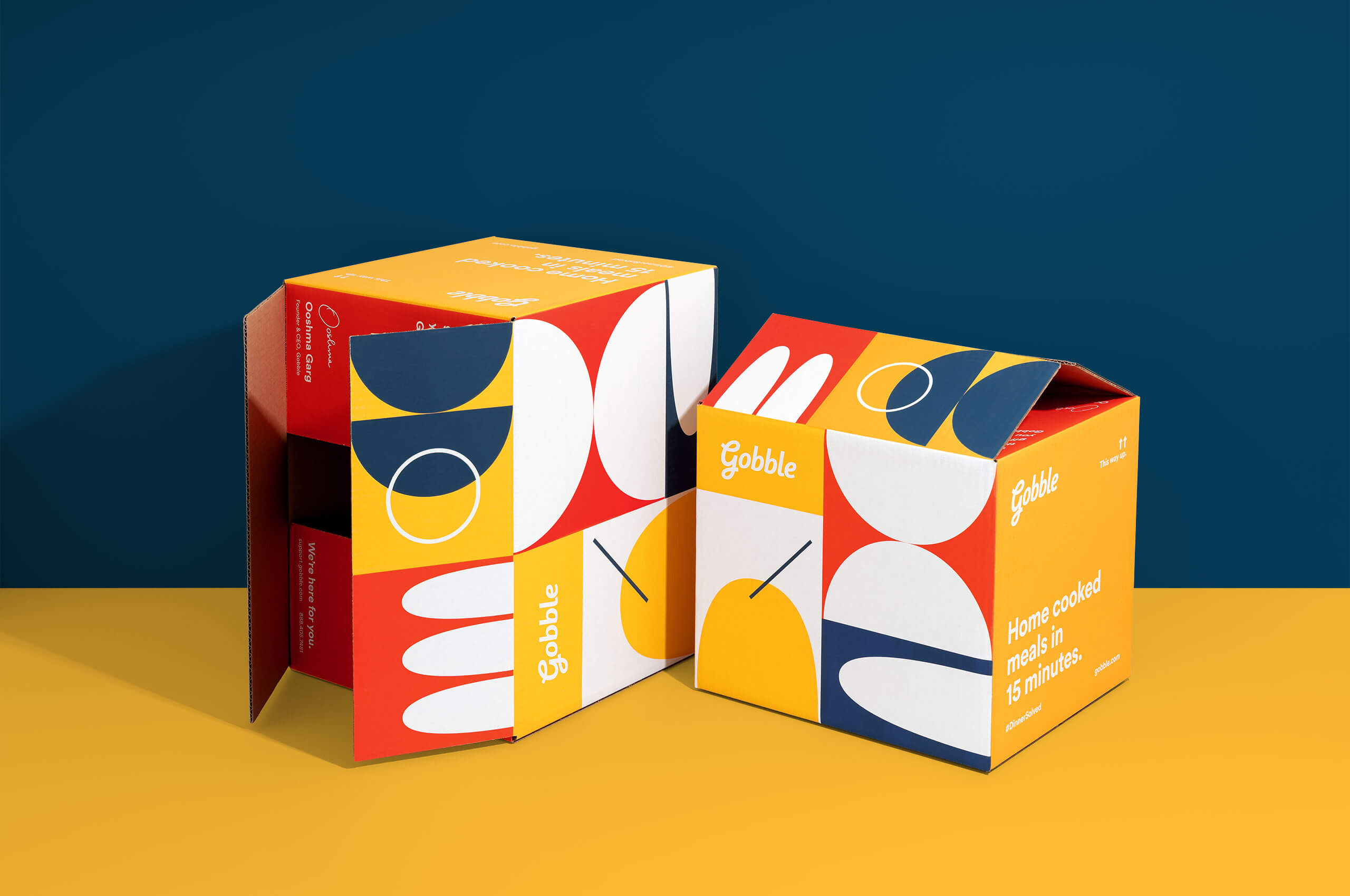
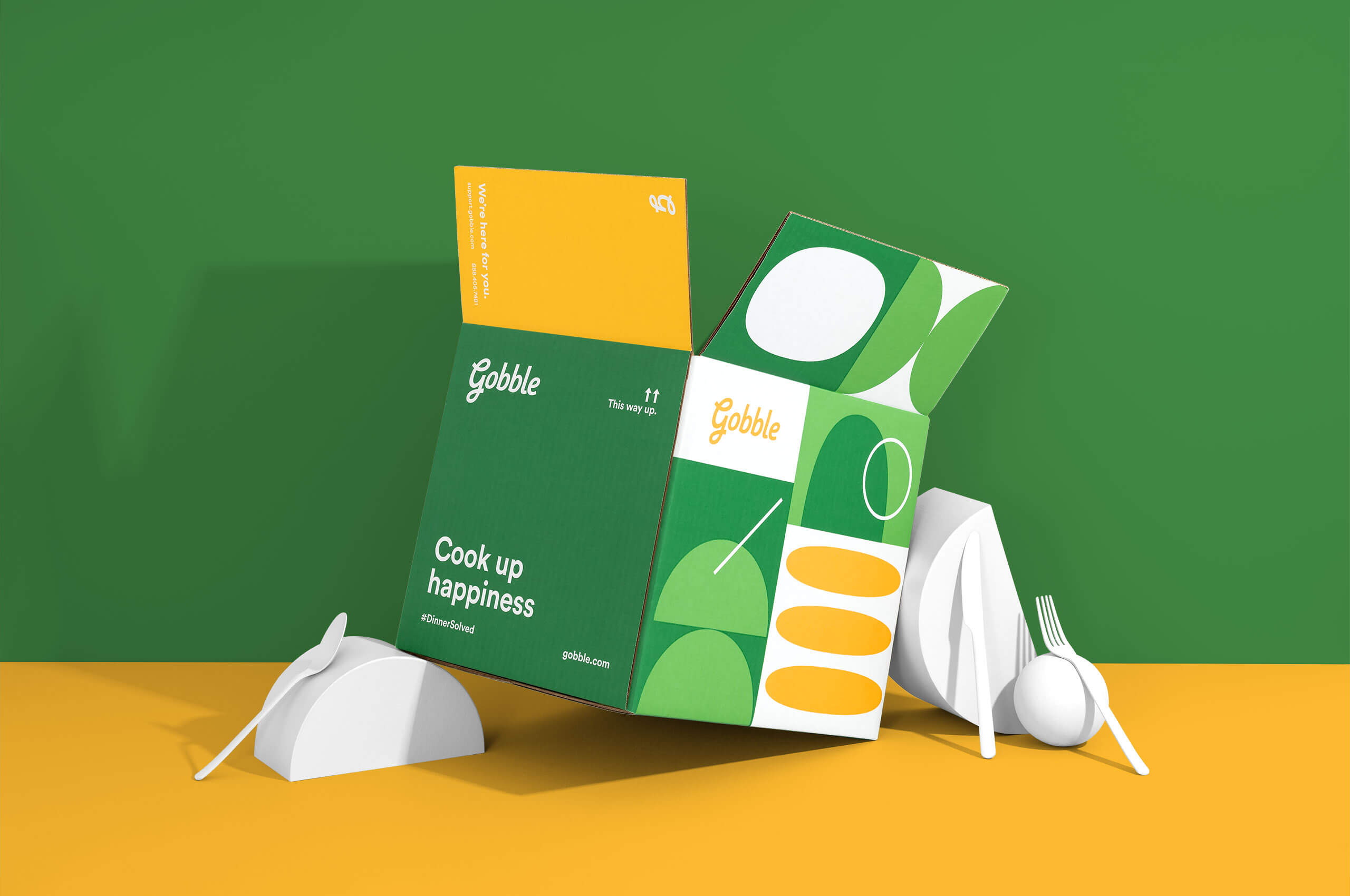
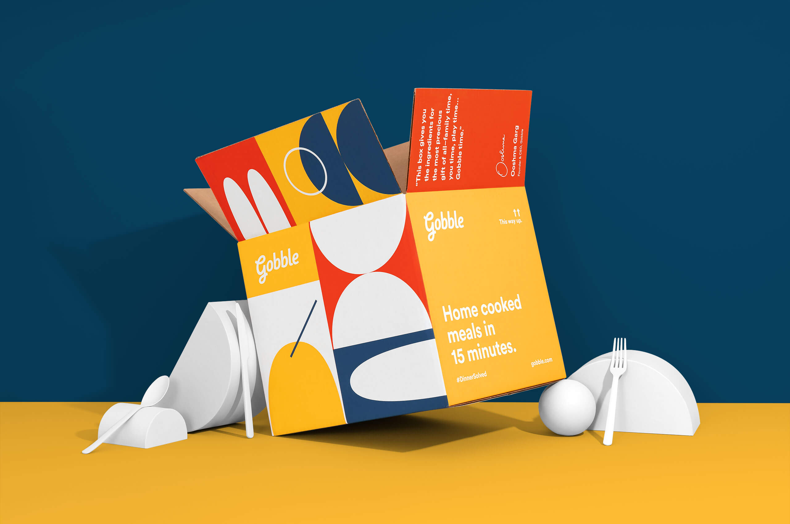
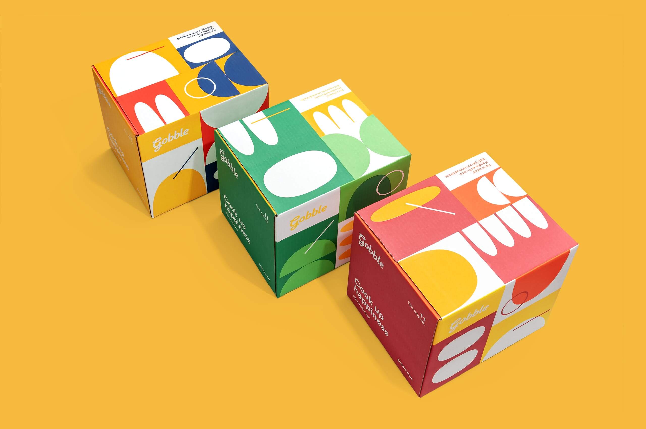
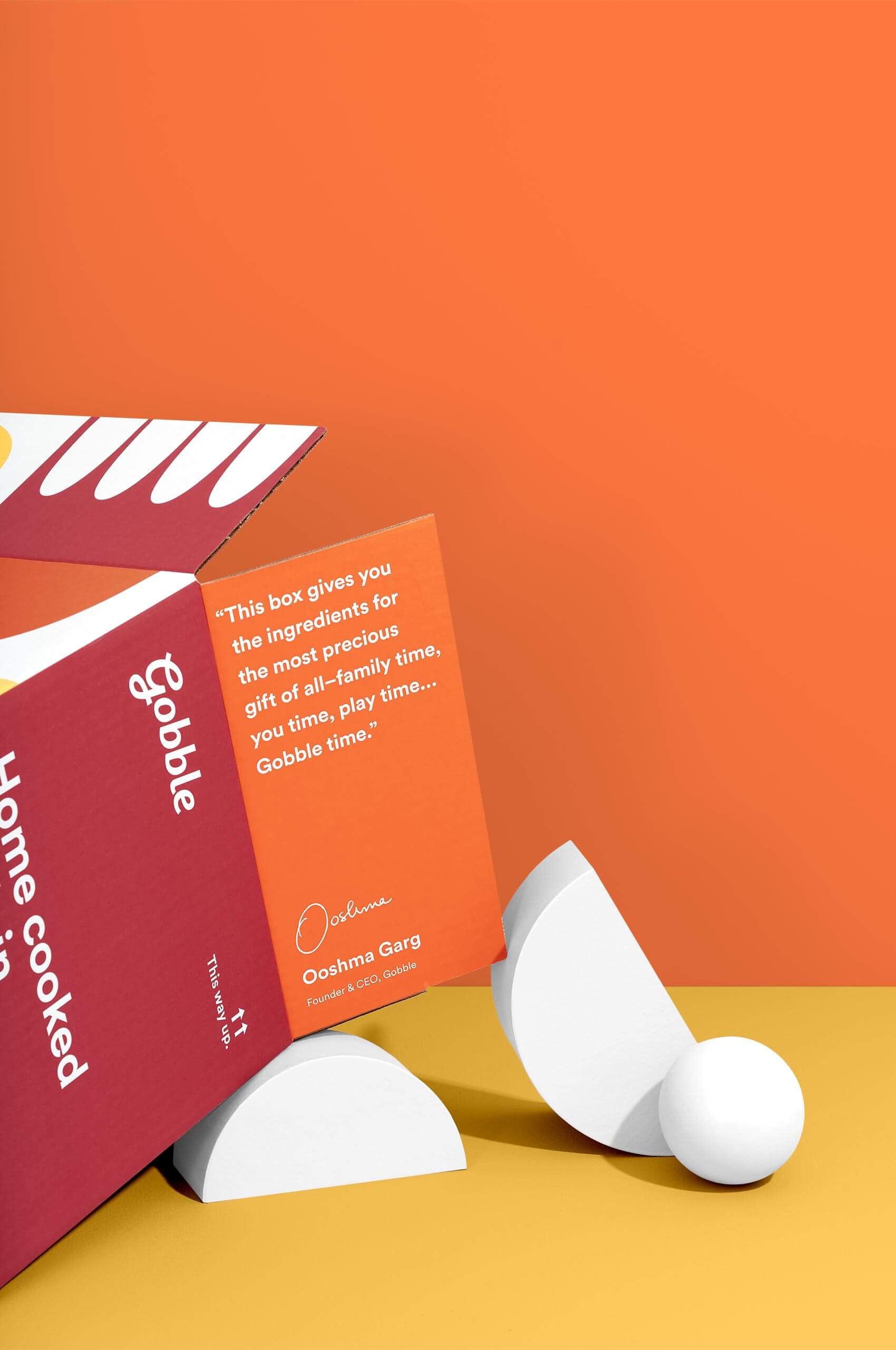
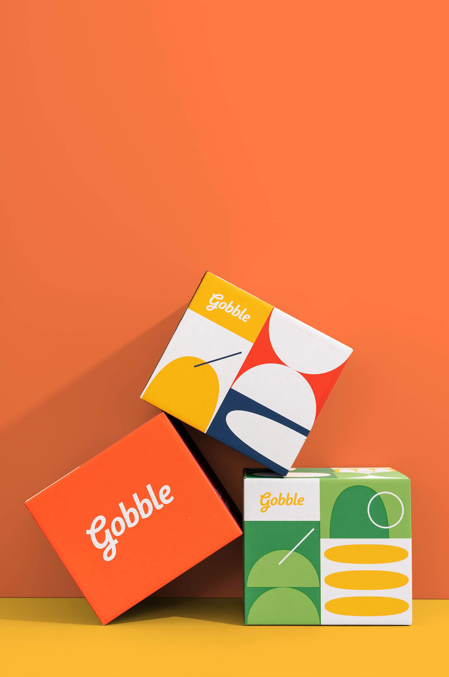
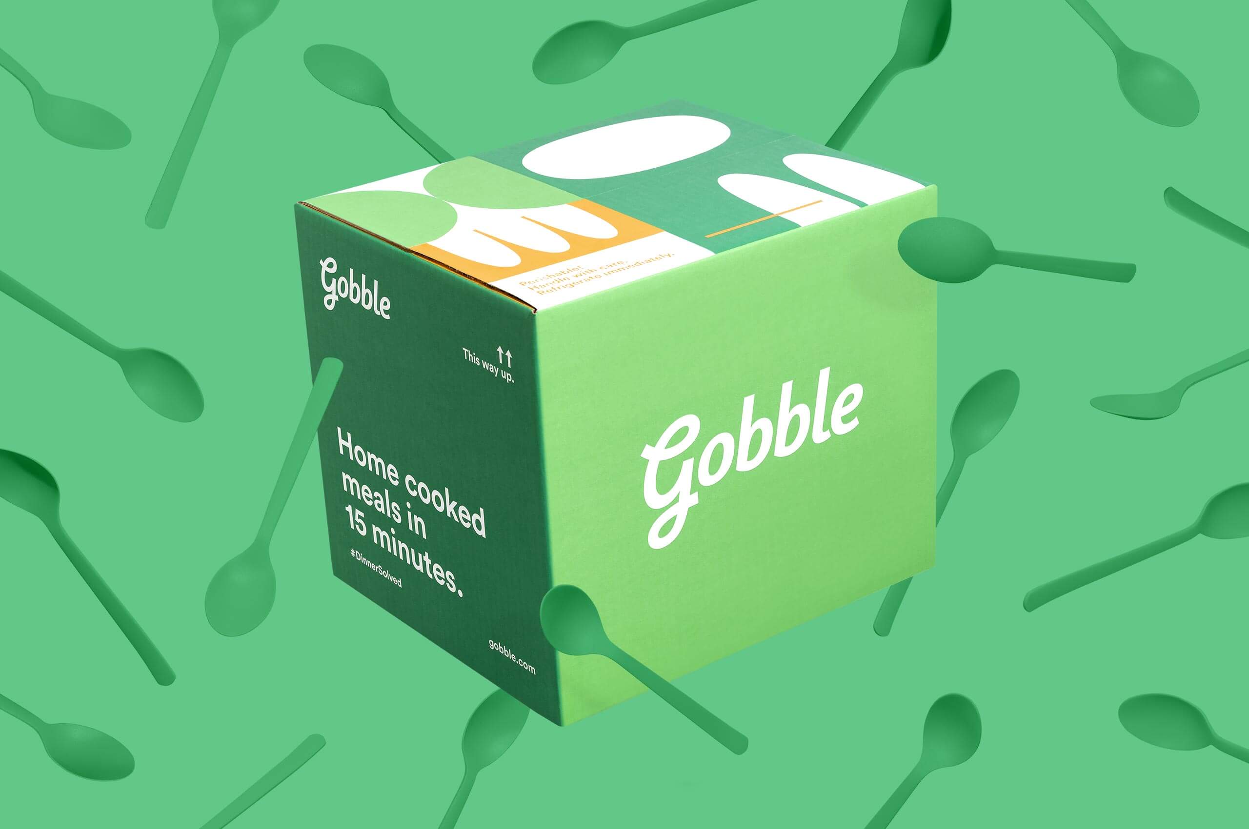
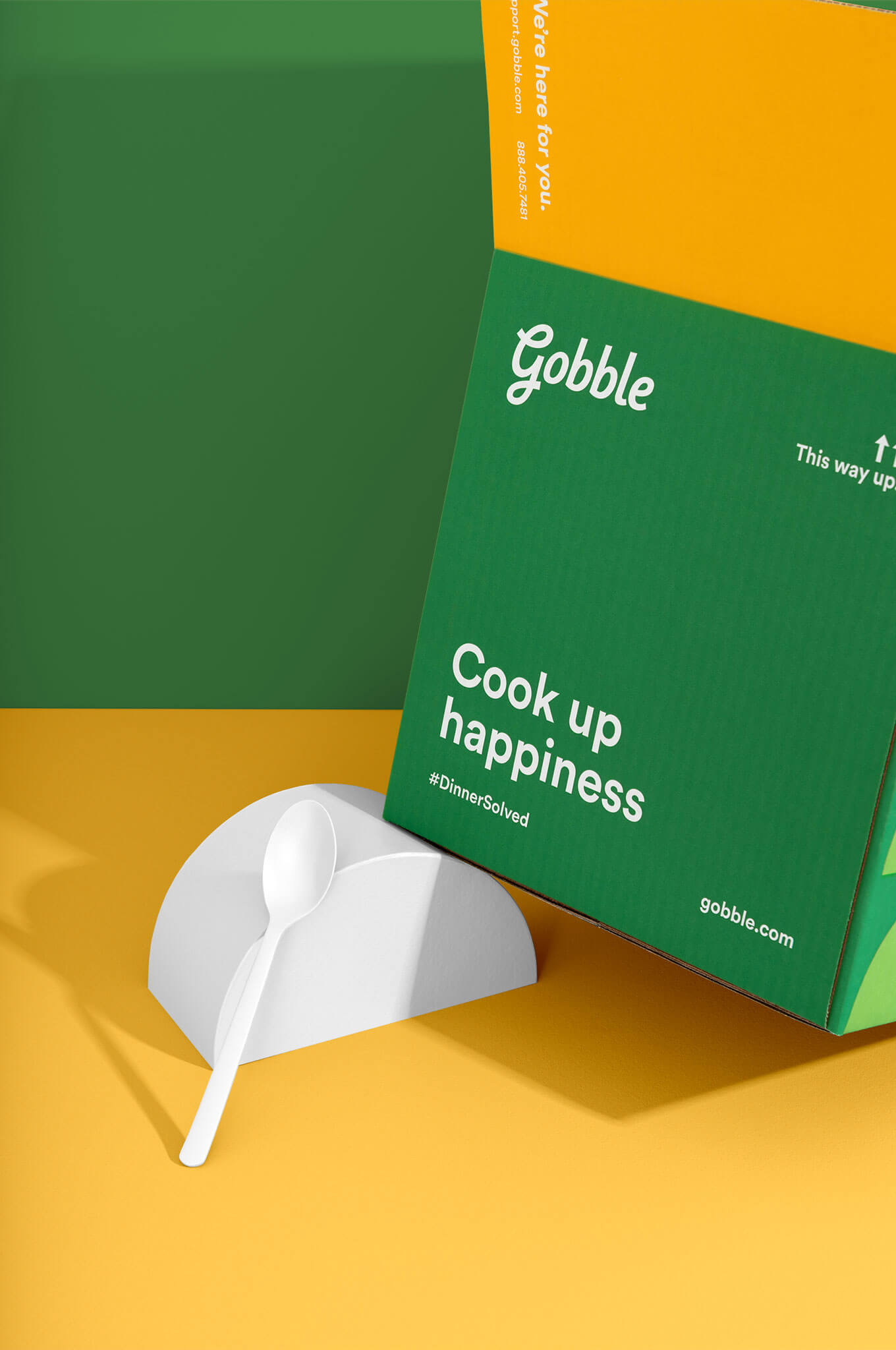
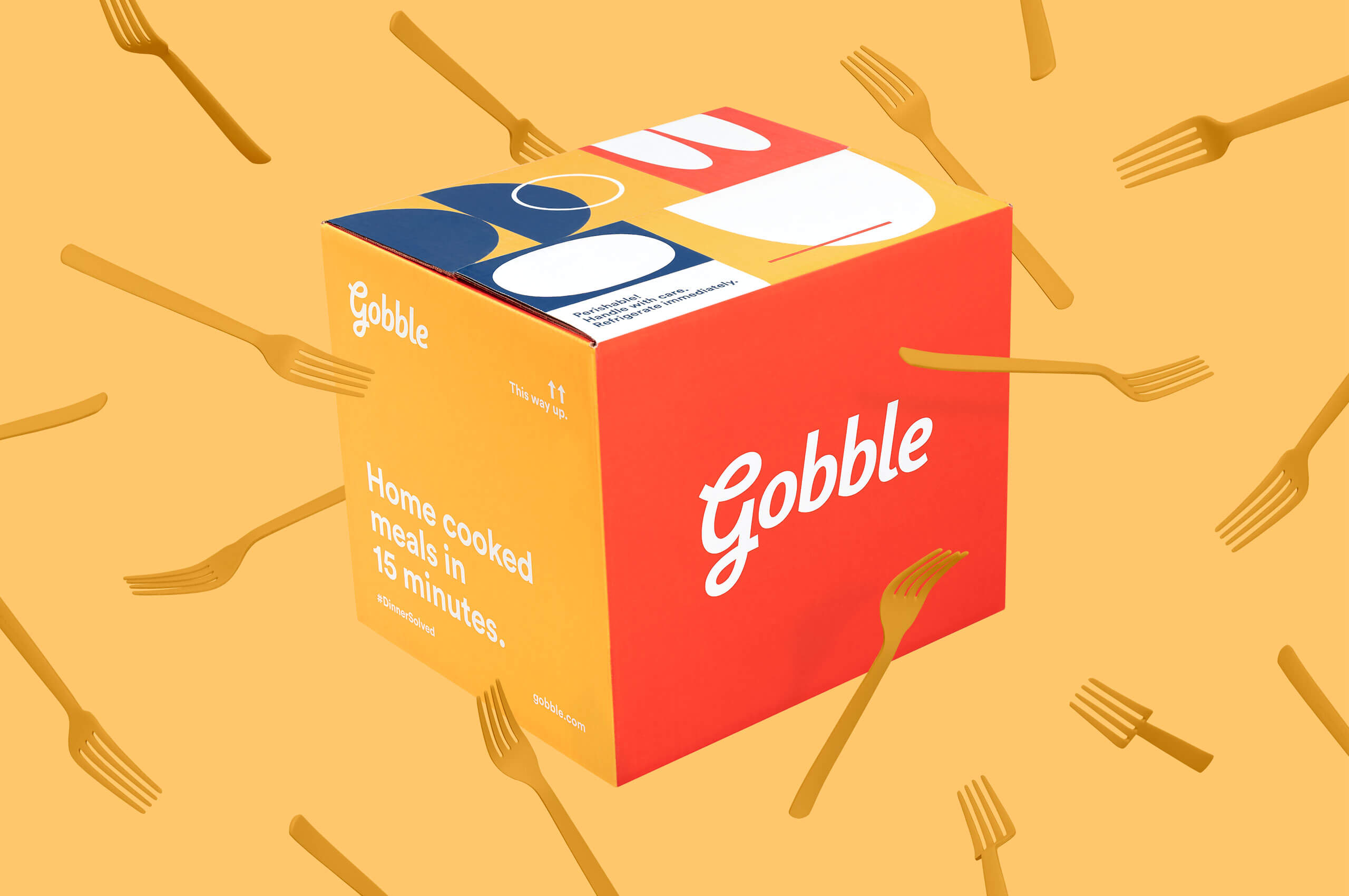
With a sea of brown boxes being delivered around the world each day, it was important to create something that would stand out in the crowd. We wanted to develop a box that was fun and would be something exciting to come home and find on your doorstep. A box that evoked the fun a customer was about to have while cooking their dinner. So much fun that it might be able to wash away all stresses from the day and get them excited to make a meal for their family.

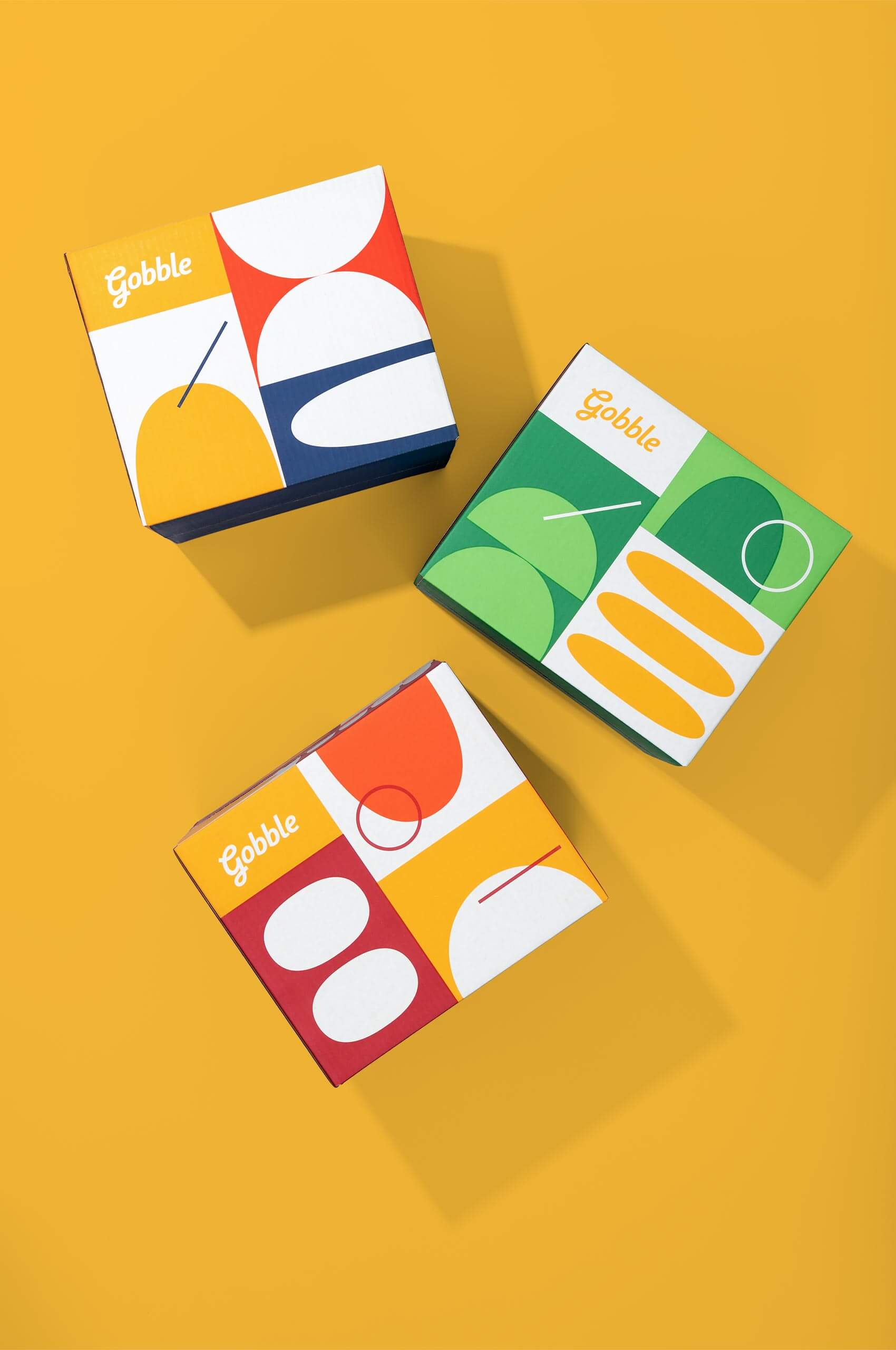
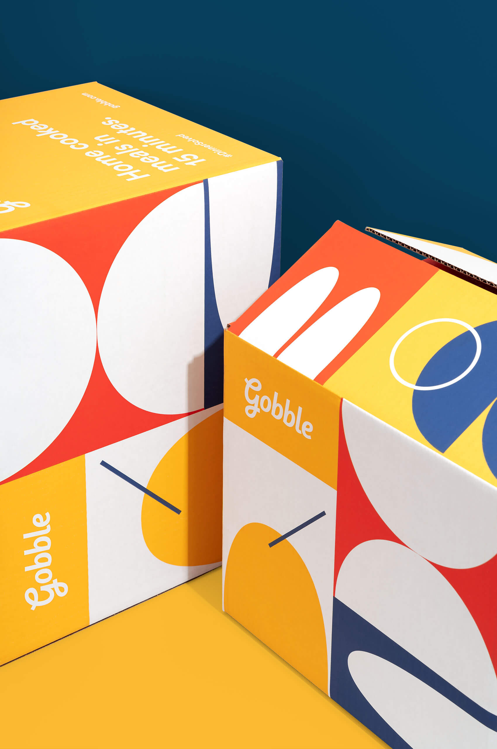
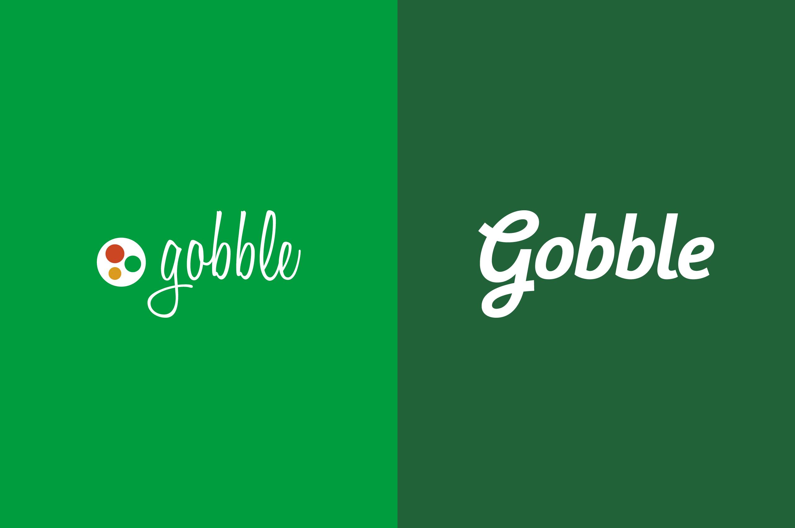
Wordmark. Before and after.
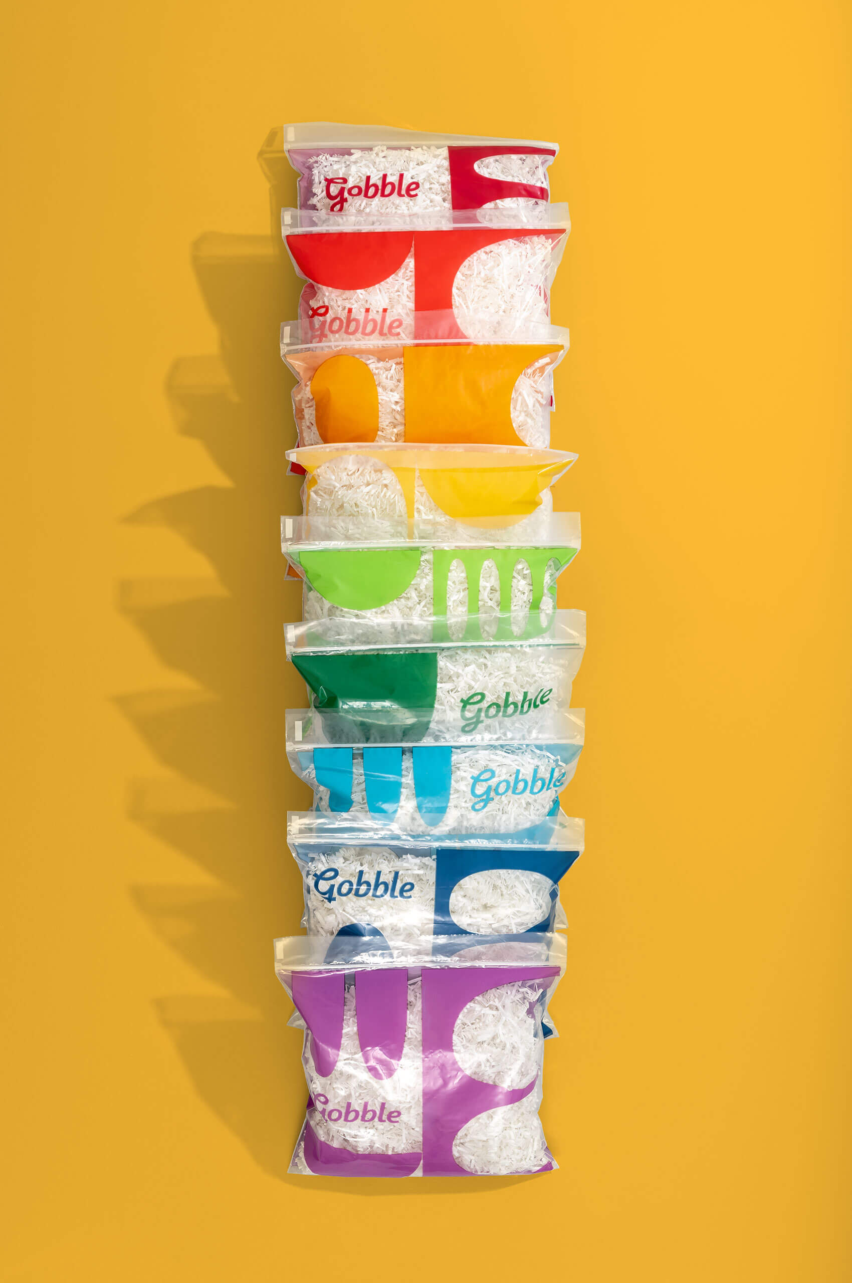
We decided that the fun shouldn’t end when you open your box. Taking the same direction as the exterior of the boxes, we created a fun and unique bag system that would allow the user to have another level of excitement, all while working as a recognition device. With each color bag corresponding to a specific protein or ingredient, they ultimately lent themselves to quicker prep times.