Kobo
Helping Africa’s leader in integrated logistics reach the global market.
Helping Africa’s leader in integrated logistics reach the global market.
Kobo is Africa’s innovation leader in integrated logistics solutions and truck brokerage services. They aggregate end-to-end haulage operations to help cargo owners, truck owners, drivers, and cargo recipients achieve an efficient supply chain framework.
Through their seamless, simple-to-use, mobile and web applications, Kobo reduces supply chain risks, logistics bottlenecks, and manufacturing waste. They achieve this by giving their drivers real-time visibility and creating an effective value chain for all stakeholders in the supply chain.
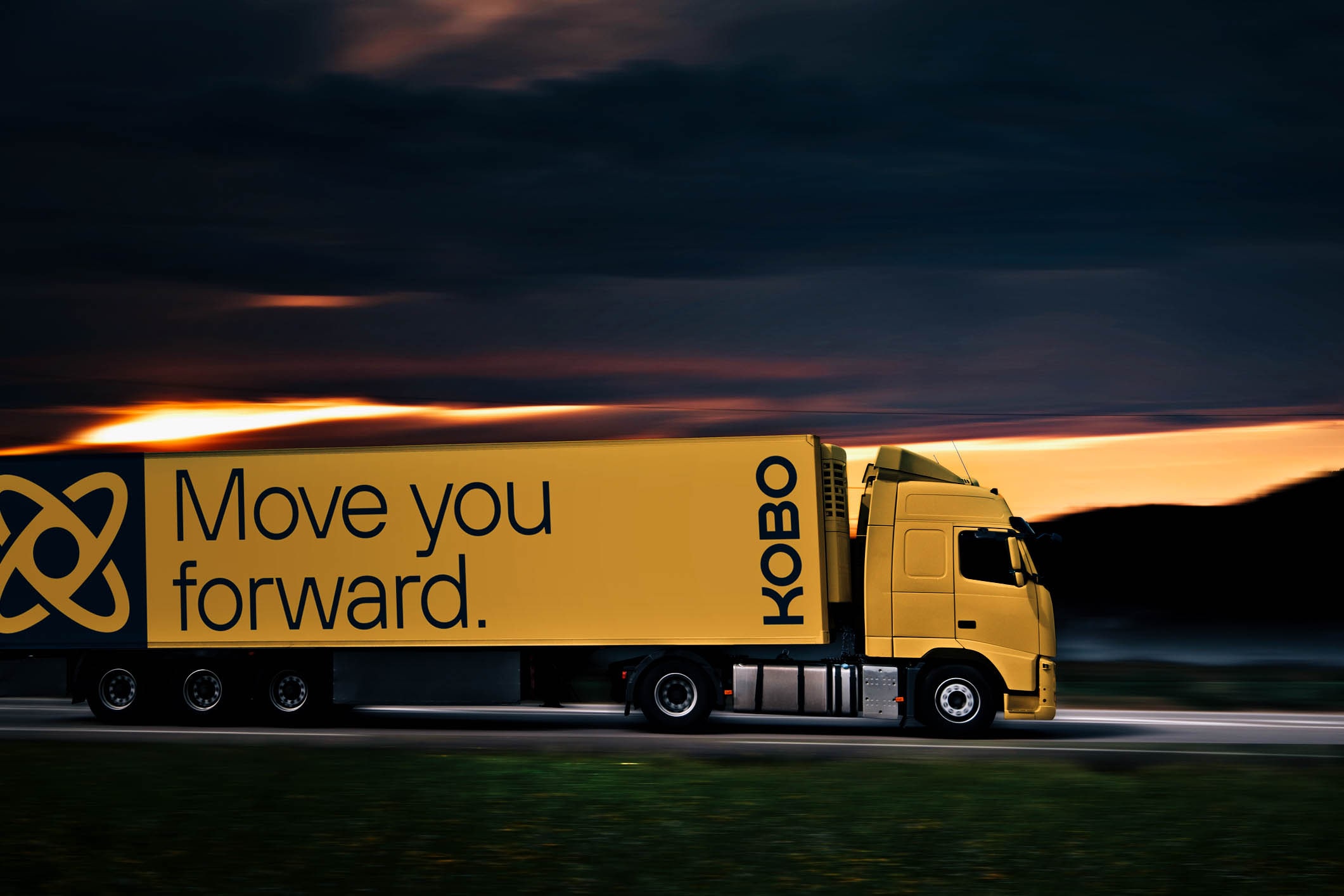
Ahead of a huge expansion effort, we worked with them to create a sophisticated, modern update to their brand that would align with their global pursuits.


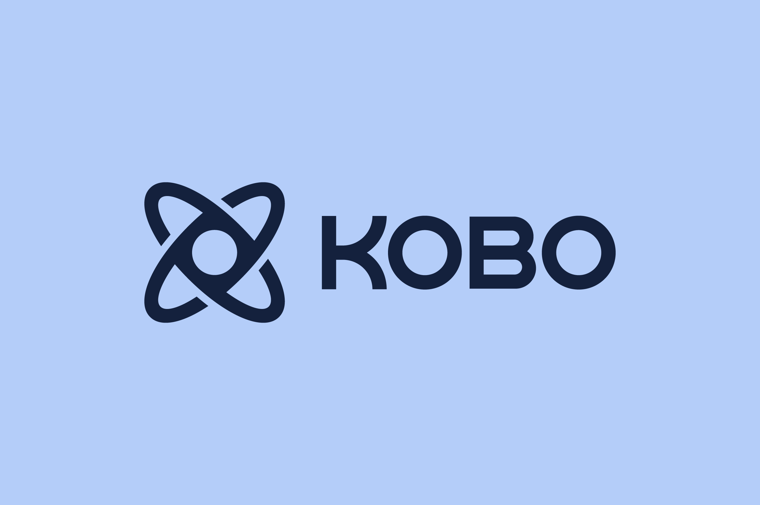
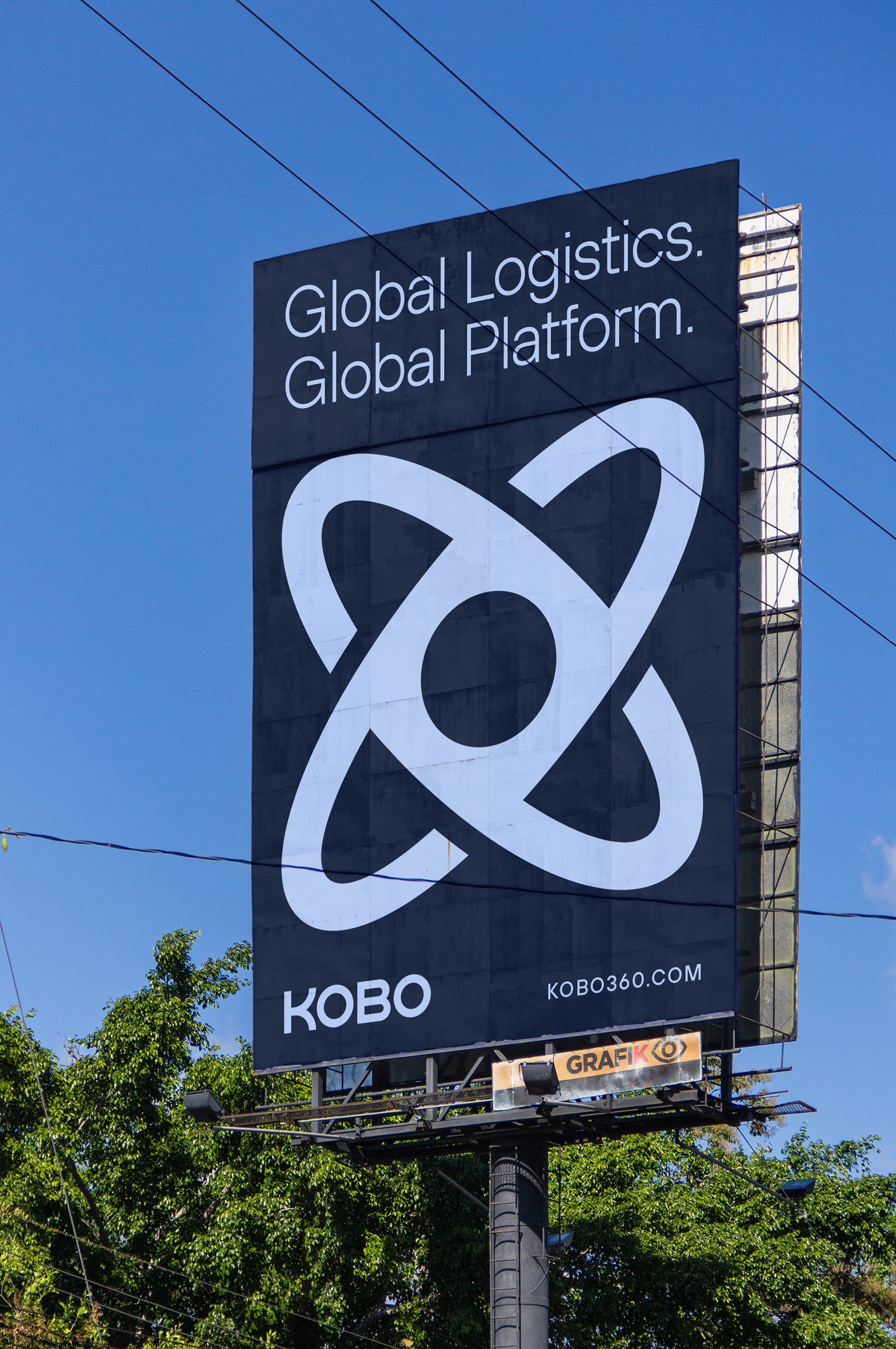
Previously Kobo did not have a symbol, which was a key component of their desire to rebrand. Becoming more well-known in the overarching tech space, they were keen to add to the brand. The introduction of an ownable symbol immediately helped create brand equity and awareness in the global market.
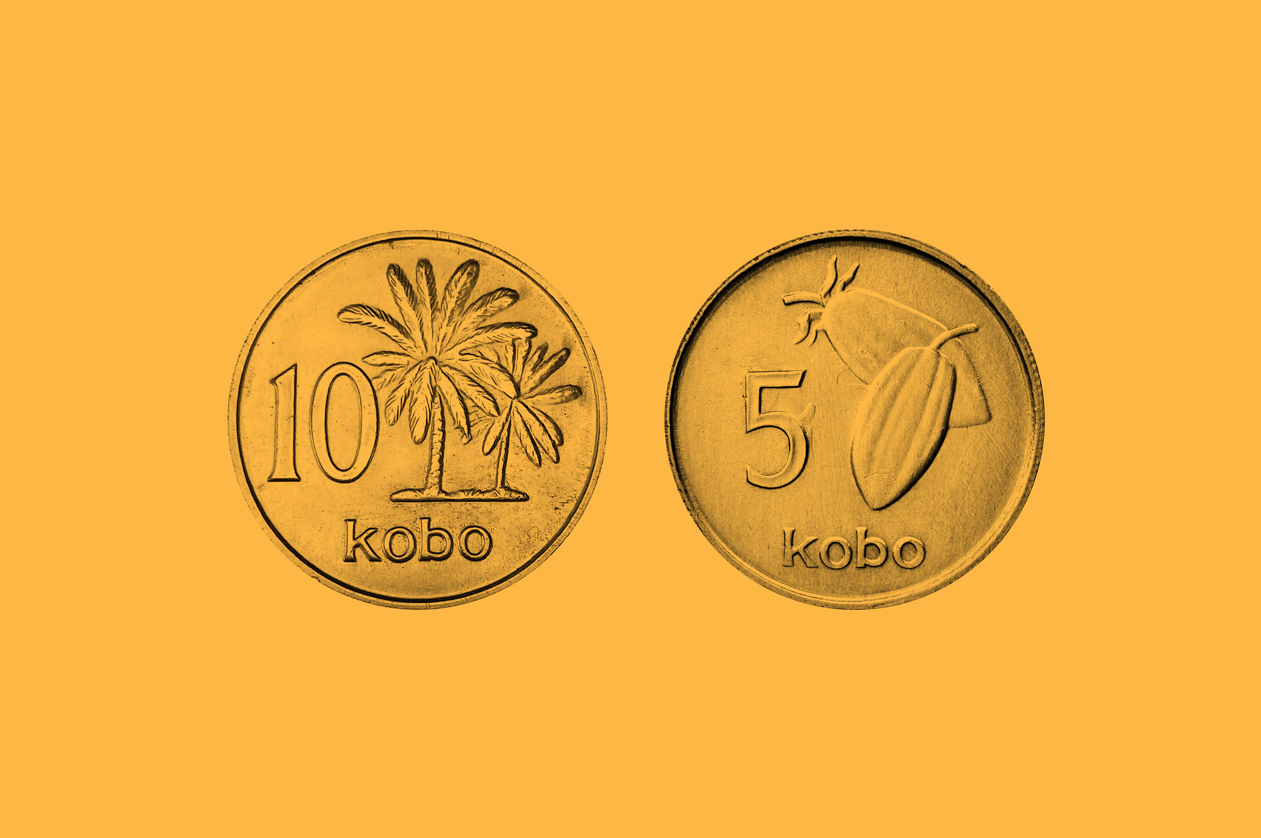
The inspiration for their name comes from the Nigerian Kobo coin. So we knew we needed to create a symbol inspired by this history and its circular form. Such a strong history and form helped give Kobo an incredible brand story.
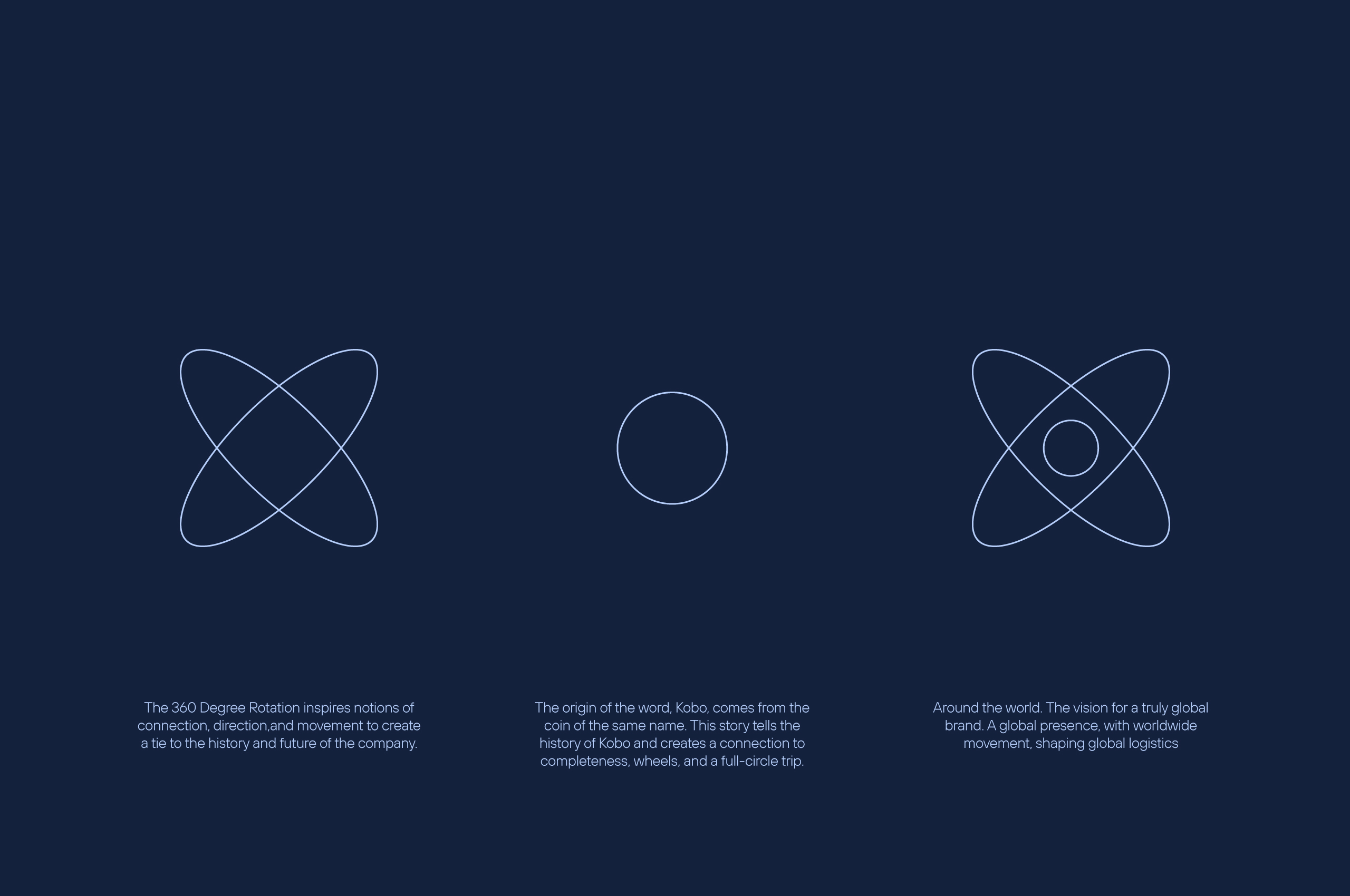
We worked with the Kobo team to create a symbol that takes inspiration from the history and meaning of the company’s name, movement, and global presence.


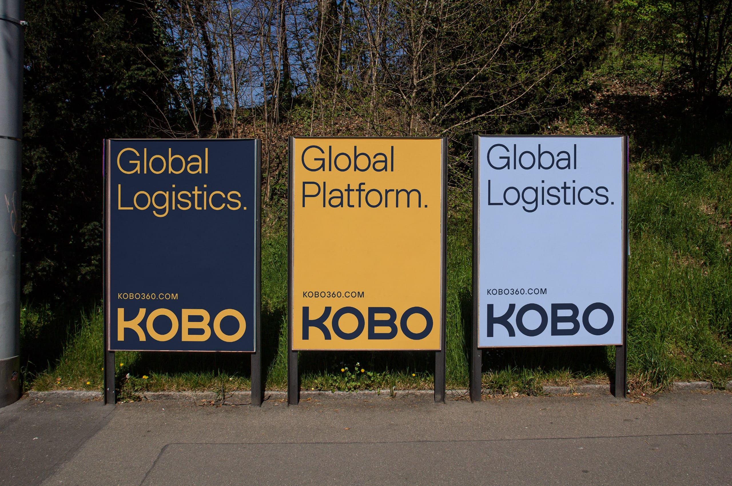
When creating a new wordmark for the future of Kobo, we started with the curves of the former mark to build upon the brand equity. In the previous wordmark, the K did not feel like it belonged. So, we created an updated K and subsequent B that take cues from the symbol and the twisting nature of roads and overpasses.

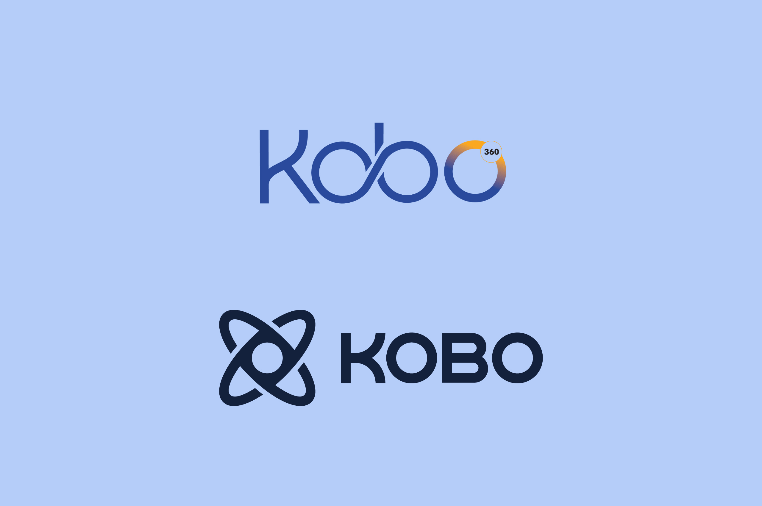
Along with not aligning with the brand’s global reach—the previous wordmark had legibility, reproducibility, and scale issues.
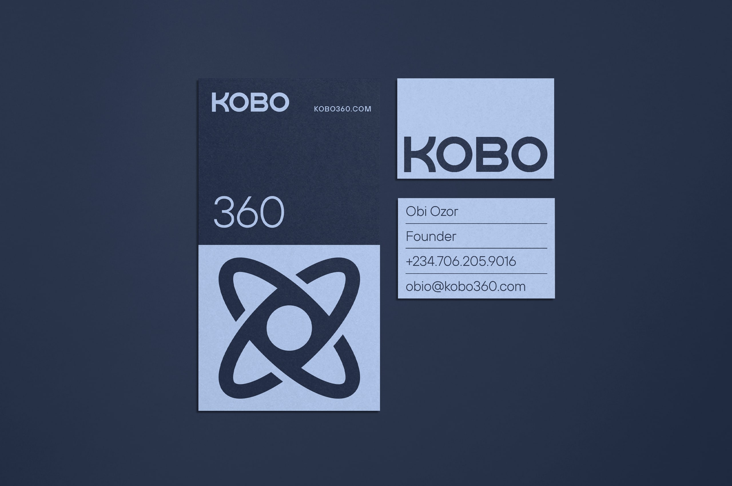
We created a bold updated wordmark based on curves of the former mark. Solving the legibility, reproducibility, and scale issues. Resulting in a mark that can work at all sizes.
The updated wordmark is modern and timeless, immediately creating legitimacy and ownability in the tech space.
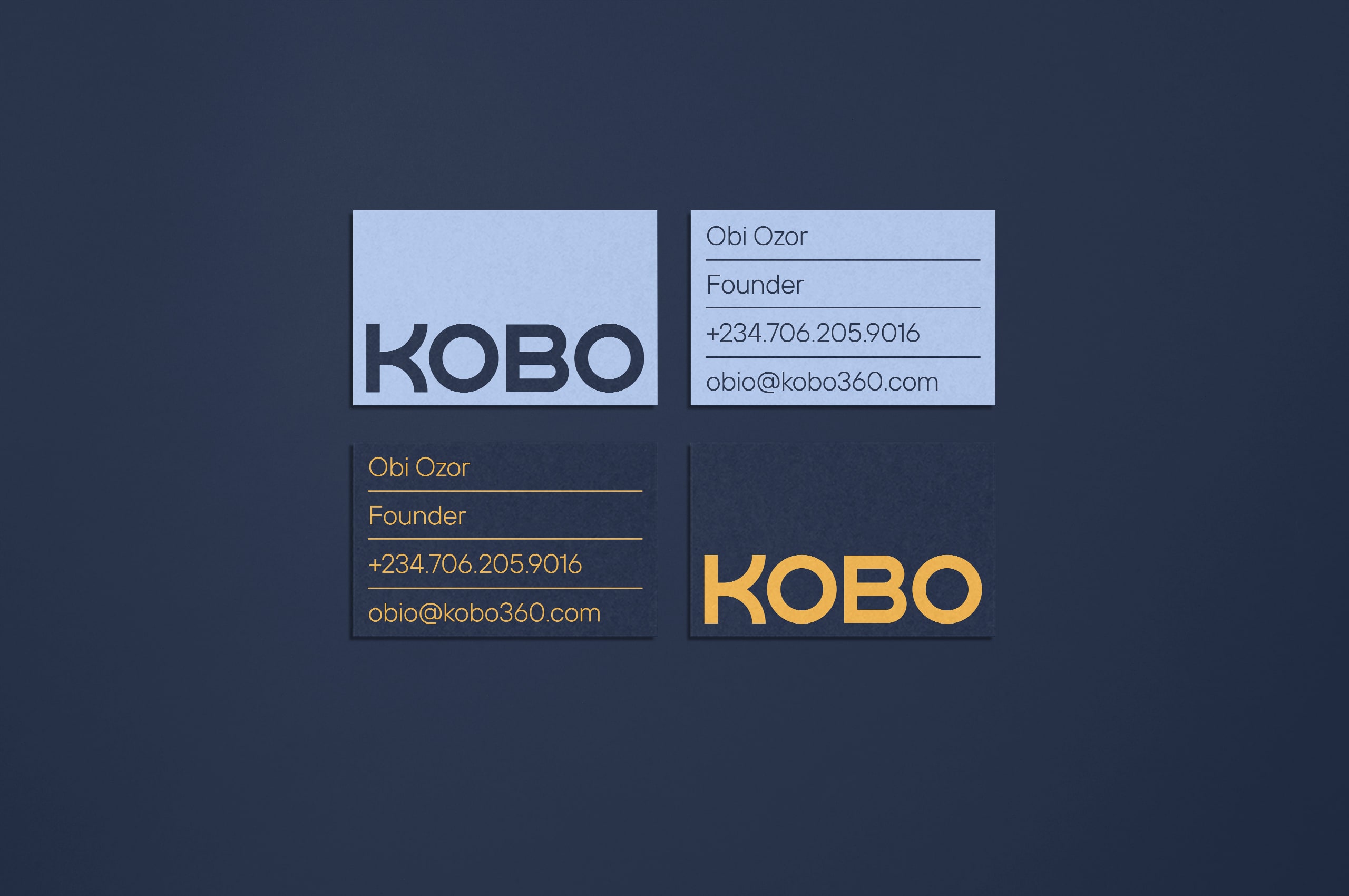
We updated and expanded the legacy color palette to preserve the brand equity while elevating its usage within the system.


Ensuring the symbol has a continuous sense of even motion, we built the mark based on a grid with as much rigor as highway engineering.
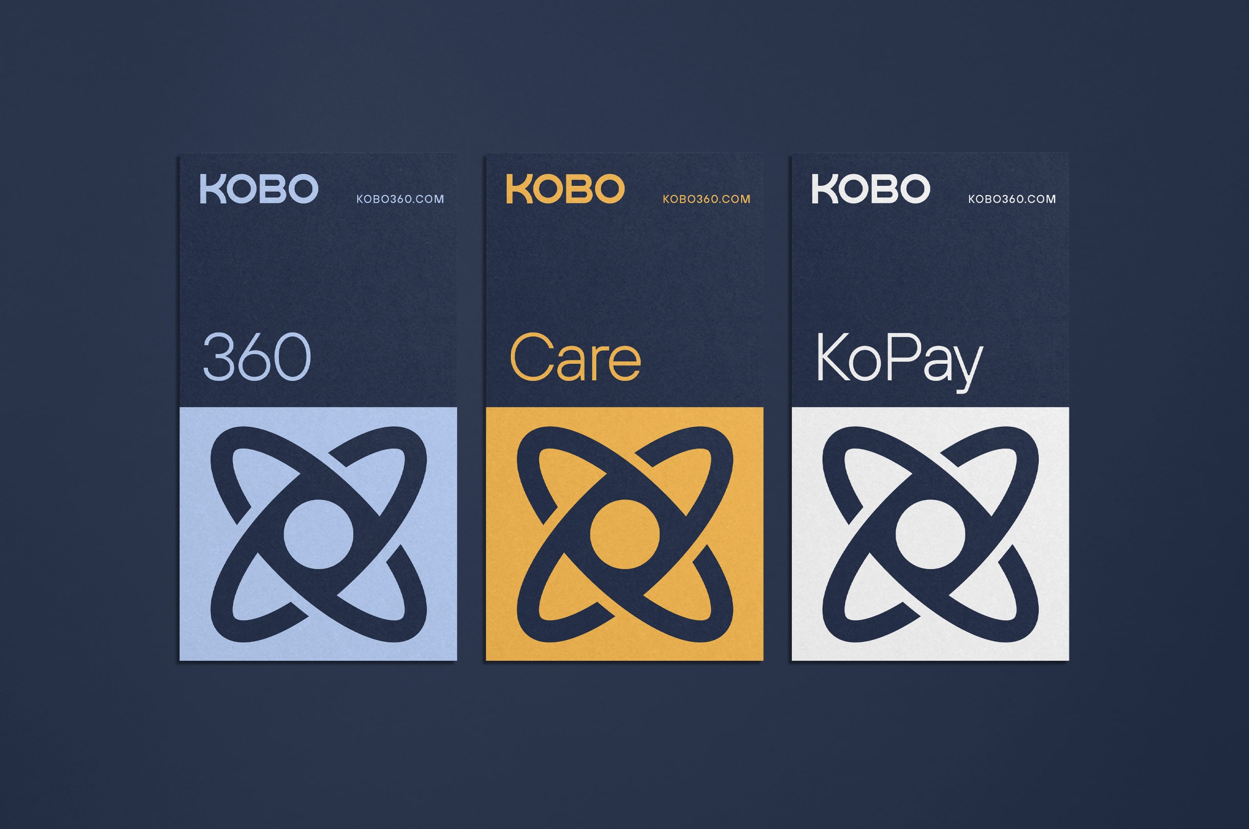
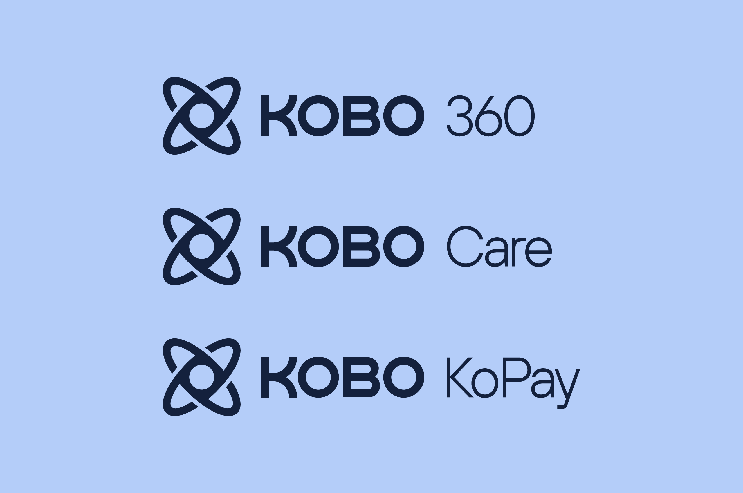
Kobo previously had a family of sub-brands that did not align with the primary identity. With an updated identity, we knew we also needed to unify the sub-brands. The overarching Kobo brand becomes stronger, more widely known, and accepted by creating a unified set of sub-brands.


We developed an exciting system extension of the brand that uses a mix of grids and modular blocks, inspired by stacked shipping containers, to create a sense of order. To be utilized in the digital and physical buildout of the brand. The robust use of the new symbol and circles immediately increases brand equity and awareness.
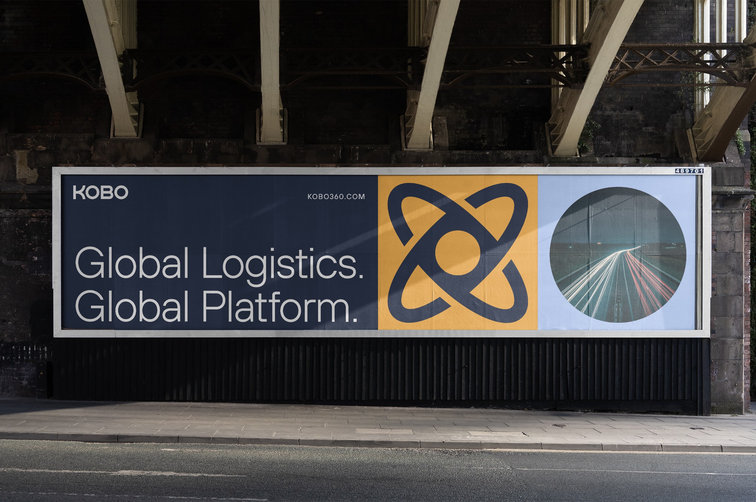
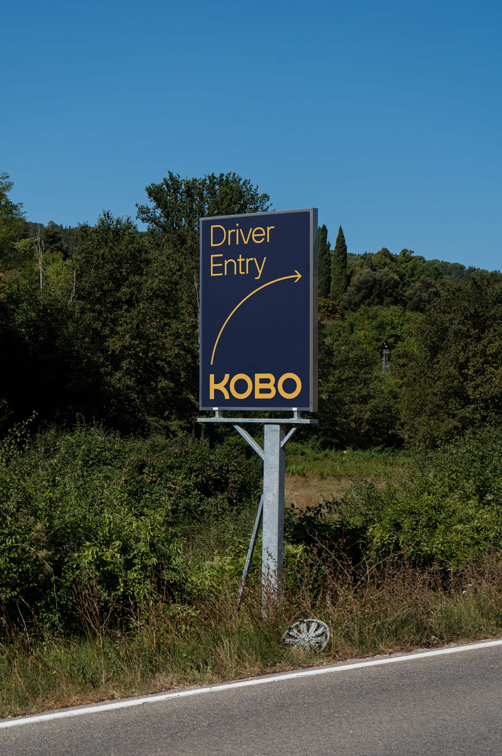
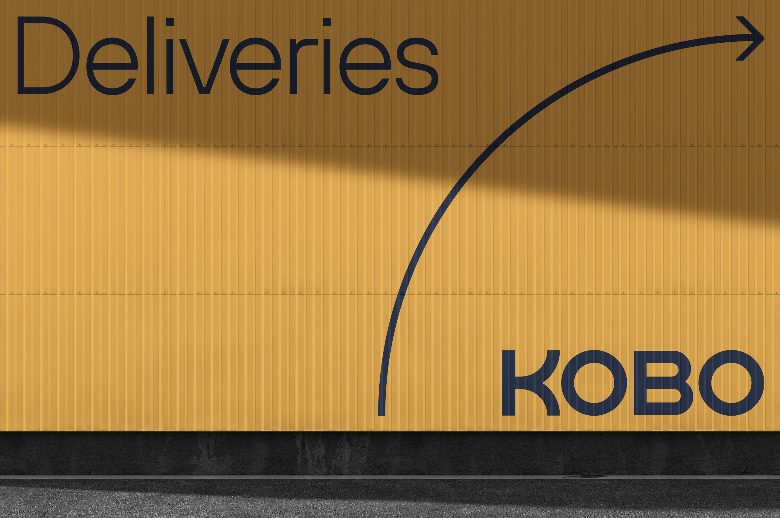
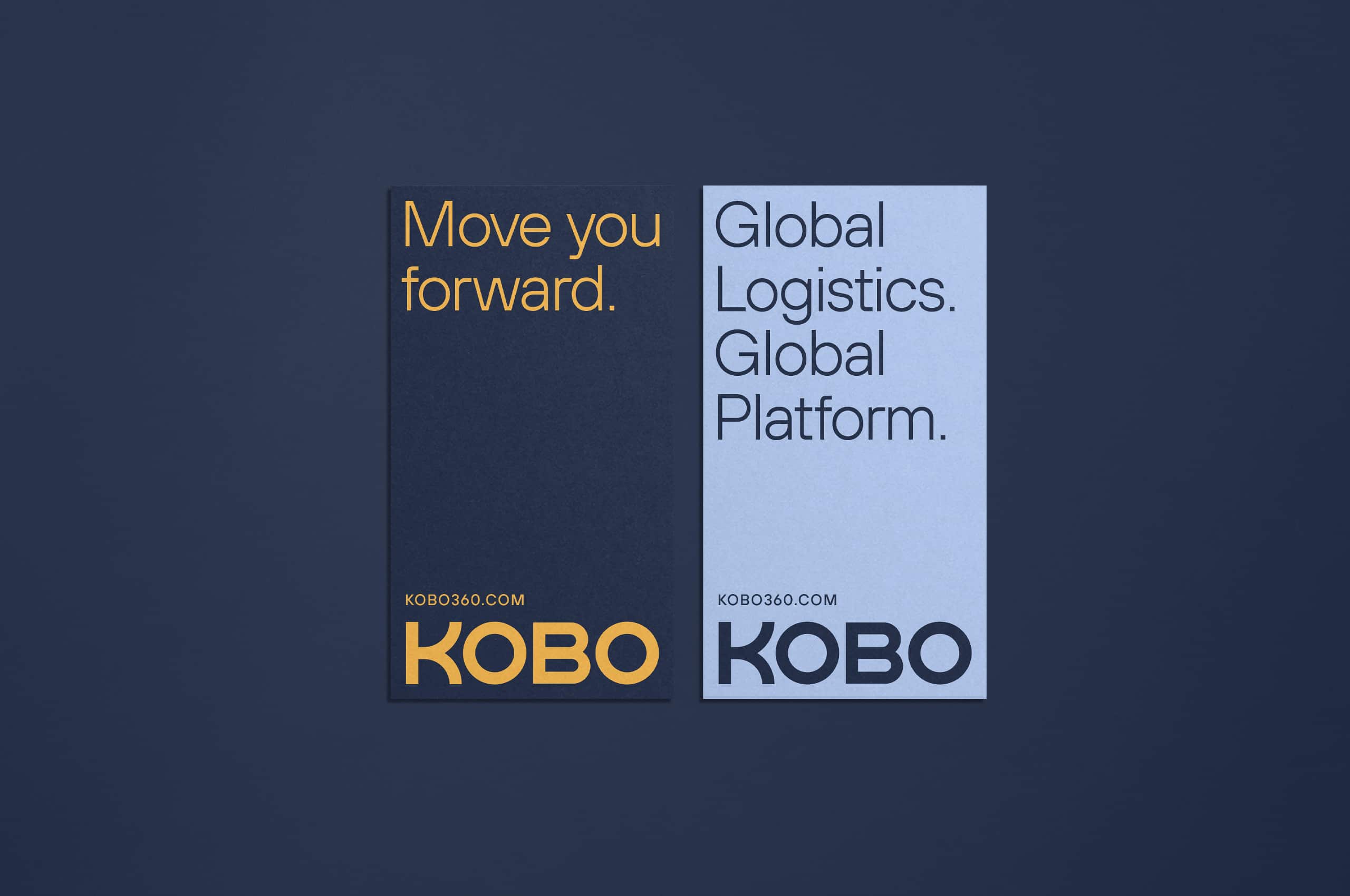
The second-most visible part of the brand, outside of the trucks themselves, billboards and signs help entice drivers to join Kobo or help their drivers find their way.