Novo
Novo was founded to serve a glaring need in healthcare for complete diagnoses and effective treatment.
Novo was founded to serve a glaring need in healthcare for complete diagnoses and effective treatment.
Dr. Scott King started his practice to help solve a glaring need he saw in healthcare: the lack of complete diagnoses. This complete diagnoses paired effective treatment provide the foundation for which Novo is built.
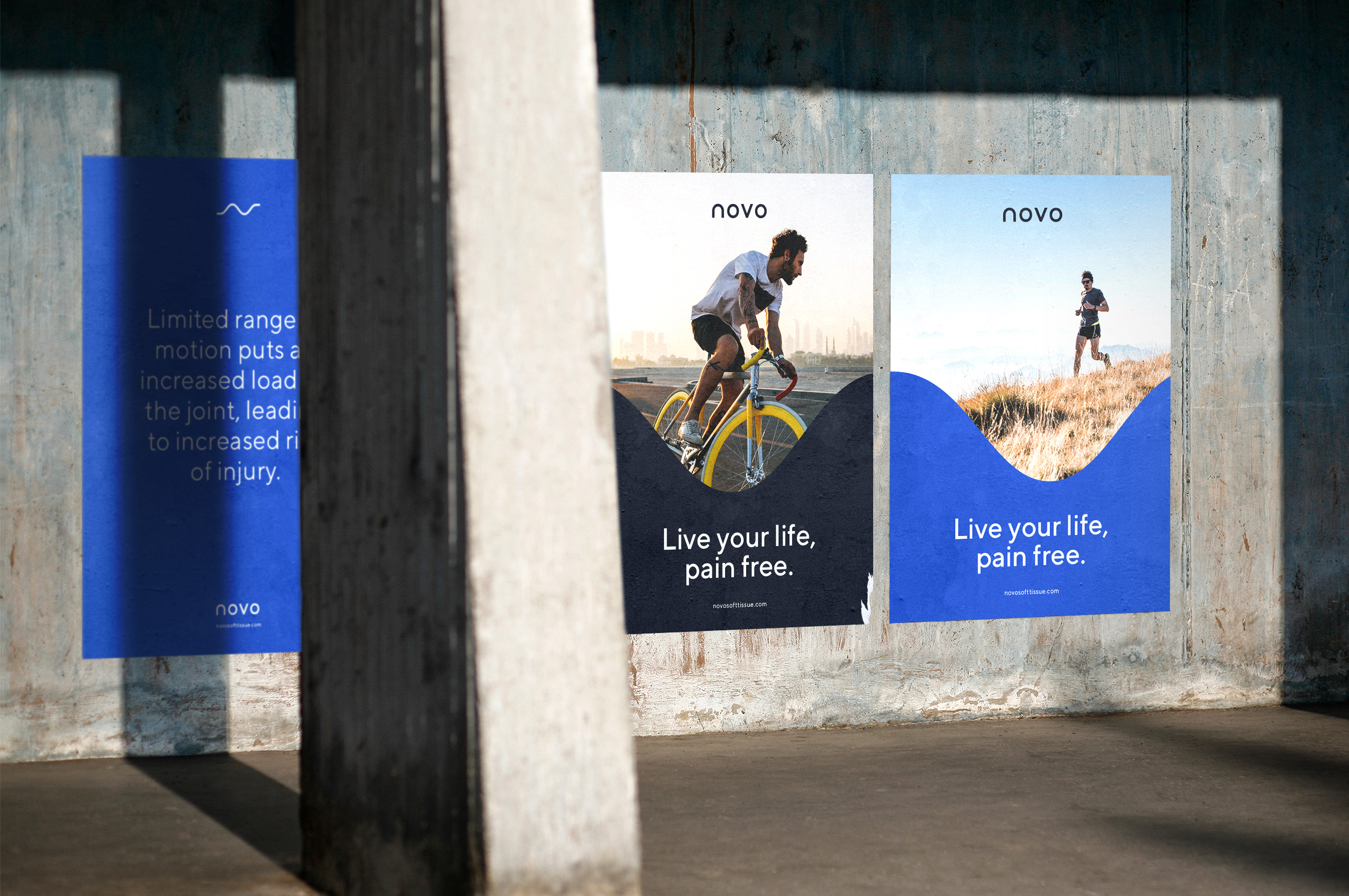
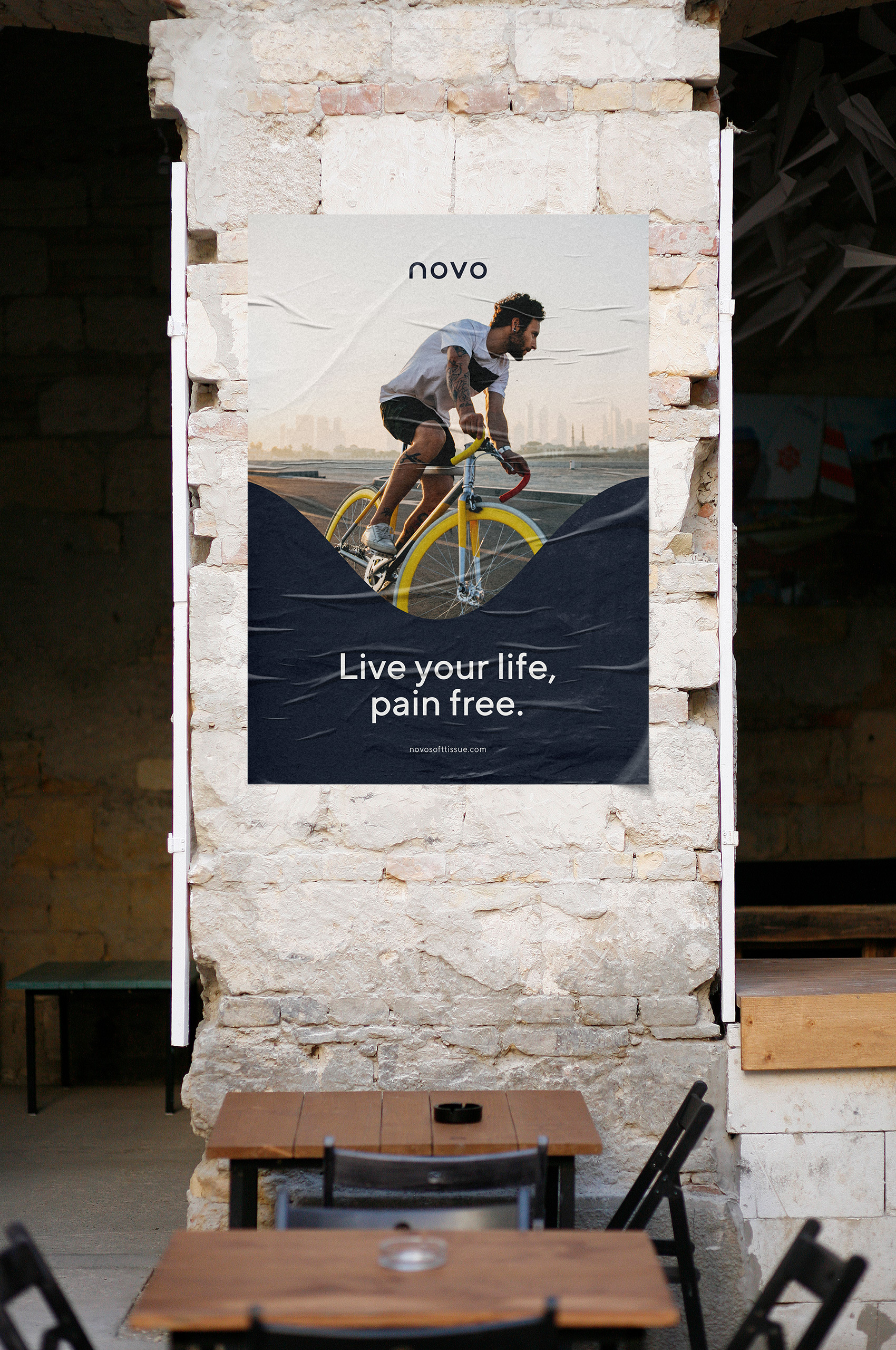
Through his practice, Dr. King is able to help patients restore function, relieve pain, and get back to living their lives pain free.
By incorporating his ability to pinpoint and solve muscle adhesion into his chiropractic practice, he is able to restore full range of motion and make life easier. Solving a myriad of complex problems along the way.
Dr. King began traveling around the world seeing patients and quickly realized his previous brand was not growing with his practice as he wanted. He came to Mast with the goal of elevating and enhancing the identity system. We helped him build a completely new identity that fell more in line with the scale of the practice and established a system that would grow with the practice for years to come.


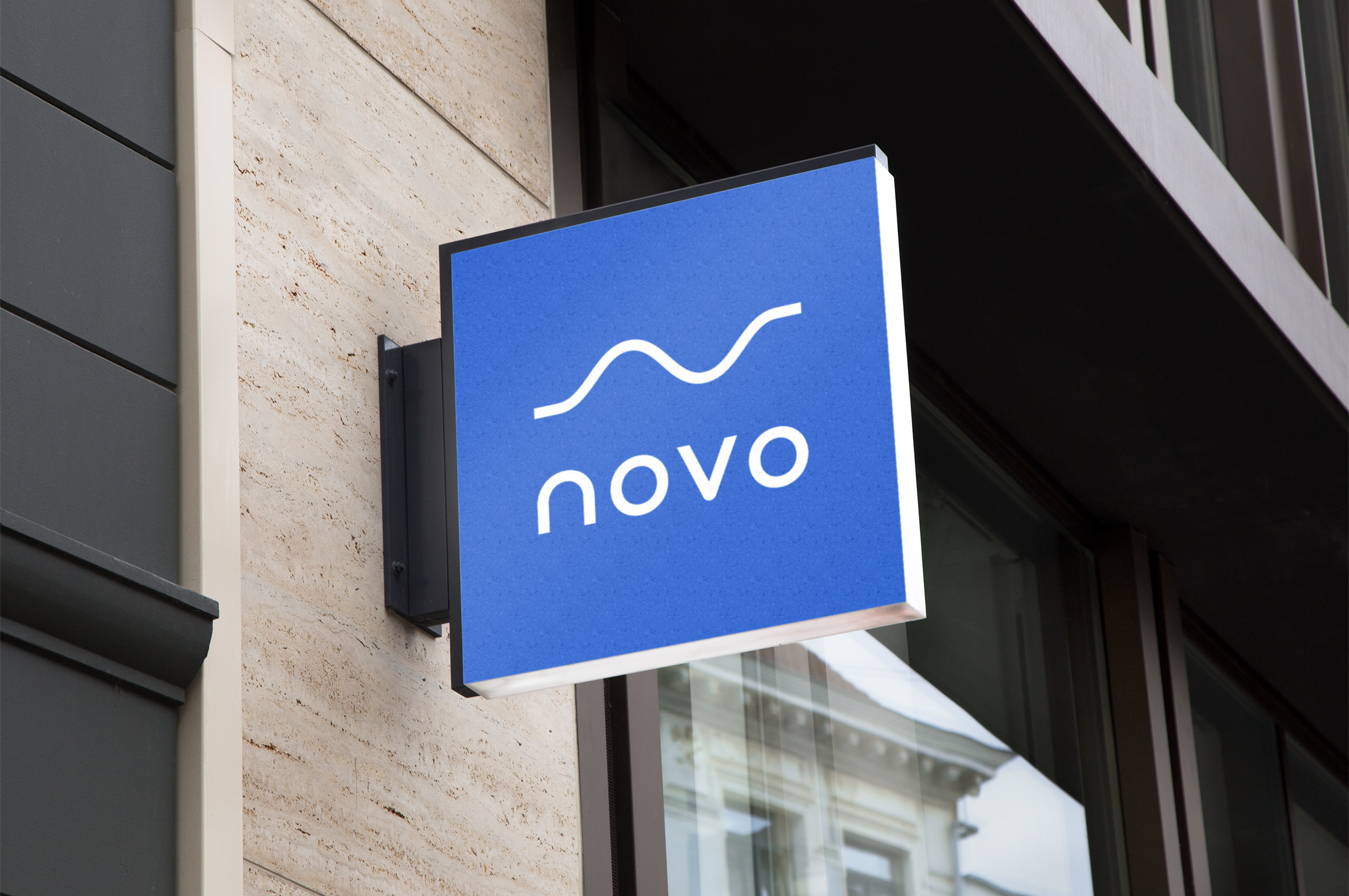
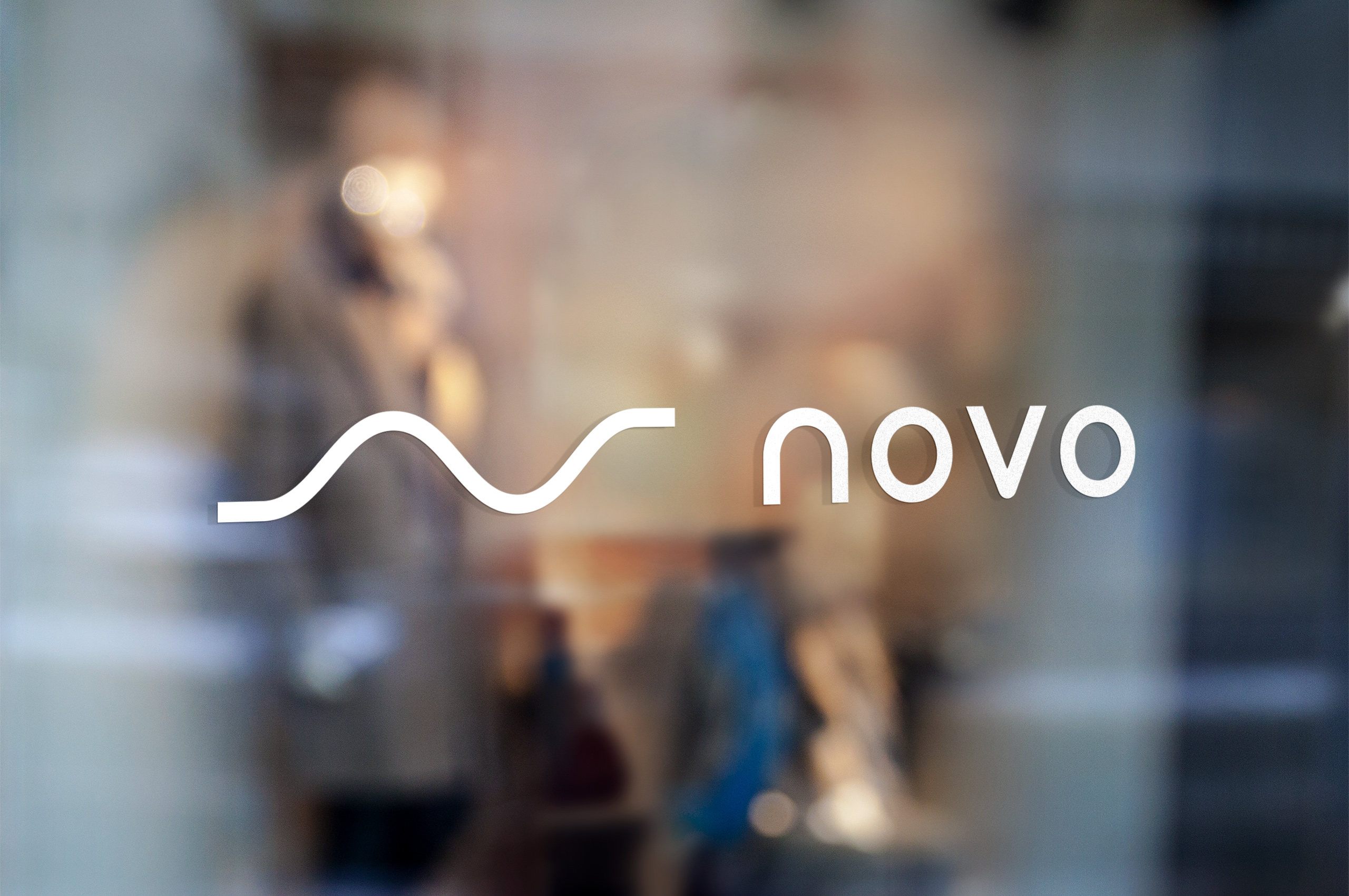
Upon first glance, the symbol appears to be a capital N. However, it also embodies the core message of “living life, pain free.”
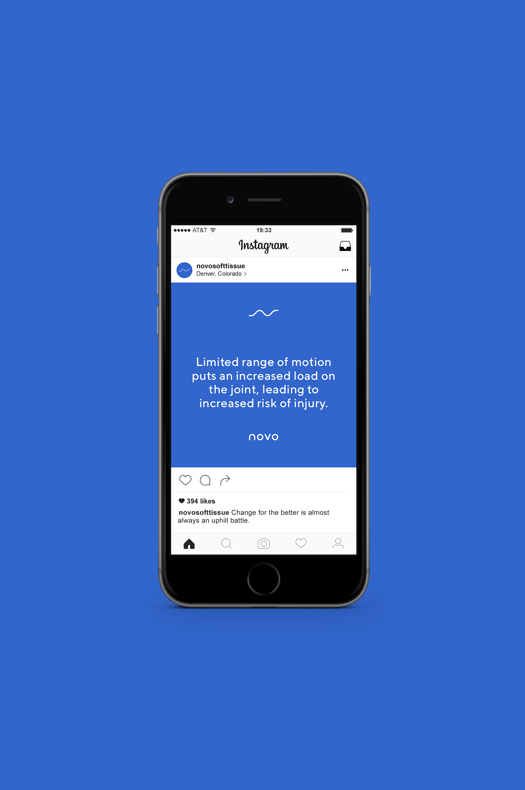
The line is straight on both sides with a curve, or disruption, in the middle. By thinking of our lives as a line; we are able to think of the times when we aren’t in pain as a straight line. These straight elements symbolize the before and after.
When we are in pain, the line possesses a curve or movement. This movement symbolizes the disruption that keeps people from living their lives without injury.
The symbol showcases the benefit Novo provides. Allowing you to get back to the baseline. Moving on with your life, free from pain.
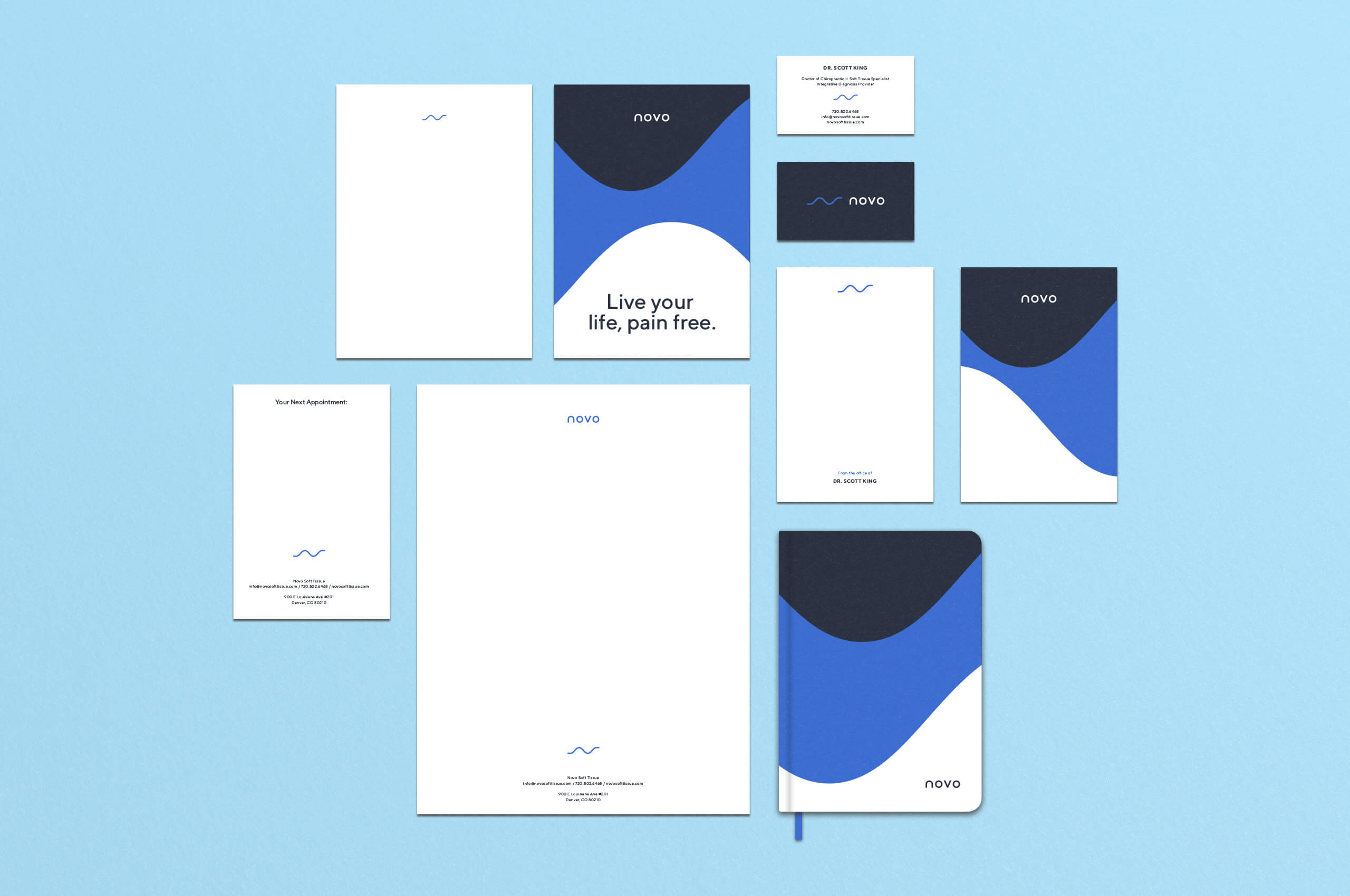
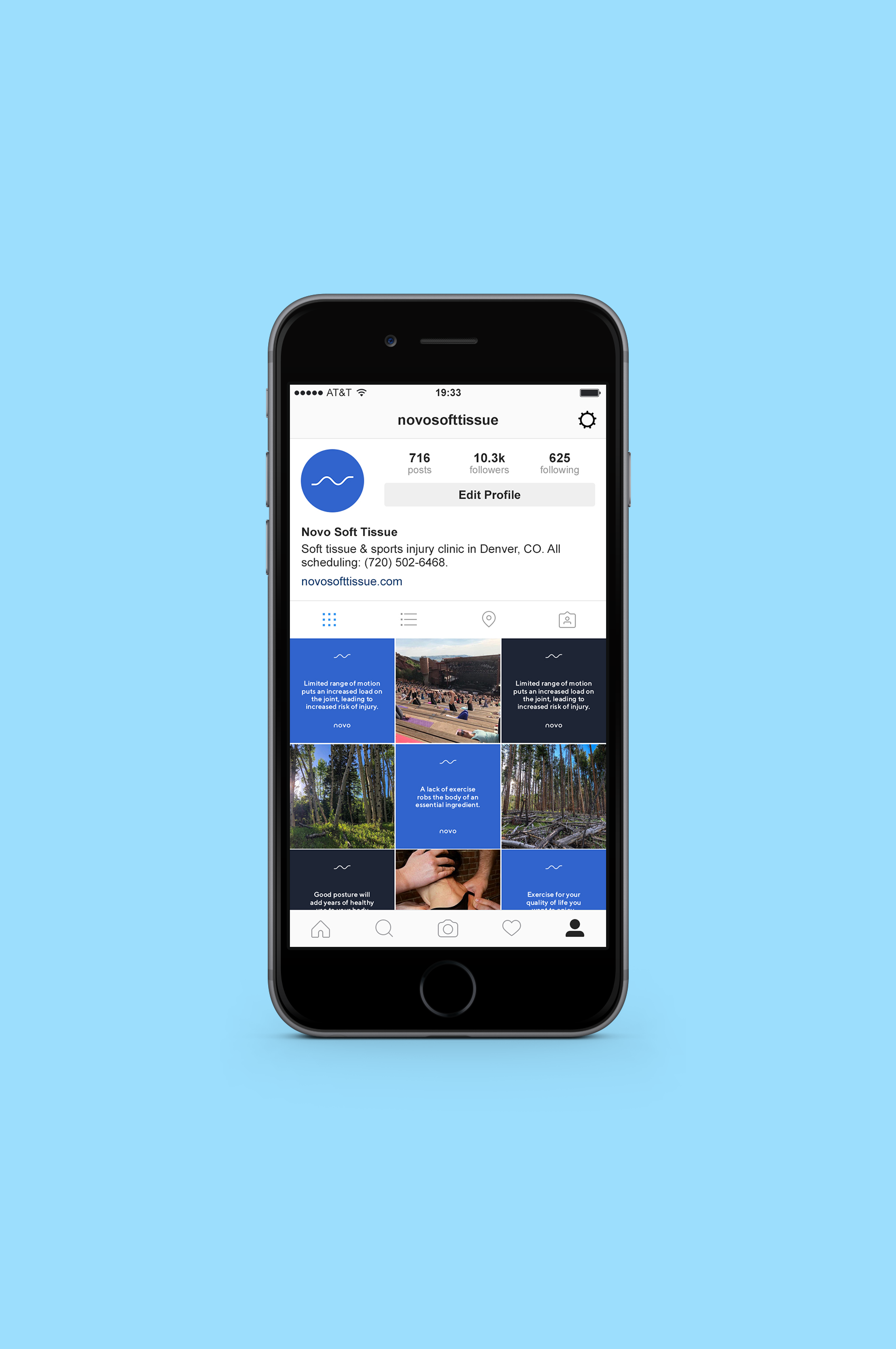
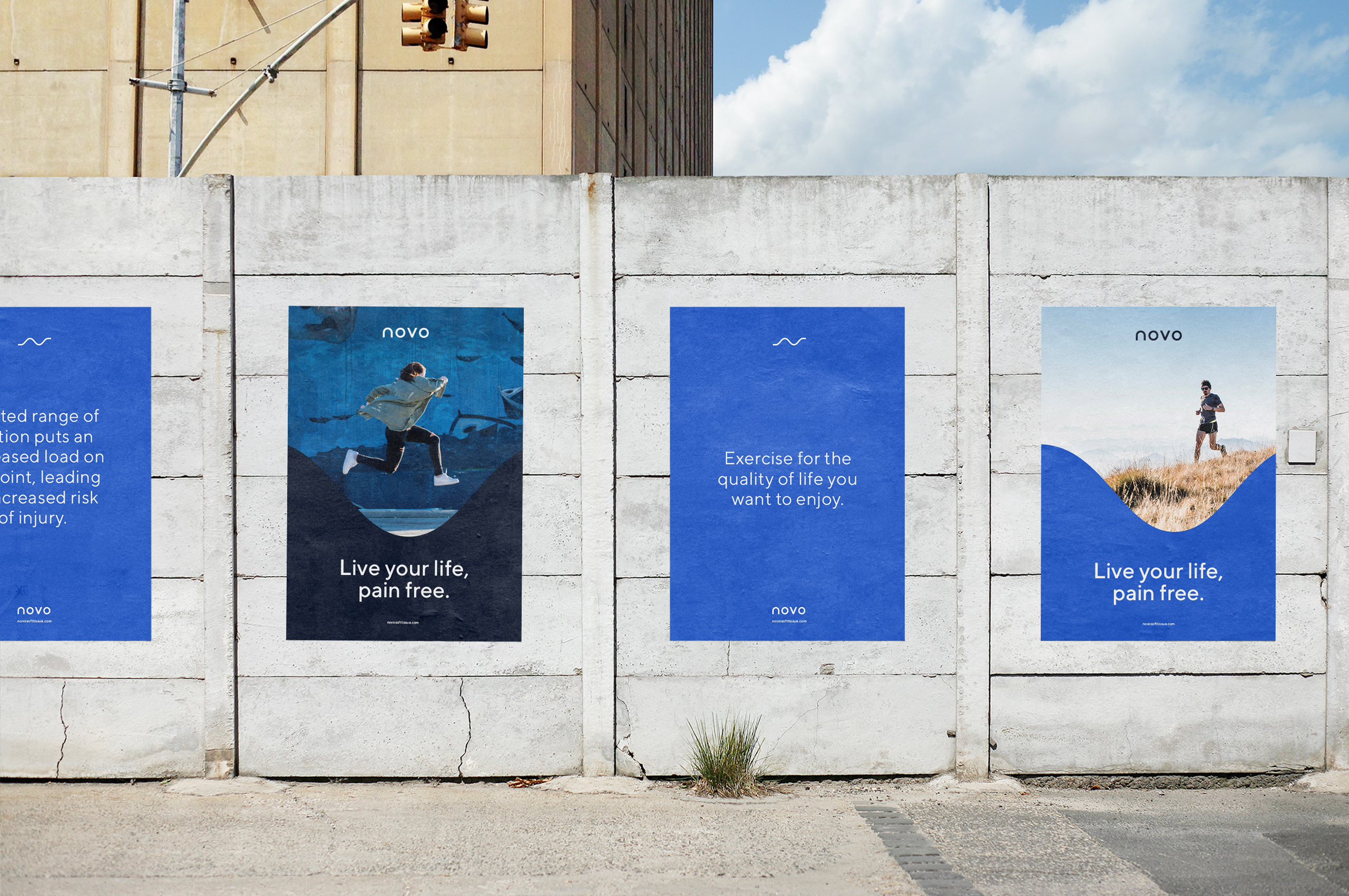
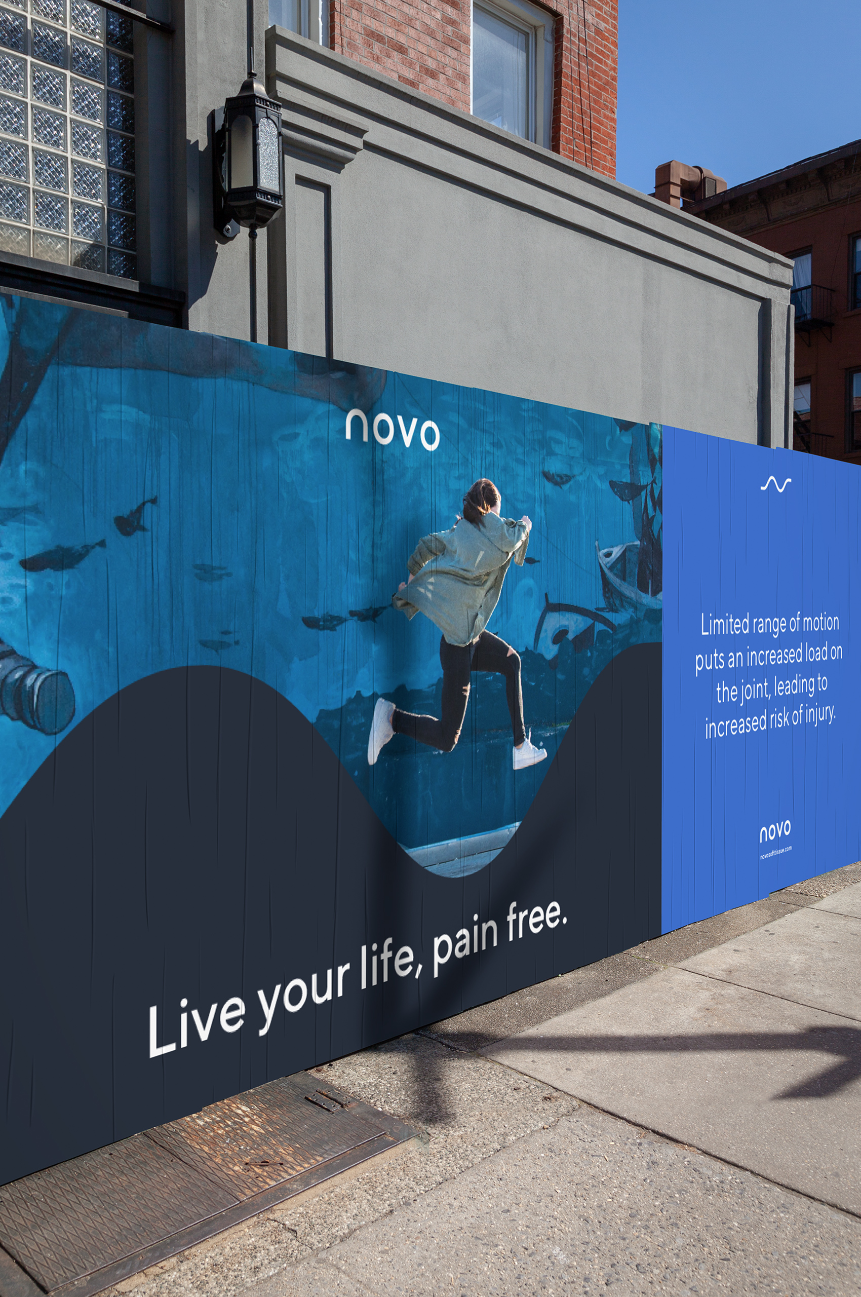
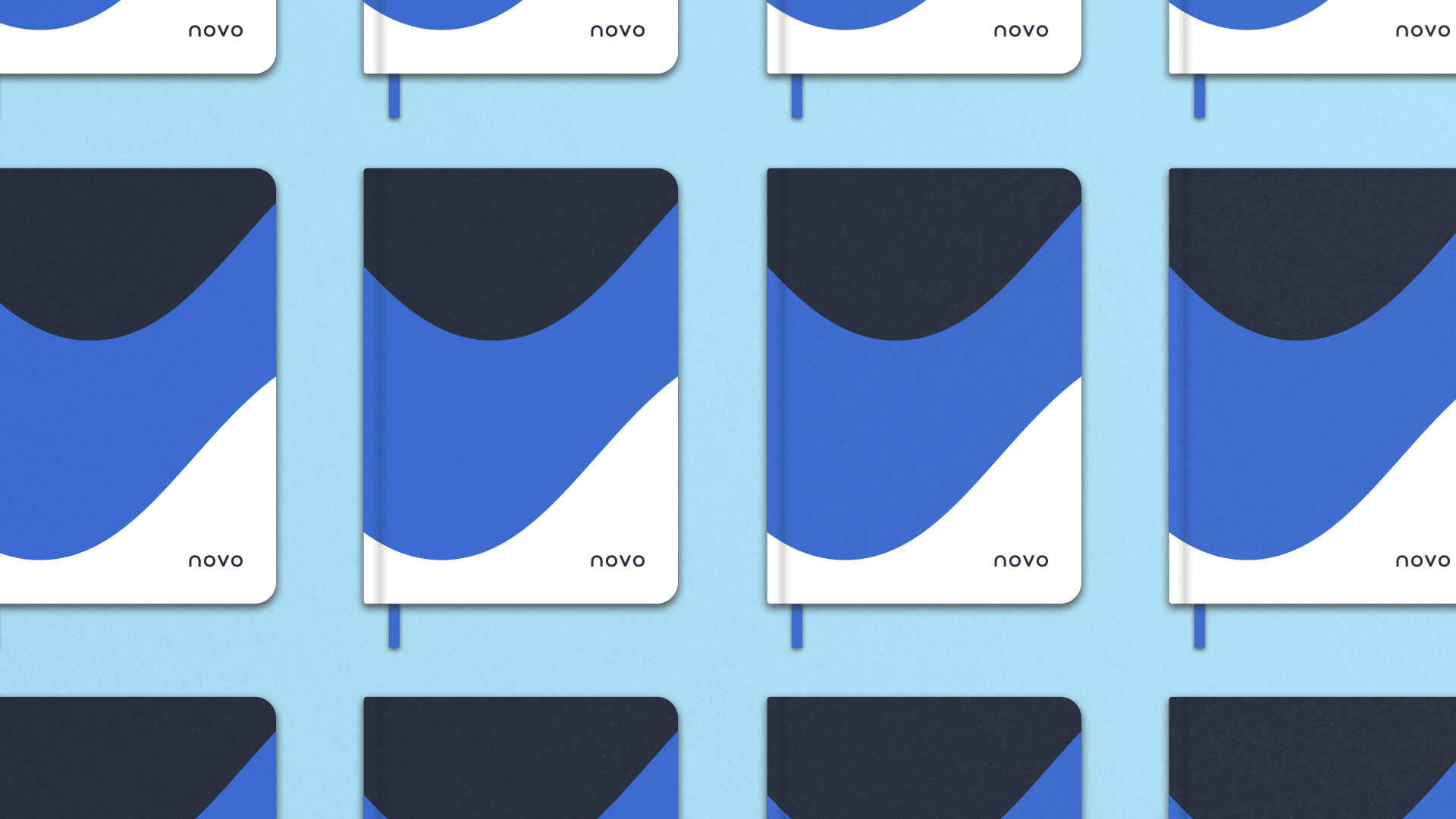
By building on the curves from the symbol, we were able to create a pattern that “flows” throughout the buildout. Allowing the pattern to take on a feeling all its own and revealing how fluid treatment for ailments can be with the help of Novo.
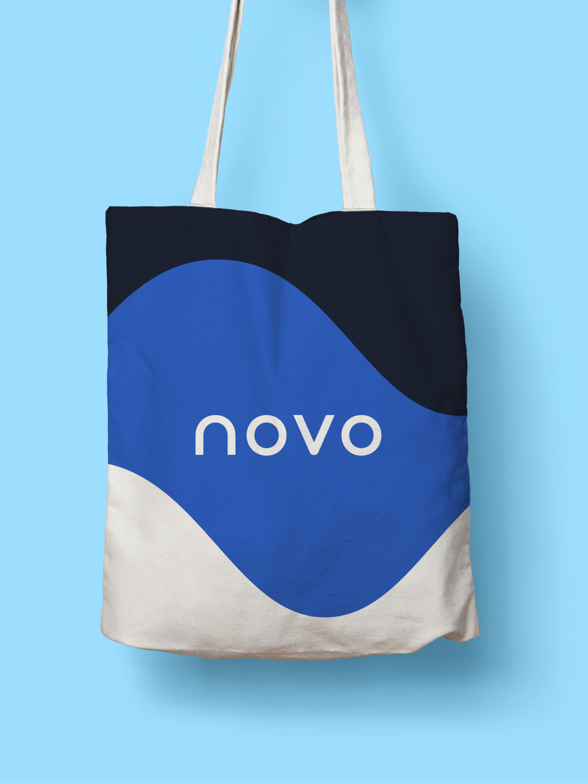
By incorporating the pattern in a single instance, we are able to seamlessly pair it with photos; extending the reach of the brand into posters, advertisements, and digital collateral.
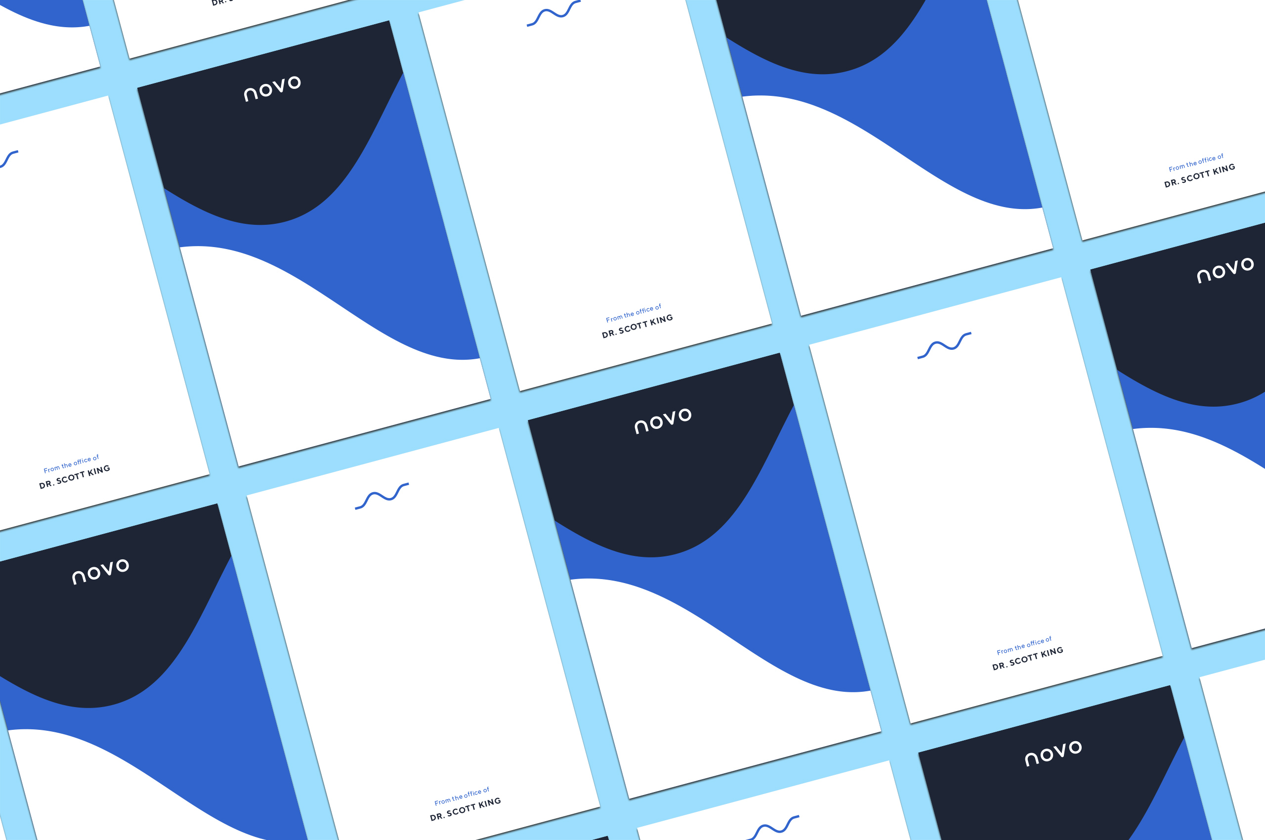
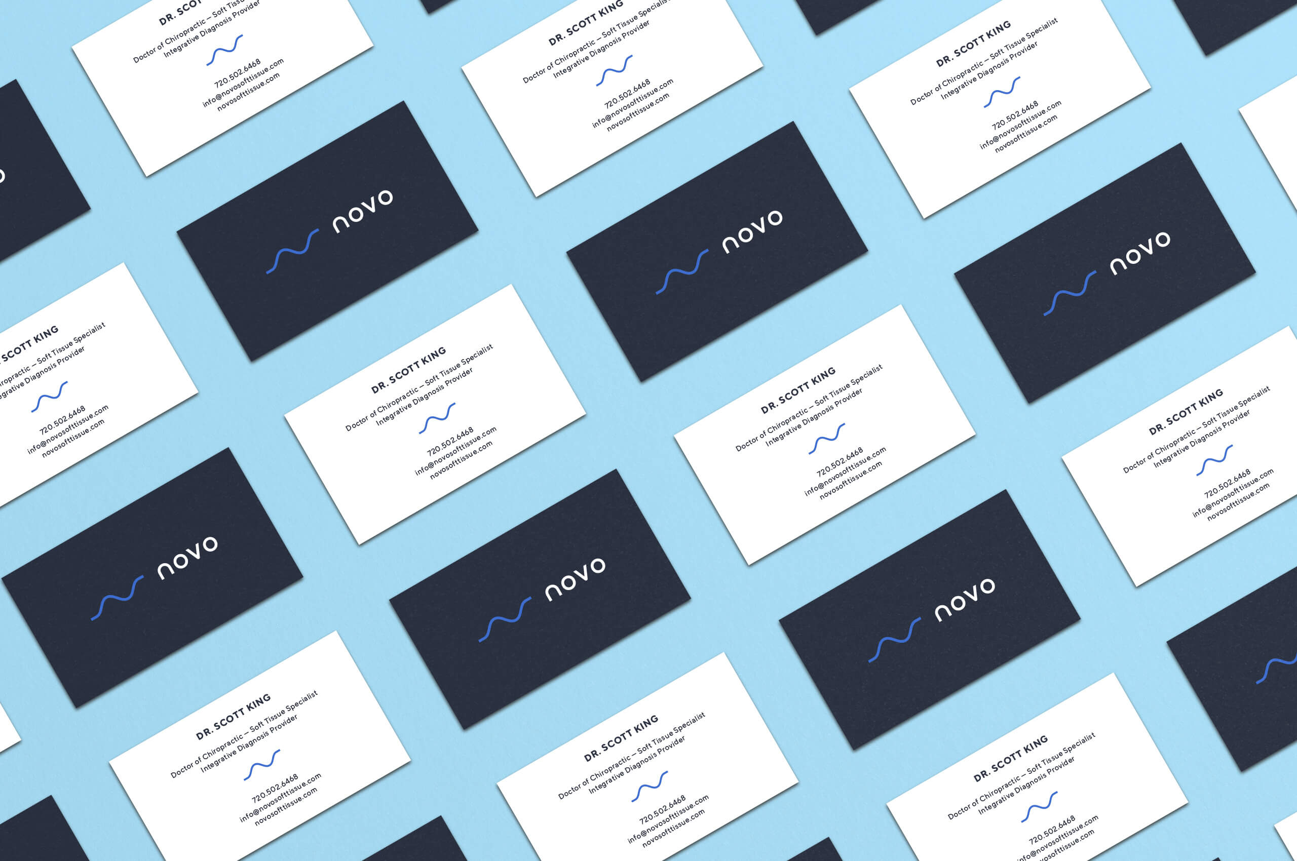
When developing the wordmark, we knew it had to be a continuation of the symbol, or it would stand in opposition. We used the frame of the symbol as a baseline for spacing, curves, and width of the wordmark. Resulting in a wordmark that is commanding on its own, while being a natural extension of the symbol when paired.