source.dev
AI-native tools that accelerate device development, built by the team who shaped Android.
AI-native tools that accelerate device development, built by the team who shaped Android.
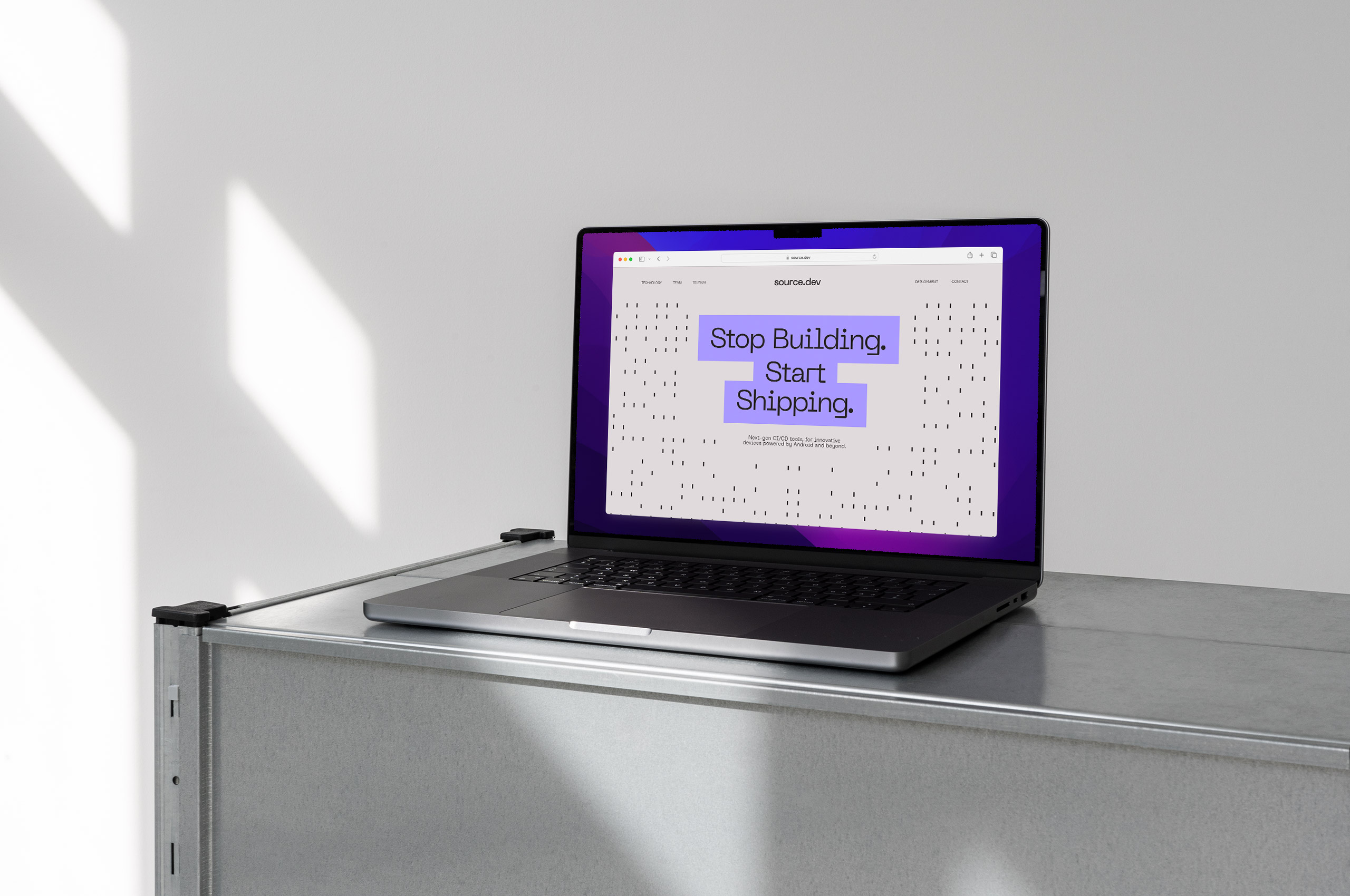
Source.dev accelerates Android device development through AI-native tools built by the team who helped shape Android itself. Composed entirely of former Android engineers with decades of collective experience, they’ve been instrumental in developing and shipping the OS to billions of devices worldwide. This deep institutional knowledge fuels breakthrough solutions like SourceFS, a virtual filesystem that builds Android 9× faster, and Harmony, which automatically resolves 88% of merge conflicts. Their comprehensive platform addresses the complete software development lifecycle, enabling device manufacturers to dramatically reduce costs, speed time-to-market, and maintain software throughout a product’s lifetime.
They partnered with Mast to develop an identity that reflects their unparalleled technical expertise and forward-thinking approach to device software. While their initial brand established market presence, they needed a visual system aligned with their team’s decades of Android experience and vision for transforming how manufacturers build, maintain, and update smart device software. The resulting identity positions Source.dev as essential infrastructure for next-generation development, combining technical precision with distinctive character that resonates with developer audiences while standing apart in the DevOps landscape.


The symbol draws inspiration from the settings icon found across Android and cellular devices, a visual language their audience encounters daily. Just as that icon represents system-level control and optimization, Source.dev’s mark embodies their role as the essential, continuous upgrade to their clients’ development infrastructure. The symbol is rooted in familiarity yet elevated through precise geometric refinement, signaling both accessibility and technical sophistication.
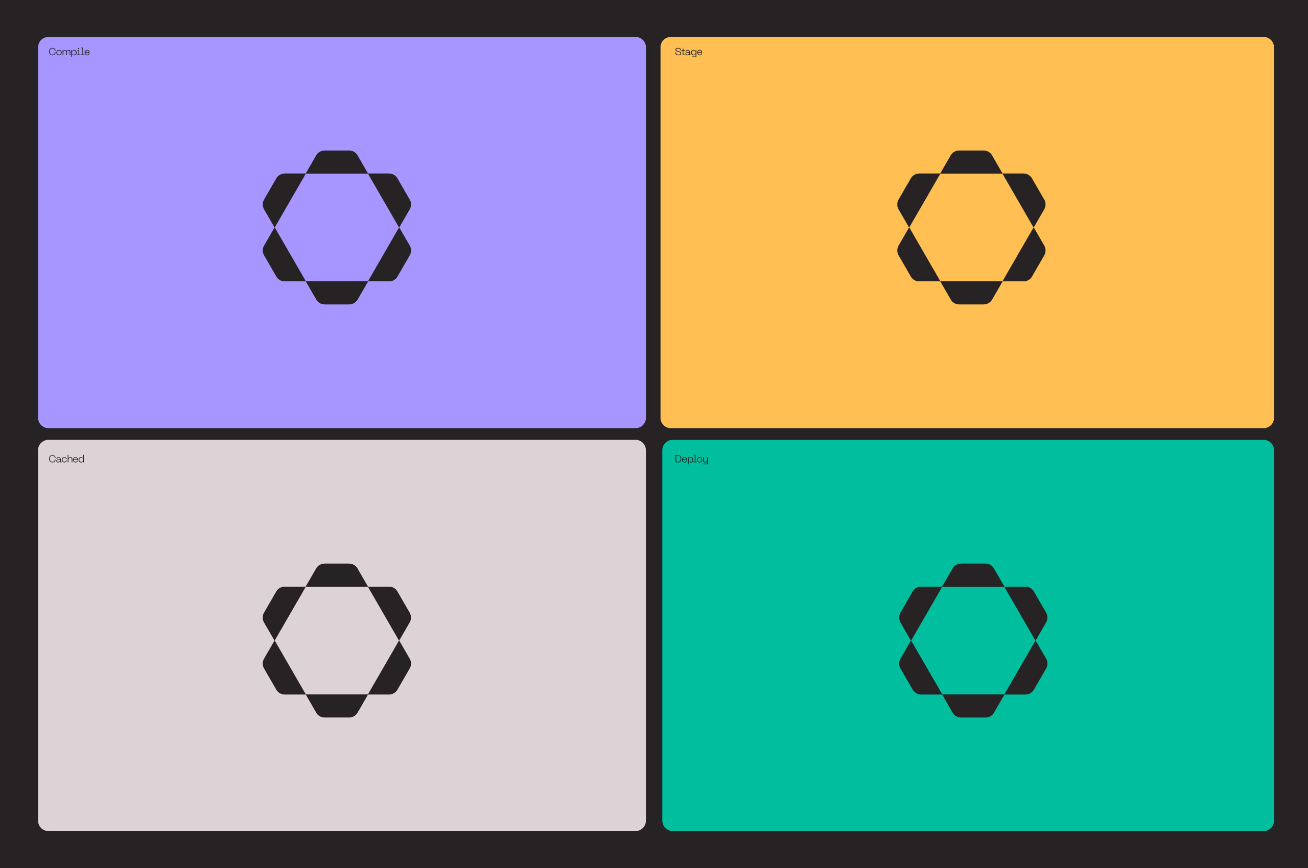
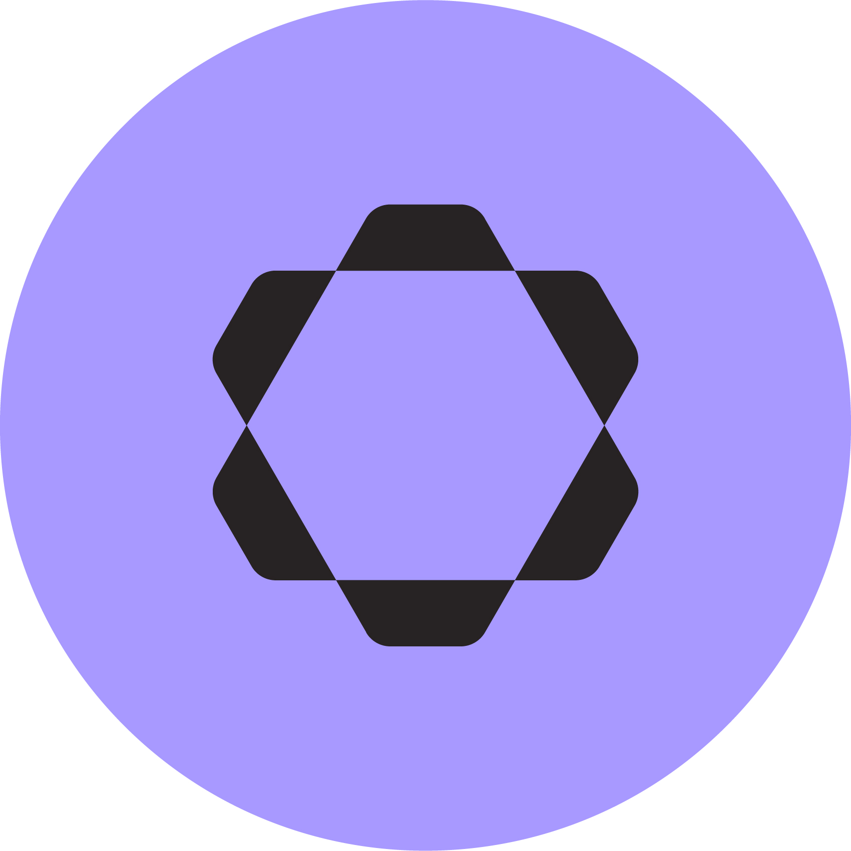
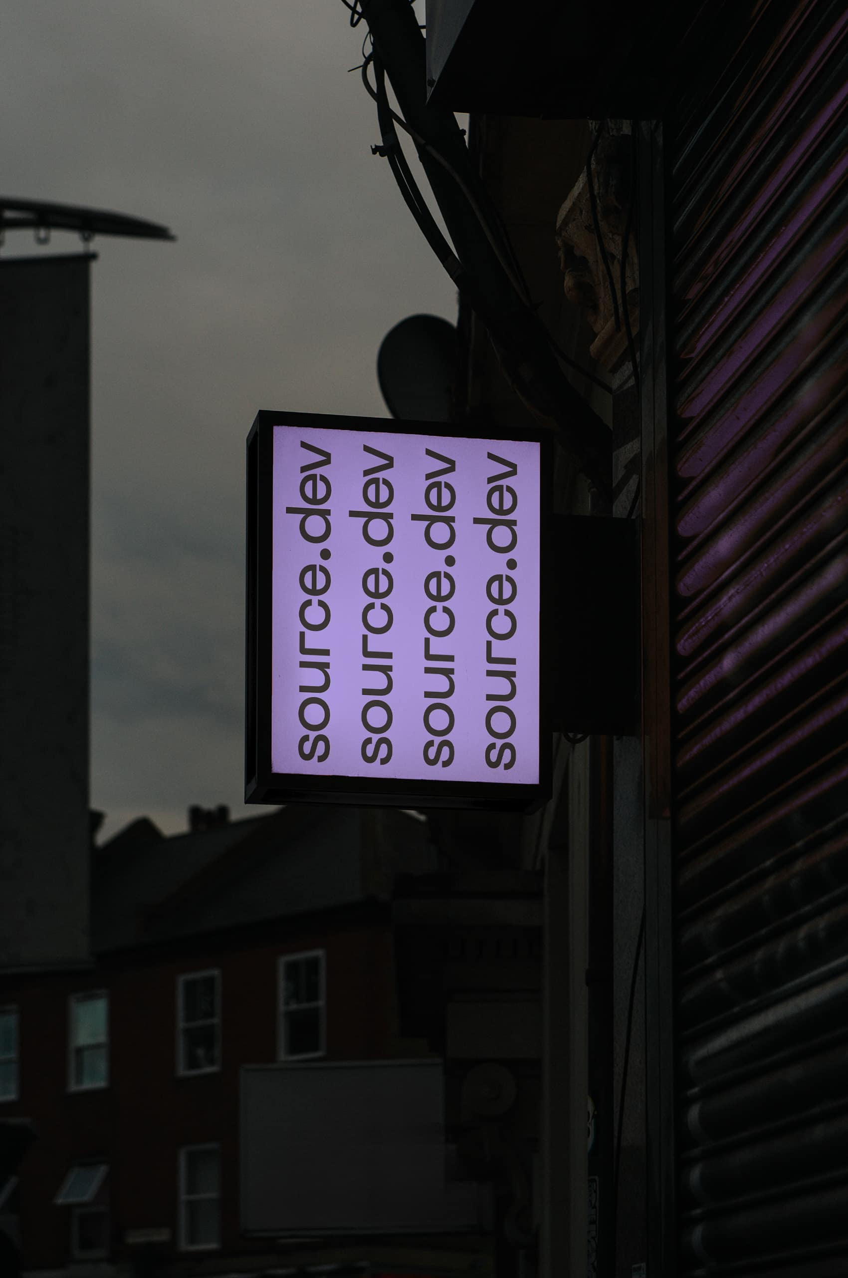
Engineered for versatility, the symbol maintains its integrity and recognition across all scales. Whether rendered at icon size on a mobile interface or displayed at architectural scale, the mark’s geometric precision ensures clarity and impact. This adaptability mirrors Source.dev’s platform: powerful enough to handle massive codebases, yet refined enough to integrate seamlessly into existing workflows.

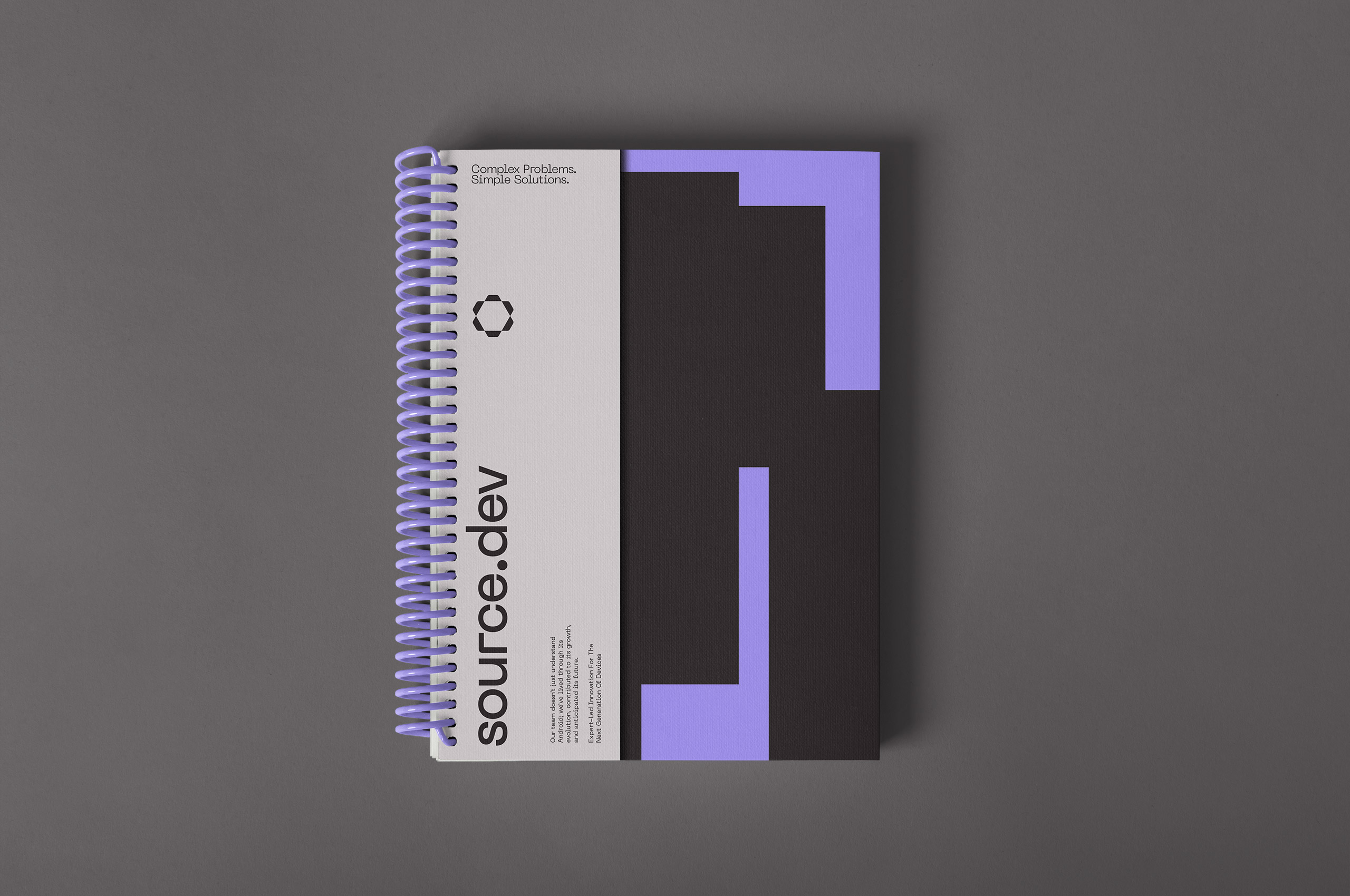
The initial brand served its purpose: establishing Source.dev’s presence and allowing the team to focus on building revolutionary tools. As the company matured and their platform solidified, they required an identity aligned with their technical depth and market ambitions. The evolution wasn’t about abandoning their roots but about matching their external expression to their internal expertise. The terminal-style typeface from the original identity carries forward in a more understated format, informing the type system throughout the brand and maintaining a thread of technical authenticity.


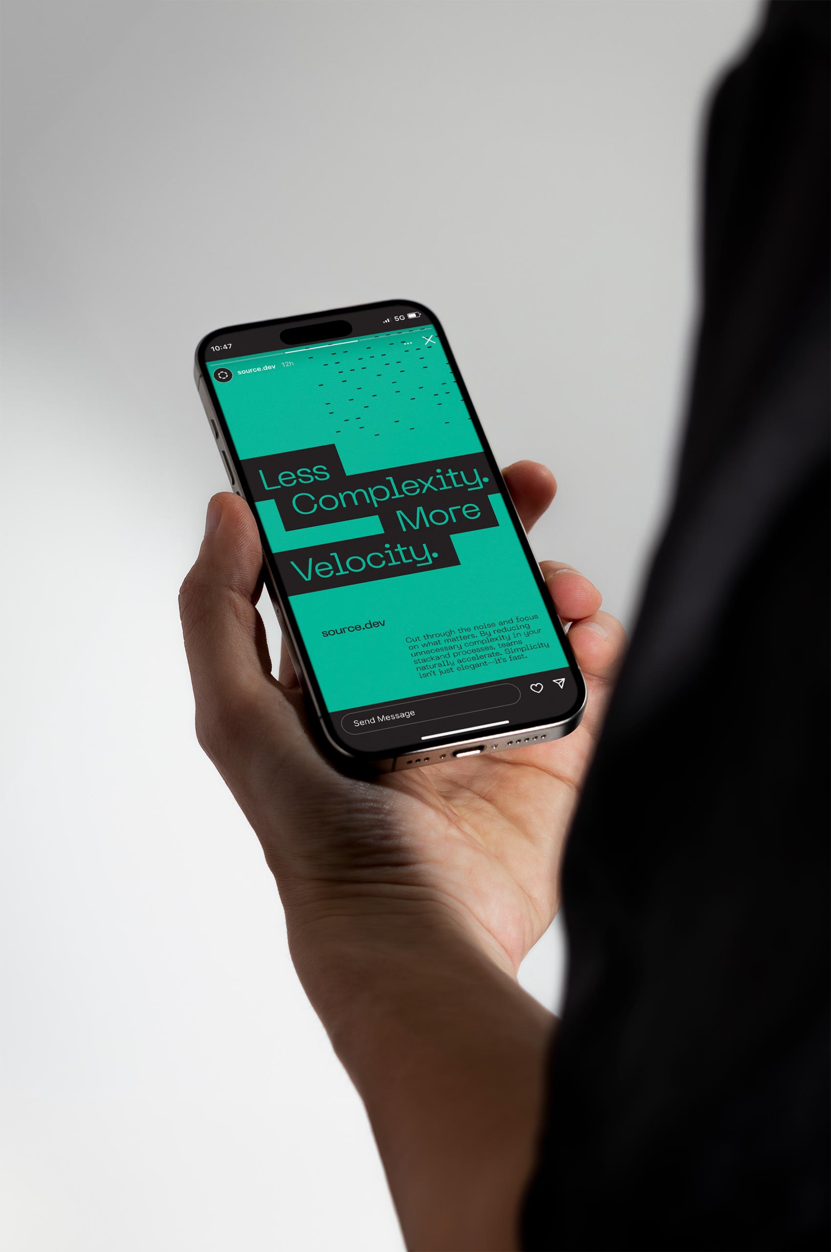
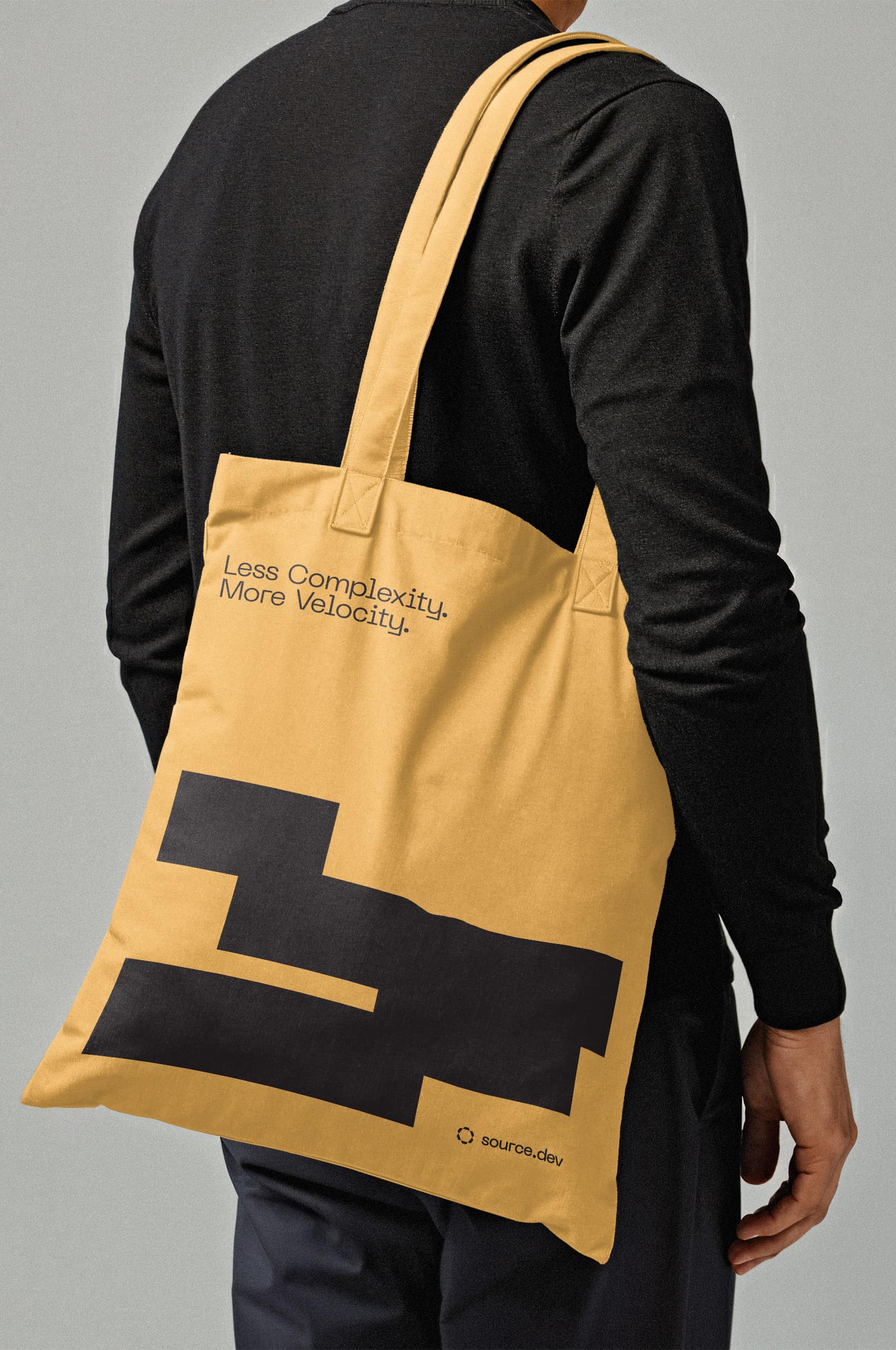
The previous brand’s highlighted “S” wasn’t discarded but amplified into a comprehensive typographic strategy. This highlight technique now extends across large-scale headlines, creating visual hierarchy that commands attention while maintaining continuity with the original identity. What began as a single letterform treatment evolved into an expressive system that brings emotional resonance to technical messaging, allowing key phrases to resonate with the same precision as their code.
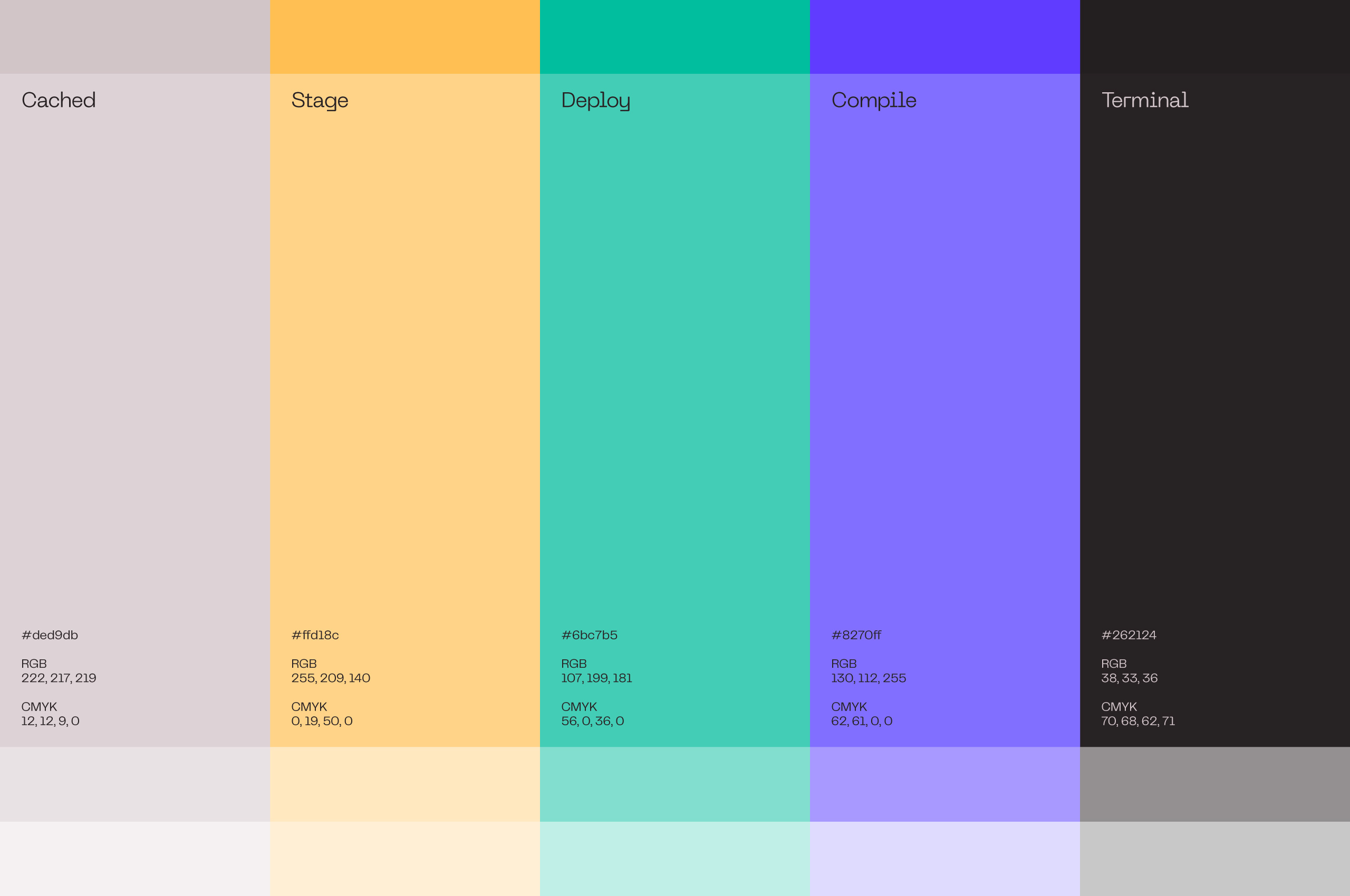
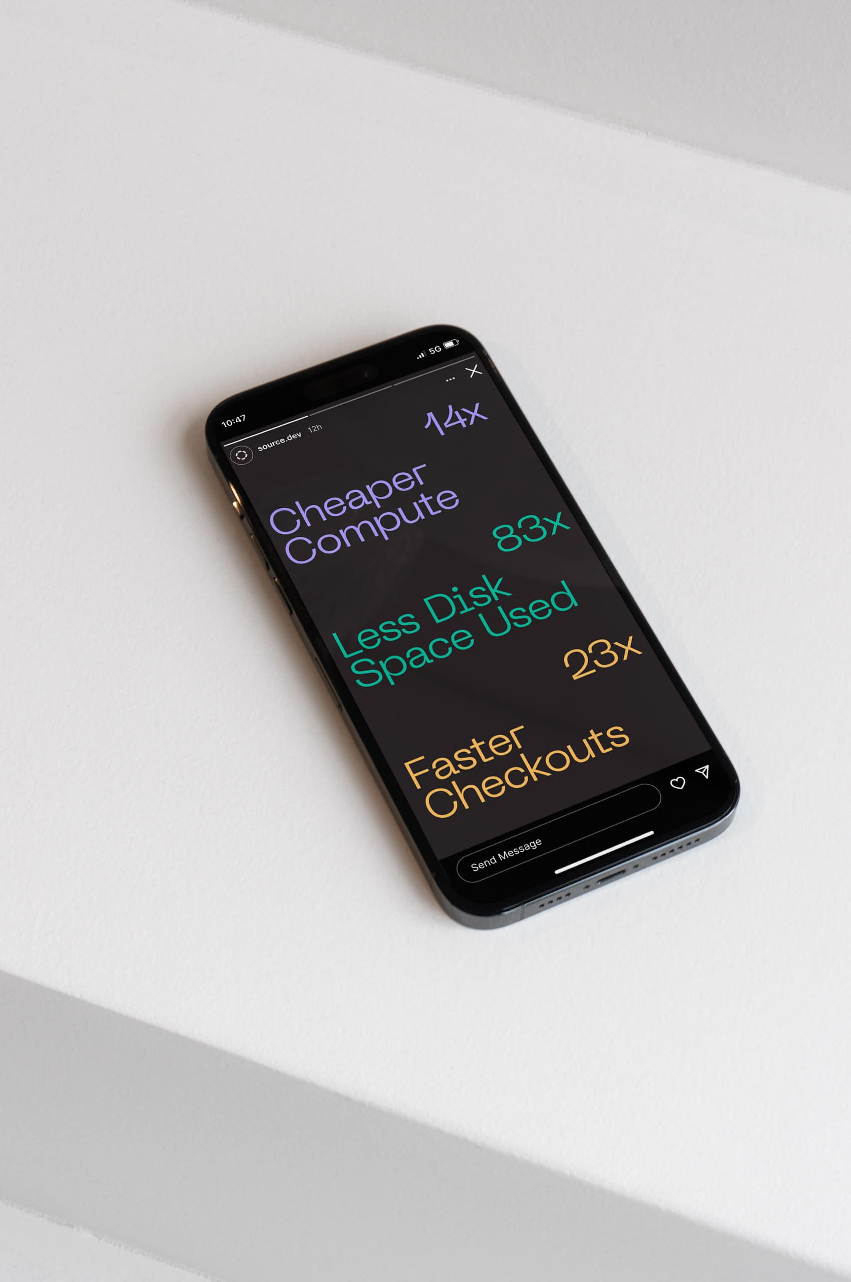
The color system builds on the original brand’s green, expanding it into a vibrant, energetic palette that stands apart in the DevOps landscape. This playful approach brings unexpected energy to a typically restrained market while maintaining connection to Source.dev’s established identity, ensuring continuity as the brand evolves alongside the platform it represents.
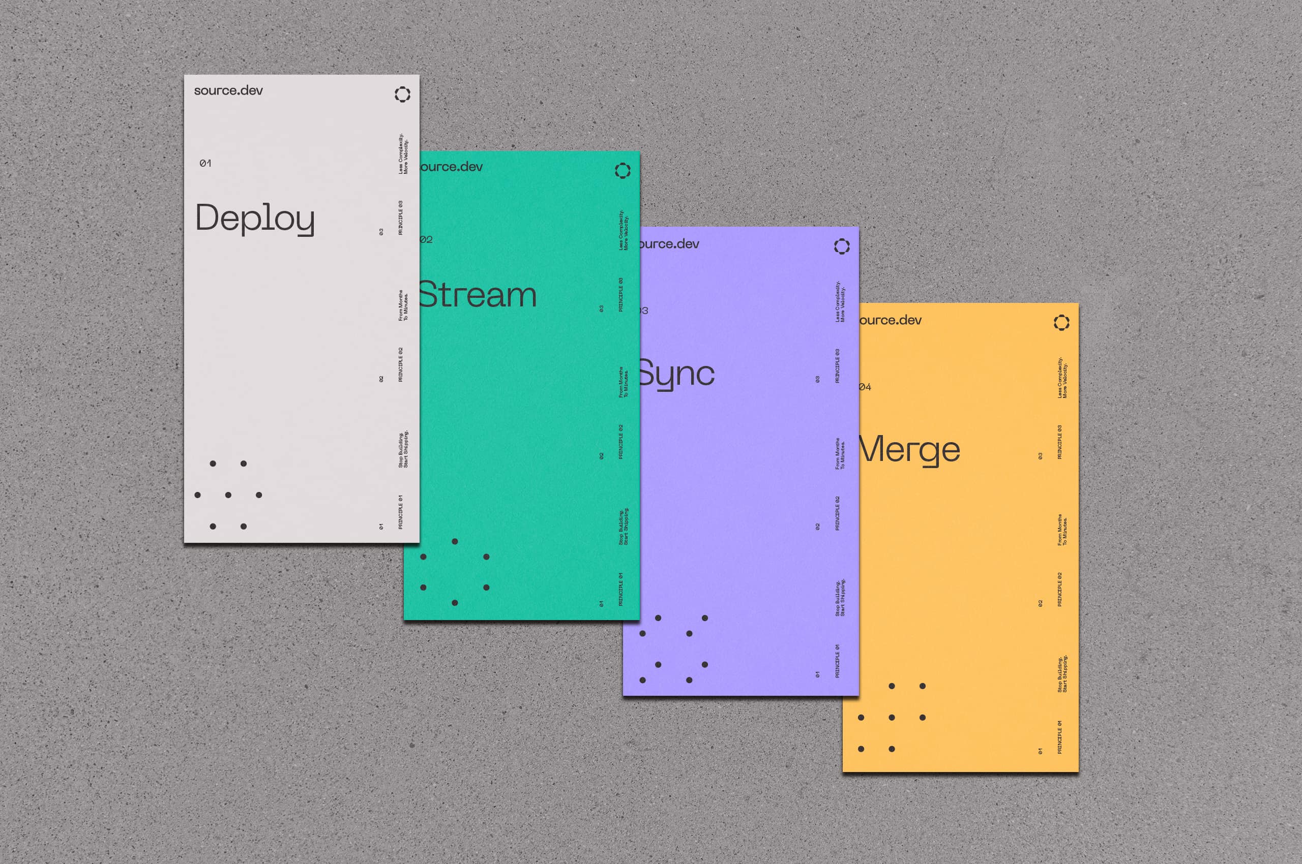
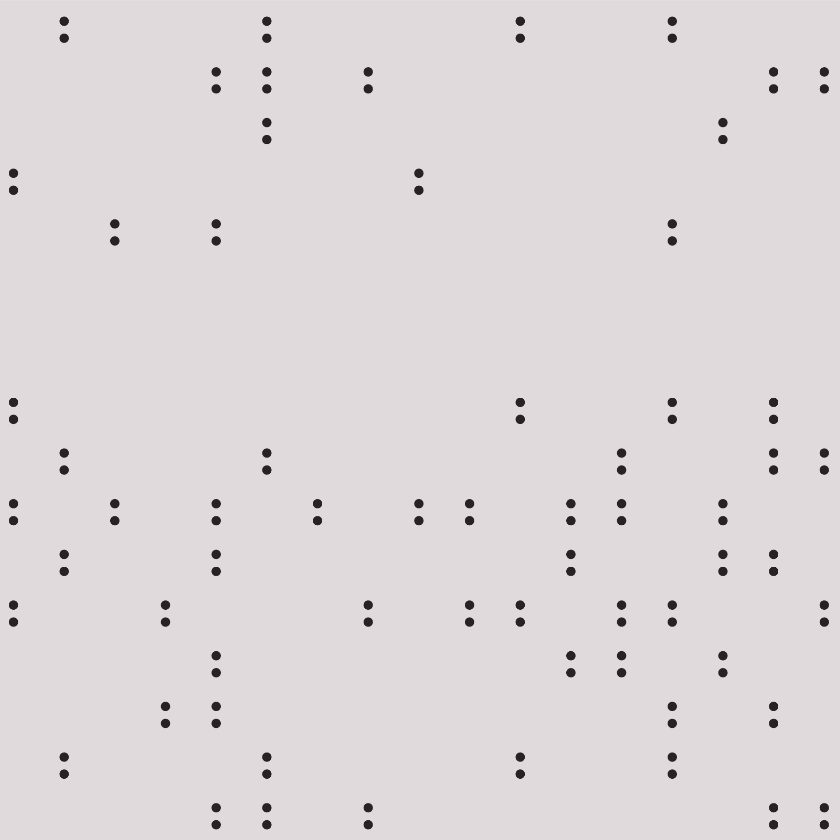
Large-scale patterns employ the Fibonacci sequence, mathematical progression found throughout nature and efficient systems. This deliberate choice visually communicates velocity and organic growth through geometric logic. The patterns don’t just decorate; they demonstrate Source.dev’s philosophy of using mathematical precision to achieve exponential improvements in speed and efficiency.


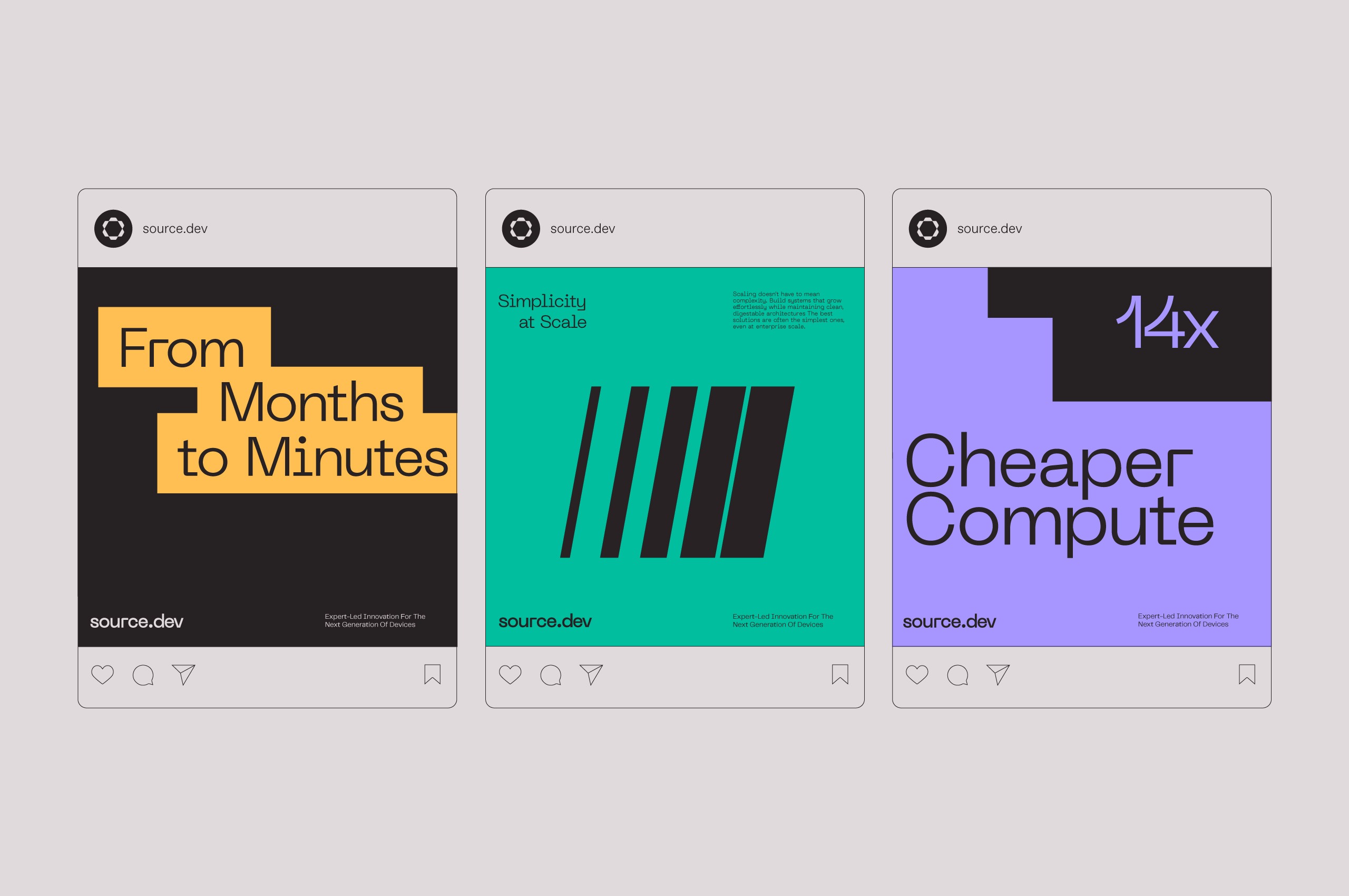
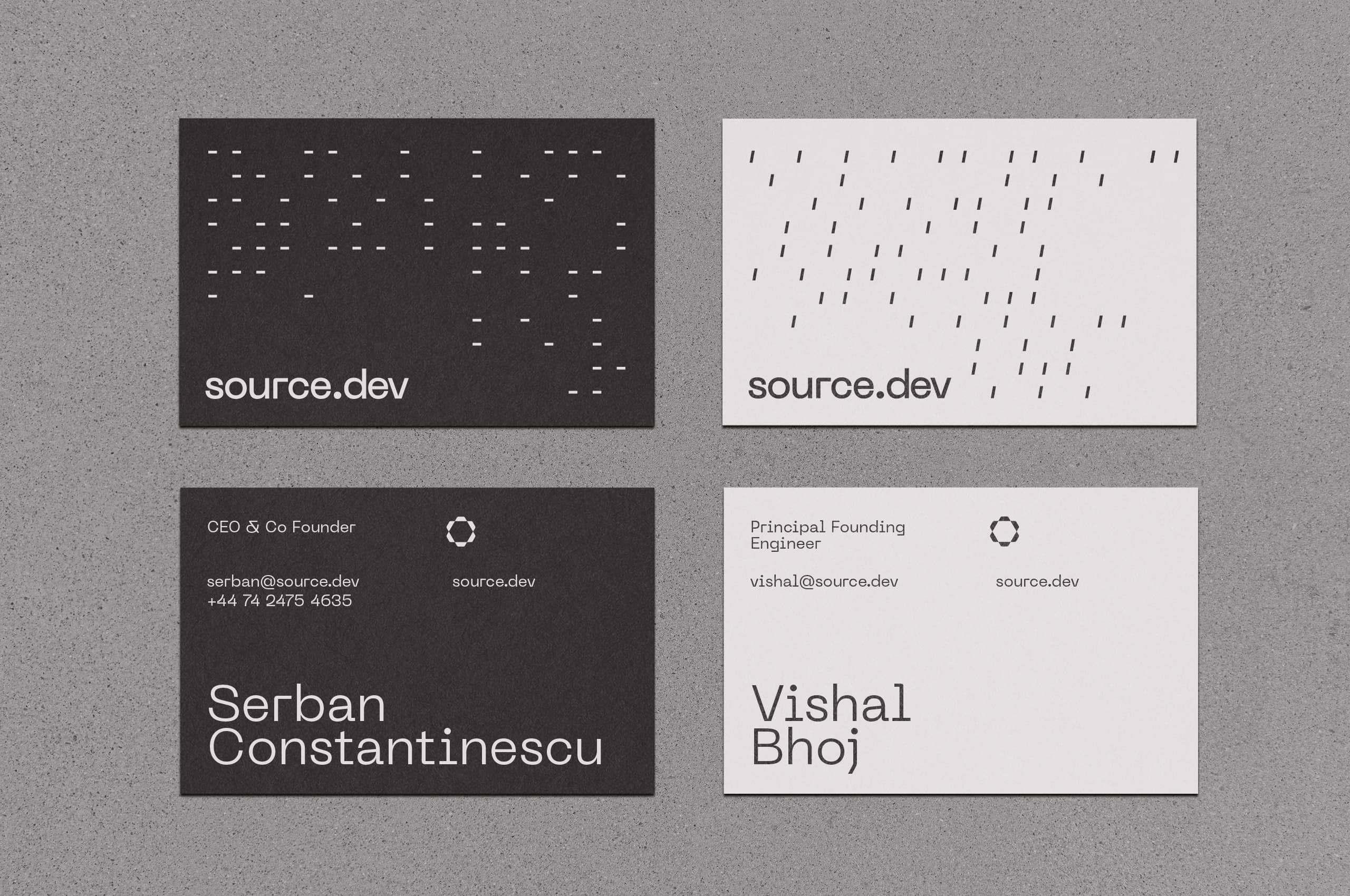
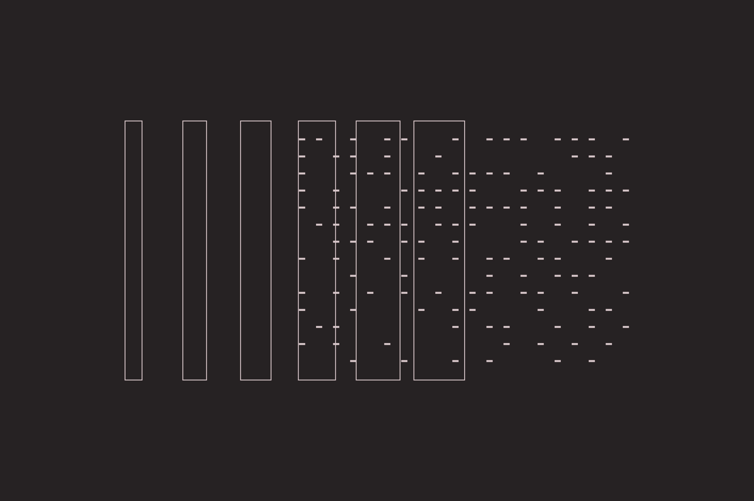
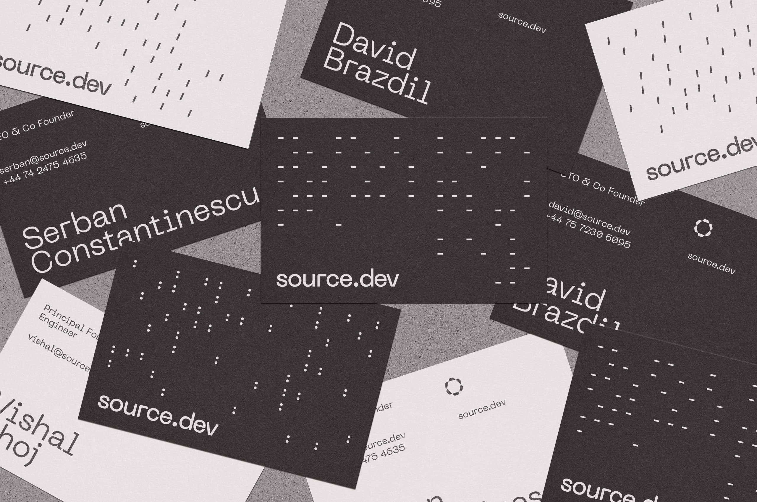
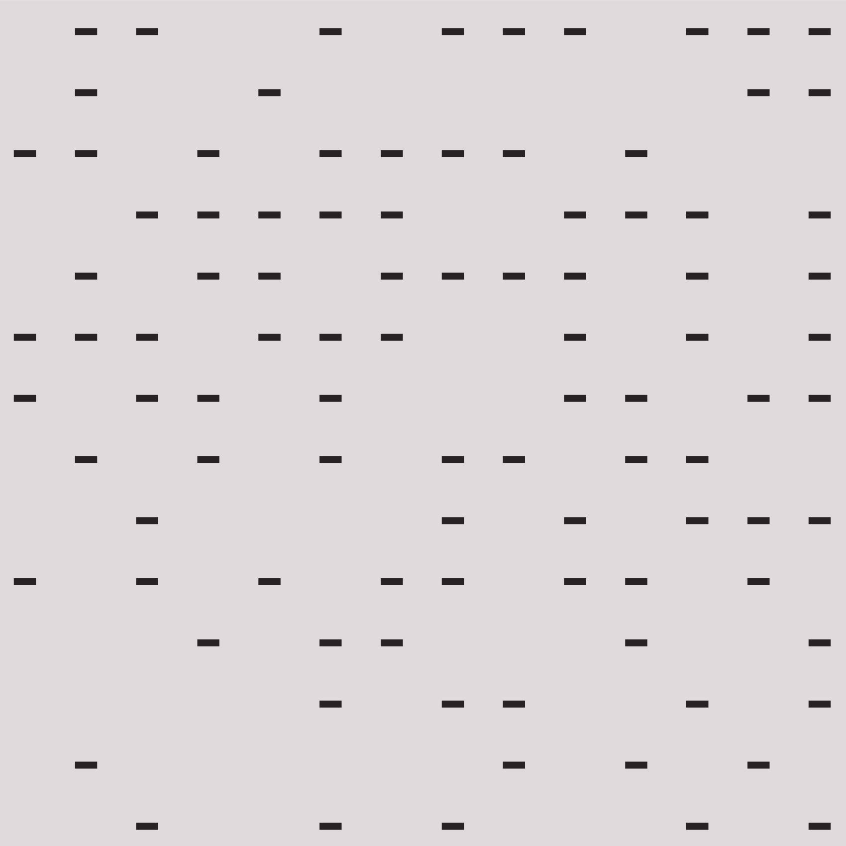
Smaller pattern elements draw directly from the punctuation within Source.dev’s codebase: periods, slashes, dashes. These fragments of actual syntax are arranged into intricate, technically sophisticated pattern screens that feel native to developers. The patterns speak the visual language of code itself, creating an immediate, authentic connection with the audience who lives in terminals daily.

The slash element within the pattern system serves dual purposes. Beyond its role in creating visual texture, it functions as a natural separator for future partnerships and co-branded initiatives. This forward-thinking detail ensures the identity system can gracefully accommodate collaboration without requiring redesign.

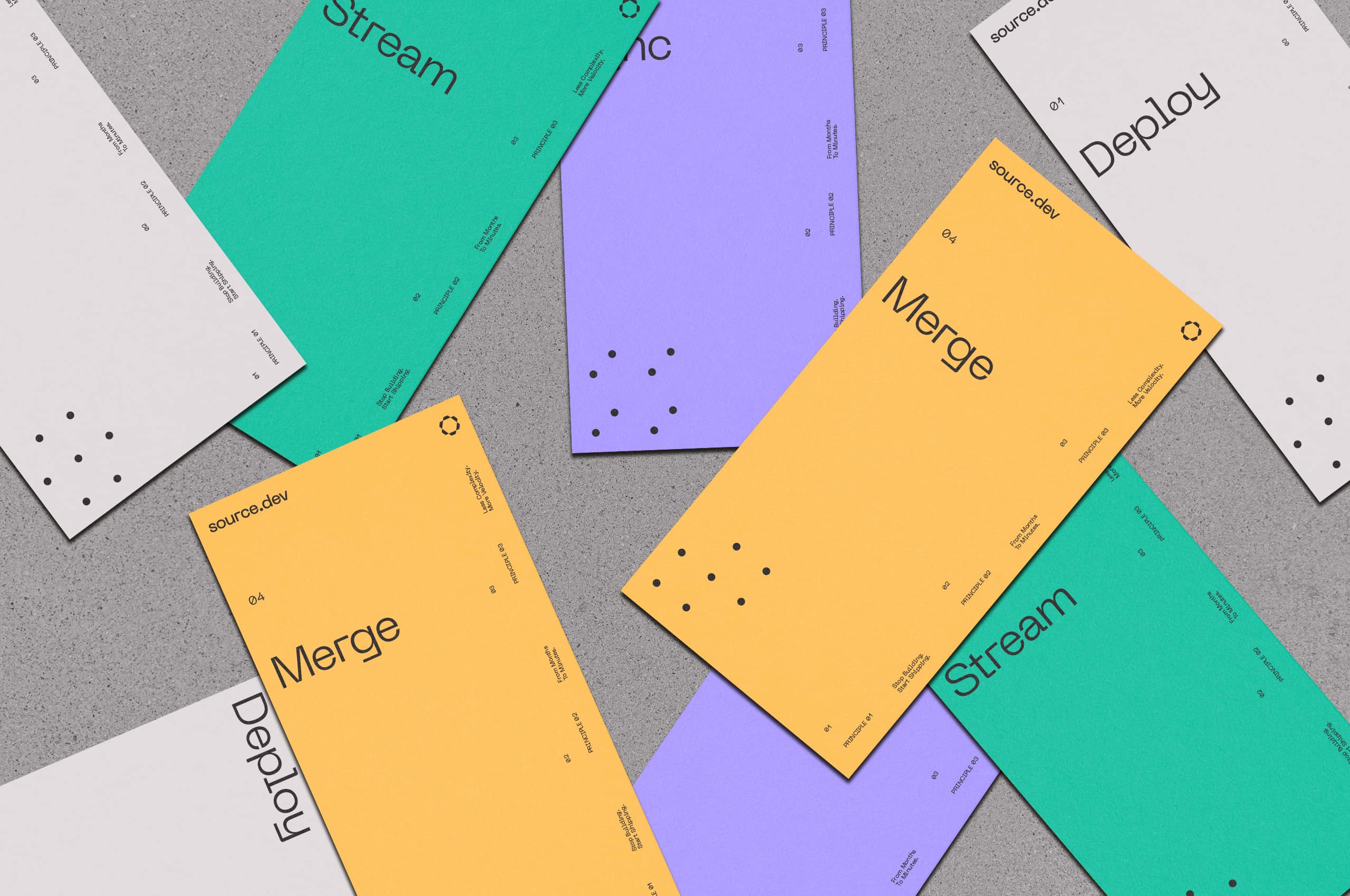

The dots scattered throughout the pattern system translate into a complete icon family constructed entirely from dotted elements. This creates a unified visual language across all system indicators, ensuring every graphic element, no matter how utilitarian, reinforces the brand’s distinctive character and technical precision.
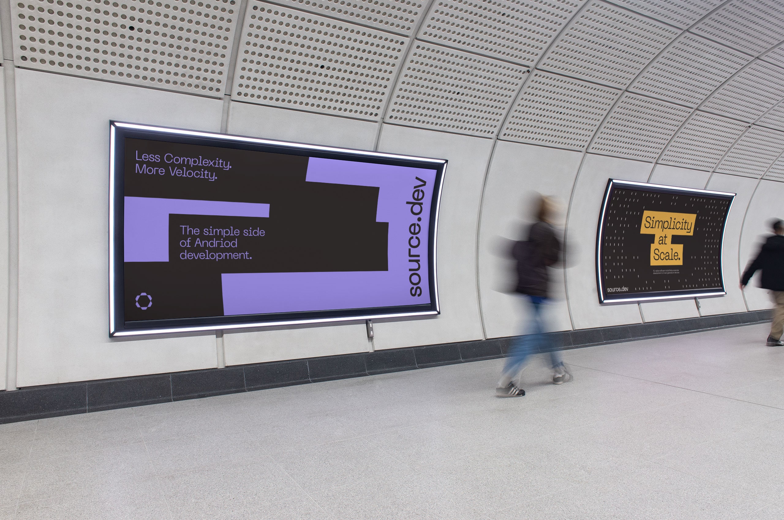
The typographic highlight, freed from its headlines, becomes a powerful graphic element in its own right. These abstract, energetic blocks create visual punctuation throughout layouts, offering moments of emotion and emphasis that break up technical density. They function as pure graphic forms while carrying the DNA of the typographic system, adding flexibility and expressiveness to the identity.


Rather than traditional photography, team members are represented through custom ASCII artwork: portraits constructed from the characters and symbols developers use every day. This approach is both technically authentic and visually distinctive, transforming portraiture into something that feels genuinely native to Source.dev’s world. The result humanizes the team while reinforcing their deep technical roots.