srch
Recruiting catalysts for growth-stage companies.
Recruiting catalysts for growth-stage companies.
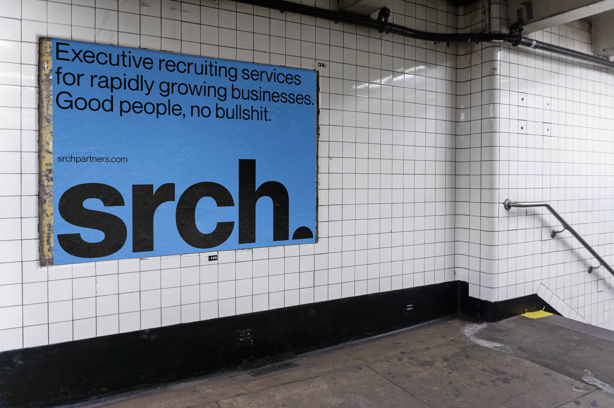
Srch is a boutique executive recruiting services agency that focuses on simplicity and results. They provide modern, comprehensive executive recruiting services for rapidly growing businesses.
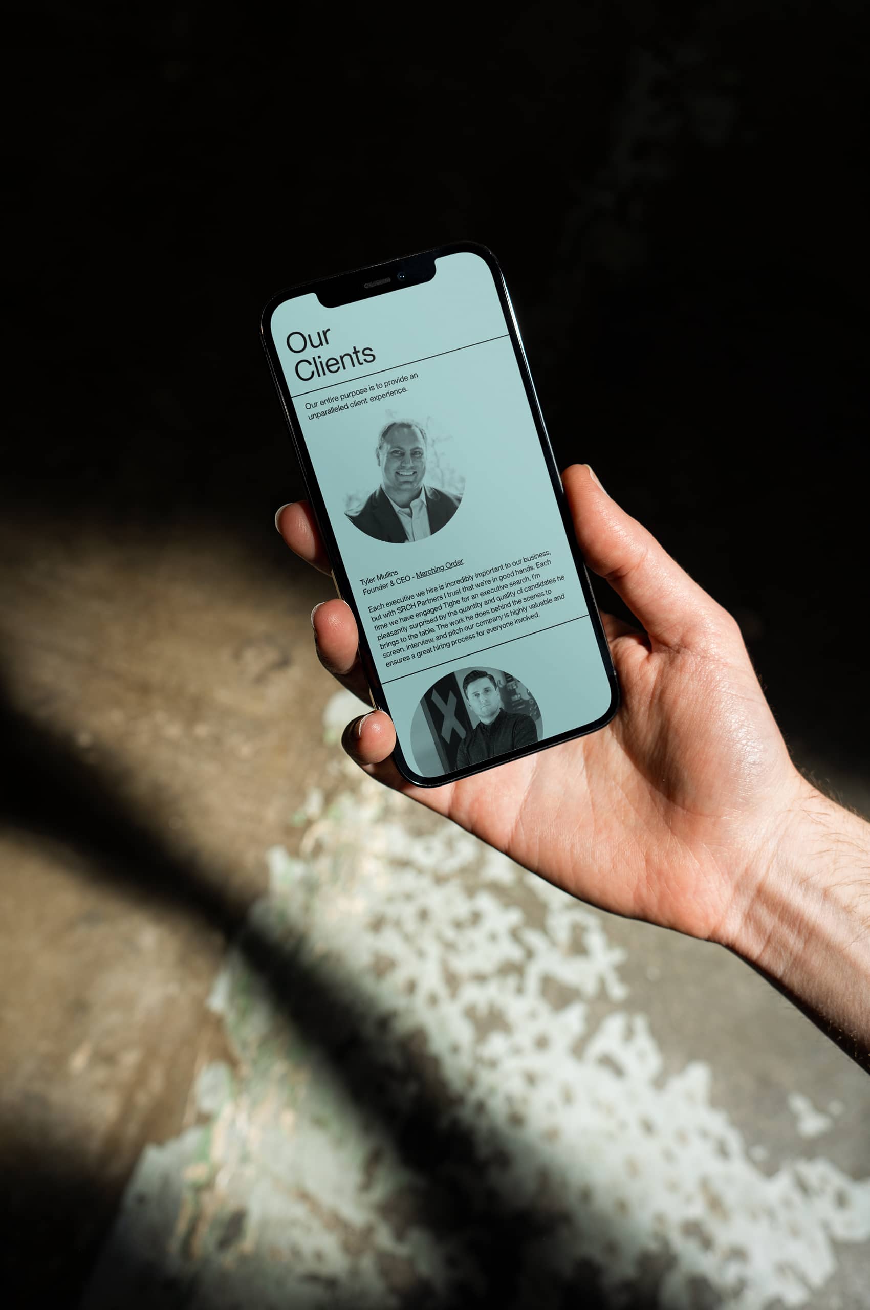
They are no strangers to the frills, filler, and, as they say, “BS” associated with more extensive executive recruiting firms. Unfortunately, these interactions often leave clients feeling unimpressed and frequently turning to srch. This is why their entire focus is providing an unparalleled client experience.
They employ a no BS mentality to their process, a direct, to the point approach that ensures high-quality results for their clients. This mentality led to the unique spelling of their name. A reductive process that left what was essential.
“Our team is small, you know what you’re getting, and our entire purpose is to provide an unparalleled client experience.”
Tighe Burke, the founder of srch, approached Mast to help usher in a new chapter for his company. We worked closely with Tighe to develop a no-nonsense, no bs identity to help srch cut through the clutter in the market.
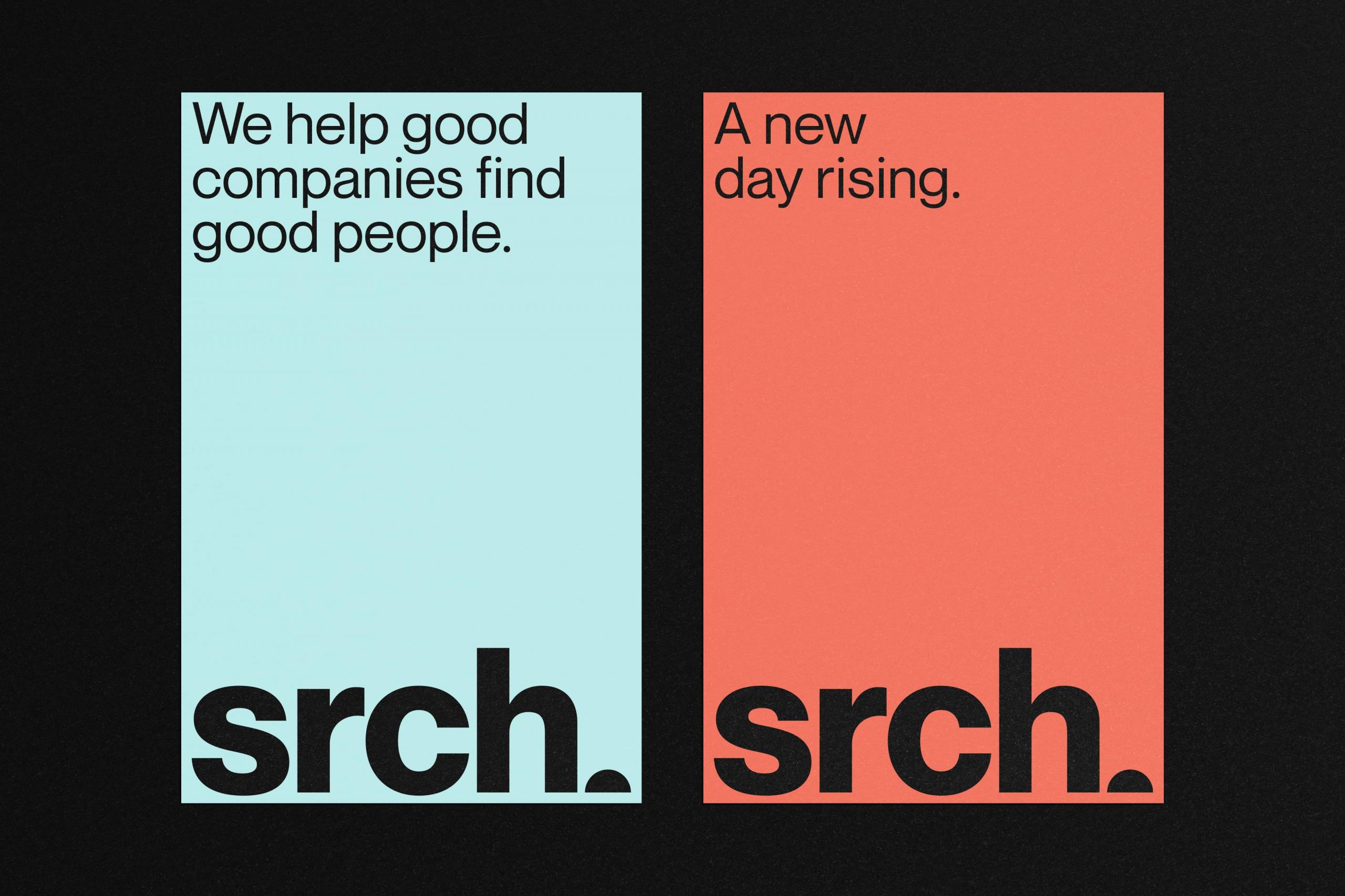
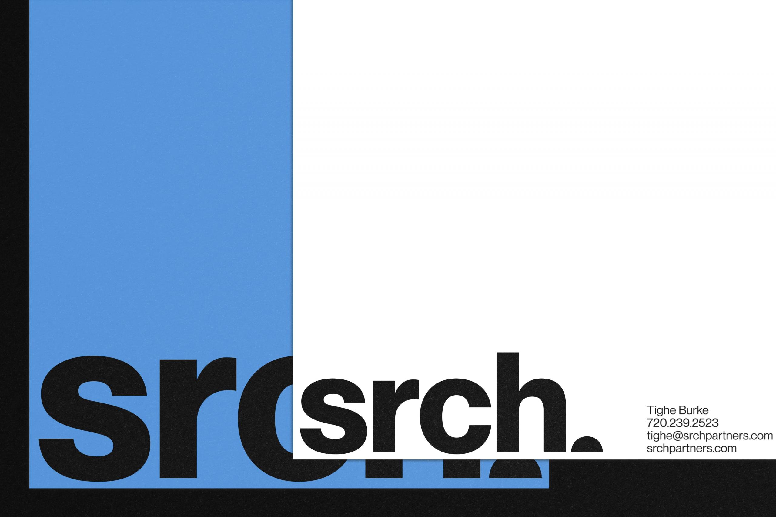
To mirror the reductive, sincere process that srch employs. We developed a straightforward, type-driven approach to the buildout of the brand. Allowing the type, color, and copywriting to carry the weight of the brand. This resulted in a straightforward brand that mirrored the ethos of srch completely.
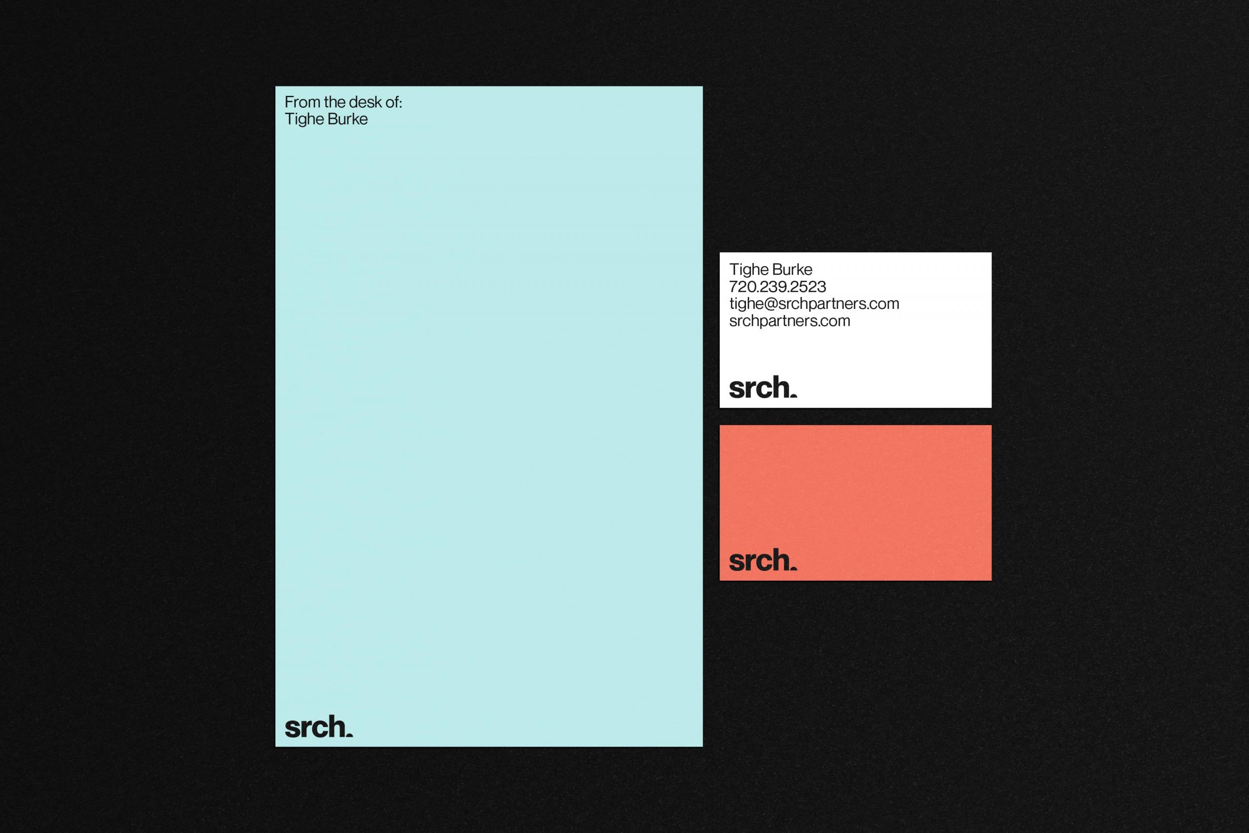
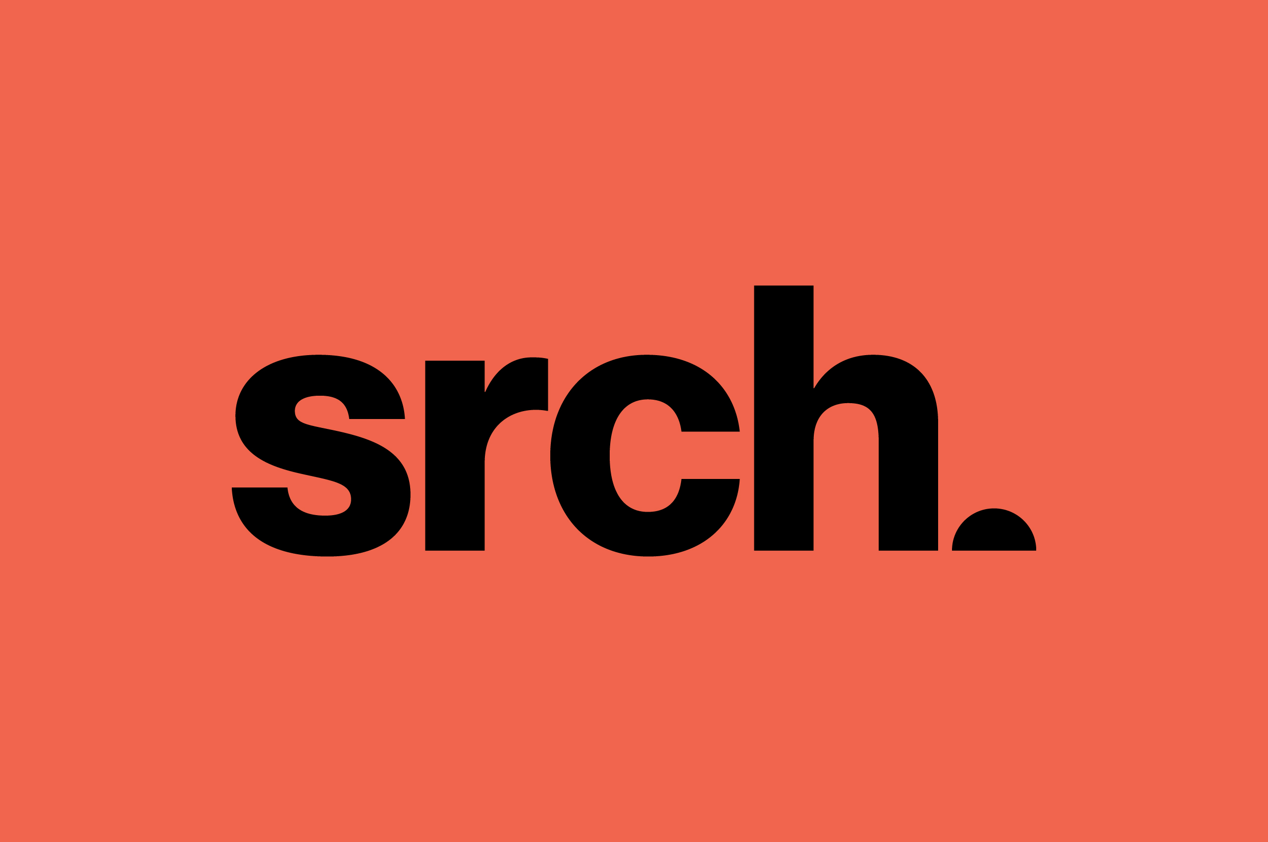
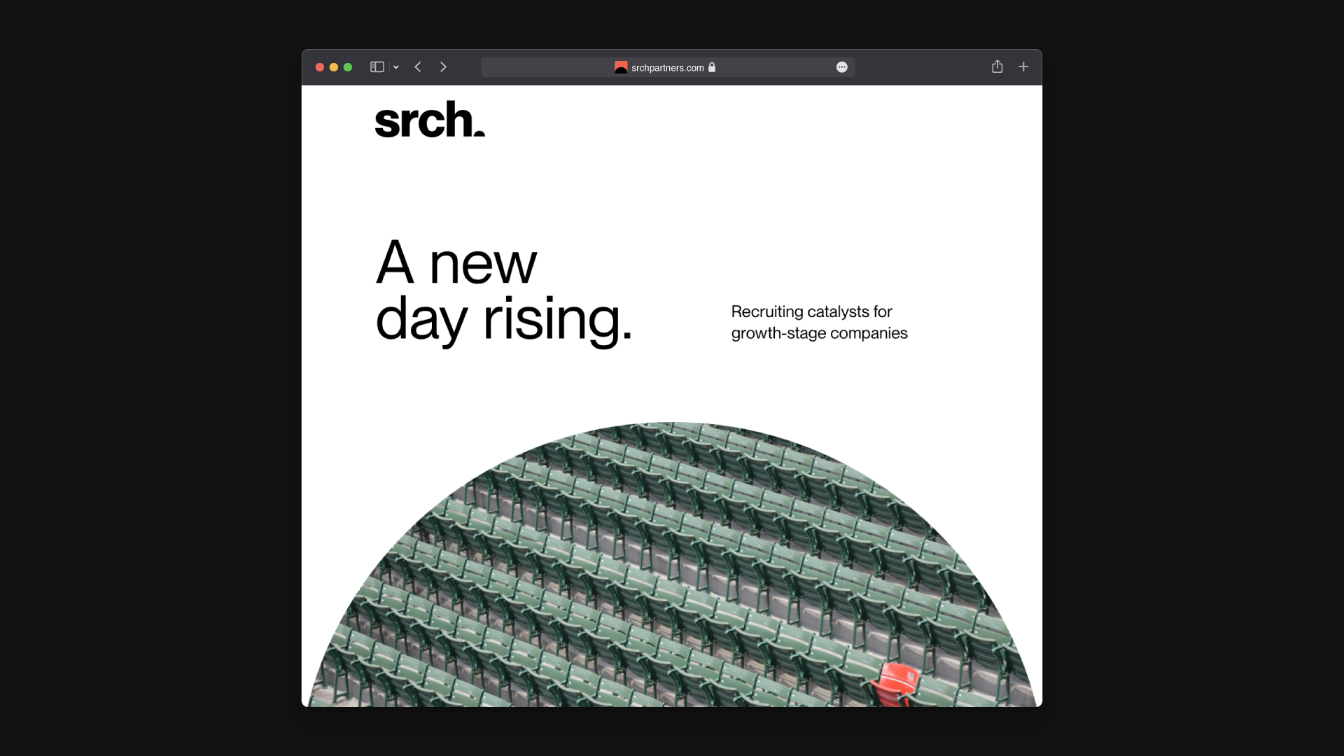
While the wordmark is straightforward and reduced in form, we wanted to sneak a little ah-ha moment into the final form. Tighe works closely with executives helping them to shape the futures of their companies. These are not inconsequential positions he is helping to fill.
He looks at these placements as new eras for these companies. A striking metaphor, we cut the period in half after the wordmark to create a visual metaphor; a new day.
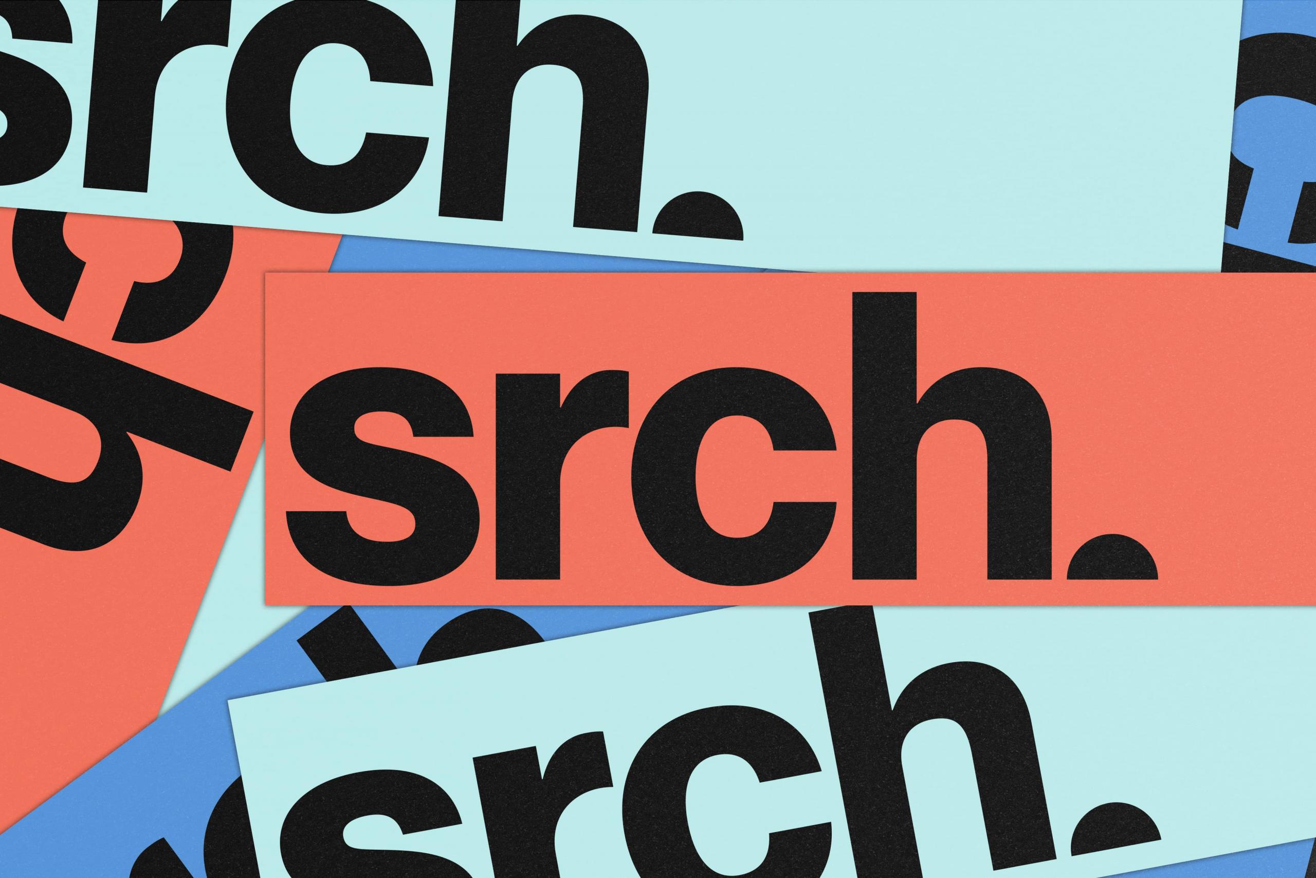
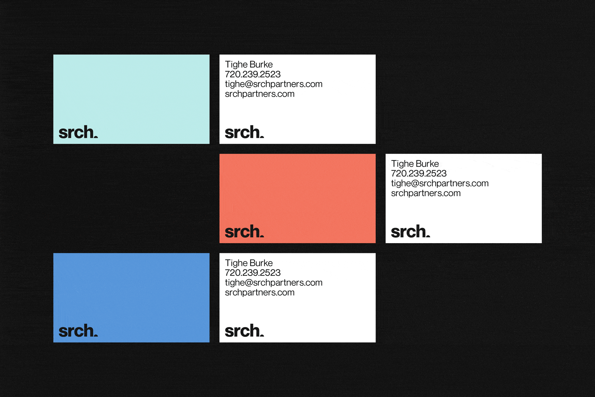
This notion of a sunrise helped shape the color palette. Black and white establish a robust and uncomplicated base to the brand, while shades of blue and orange provide the spirit of a new day dawning.


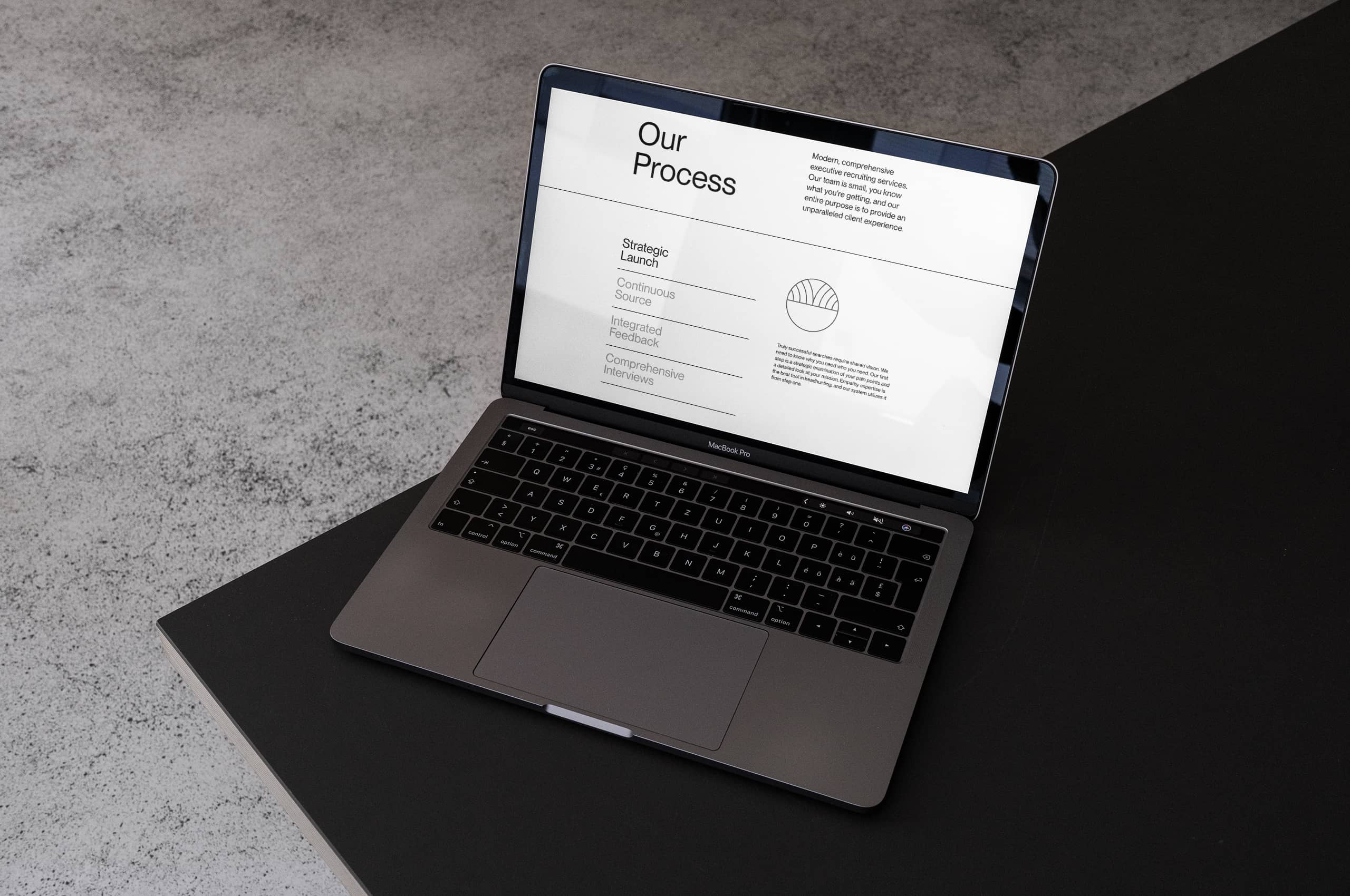
We worked with Tighe to build a digital home for srch to mirror the direct manner of the company and brand. Providing prospective clients with the necessary information and nothing else. Truly reductive to its core.
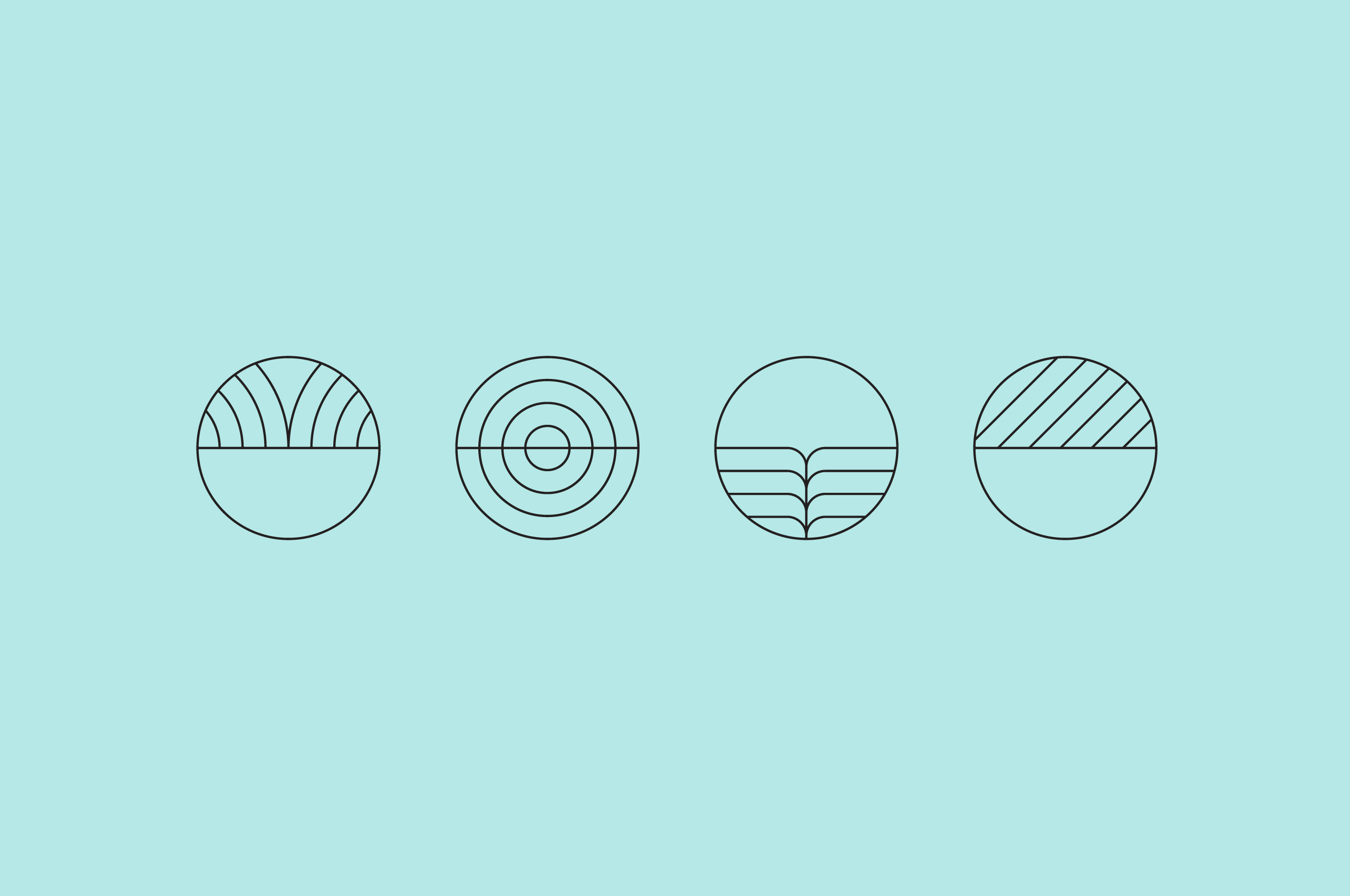
The site still needed a bit of help through a suite of icons to help simplify and explain more complex ideas of their process. So we created a custom set of icons inspired by the sunrise that employed linework from the site, rooting them in place.
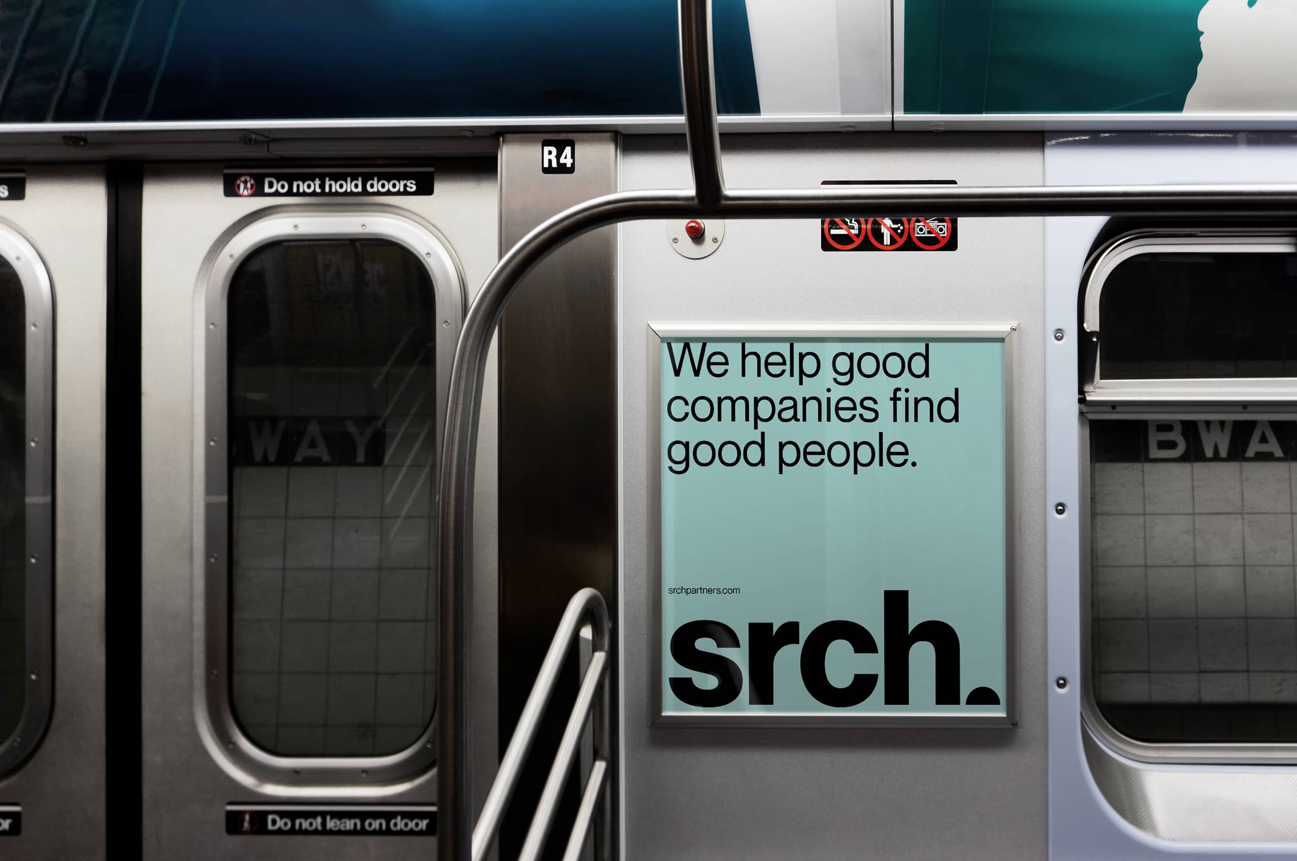
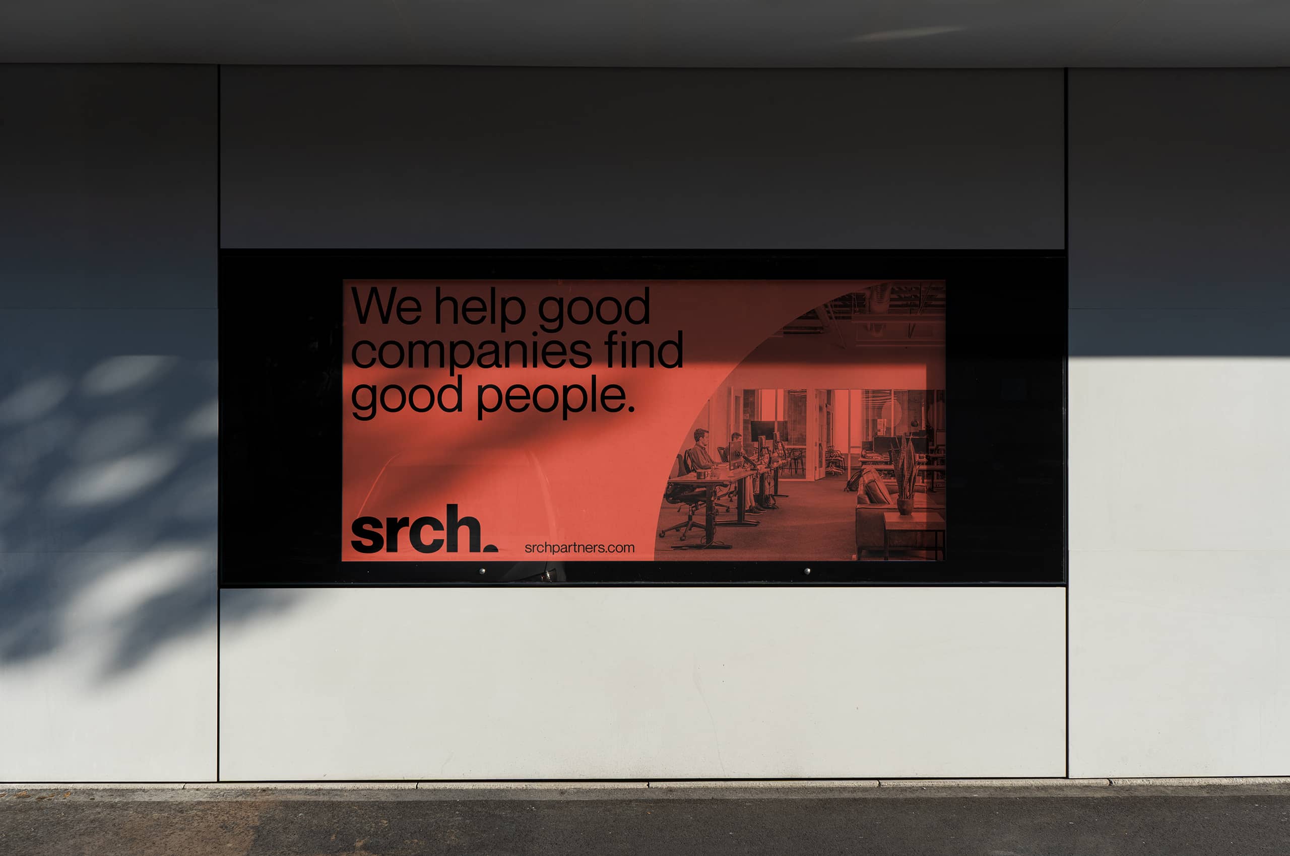
Building on the straightforward, type-driven print collateral, we helped create a bold, impactful set of out-of-home materials to stop people in their tracks. Again, utilizing type most of the time but sometimes introducing half and quarter circle images to create a more significant visual impact while matching the wordmark.