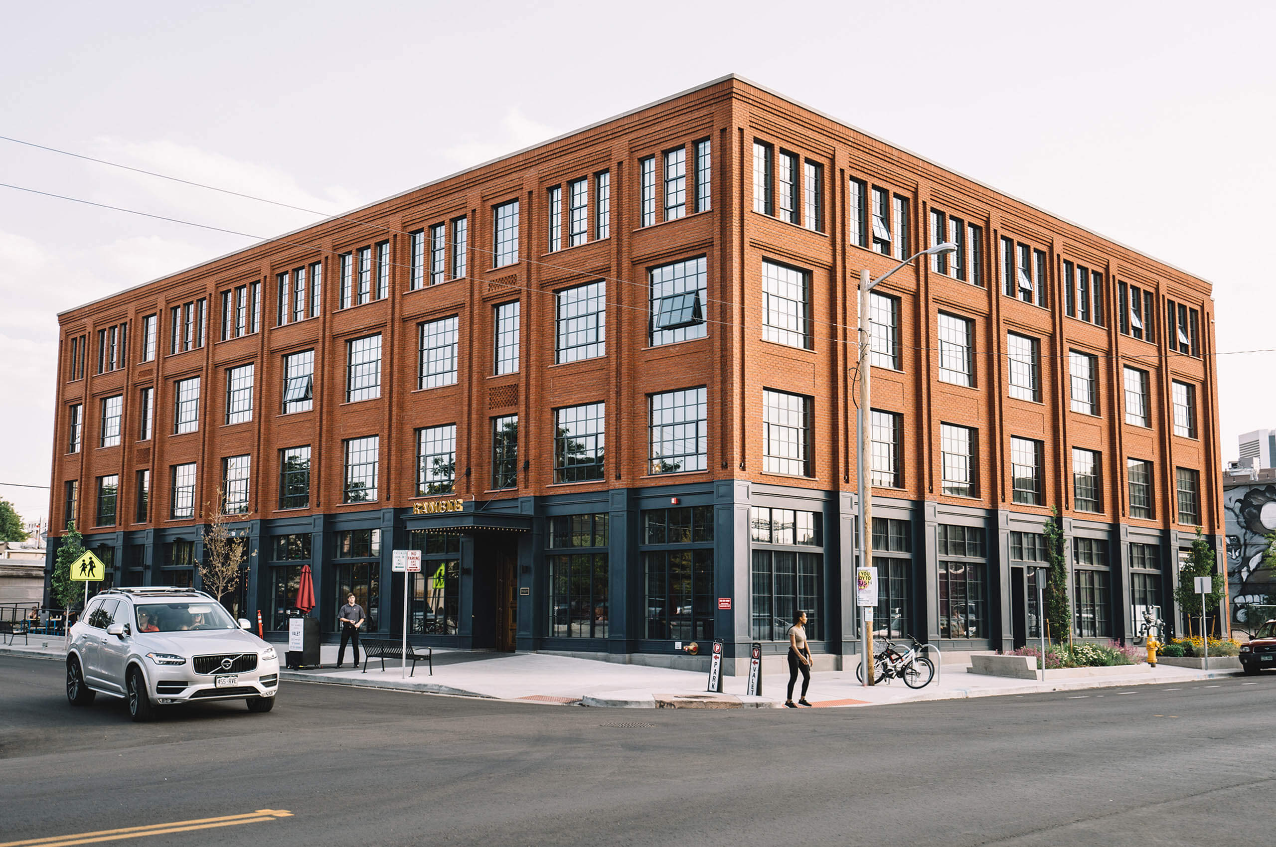
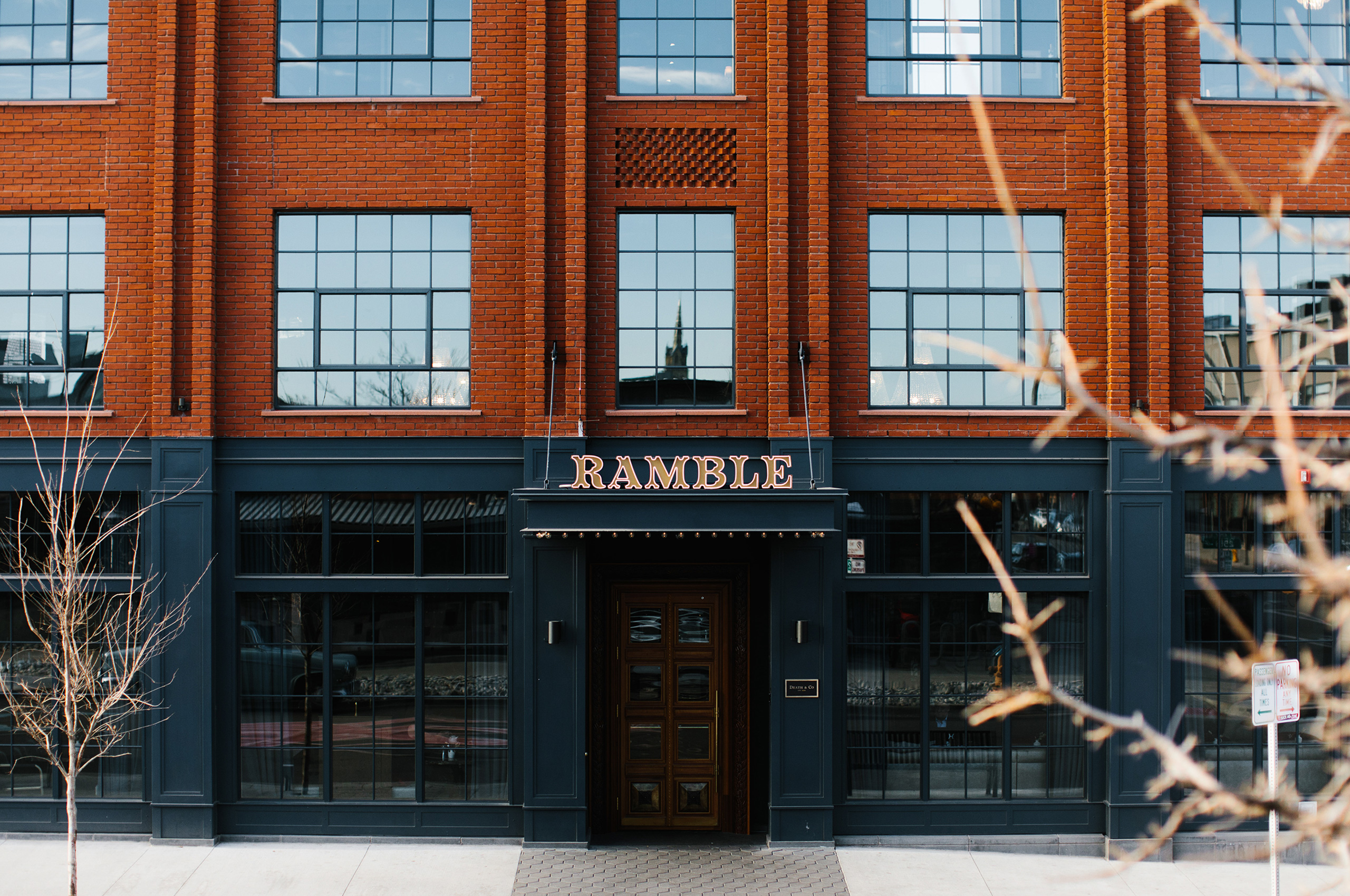
The Ramble Hotel
A French Salon inspired hotel in Denver’s fastest growing neighborhood.
A French Salon inspired hotel in Denver’s fastest growing neighborhood.
When Ryan Diggins set his mind to open a hotel, he wanted to do it a little differently. After years traveling as a property developer, he saw a frustrating trend in the hotel industry: so many hotels just became a transactional rather than a transformative experience.
He sought to create a hotel that served not only as a place to have a great stay but a hotel that served as a community meeting place. This comes from Ryan’s appreciation of 17th and 18th-century French salons and the exchanging of information, ideas, and camaraderie. The name itself is an homage to one of the founders of the salon movement in France, Catherine de Vivonne, marquise de Rambouillet. This created a fitting nod to the past while situating itself nicely in the present.
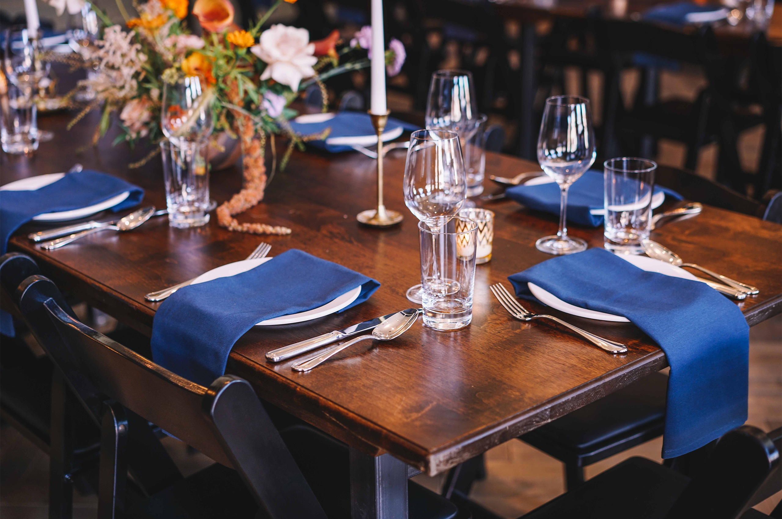
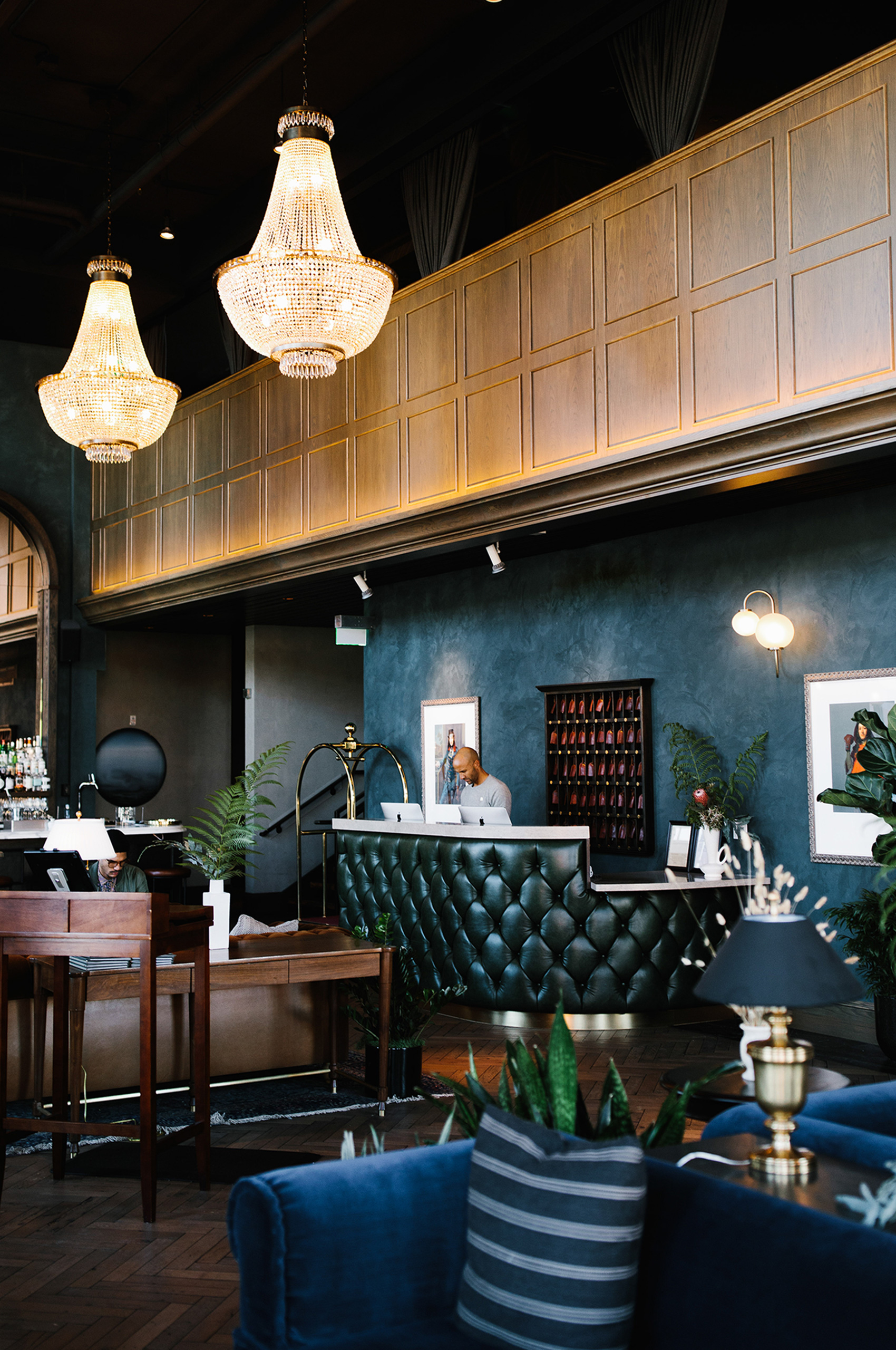
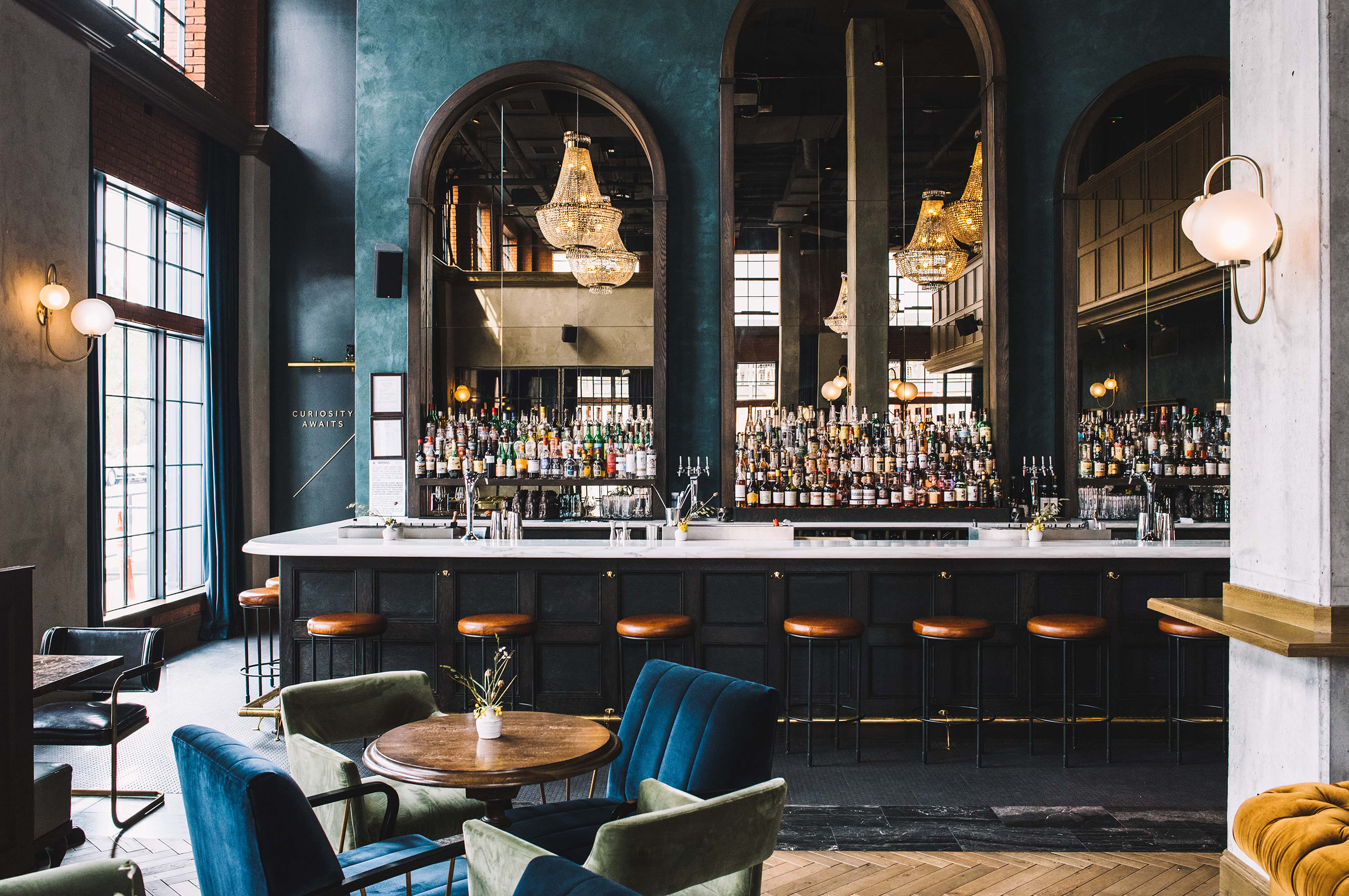
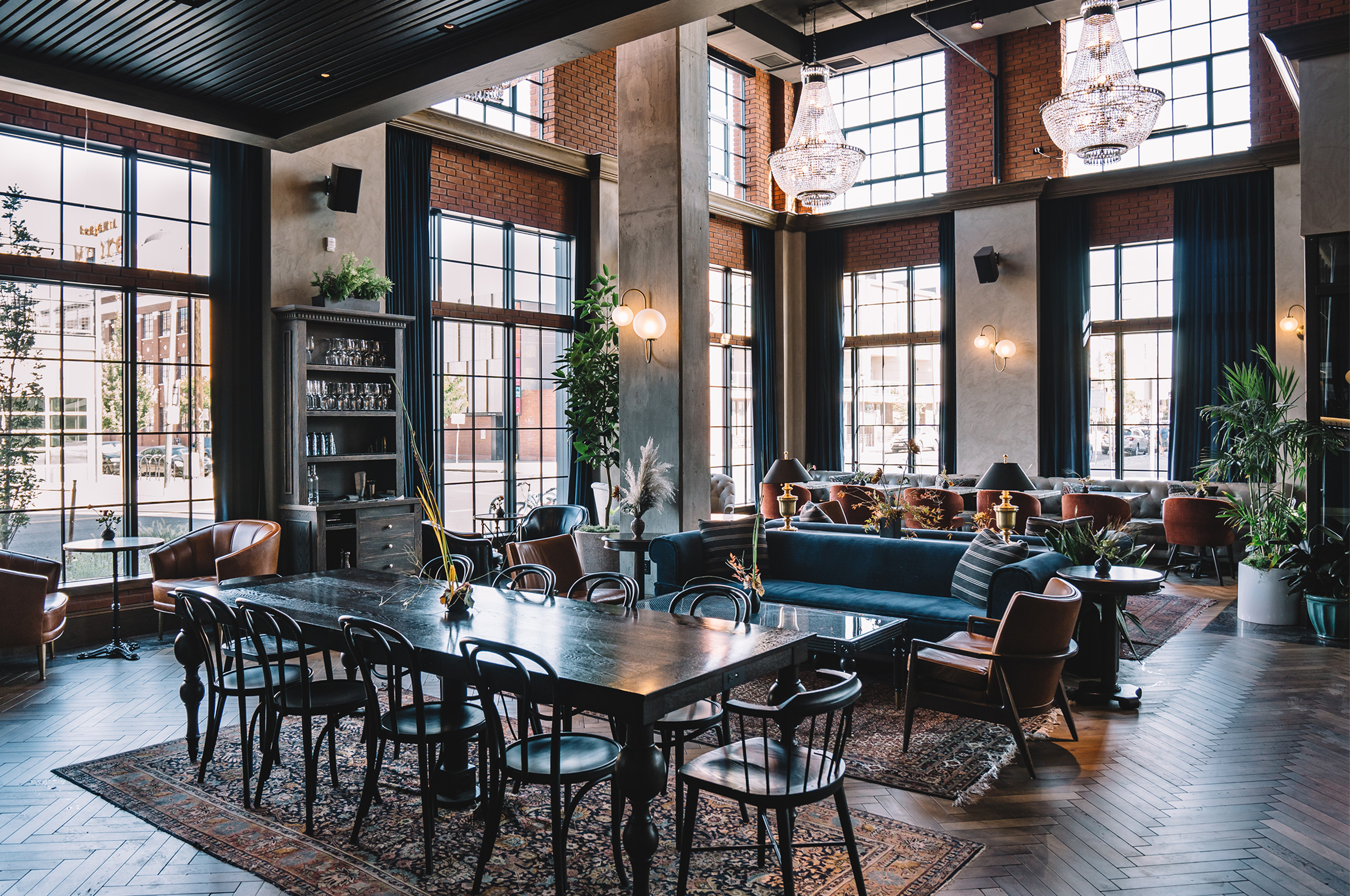
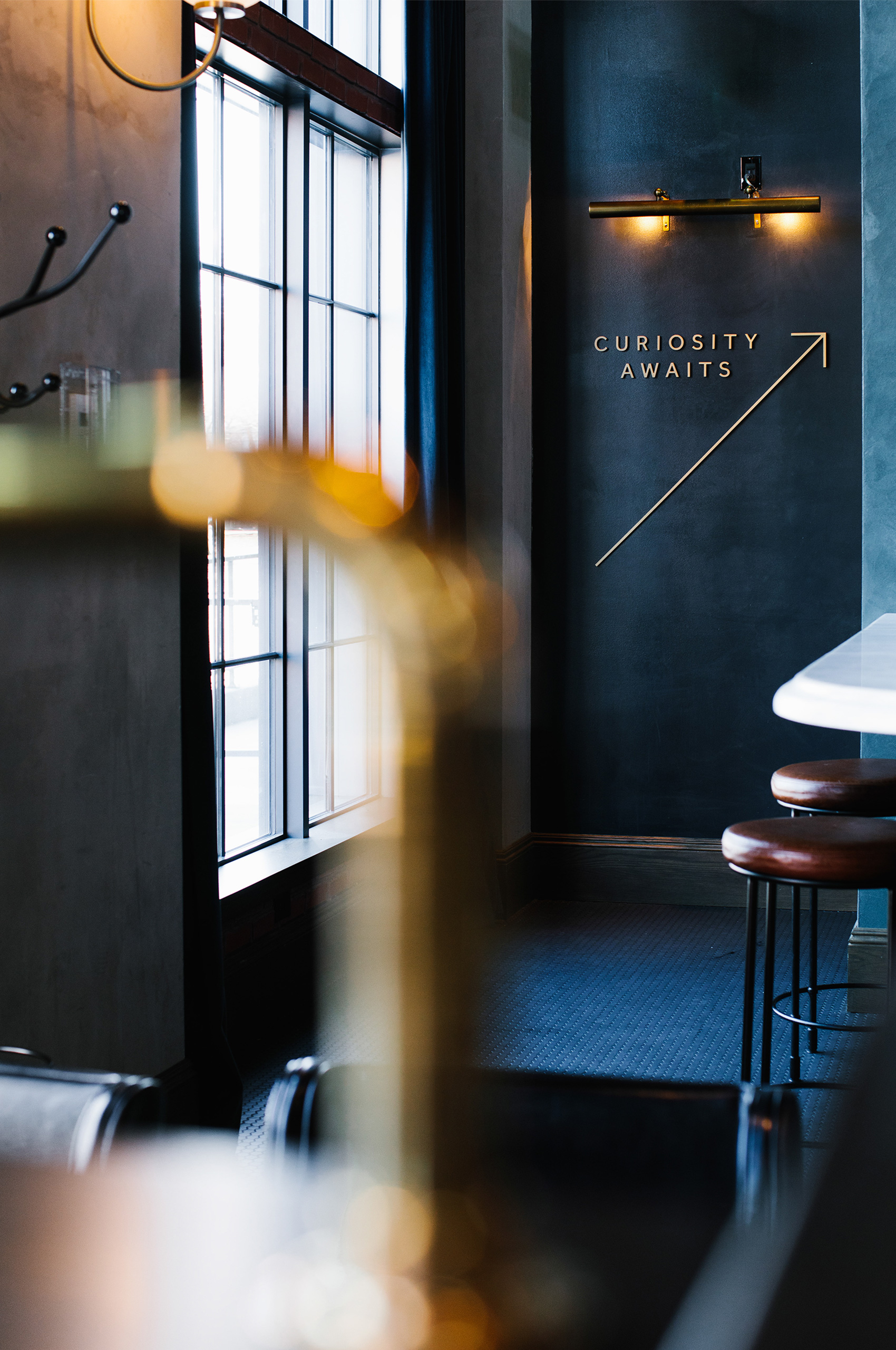
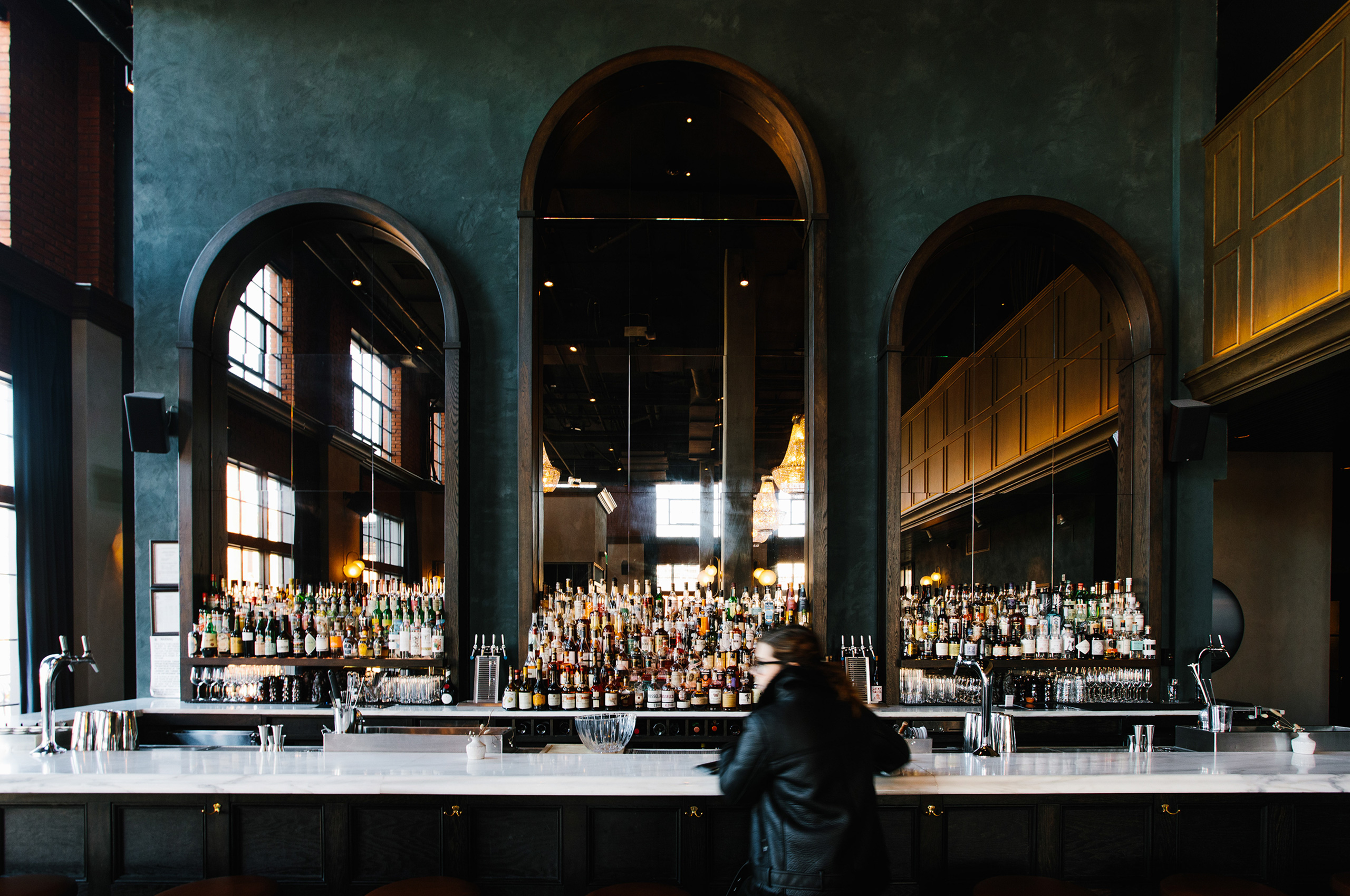
Continuing the idea of the community meeting place, The Ramble lobby is home to a new bar by Death & Co, the famous New York cocktail outpost.
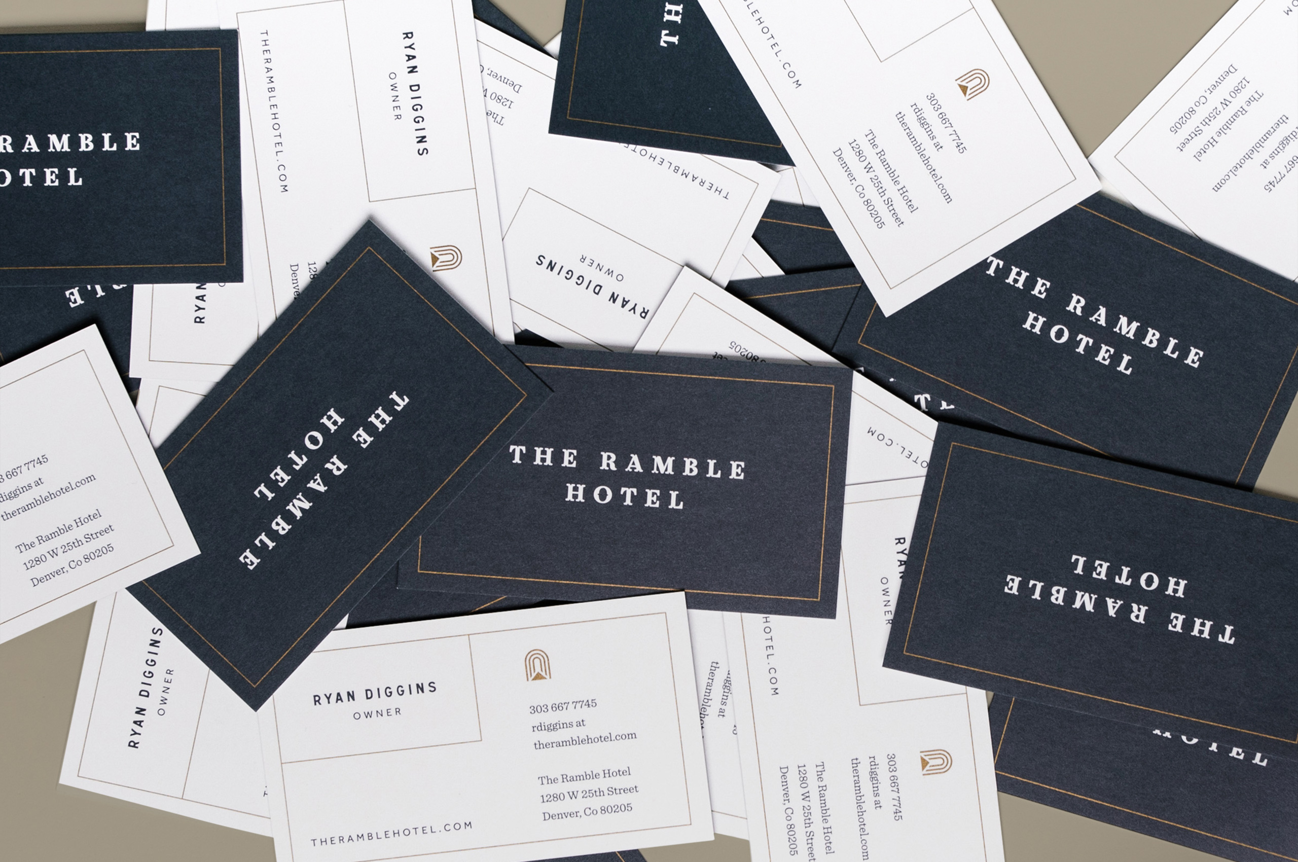
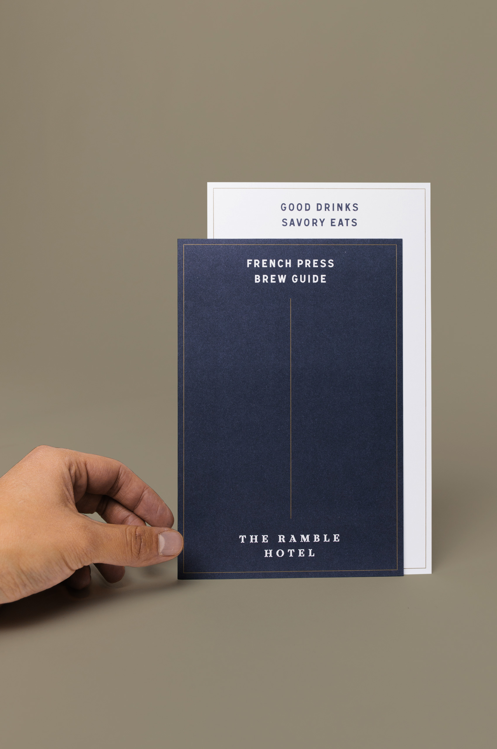
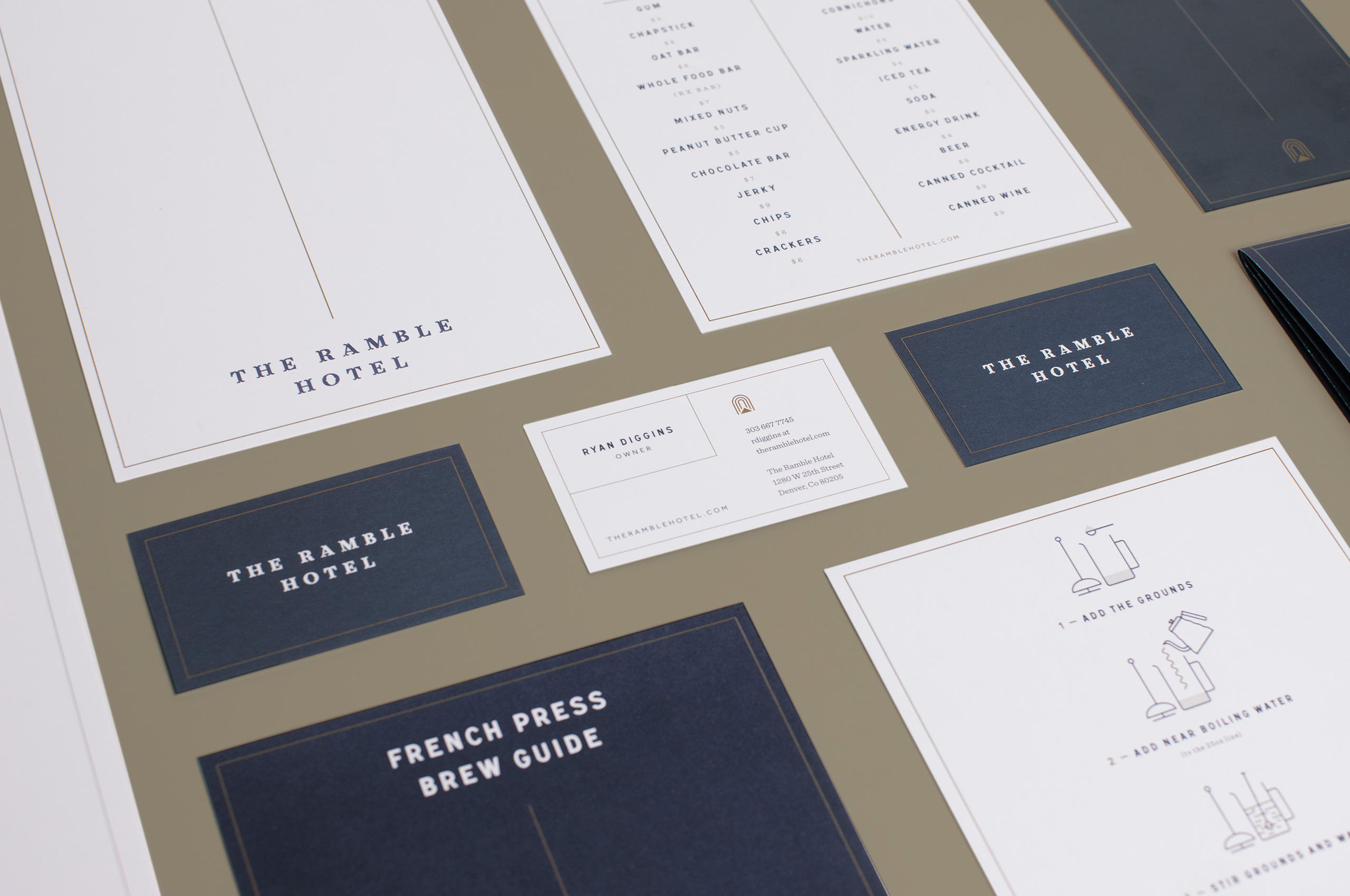
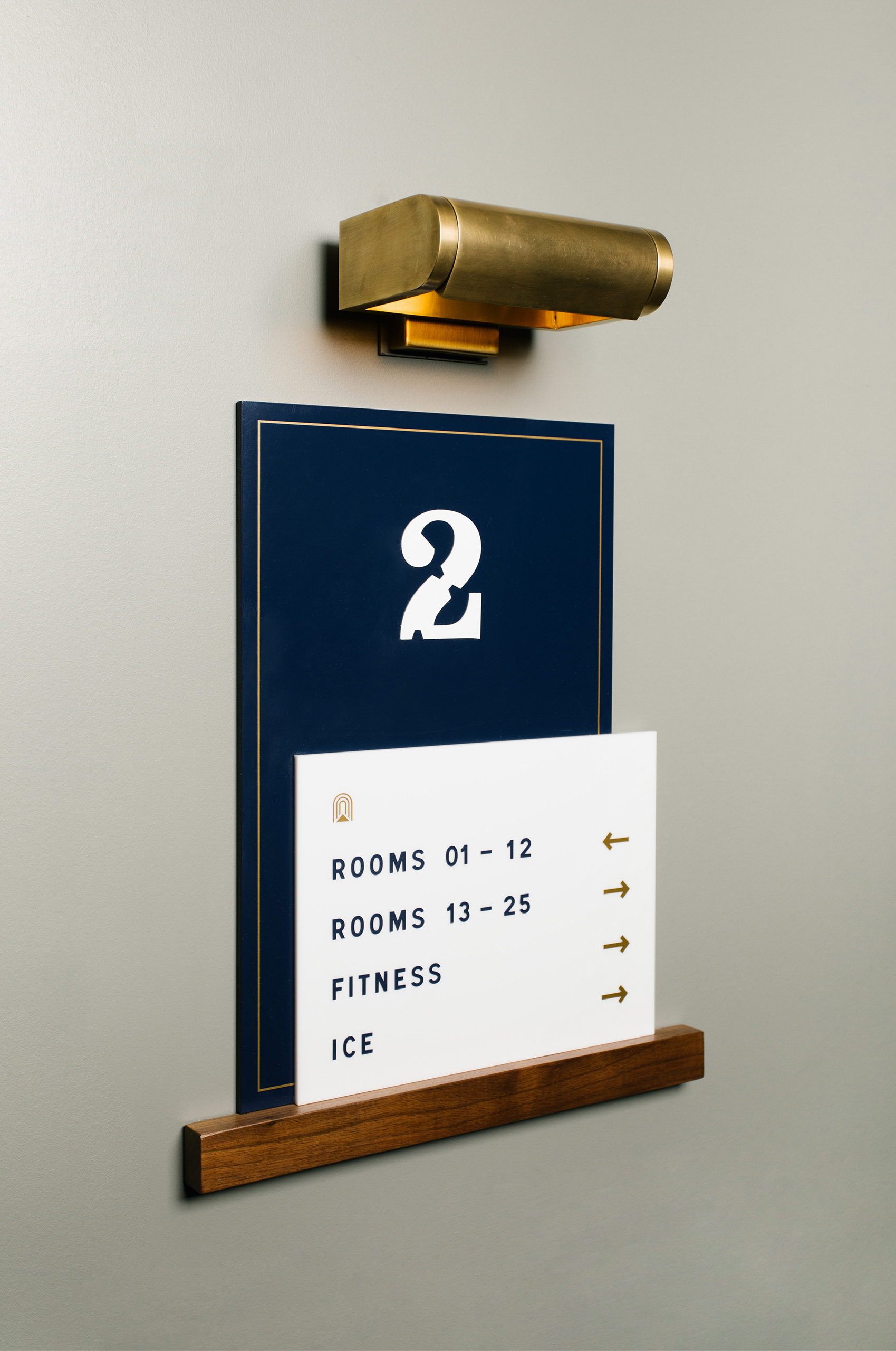
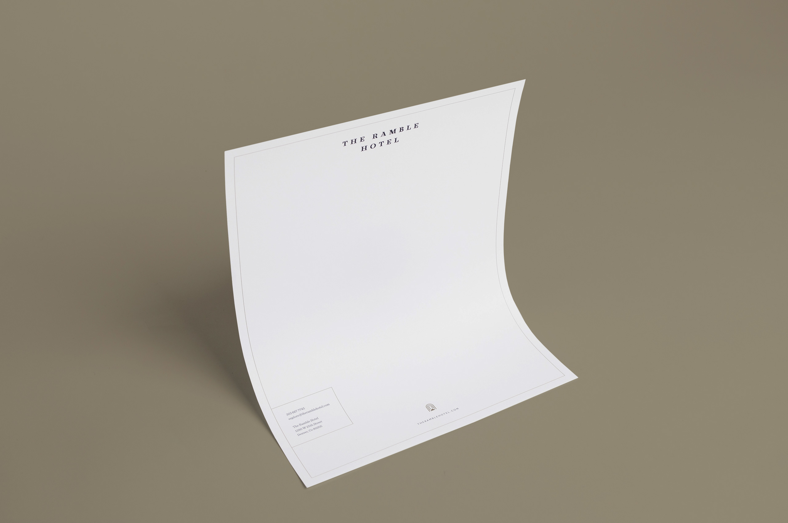
Ramble approached Mast to help create a modern brand that would look to the past for inspiration. Creating a cohesive brand across all touchpoints throughout the space from the physical signage and collateral, down to the interior color swatches.
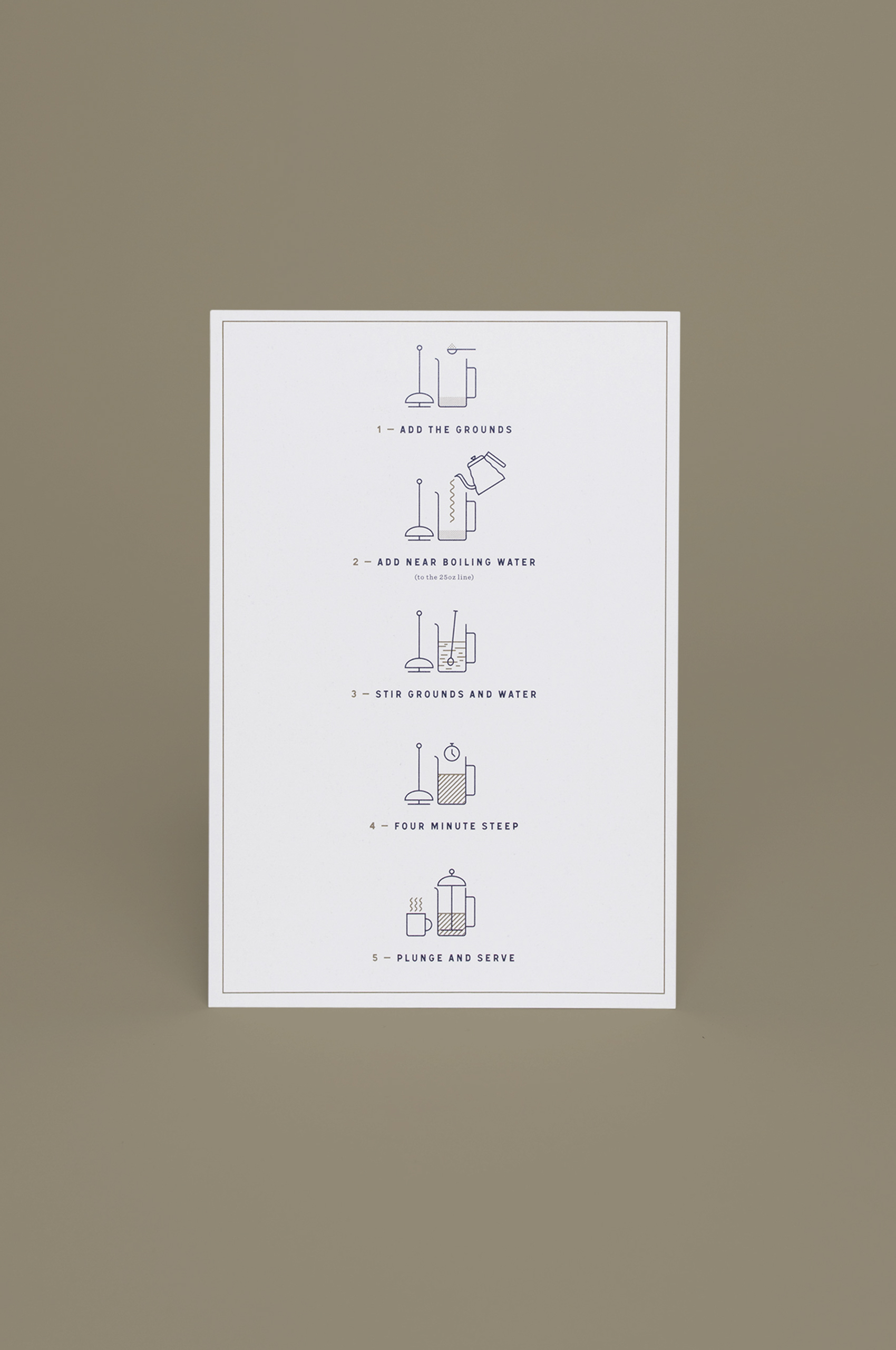
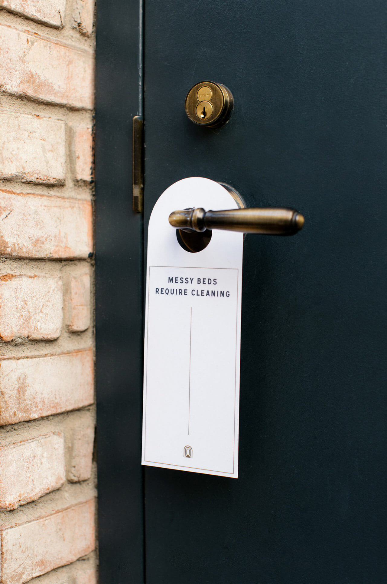
Photos by Levi Tijerina & Josh Perez.

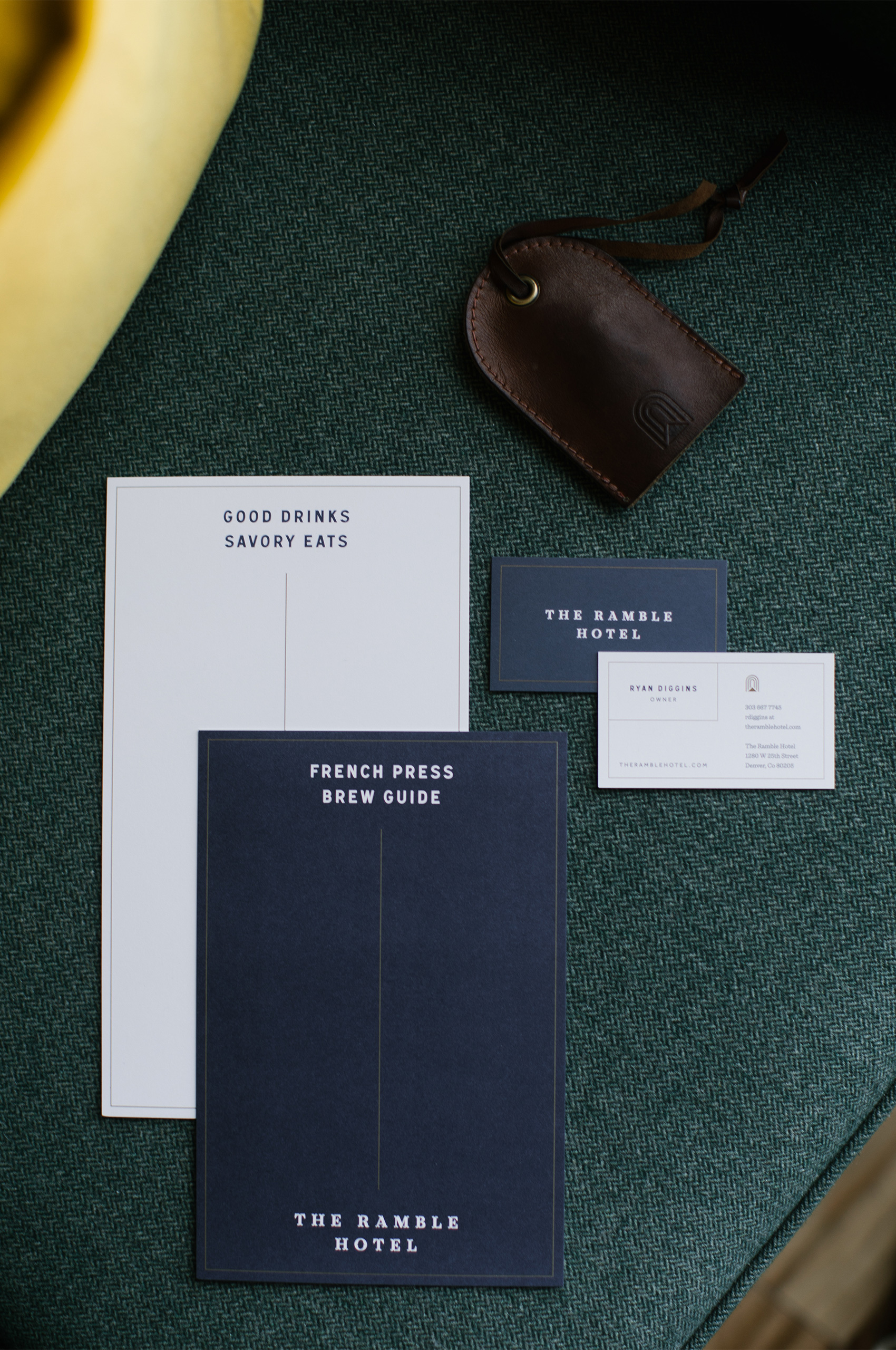
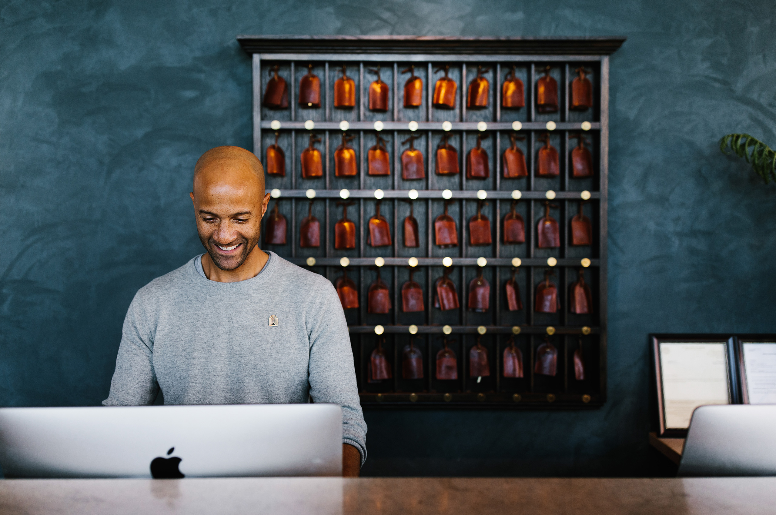
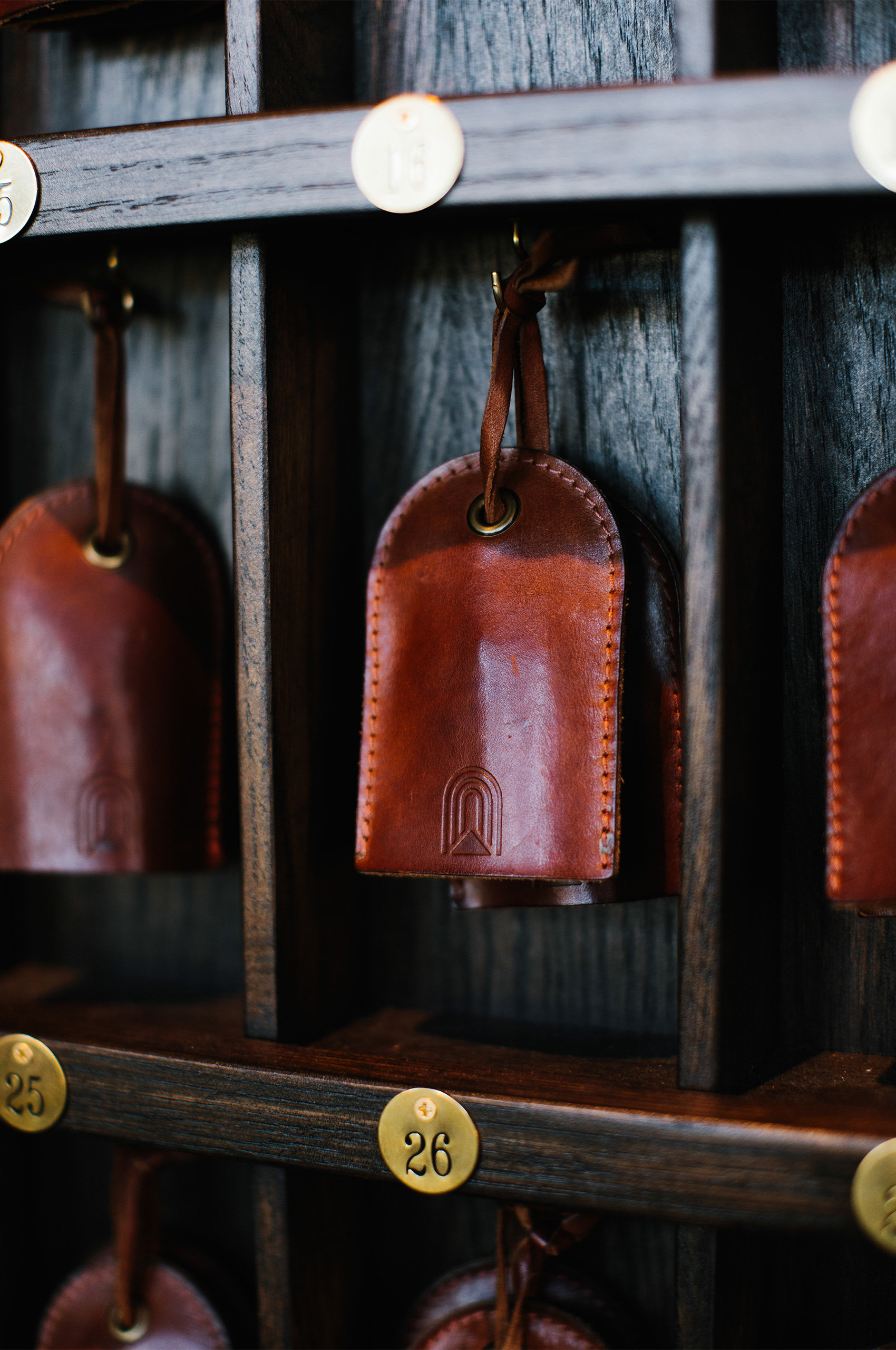
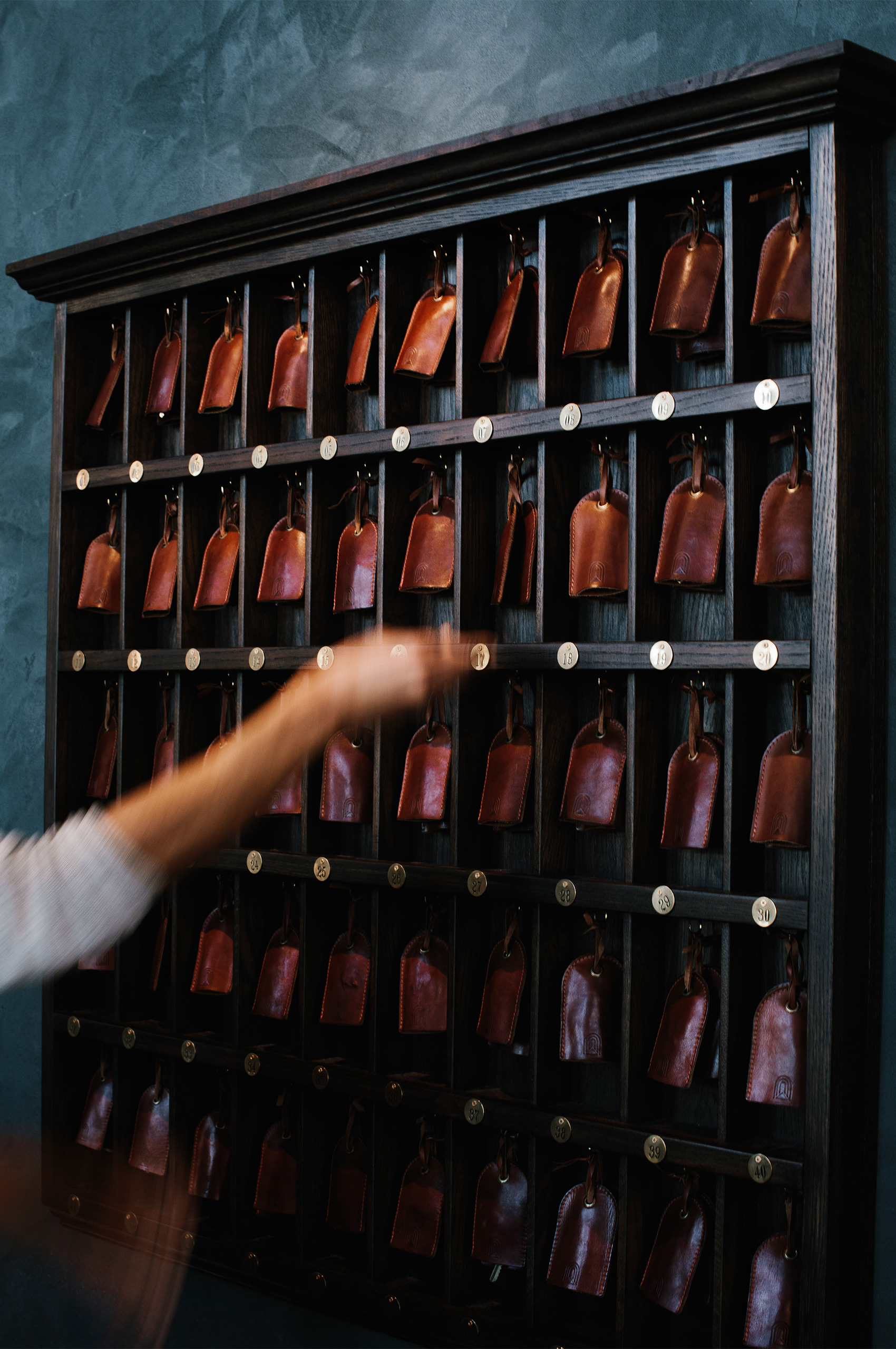
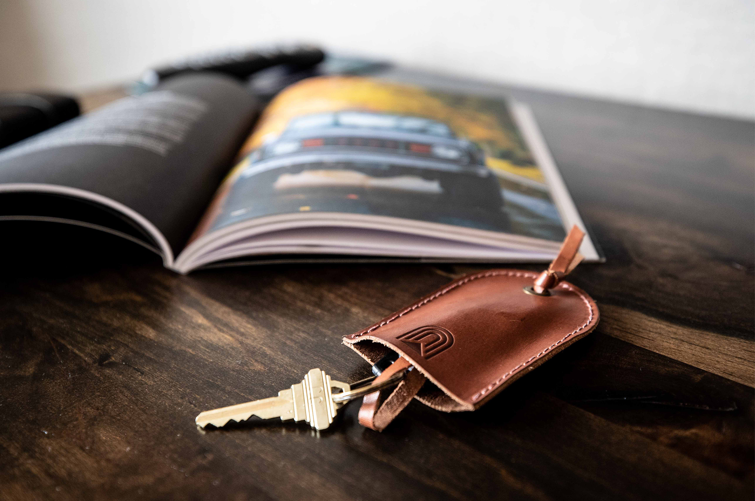
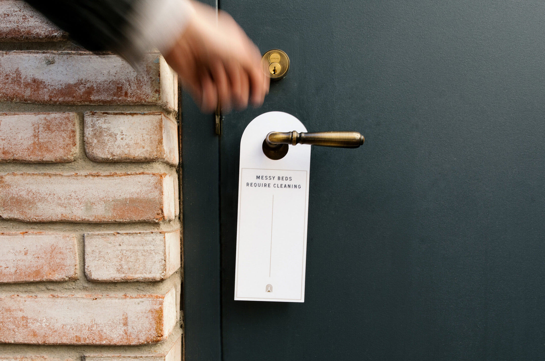
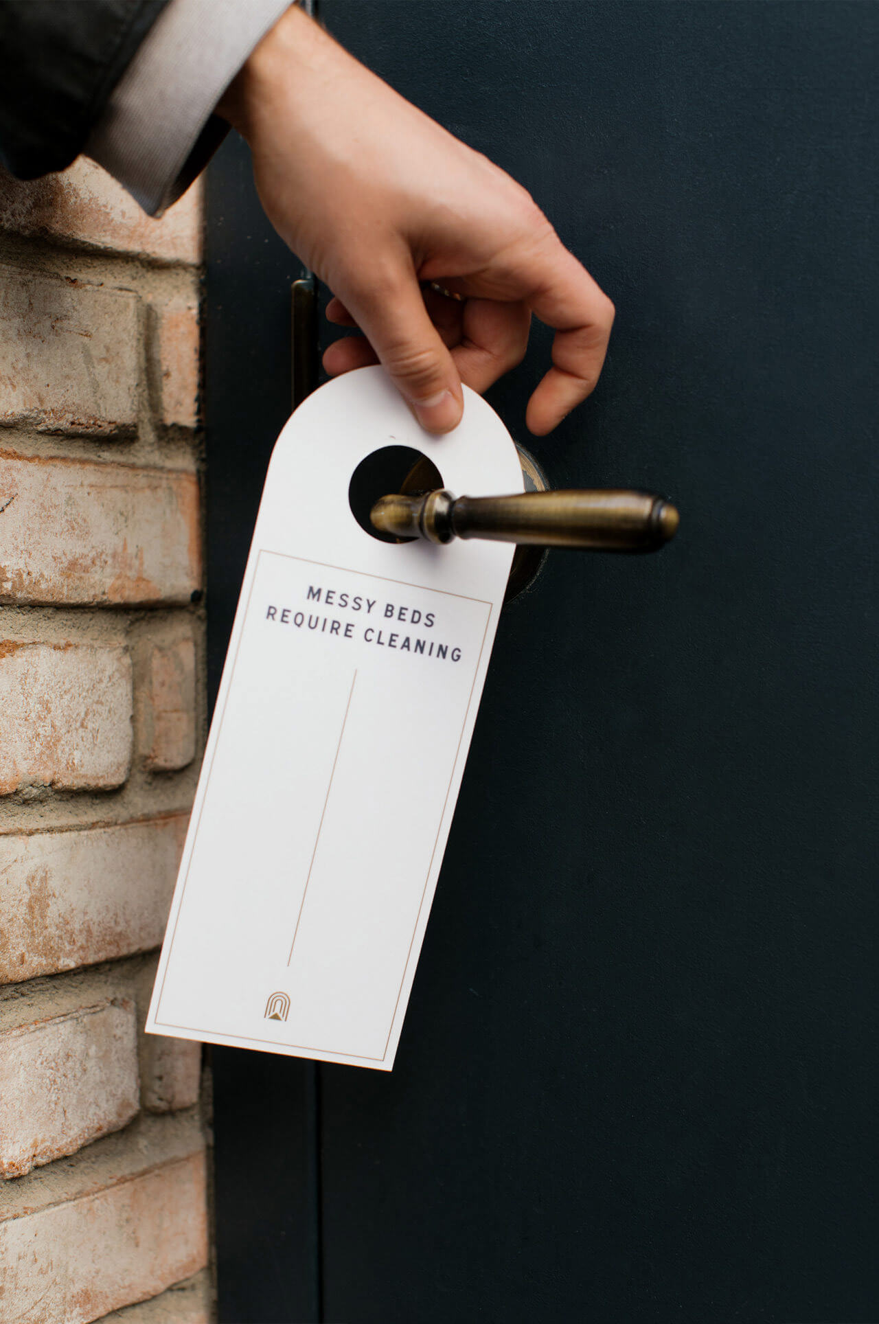
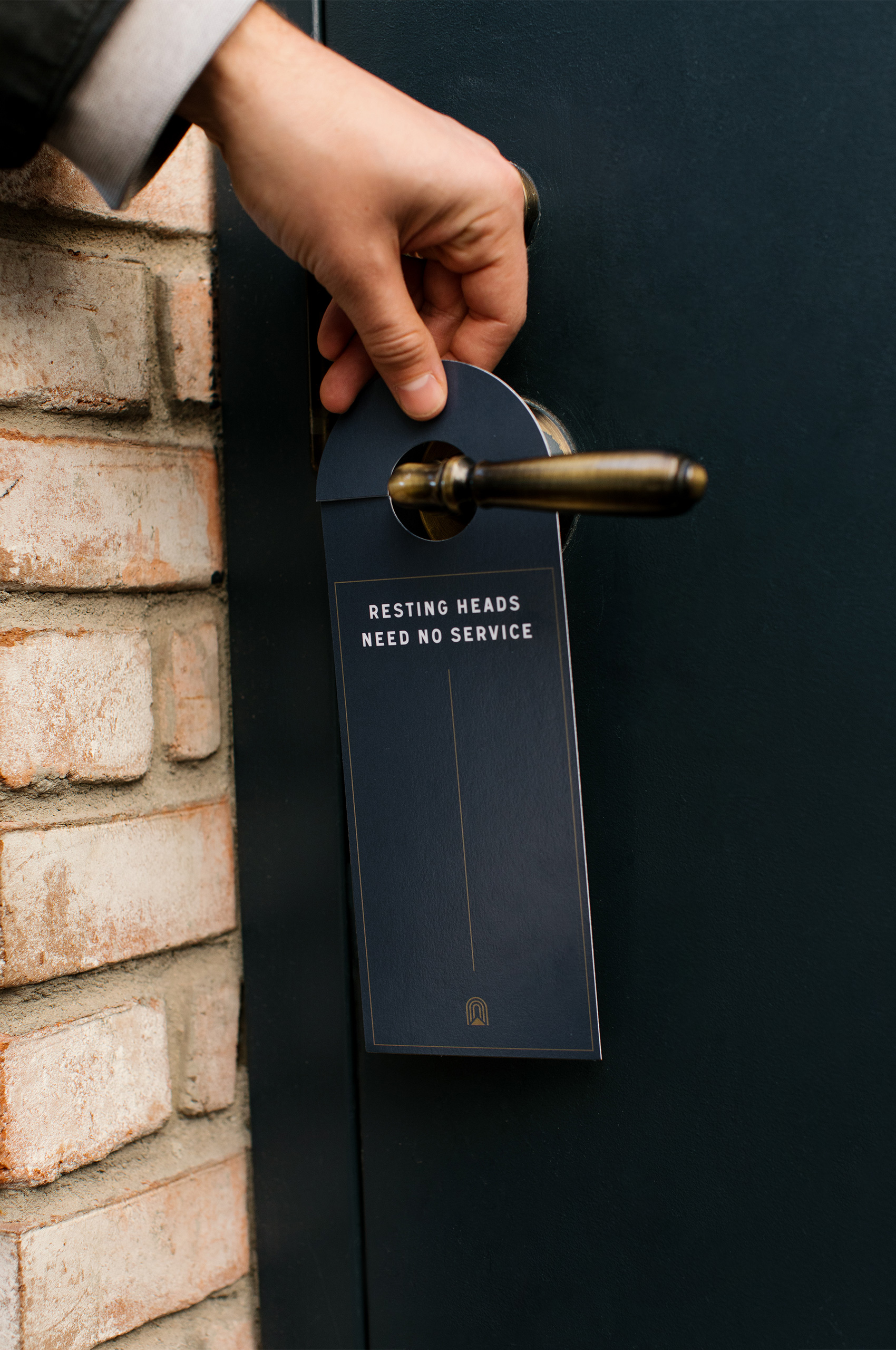
With so many hotels shifting to a card for their keys, it was important from the onset of the project that the Ramble used physical keys. We wanted to elevate the experience, even more, by creating a custom key-holder. We worked with the local company Winter Session to create these custom leather key-holders, built to the same form as the symbol itself. It was a conscious decision to use leather, as it would patina over time and take on its own personality.
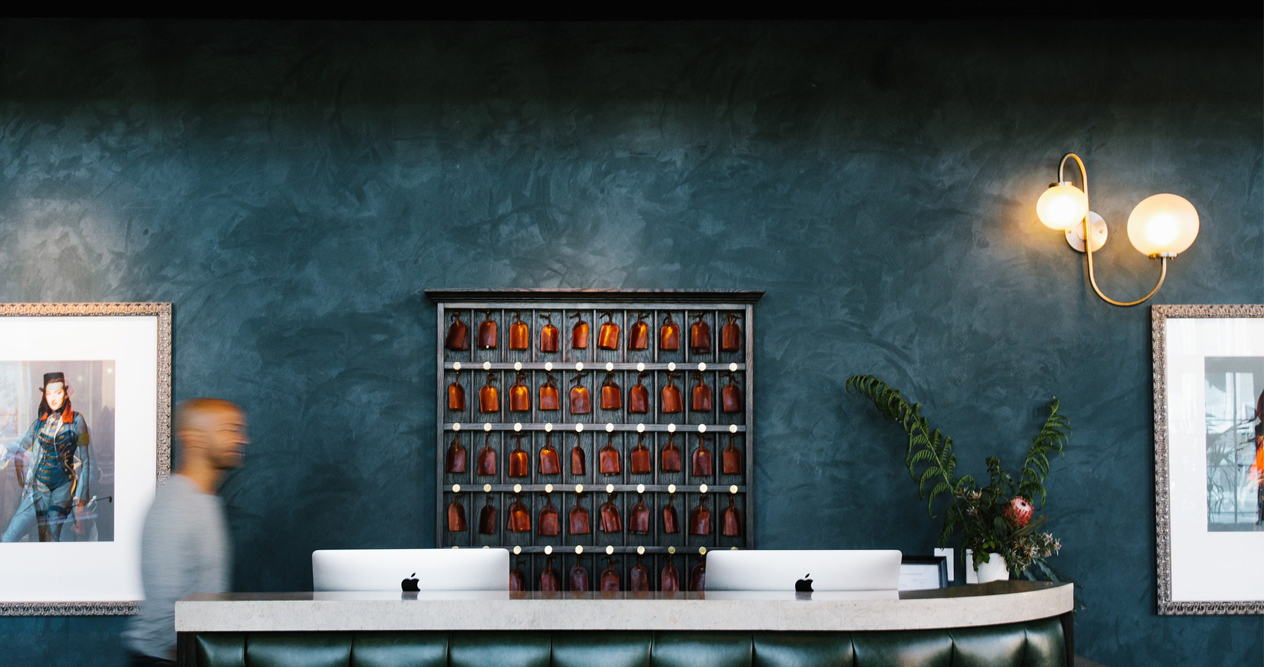
After the key-holders were created, we knew we had to show them off. We worked with Ryan to create a key cabinet that showcased the holders themselves while creating a focal point for guests when entering the lobby.
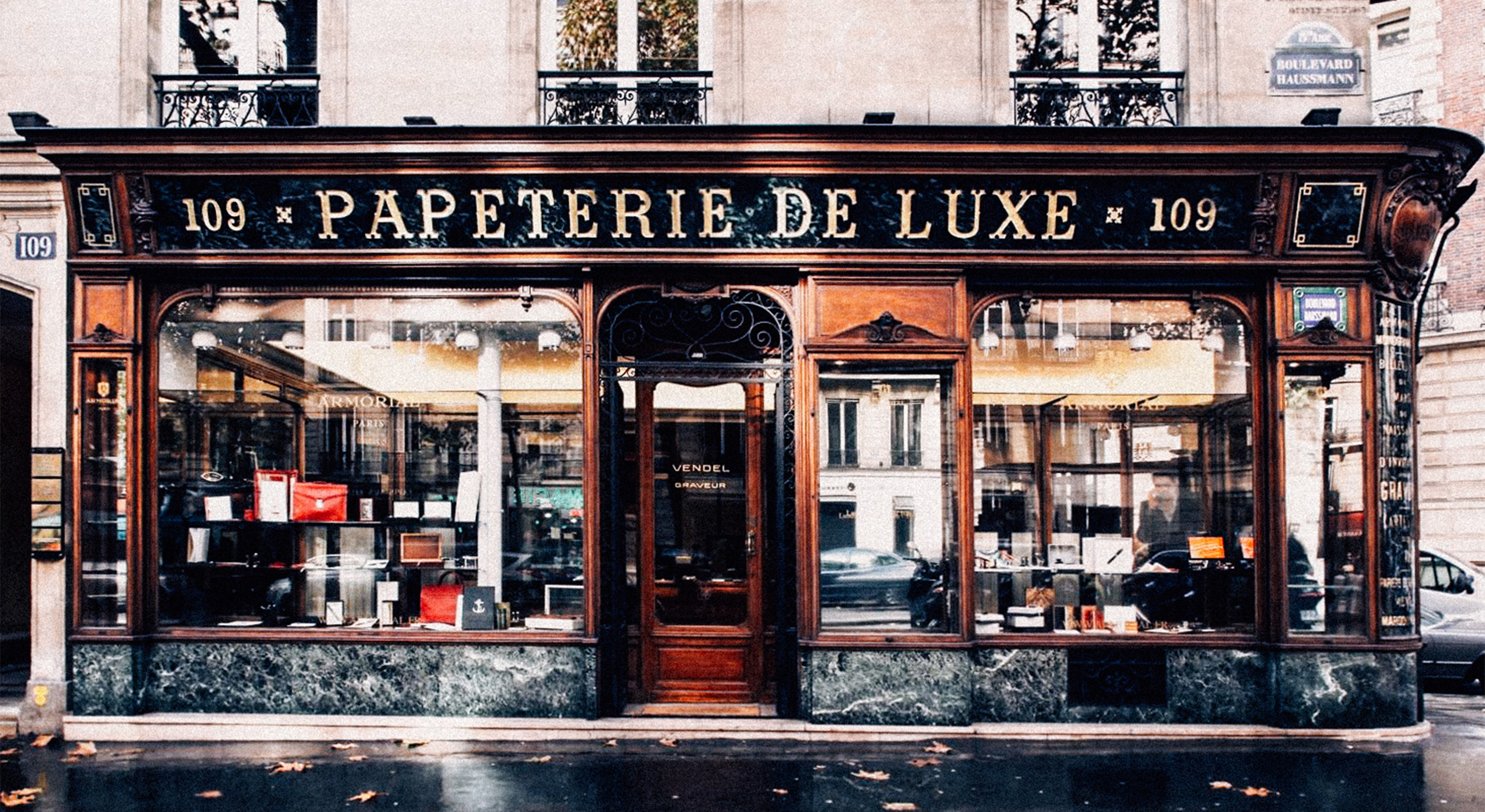
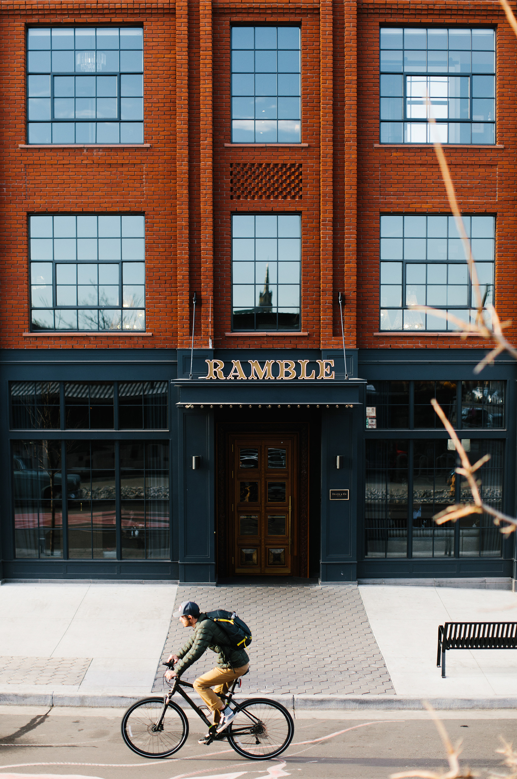
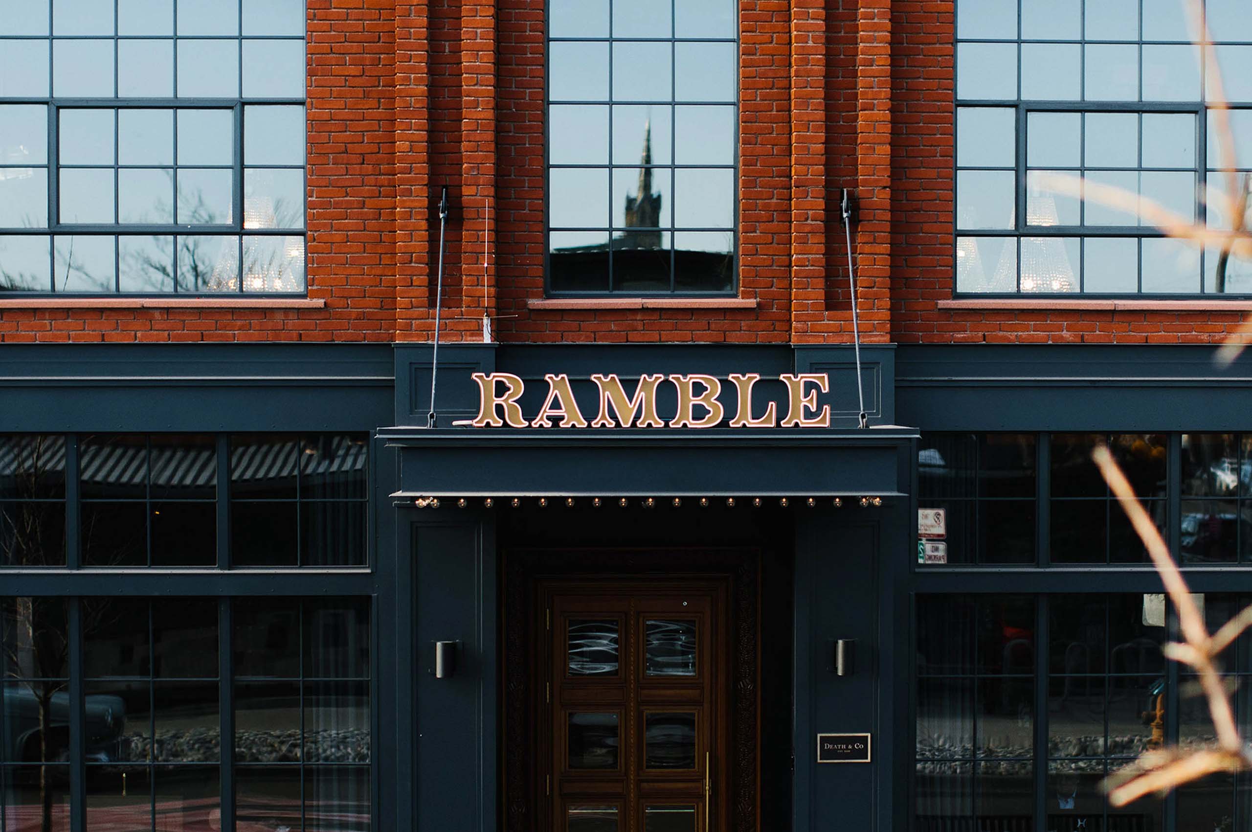
When beginning work on the wordmark, we knew it had to be completely custom and that it had to be as refined as the hotel itself. We drew inspiration from the ornate Parisian store-front signage. The character and personality of these letterforms were exactly what we needed for The Ramble.
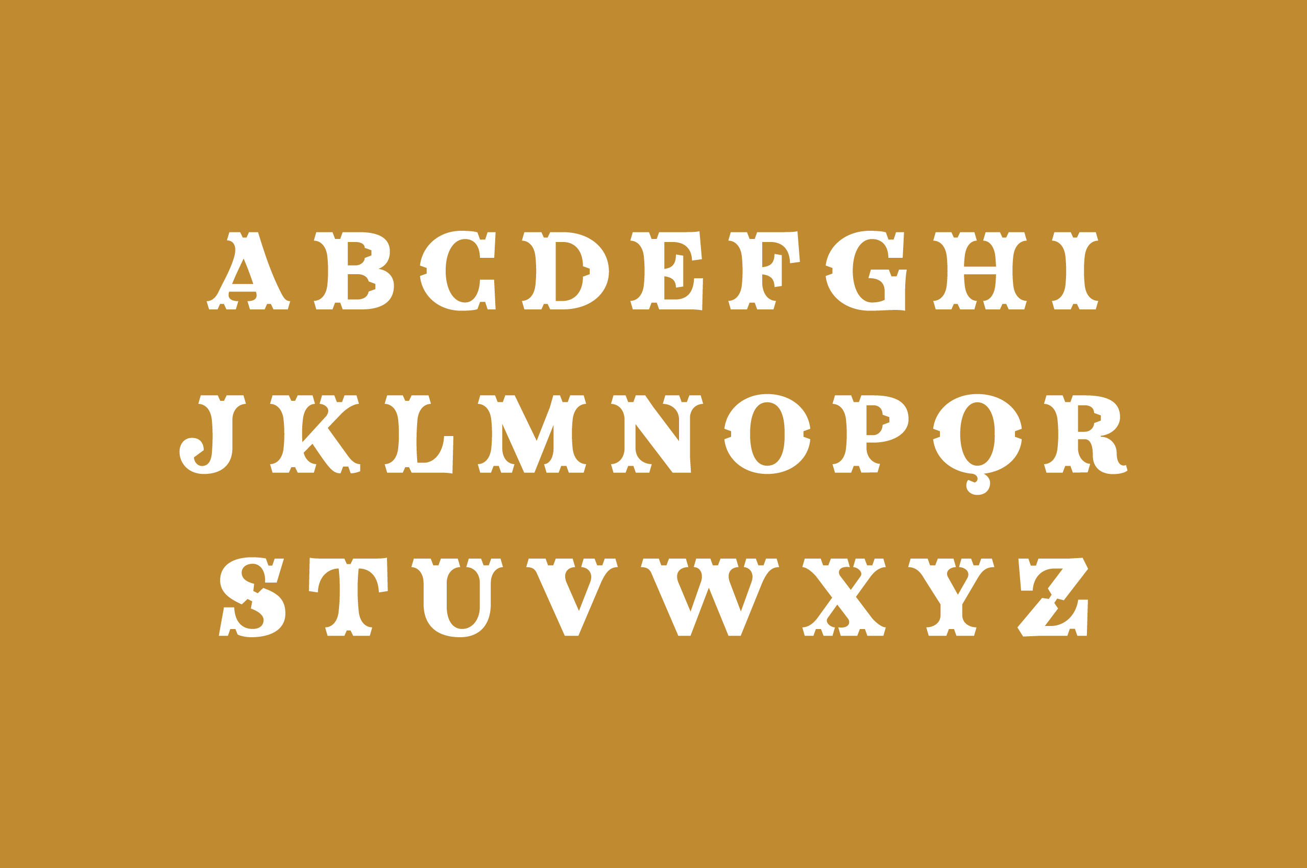
We brought our good friends at Badson onboard to create a custom face. A face that drew inspiration from these historic letterforms, built with the typographic rigor of today. Re-interpreting the cut-outs of the Parisian type, which was often used to affix the letters to the storefront, in a new and more stylistic way. Through this process came our typeface — Catherine Display. Named for Madame de Rambouille herself, the inspirational woman who created a movement.
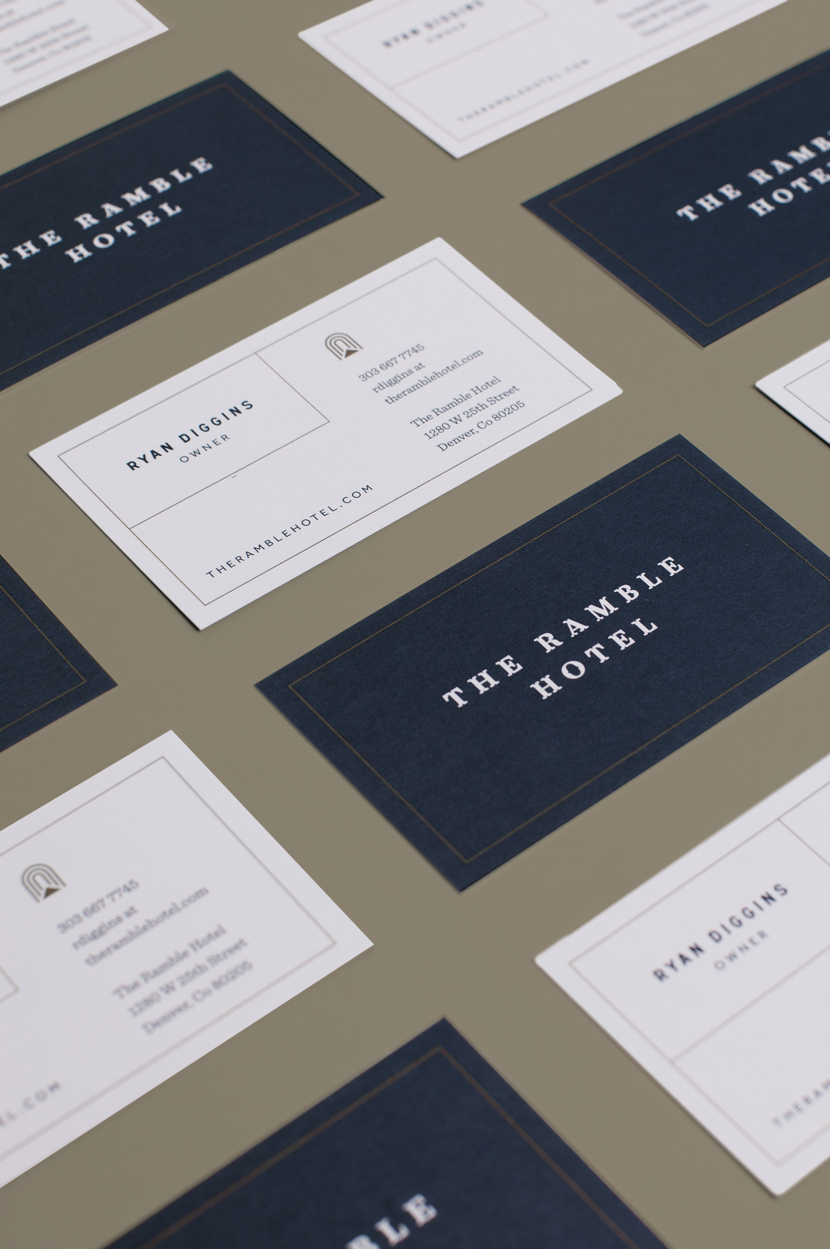
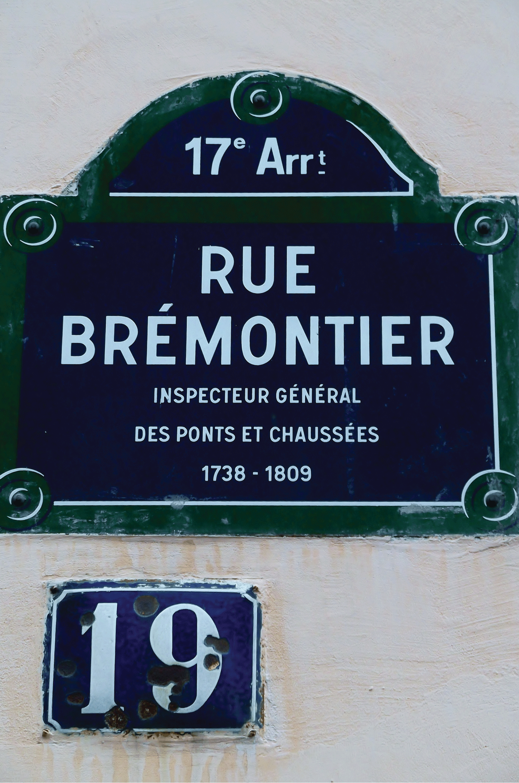
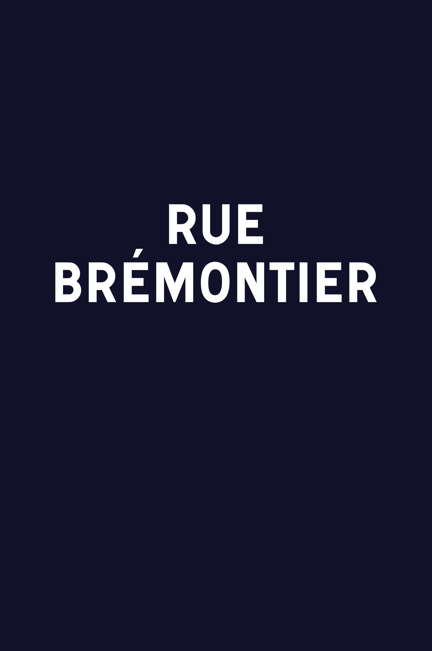
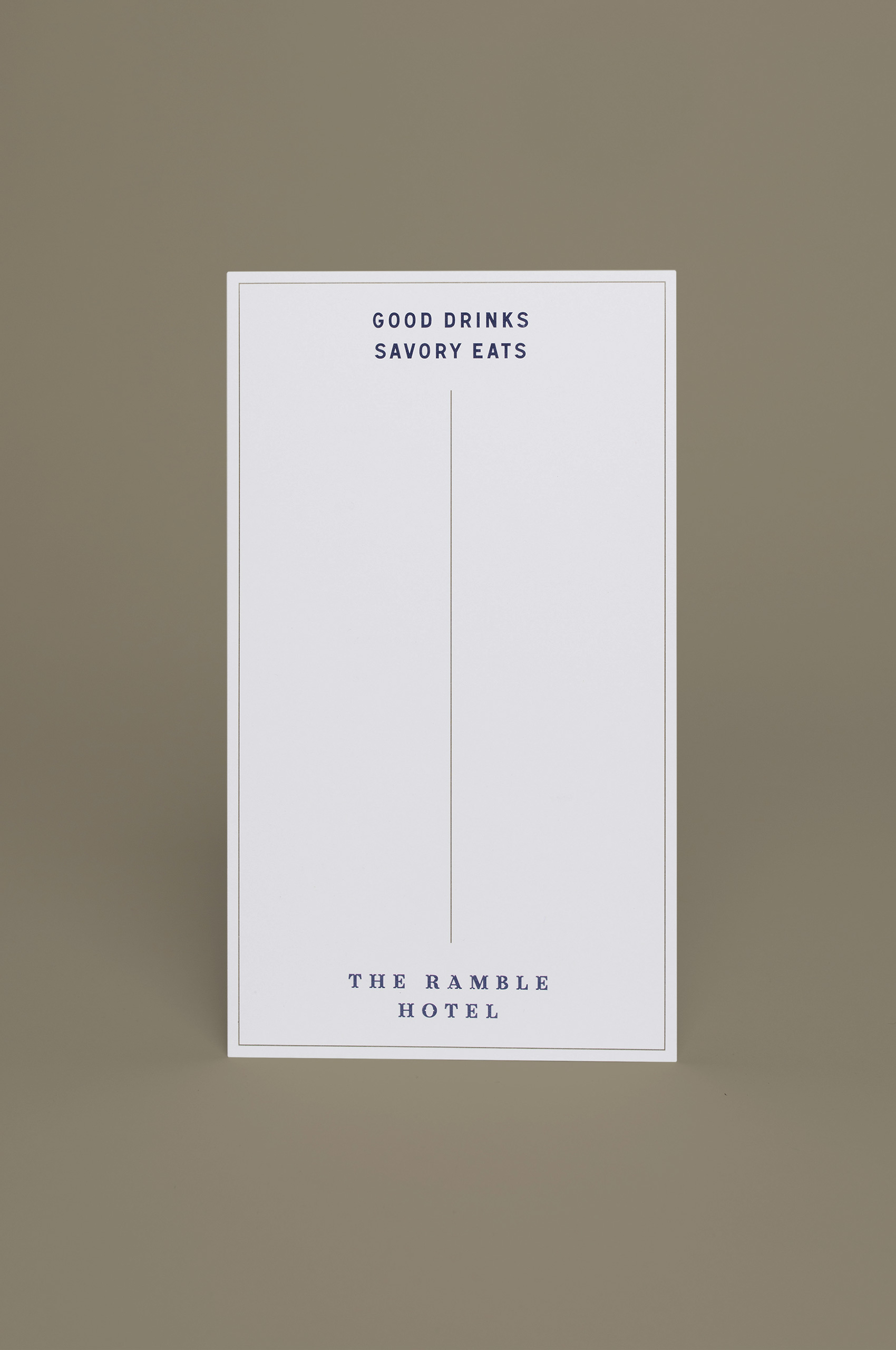
With such a highly ornate display face in Catherine, we needed to balance that with a more legible, workhorse typeface. But nothing felt right, until we discovered the typeface Signal, by URW Type Foundry. These letters were modeled after the typeface found on the iconic blue and green street signs found in Paris.
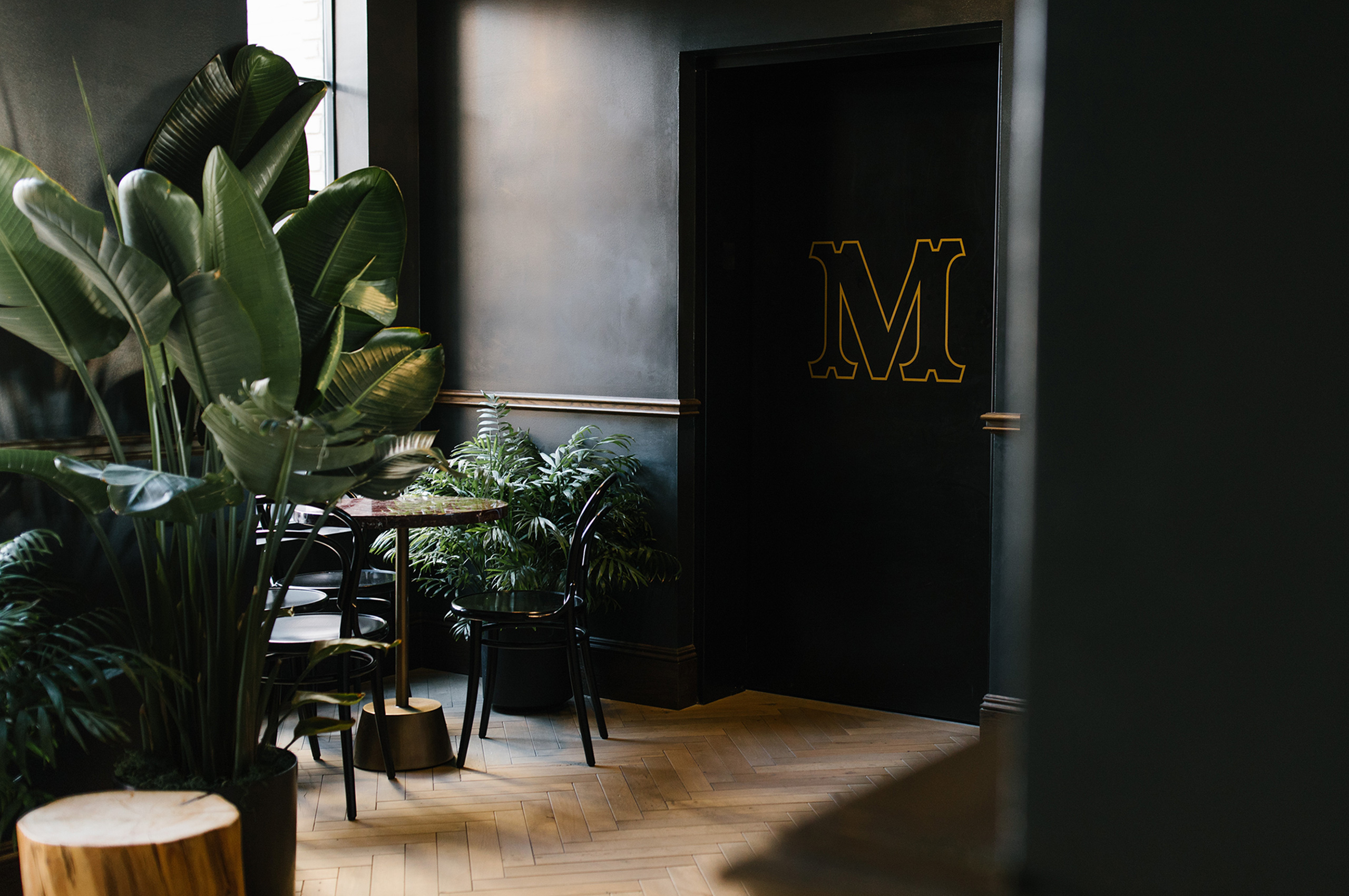
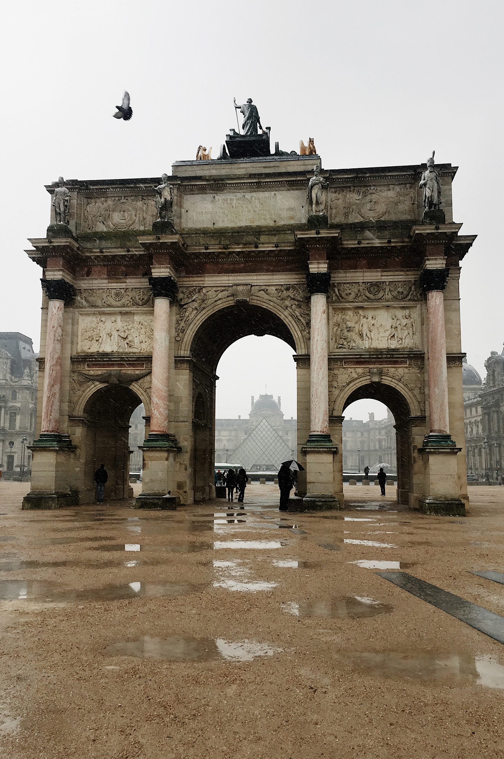
We began our research by diving into the history of Catherine de Vivonne, to learn more about her famous salon. We uncovered that her salon was in “the lost neighborhood” of Paris, the Quartier du Louvre. A neighborhood that existed between the Louvre and the Tuileries Gardens. An area occupied by the Arc de Triomphe du Carrousel and the now famous I.M. Pei Louvre Pyramid.
Over the years, this neighborhood became increasingly more dangerous and Napoleon was fed up with how it was encroaching on his Palace. He decided to clear the neighborhood and create a new courtyard between the Louvre and The Tuileries Palace.
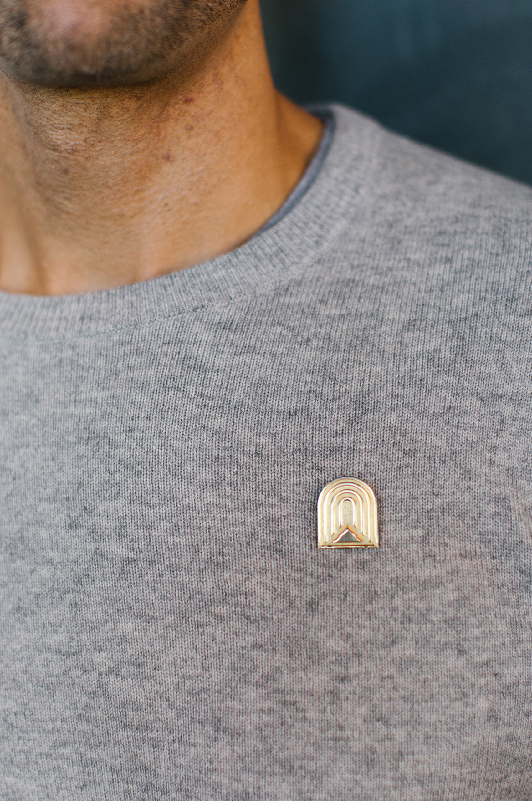
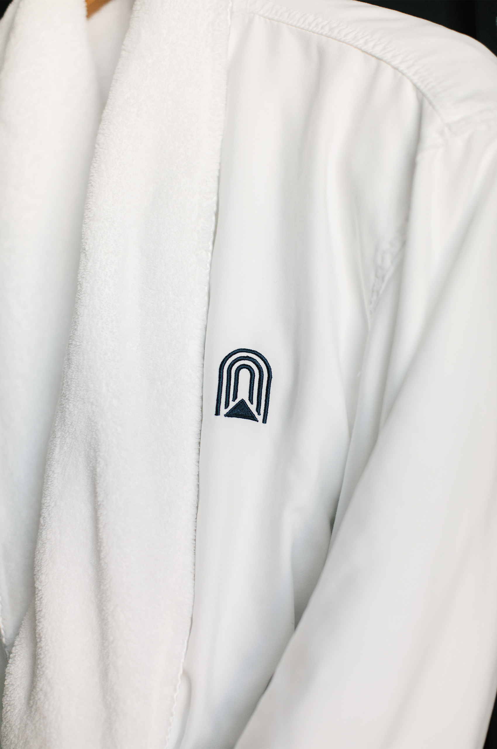
This story really piqued our interest and served as the inspiration behind the symbol. Now if you stand at the correct angle, you can see the glass pyramid through the arc itself. This inspired us to develop the phrase “looking through a window of the past, to visualize the future.” This served as inspiration for the symbol, which possesses all three arcs, and a pyramid in the center.
Looking through the Arc to see the Pyramid. The inspiration for the phrase “looking through a window of the past, to visualize the future.”
We brought the arc into the lobby bar, recreating the three arcs in massive two-story mirrors.
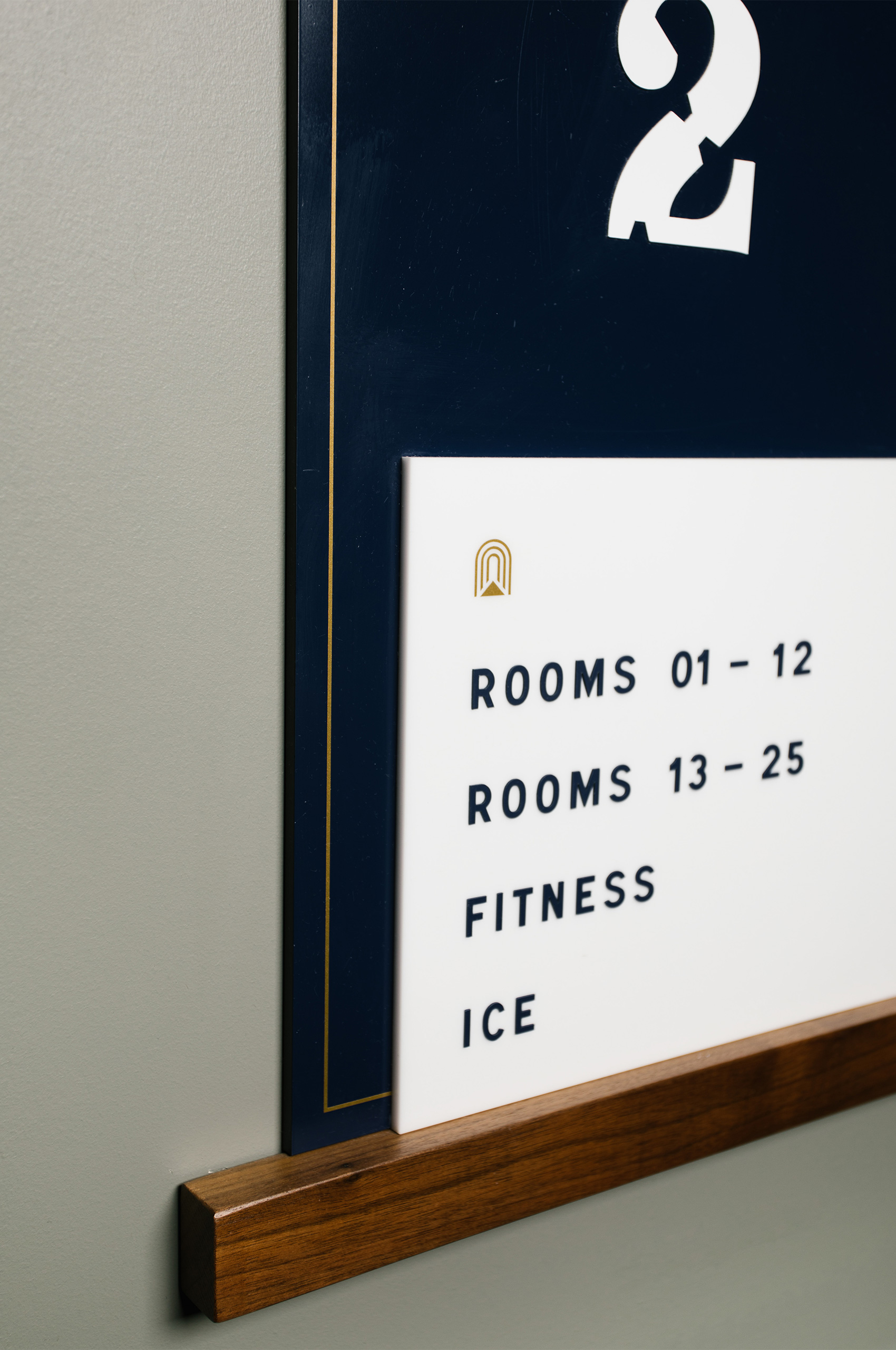
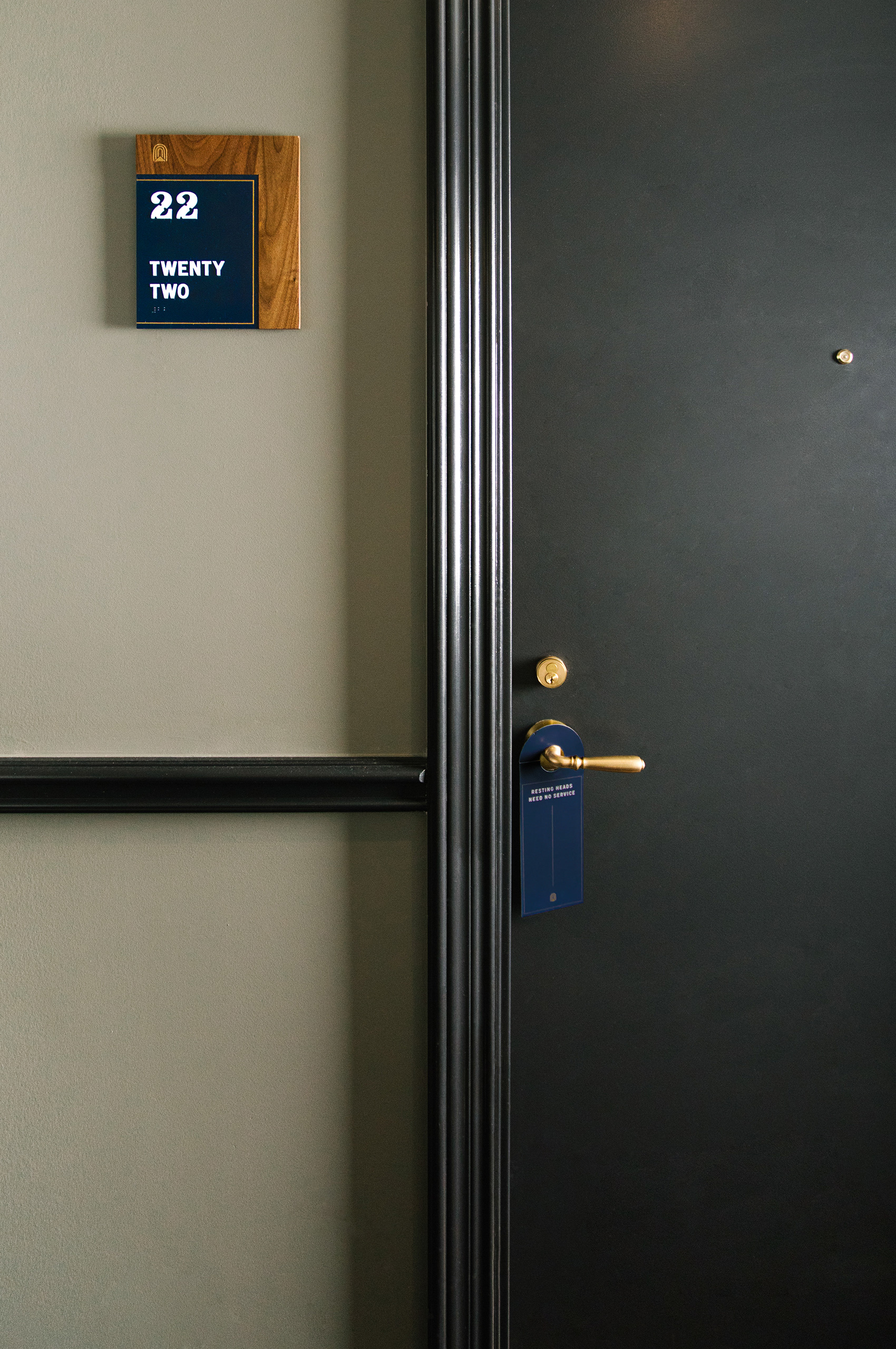
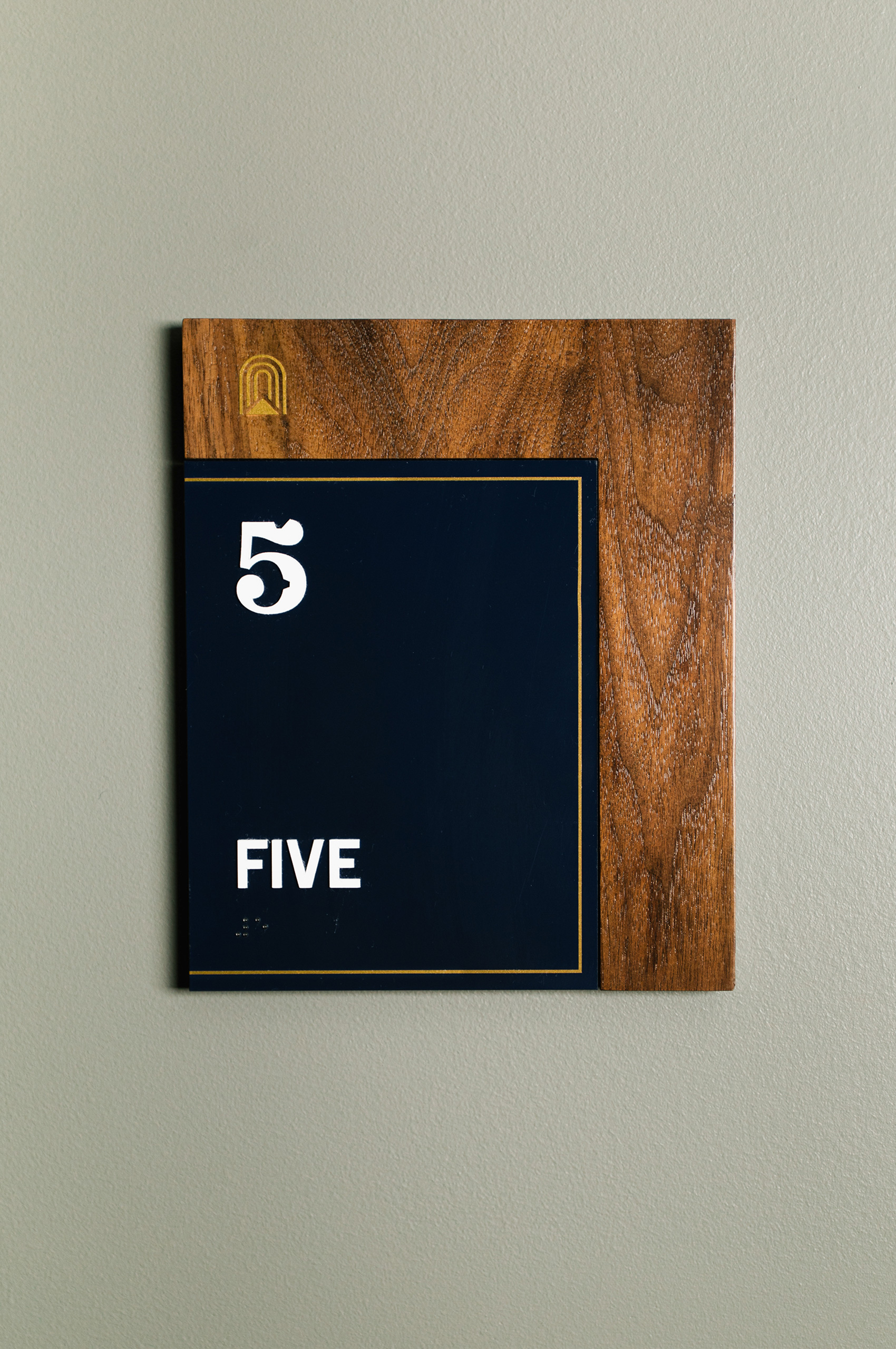
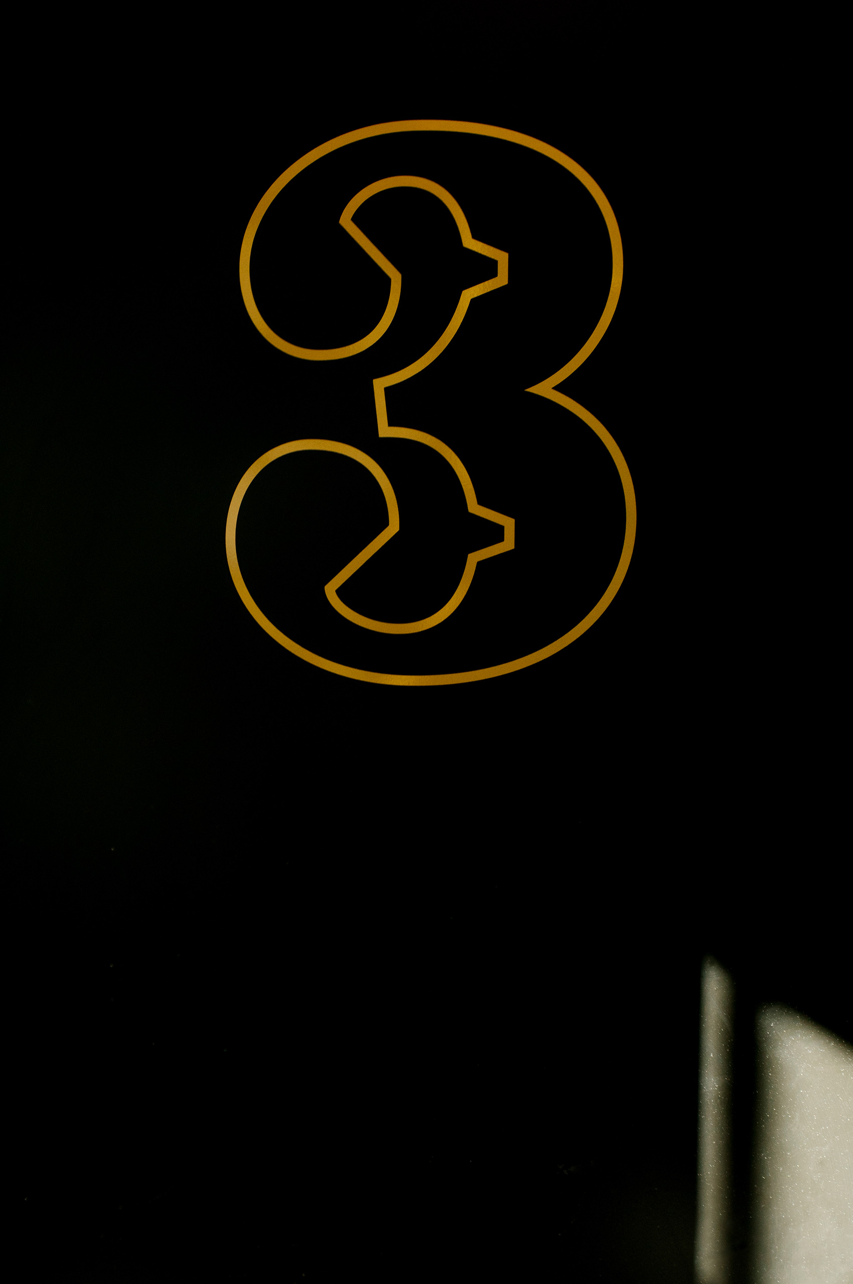
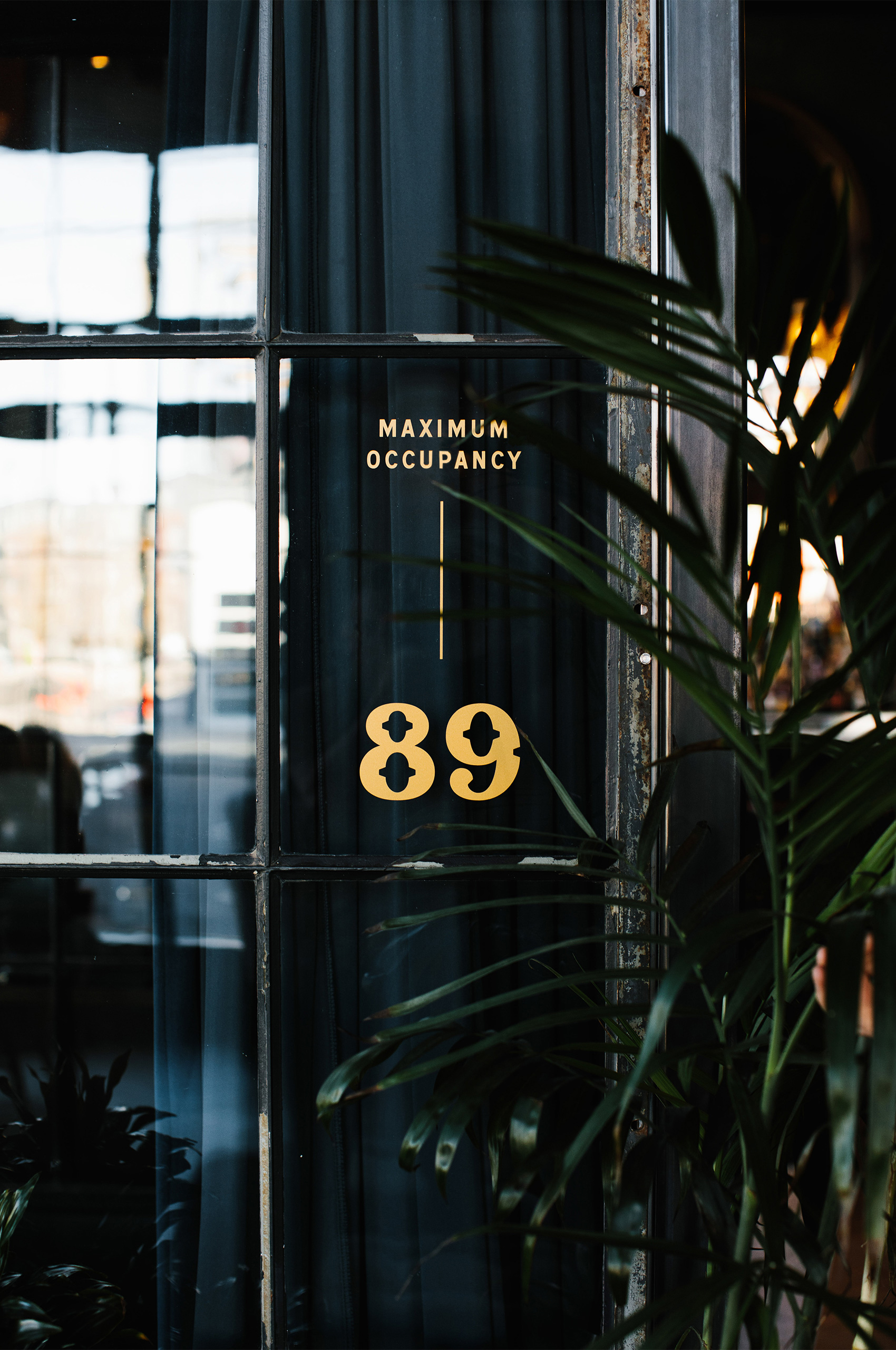
Throughout the physical buildout and collateral pieces, we utilize a small gold keyline. This again harkens back to Parisian signs. The keyline comes from the street signs, and the gold comes from the shop signs, which are often gilded. This ties into the physical space, which utilizes brass accents throughout. From the handrails to the door handles.
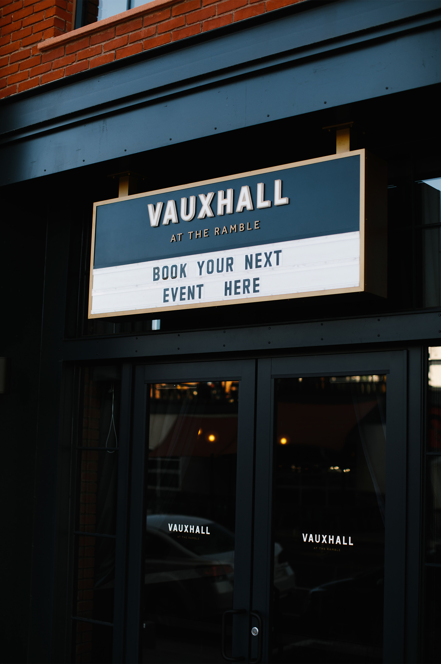
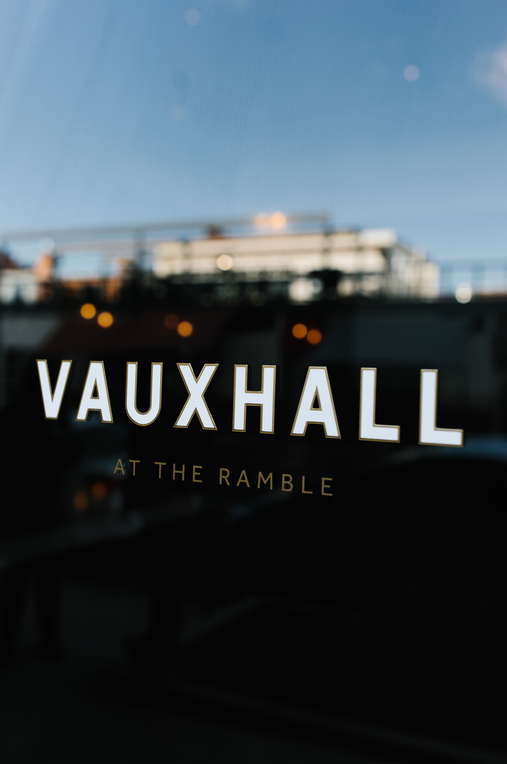
Through our research, we discovered that there was once a theater by the name Vauxhall in the same estate as the salon. This was something we kept in the back of our heads, thinking we might use it in the future.
After we had finished the main identity, and the building was under construction, Diggins approached Mast in need of help naming and branding the theater and event space at the Ramble. It only seemed fitting to call it Vauxhall.